
Announcing Storybook 3.4
Polymer, Image/Vue/Angular Storyshots, Multi-Hierarchy, & more!

It’s that time again folks: we’re excited to announce the latest iteration of Storybook, the award-winning software for developing, testing, and documenting UI components in React, React Native, Vue, Angular, and Polymer. 🍾🥂😅
Storybook 3.4 is on the NPM registry, and it’s a big one. It includes:
- New framework support: Polymer!
- Component testing: Storyshots image snapshots, Vue/Angular support
- UI improvements: Multiple story hierarchies
- Storysource: New addon for component code documentation
Read on for a tour of improvements and a brief status update!
🎁 Polymer support
We’re proud to add Polymer to our growing list of supported frameworks. This is a natural sequel to Vue in 3.2 and Angular in 3.3. Polymer support was contributed by Stijn Koopal, Norbert de Langen, Teije van Sloten, and Léon Rodenburg at Xebia. 🙏
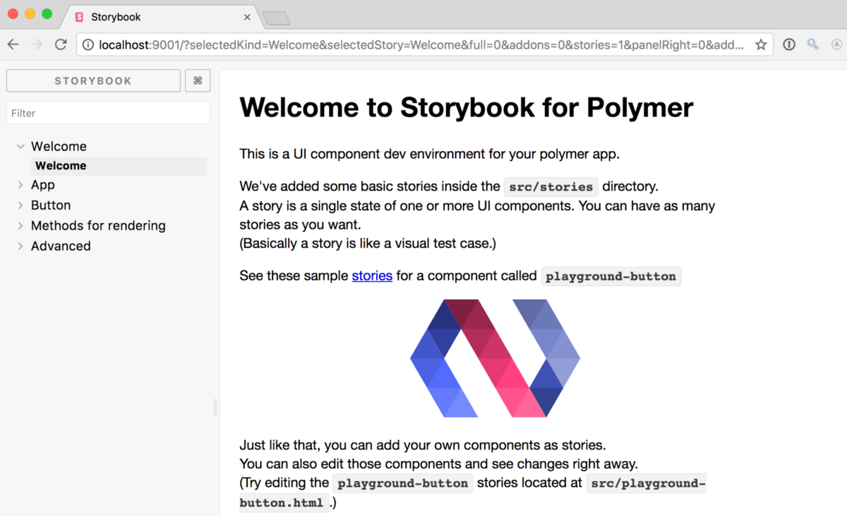
Storybook for Polymer supports native custom elements and plain HTML in addition to Polymer. So it’s also great if you want to write simple examples with html, or are more focussed on CSS/SASS components.
As usual, it’s ridiculously easy to add Storybook to your Polymer project:
npm i -g @storybook/cli
cd my-polymer-project
getstorybook
npm run storybook
Stijn has written a superb introductory post with details about how to use Storybook for Polymer, so check it out!
📸 Image snapshots
A second major improvement in 3.4 is image snapshotting for StoryShots, graciously contributed by Thomas Bertet. 🔥

Prior to 3.4, StoryShots used Jest’s DOM snapshotting capabilities to compute differences between component versions, and automatically notify developers when the render has changed. DOM differencing can catch many regressions, but fails to catch cases where the are purely visual, such as is the case with CSS updates.
In image snapshotting, a rendered image is saved to disk so that visual changes of any kind (including DOM changes and also CSS changes, etc.) get caught when they happen.
To utilize image snapshots with the most simple configuration, call initStoryshots with a custom test:
import initStoryshots, { imageSnapshot } from '@storybook/addon-storyshots';

initStoryshots({ suite: 'Image storyshots', test: imageSnapshot() });
To learn more and see other configuration modes, see the StoryShots documentation. Image Snapshots are currently supported for all platforms except React Native.
✨ StoryShots for Vue/Angular
The 3.4 release also improves StoryShots with support for Vue and Angular. This work was contributed by Igor Davydkin on his birthday as an incredible present to the Storybook community. 🎁
StoryShots attempts to infer your project type from its dependencies, but you can also specify it manually using the framework option, which can currently take on one of the following values: undefined, 'react', 'react-native', 'vue', 'angular'. For example:
import path from 'path';
import initStoryshots from '@storybook/addon-storyshots';

initStoryshots({
  framework: 'vue',
  configPath: path.join(__dirname, '.storybook'),
});
For more information, see the StoryShots documentation.
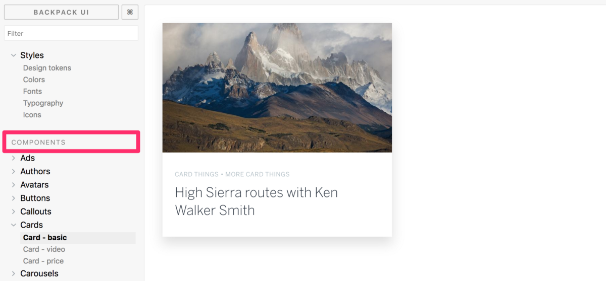
🌿 Multiple story hierarchies
The Storybook UI has also improved with multiple story hierarchies. This improvement, contributed by Max Meinders, allows you to group stories into visual sections in the UI:
To set this up, there’s a new configuration option hierarchyRootSeparator. For example, the following setup allows you to create groups of stories:
import { setOptions } from '@storybook/addon-options';

setOptions({
  hierarchySeparator: /\//,
  hierarchyRootSeparator: /\|/,
});

storiesOf('Group1|path/to/component1')
  .add('one', () => ...)
  .add('another', () => ...)

storiesOf('Group1|path/to/component2')
  .add(...)

storiesOf('Group2|component3')
  .add(...)
For more information, see the addon-options README.
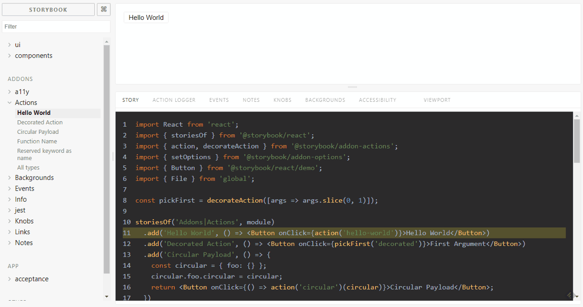
📄 Storysource addon
As an added bonus, Igor Davydkin also snuck in his Storysource addon to the 3.4 release. Storysource shows the code for your stories in Storybook’s addon panel, allowing viewers to browse a component’s usage side-by-side with its output behavior:
Storysource is our most direct way yet to document your components, and it’s easy to add to your project. First, install the addon:
yarn add --dev @storybook/addon-storysourceThen, import the library into your addons.js file:
import '@storybook/addon-storysource/register';Finally, add a hook to a custom webpack.config, which allows the addon to automatically instrument all of your stories:
module.exports = {
  module: {
    rules: [
      {
        test: /\.stories\.jsx?$/,
        loaders: [require.resolve('@storybook/addon-storysource/loader')],
        enforce: 'pre',
      },
    ],
  },
};
For more Storysource usage options, see the package README. For more details on the technical magic, Igor has written a wonderful article explaining how it works under the hood.
💥 And more!
Storybook 3.4 contains hundreds of other improvements. From nice details like adding a code example “copy button” to addon-info (#2713) to numerous Angular improvements based on user feedback in the 3.3 release (#2690, #2669, #2735). For a full list, see our CHANGELOG.
One of the biggest changes under the hood is a major refactoring in which we added a framework-independent core library to support React, Vue, Angular, Polymer, and many more to come (#2241). This makes it dramatically easier to add new frameworks to Storybook and to maintain our growing collection of frameworks. If you want to add support for your favorite framework, get in touch on Twitter, Slack, or Github and we’ll help you get it shipped in our next version!
📈 Onwards and upwards
Storybook 3.4 continues a great string of community-driven releases. We’ve surpassed:
- 22k+ stars and 400+ contributors on github
- 200k+ weekly downloads on npm
Storybook also recently won the “most impactful contribution to the community” award at React Amsterdam 2018. Read about it here!
If Storybook brings delight and efficiency to your UI development process, please consider helping make Storybook better. Whether you’re contributing a new feature like the ones described in this post, fixing a bug (we have those too), or helping improve the documentation, there is a mountain of work that goes into every release. Join us on Slack, support us financially on Open Collective, or just jump in on Github.
Many thanks to the awesome community members who contributed to this release:@9034725985 @aaronfullerton @abrahamgnz @adrukh @alexandermikuta @alfredo-delgado@alterx @anescobar1991 @arty-name @aseeto @avol-io @aymeric-duchein @benbakhar @chentsulin @christiandavis @clehnert-psl @cliedeman @cshell7 @danawhite @dangreenisrael @danielduan @davidkwan95@dependencies-bot @derekshull @dfdeagle47 @ersel @felipedeboni @fredyc @getsetbro @godban @gongreg @guylivni @hswolff @hypnosphi @igor-dv @javidjamae @jayandcatchfire @jdonor @jeffcarey @jonrimmer@juristr @kazupon @kevinsuttle @kiwka @kn0ll @kt3k @lachlanjc @m10l @markelog @matissjanis @mehandes @meros @metronom72 @mloughry @mnicole @mshaaban088 @mynnx @nblackburn @ndelangen @outspaced @pascalduez @paul42 @playfulcorgi @preya @primigenus @psimyn @punitgr @quramy @rhalff @richardbray @seberik @sec0ndhand @shilman @simon360 @sixmen @superol3g @sw-yx @telichkin @theneva@thomasbertet @tmeasday @tniezg @tsiq-swyx @vcarl @wuweiweiwu @x1c0 @yjcxy12 @zajn
🙌 Get it Now
Try out Storybook 3.4 today. If you’re already using Storybook, it takes just a minute to upgrade. And if you’re not, get started with the best way to develop React, React Native, Vue, Angular, and Polymer component UI’s:
npm i -g @storybook/cli
cd my-vue-react-rn-angular-or-polymer-project
getstorybook
npm run storybook
If you have questions, problems, encouragements, or simply exclamations of joy for the new release, please give us a holler on Twitter, Slack, Github, or in the comments below!
Finally, to stay up to date with Storybook-related news, follow us here on Medium or check us out on Twitter. And if you love Storybook, please applaud this post and share to help more people discover it.
With ❤️ from the storybook team.