
Building Pages in Storybook
Write stories for hard-to-reach page states

Building pages in an app might seem straightforward at first, but as your project matures things get more complicated. What happens if the network fails or the data is missing? Or worse, your app gets poorly formatted or incomplete data. What should the page render in all these scenarios?
Leading teams at Mozilla, The Guardian, and Shopify use Storybook to capture page states that are tricky to reproduce. That helps them methodically address each case their users may encounter.
This article shows how to develop pages in isolation with Storybook. We'll illustrate this process using the Component Encyclopedia—a new website that catalogs the world's UI components for frontend devs to reference. It consists of hundreds of pages with a wide gamut of UI states and data variance to account for.

Why use Storybook for pages?
Pages have non-obvious requirements like layout, accessibility, device compatibility, performance, and user personalization. This yields countless states for frontend devs to build and maintain.
Storybook helps you construct each page state in isolation then save it as a story to revisit during QA and automated testing.
💎 Capture the edge cases
Stories demonstrate the various states of your page. That includes edge cases that can be hard-to-reach in your app like the loading and empty states.
🖼 Share your work
By publishing your Storybook, you can share a link to a specific story in a given state with your team for feedback. That simplifies the sign-off process.
✅ Test user interactions
Even the most basic task requires the user to complete a sequence of steps across multiple components on a page. You can verify such interactions by scripting user behavior and writing assertions in a play function.
How to build pages in Storybook
A page is really just a component with extra data requirements. You build it in a similar way as a regular component. First develop the page in its most common “default” state with all data present. Then write stories for edge cases like no data, missing data, responsive breakpoints, etc.
Stories help you keep track of page states
The ideal state of a page is when all data is provided. We can write a Default story with inputs capturing this state:
Default.args = {
 authorAvatarUrl: mockImageUrl(50, 50),
 componentCount: 55,
 components: mockComponents,
 contributors: [
   {
     avatarUrl: mockImageUrl(50, 50),
     name: 'First Last',
   },
   {
     avatarUrl: mockImageUrl(50, 50),
     name: 'First Last',
   },
   {
     avatarUrl: mockImageUrl(50, 50),
     name: 'First Last',
   },
 ],
 description: 'Spectrum provides components and tools to help product teams work more efficiently, and to make Adobes applications more cohesive',
 downloads: 15123,
 gitHubUrl: '#',
 org: 'Adobe',
 packageName: 'packagename',
 storyCount: 135,
 storybookUrl: '#',
 title: 'Spectrum Design System',
}
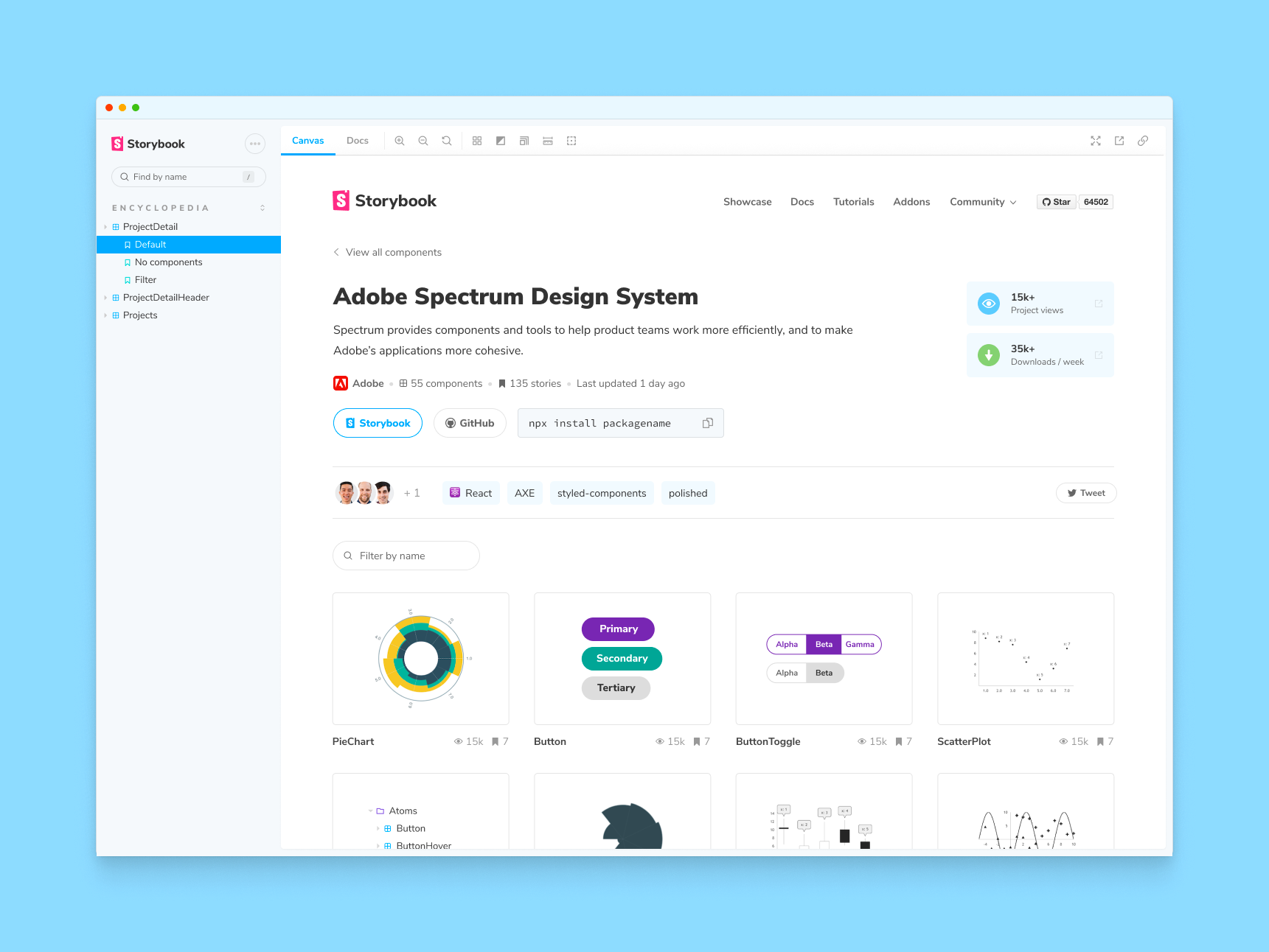
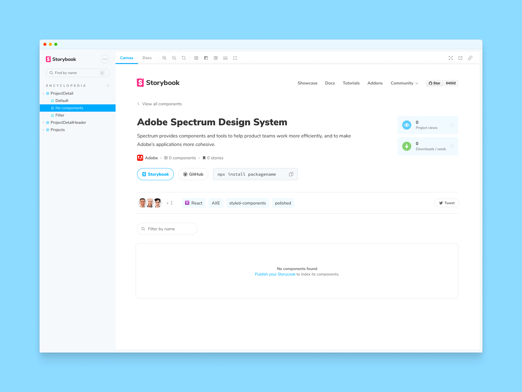
But what about less ideal cases, such as “no data” states? We can reuse the inputs from the Default story, and then override some of the values to properly create that state:
NoComponents.args = {
 ...Default.args,
 componentCount: 0,
 components: []
}
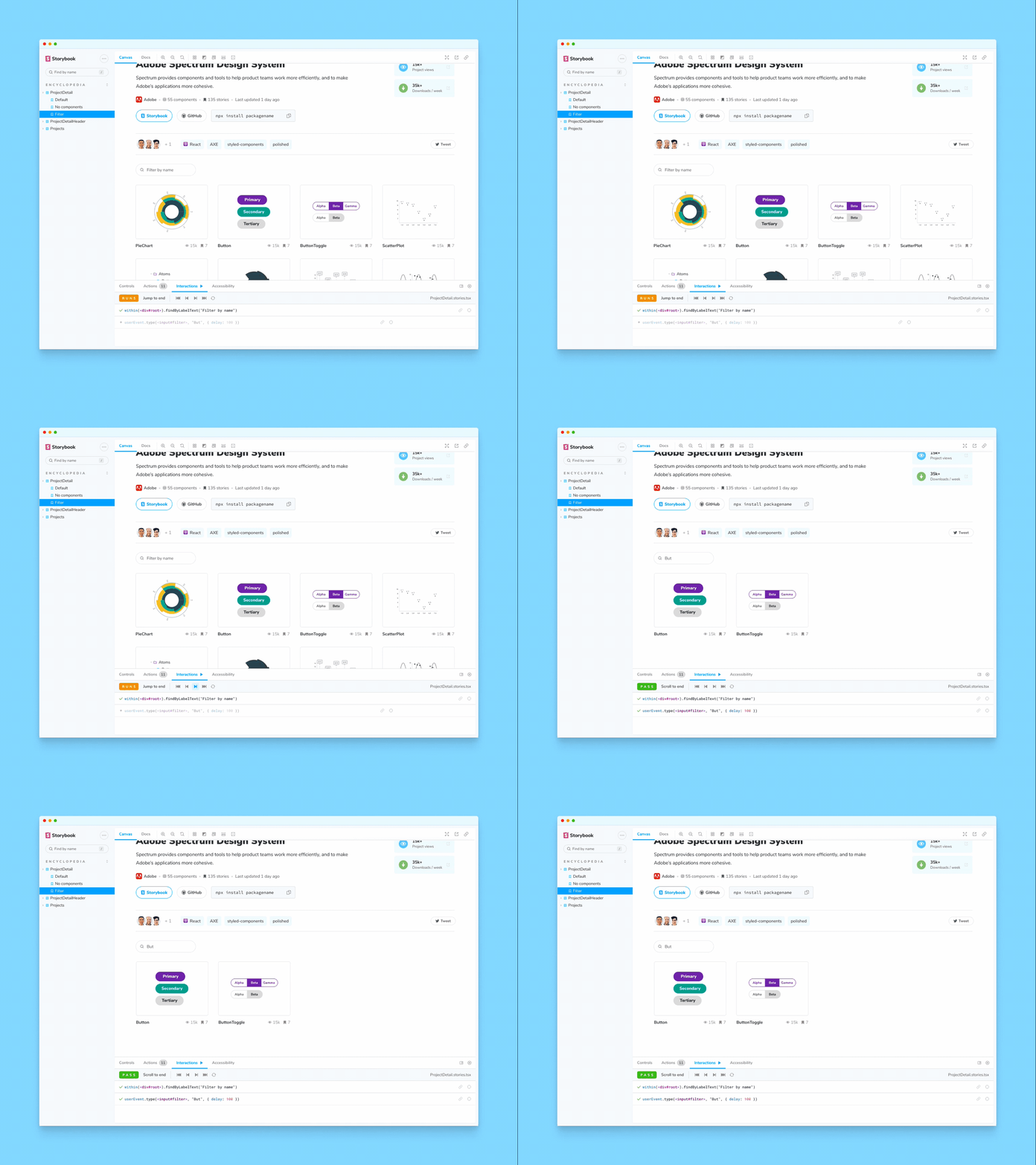
Sometimes, the page’s state needs to be demonstrated not by providing inputs, but by interacting with it. We can do that using play functions to simulate interactions, such as typing into a filter control to check its behavior and outcome:
Filter.args = {
 ...Default.args
};
Filter.play = async ({ canvasElement }) => {
 const canvas = within(canvasElement);
 const filter = await canvas.findByLabelText('Filter by name');

 await userEvent.type(filter, 'But', { delay: 100 });
};
Decompose complex pages into simple components
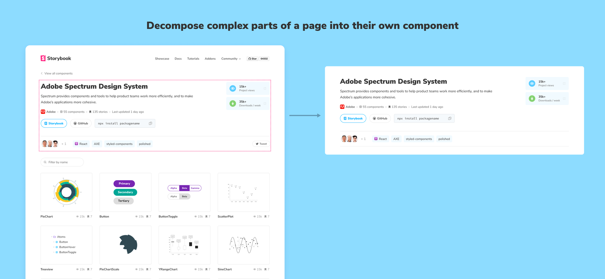
If you take a component-driven approach, where UIs are assembled from reusable components, you can further decompose the page by breaking it apart into its constituent components.
For example, the Project page from the Component Encyclopedia holds most of its complexity in the header region. To separate page-level concerns like data loading from component-level concerns like title length, we extract the header into its own component, with its own stories.
Use addons to test behavior, accessibility & more
Once we’ve written the stories, we can make our Storybook even more useful with addons. In addition to demonstrating a page’s various states, we can check accessibility with the a11y addon, which gives us a convenient panel of check statuses which update as we work. Taking it even further, we can run our stories as automated tests in CI with the newly-announced interaction tests.
Conclusion
Building pages is something all developers have to do. It’s difficult and error prone to build pages within an app because many states are tough to reproduce. You end up clicking through the user flow or messing with fixtures to work on each state.
Stories are living documentation of a page’s “known good states” that you can share with your team. You develop each page’s stories in isolation. That allows you to avoid hairy business logic or messy app context.
This article was inspired by our efforts to build a page for the Component Encyclopedia, which collects public Storybooks full of components and pages to browse and learn from. Sign up to the Storybook mailing list below to get Component Encyclopedia updates and early access. Or submit the URL of your own Storybook here.
Building pages in an app seems straightforward, but there is so much to account for—loading & empty states, missing data, and countless UI variations.
— Storybook (@storybookjs) March 4, 2022
Isolating pages in Storybook makes it easier to test these tricky cases. Our new article shows you how:https://t.co/qdFWEVF3PD pic.twitter.com/p0c71PYNh0