
Community Showcase #3
New homepage, video tutorials, and Storybook for game development

Welcome to showcase #3! This month we've got lots of design updates and a roundup of great articles, addons, and resources from our community.
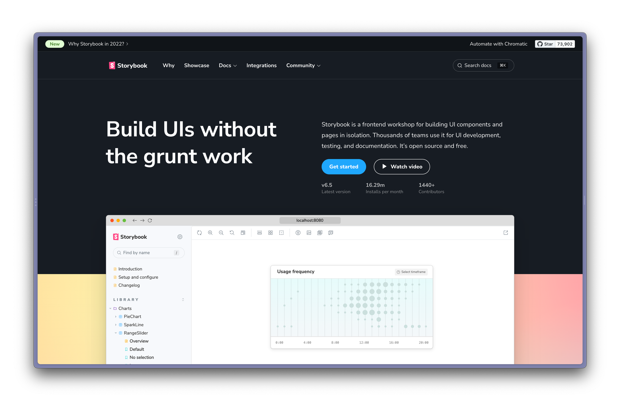
Fresh coat of paint for the Storybook website
I am excited to announce the launch of the new Storybook homepage. It's packed with animations and demos to showcase all capabilities of Storybook. We've also streamlined the navigation to make finding what you’re looking for easier and you can now search docs from any page.
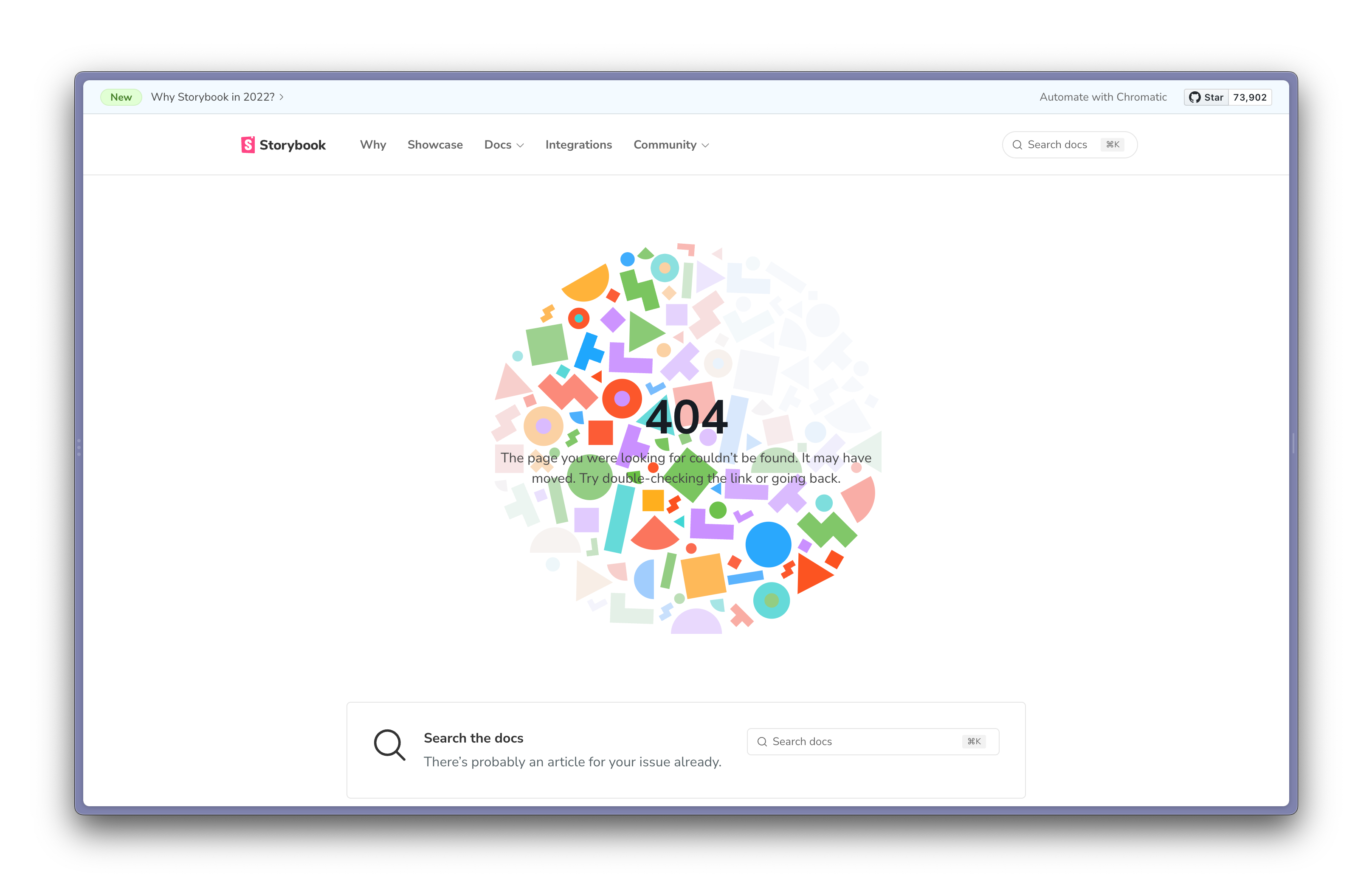
Oh, and if you stumble upon our 404 page, it now has a fun little interactive toy.
7.0 design alpha
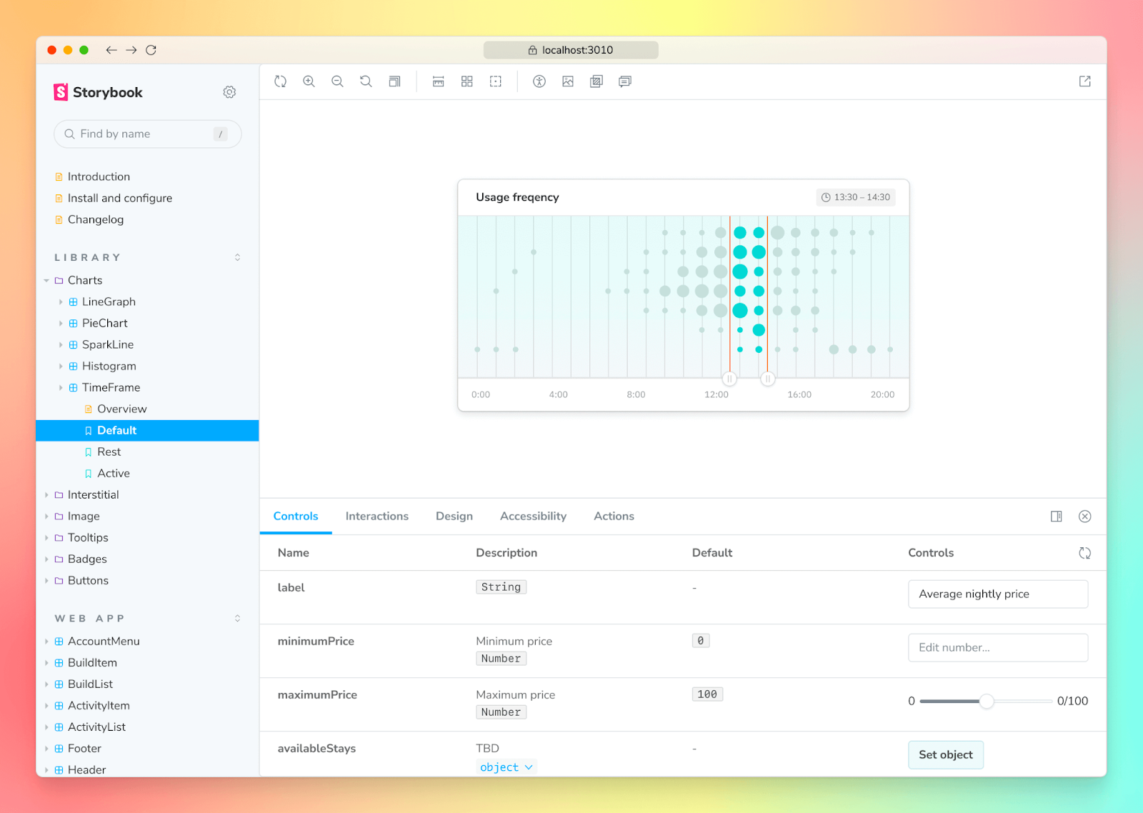
The website isn’t the only thing that got a visual refresh. We’ve also refined the core Storybook UI—edge-to-edge layout, reorganized toolbar and a fresh set of icons. The 7.0 update also pre-bundles the Storybook UI which means faster start up.
The new design is now available in alpha, check it out »
Chantastic video tutorials
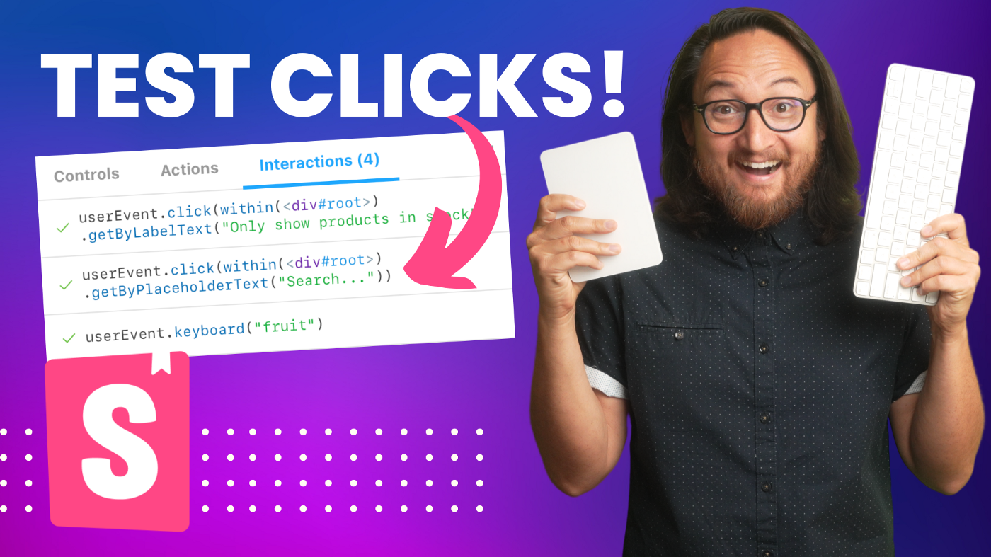
In July, chantastic kicked off a new YouTube series to help you and your team become Storybook pros.
The latest tutorial explores interactive component testing in Storybook. You’ll learn how to simulate user clicks and keypresses using play functions, testing-library, and Jest.
Past videos covered workflows such as connecting props with Storybook Controls, debugging CSS with Measure and Outline addons and testing responsive UIs using the Viewport addon.
Addons
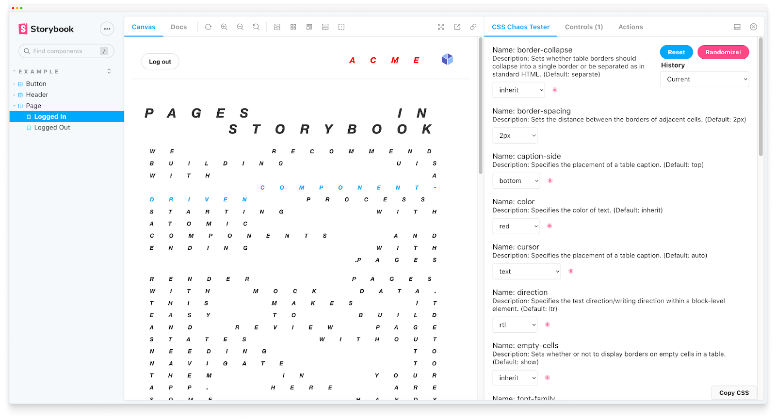
Chaos Addon: Is your component resilient to style bleeding? Alex Wilson’s addon applies inheritable CSS properties to a component to see how it breaks its styling.
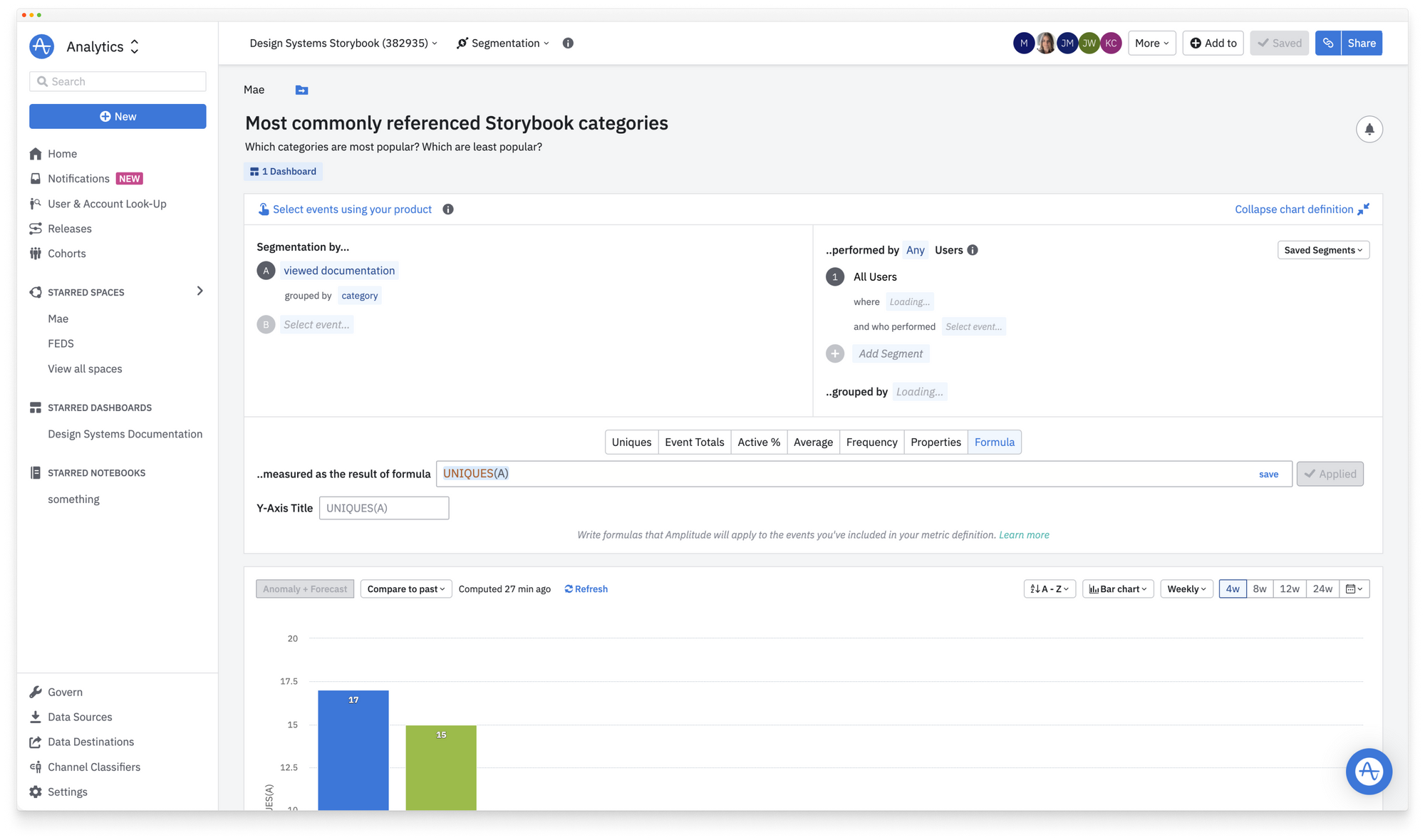
Amplitude Addon: helps design system teams capture usage metrics for their Storybook. Mae Capozzi (one of the creators of the addon) even wrote a blog post to share how they used metrics to improve the UX of their design system docs.
Docusaurus Addon: makes it easier to develop Docusaurus components in Storybook. Jody Heavener’s addon applies the core Webpack required for your Storybook to load SVG, fonts, MDX, and CSS modules the Docusaurus way.
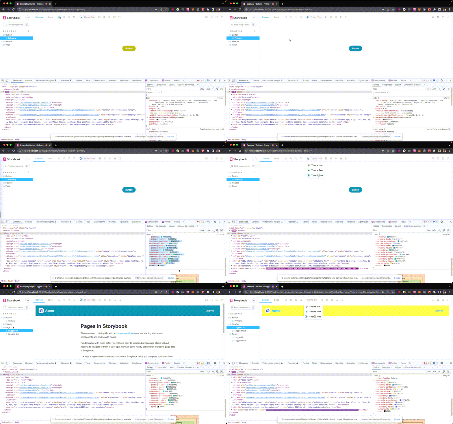
Design Tokens CSS Addon: it’s common for teams to maintain their design tokens as CSS variables. Raul Melo has built an addon that allows you to quickly swap those token values.
Resources to help you get started
Jumpstart your Angular 14 development by Colum Ferry shows you how to combine Angular with Storybook, Tailwind and Nx.
How to test a React application by Patrick Lafrance shows you how to test at the component level by combining Storybook interaction tests with Chromatic Visual tests.
Storybook as a collaborative tool for teams. In this talk, Niamh McCooey shares how teams can use Storybook & React to make cross-discipline collaboration easier and reduce bottlenecks.
Get started with NX, Storybook, and next-generation builders by Katerina Skroumpelou shows you how to use Vite for Storybook in your Nx workspace.

Cool Integrations
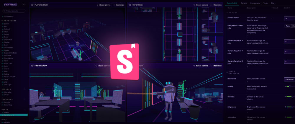
Storybook as a game development tool! @Foxhoundn applied the component-driven approach when making their 3D game called SYNTHAX. They used Storybook to build the various constituent parts in isolation—meshes, particles, animations, and interactive elements.
Sitecore is one of the most popular enterprise CMS. Thomas Desmond shows you how to use Storybook with Sitecore.
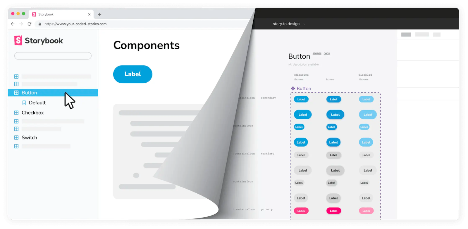
Story.to.design takes an innovative approach to convert stories into Figma components. On a recent episode of Learn With Jason, Thaís Santos demonstrated how to Generate Figma UI kits using Storybook and story.to.design.
Want to show up here? Mention @storybookjs with your articles, videos, and addons.
Storybook Community Showcase #3 is out
— Storybook (@storybookjs) September 15, 2022
A quick roundup of news, tutorials, addons, and more.
🎨 New homepage
📹 Video series to help you become a Storybook pro
🧩 New addons: Chaos, Amplitude & Docusaurus
🕹️ Storybook as a game development toolhttps://t.co/jCY9gaolwa pic.twitter.com/fSDxgyIlIq