
Component Story Format 3.0
Out with boilerplate, in with scripted interactions!

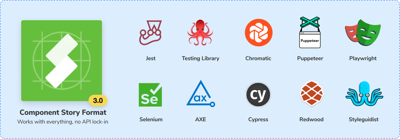
Storybook is based on one core construct: the story. Everyone that uses Storybook writes stories for their component examples. Component Story Format is our expressive, platform-agnostic format that's used across the industry from Netflix to Shopify and beyond.
I'm excited to announce Component Story Format 3.0. It's the next major iteration of CSF that harnesses a year's worth of community feedback to dramatically reduce boilerplate and allow you to focus on the essence of your stories.
- ♻️ Spreadable story objects for reuse
- 🌈 Default render functions for brevity
- 📓 Automatic titles for convenience
- ▶️ Play functions for scripted interaction
- ✅ 100% backwards compatible with CSF 2.0
CSF 3.0 is available to use today in experimental mode. We'd love your feedback to help make it better before official release. Let's get into the details below.
What's so good about CSF anyways?
Component Story Format (CSF) is a simple, ES6 module-based file format for component examples. Since launching two years ago, it's become a smash hit.
Under the hood, CSF is standard JavaScript that's decoupled from Storybook’s API. No tooling lock-in. That means you can import stories into your favorite JS libraries.
Last year we launched CSF Args: dynamic story inputs that open up new use-cases, such as dependency injection and automatically-generated controls.

Args have become a powerful building block for Storybook and its addons, but also for third party integrations like Testing Library and Cypress.
What's more, because CSF is platform-agnostic, it's now supported by incredible projects across the ecosystem like RedwoodJS, React Styleguidist, and UXPin.
New in CSF 3.0
Component Story Format is a file format based on ES6 module exports: the default export contains metadata about the examples and each named export is an example.
In CSF 2.0, the named exports are always functions that instantiate a component, and those functions can be annotated with configuration options. For example:
// CSF 2.0
export default {
  title: 'components/Button',
  component: Button,
};

export const Primary = (args) => <Button {...args} />;
Primary.args = { primary: true };
This declares a Primary story for a Button that renders itself by spreading {primary: true} into the component. The default.title metadata says where to place the story in a navigation hierarchy.
Here's the CSF 3.0 equivalent:
// CSF 3.0
export default { component: Button };
export const Primary = { args: { primary: true } };
It's a lot shorter! Let's go through the changes individually to understand what's going on.
Spreadable story objects
The first thing you might notice is that in CSF 3.0 the named exports are objects, not functions. This allows us to reuse stories more efficiently with the JS spread operator.
Consider the following addition to the intro example, which creates a PrimaryOnDark story that renders against a dark background:
Here's the CSF 2.0 implementation:
// CSF 2.0
export const PrimaryOnDark = Primary.bind({});
PrimaryOnDark.args = Primary.args;
PrimaryOnDark.parameters = { background: { default: 'dark' } };
Primary.bind({}) copies the story function, but it doesn't copy the annotations hanging off the function, so we must add PrimaryOnDark.args = Primary.args to inherit the args.
In CSF 3.0, we can spread the Primary object to carry over all its annotations:
// CSF 3.0
export const PrimaryOnDark = {
  ...Primary,
  parameters: { background: { default: 'dark' } },
};
This may seem like a small thing, but we can do a lot of neat stuff with it, as we'll see below.
Default render functions
The next thing you might notice is that in the initial example, there are no functions at all! What's going on here?
In CSF 3.0, stories are objects, so the way you specify how a story renders is through a render function. We can rewrite a CSF 2.0 example to CSF 3.0 through the following steps.
Let's start with a simple CSF 2.0 story function:
// CSF 2.0
export default {
  title: 'components/Button',
  component: Button,
};

export const Default = (args) => <Button {...args} />;
Now, let's rewrite it as a story object in CSF 3.0 with an explicit render function that tells the story how to render itself. Like CSF 2.0, this gives us full control of how we render a component or even a collection of components.
// CSF 3.0 - explicit render function
export const Default = {
  render: (args) => <Button {...args} />
};
But in CSF 2.0, a lot of story functions are identical: take the component specified in the default export and spread args into them. What's interesting about these stories is not the function, but the args passed into the function.
So in CSF 3.0 we are providing default render functions for each framework. If all you're doing is spreading args into your component—which is the most common case—you don't need to specify any render function at all:
// CSF 3.0 - default render function
export const Default = {};
It doesn't get any simpler than that. Say goodbye to boilerplate!
Generate titles automatically
Another huge convenience in CSF 3.0 is automatic title generation.
// CSF 2.0
export default { title: 'components/Button', component: Button }
// CSF 3.0
export default { component: Button }You can still specify a title like in CSF 2.0, but if you don't specify one, it can be inferred from the story's path on disk.
This is controlled by the way stories are configured. Consider an old-style configuration:
// .storybook/main.js
module.exports = {
  stories: ['../src/**/*.stories.*']
};
Now consider a new-style configuration available in Storybook 6.4:
// .storybook/main.js
module.exports = {
  stories: ['../src']
};
Given this configuration, the stories file ../src/components/Button.stories.tsx will get the title components/Button.
Need more control? The following would match a custom file pattern, and add a custom prefix to the generated title:
module.exports = {
  stories: [
   { directory: '../src', files: '*.story.tsx', titlePrefix: 'foo' }
  ]
};
Play functions
Last but not least, we bring an entirely new feature to CSF 3.0: play functions. Play functions are small snippets of code that are executed after the story has been rendered.
While the other CSF 3.0 features optimize existing story constructs, the play function enables scenarios that weren't possible before.
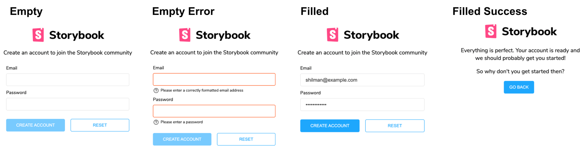
Consider the scenario of a validating form:
And its CSF 3.0 implementation:
// CSF 3.0
import userEvent from '@testing-library/user-event';

export default { component: AccountForm }

export const Empty = {};

export const EmptyError = {
  ...Empty,
  play: () => userEvent.click(screen.getByText('Submit'));
}

export const Filled = {
  ...Empty,
  play: () => {
    userEvent.type(screen.getById('user'), 'shilman@example.com');
    userEvent.type(screen.getById('password'), 'blahblahblah');
  }
}

export const FilledSuccess = {
  ...Filled,
  play: () => {
    Filled.play();
    EmptyError.play();
  }
}
The Empty story renders the empty form.
The EmptyError simulates a validation error by emitting a user event to click the submit button using Testing Library immediately after the story is rendered. Thanks to spreadable story objects, this story inherits all of the args and parameters of the Empty story.
The Filled story fills out the form using Testing Library.
And finally the FilledSuccess story shows the submitted state by first reusing the Filled story's play function, and then clicking the submit button.
We can even animate the entire sequence in CSF 3.0:

This scenario also motivates the spreadable object syntax of CSF 3.0. We can now conveniently copy a story's entire configuration, and only modify the pieces that we care about.
Feedback wanted
CSF 3.0 is available as an experimental release. We'd love your feedback.
If you're using Storybook 6.3 or SB 6.4 prerelease, turn on previewCsf3 in your .storybook/main.js config:
// .storybook/main.js
module.exports = {
  features: {
    previewCsfV3: true,
  }
};
👉 For automatic title generation specifically, you must use SB 6.4, and you must update your stories configuration in .storybook/main.js to the new format sketched out above–official docs coming soon.
For your convenience, there's a codemod to upgrade your stories:
$ npx sb@next migrate csf-2-to-3 --glob="**/*.stories.js"For feedback, there's a GitHub discussion and the #component-story-format channel in Storybook Discord. Check known open issues labeled with csf3 on Github.
We plan to iterate CSF throughout the SB6.4 release cycle, and remove the feature flag once it's ready. CSF 3.0 is backwards compatible, so all CSF 2.0 features are still available. You can kick the tires without needing to change any of your existing stories.
Get involved
Component Story Format 3.0 was developed by Michael Shilman (me!), Tom Coleman, Gert Hengeveld, and Pavan Sunkara with testing and feedback from the entire Storybook community.
Storybook is the product of over 1320 community committers and is organized by a steering committee of top maintainers.
If Storybook makes your UI development workflow easier, help Storybook get better. You can contribute a new feature, fix a bug, or improve the docs. Join us on Discord, support us on Open Collective, or just jump in on Github.
Component Story Format 3.0 is here (alpha)
— Storybook (@storybookjs) July 7, 2021
♻️ Spreadable story objects
🌈 Default render function
📓 Automatic titles
▶️ Play functions for scripted interaction
✅ 100% backwards compatible
All with much less boilerplate! https://t.co/ky1vC6FcEL pic.twitter.com/CB7bQxNkiy