
Component Story Format
Simple, portable, future-proof component examples

Storybook is the world’s most popular UI component workshop. It enables structured UI development and testing for every major view layer including React, Vue, Angular, and many more.
Storybook 5.2 introduces Component Story Format (CSF), a new way to author stories based on ES6 modules. Component Stories are simple, easy to read, and decoupled from Storybook’s internal API so you can use them anywhere.
Read on to learn more:
- 🏆 Why: The big opportunity
- 📄 Format: What it is & why it’s better
- 🚚 Portability: Jest embedding example
- 🔀 Codemods: How we make it easy to upgrade
- ⚡ 3 minute install: Get started today
- 🔭 What’s next?: The way forward
🏆 Why a new format?
Imagine if developing a component in Storybook automatically unlocked the ability to test it with Jest, import it in Sketch designs, paste it into InVision prototypes, and visually test it in Chromatic. What if your component library was universally accessible inside all your favorite tools?
In the last three years, components have risen to dominate the UI landscape. Everywhere you look there are new component-oriented tools for development, testing, design, and prototyping.
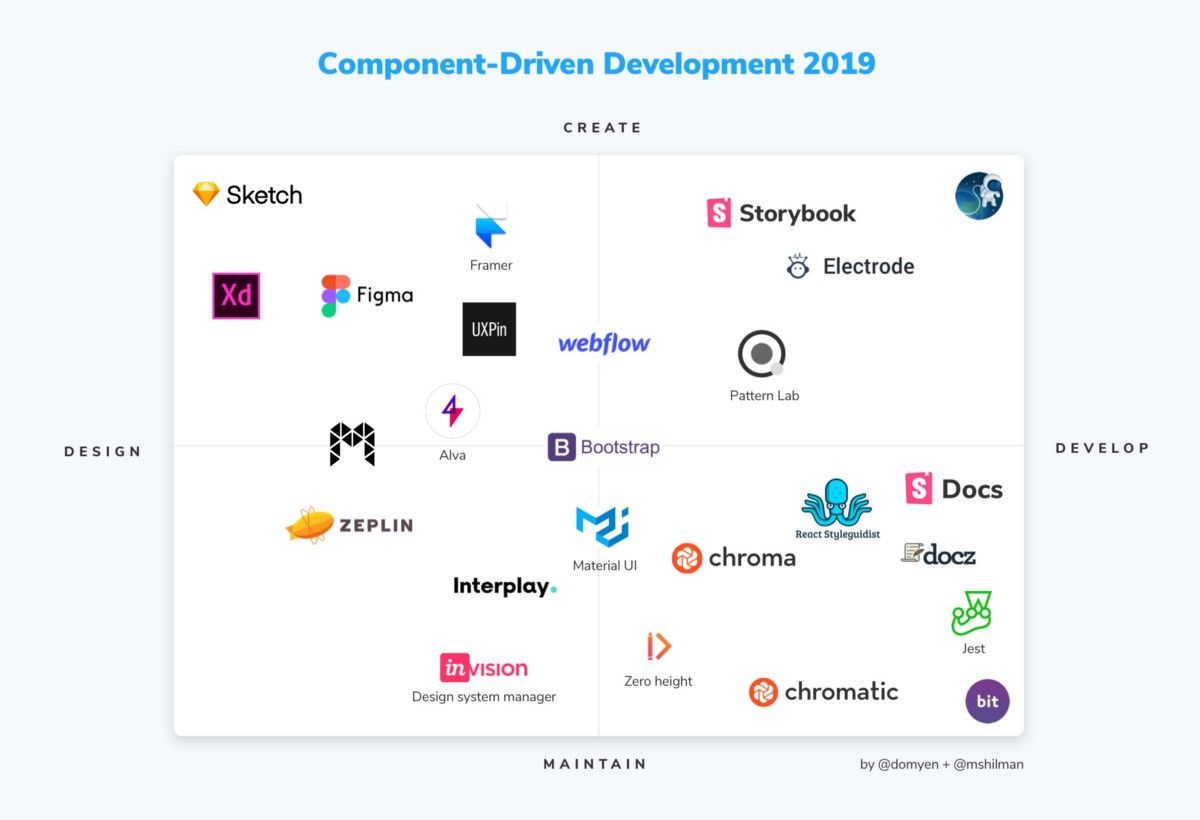
These tools engage in the creation and consumption of components and component examples (a.k.a. stories). But each tool has its own proprietary format because a simple, platform-agnostic way to express component examples doesn’t yet exist.
The “Story” is the source of truth for a component example
Storybook’s popularity stems from its extensive, open source tooling for component development, testing, and documentation. These rich features make it essential to the frontend workflows of powerhouses like Airbnb, Slack, Squarespace, Lyft, Uber, and Dropbox.
However, if you peel everything away, Storybook is built on one core construct: the story.
A story is a code snippet that renders an example of a component in a specific state.
A story uses the production code shipped to users, which makes it the most accurate representation of a component example. What’s more, stories are expressed in the view layer you use to build your app.
Tom Coleman, Norbert de Langen, and I originally set out to simplify writing stories in Storybook. Along the way we realized that creating an expressive, platform-agnostic format would allow developers to use stories in other tools and even independently of Storybook itself. This could improve the experience of everyone using components!
📄 Component Story Format
I’m excited to introduce Component Story Format. If you’ve used earlier versions of Storybook, you’re probably familiar with the “classic” storiesOf API:
storiesOf('atoms/Button', module)
  .add('text', () => <Button>Hello</Button>)
  .add('emoji', () => <Button>😀😎👍💯</Button>);
This tried and true API gets the job done. But after helping tens of thousands of developers capture, document, and test key component states, we’ve come up with a much better way:
export default { title: 'atoms/Button' };

export const text = () => <Button>Hello</Button>;
export const emoji = () => <Button>😀😎👍💯</Button>;
CSF has every affordance of the storiesOf API, but brings many additional benefits:
💎 Simple. Writing stories is as easy as exporting ES6 functions from your story file in a clean, standard format you know and love.
🚚 Portable. Component stories are easily consumed anywhere ES6 modules live, including your favorite testing tools like Jest and Cypress.
🔥 Optimized. Component stories don’t need any libraries other than your components. And because they’re ES6 modules, they’re even tree-shakeable!
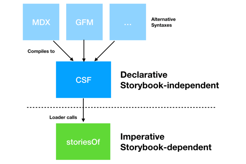
☝️ Declarative. The declarative syntax is isomorphic to higher-level formats like MDX, enabling clean, verifiable transformations.
👾 Future-proof. Component stories hide Storybook’s underlying API, giving maintainers flexibility to improve Storybook without breaking any contracts.
🚚 Story portability
Component stories have no dependence on Storybook, so consuming them is as easy as importing an ES6 module. Consider how we might test interactivity with Jest and react-testing-library.
Here’s a CSF file for a stateful Counter component that increments its count on each click:
export default { title: 'Counter' };

export const enabled = () => (
  <Counter text="Enabled" />
);

export const disabled = () => (
  <Counter disabled text="Disabled" />
);
And here’s how we can use it in an interactive test:
import { render, fireEvent } from '@testing-library/react';
import { enabled, disabled } from './Button.stories';

describe('counter interactivity', () => {

  it('should increment when enabled', () => {
    const comp = render(enabled());
    fireEvent.click(comp.getByText('Enabled: 0'));
    expect(comp.getByText('Enabled: 1')).toBeTruthy();
  });

  it('should do nothing when disabled', () => {
    const comp = render(enabled());
    fireEvent.click(comp.getByText('Disabled: 0'));
    expect(comp.getByText('Disabled: 0')).toBeTruthy();
  });

});
With Component Story Format, this integration is simple and natural. Achieving the same result using storiesOf would require a significant restructuring of your code.
🔀 Convenient code migrations
What about your existing library of stories? Have no fear. With our entire existing user base depending on Storybook’s classic API, we’ll continue to support storiesOf for the foreseeable future.
That said, we want you to upgrade so we’ve made it incredibly easy. Since everything in the storiesOf API has a direct equivalent in the Component Story Format, you can automatically migrate your existing stories in seconds.
For example, if you suffix your stories with .stories.js, converting your stories is as simple as running the following command in the Storybook CLI:
npx sb migrate storiesof-to-csf --glob "**/*.stories.js"Storybook uses the amazing JSCodeshift under the hood to make this conversion fast and easy. You’ll also need to modify your call to configure if you’re migrating from the storiesOf API.
⚡ 3 minute install
Try out Component Story Format today in Storybook 5.2:
npx npm-check-updates '/storybook/' -u && npm installTo load Component Stories, Storybook’s configure API gets a little facelift. Here’s a sample.storybook/config.js:
import { configure } from ‘@storybook/react’;

configure(require.context(‘../src/’, true, /\.stories\.js$/), module);
Finally, you can add a new story to verify it’s working, and then run the automated migration (see above) on your story library. The migration overwrites your files so make sure your stories are in version control.
Or if you want to try it in a fresh project, Storybook’s default setup now ships with Component Stories as default:
cd my-react-vue-angular-project
npx -p @storybook/cli@next sb init
And Bob’s your uncle! 🎉
🔭 What’s next?
Component Story Format is a foundational step forward for Storybook that brings immediate benefits including simplicity, portability, and optimizability.
The format’s long-term benefits will be even greater. An open, portable, and standards-based format enables the entire ecosystem of component design and dev tools to work together on behalf of users.
As the most popular component explorer, Storybook is well-positioned to promote a universal standard. More than 20,000 GitHub repos depend on Storybook (that we know of), with usage across every major front-end view layer by the largest companies in the world. It’s installed over 4M times per month on NPM.
Storybook users are already transitioning to CSF so that they can reuse their existing stories outside of Storybook in other tools and libraries.
📣 Follow us on Medium or Twitter to see how the project evolves.
💌 If you’re creating a tool that can benefit from CSF or any kind of Storybook integration, we’d love to collaborate. Contact me: michael@hichroma.com.
Thanks to the community
Component Story Format was developed by Tom Coleman, Norbert de Langen, and Michael Shilman (me!), with testing and feedback from the entire Storybook community.
Storybook is the product of over 700 community committers and is organized by a steering committee of top maintainers. Thanks also to gracious donations on Open Collective.
If Storybook makes your UI development workflow easier, help Storybook get better. You can contribute a new feature, fix a bug, or improve the docs. Join us on Discord, support us on Open Collective, or just jump in on Github.