Figma plugin sneak peek
Storybook Connect links your stories to Figma components
At Storybook, we believe the software industry is converging on Component-driven UIs to deliver durable user experiences. Our goal is to accelerate the industry's shift to components.
Thousands of developers now build, test, and document components with Storybook. Designers create components too. Figma adopted components back in 2016 and is championing the cause from the design perspective.
I’m excited to share a sneak peek of our new Figma plugin, Storybook Connect. It keeps designers and developers in sync by connecting designs to stories.
- 🤝 Link design components to stories
- 🕹 Play with interactive stories in Figma
- 🎯 Compare implementation to the design

Wait, but why?
One of the classic hurdles in frontend is keeping designers abreast of what’s live in production. The implementation and design tend to drift apart over time. This leads to confusion around expected UI appearance and behavior.
With components, developers and designers have a shared construct. But the approach to components is different depending on your discipline.
Developers use Storybook to develop components in isolation from the app. The core innovation is the story, a standards-based format for component examples. You build components and write stories along the way that capture key states.
Inspired by engineering, Figma’s components unlock superpowers like “composition, inheritance, and unlimited overrides”. With component variants, designers can represent key states in a more granular way.
It doesn’t take much squinting to see that Storybook stories map to Figma variants and vice versa. Till now, these sibling constructs have been tough to link together.
Connect Storybook and Figma
What if you could connect stories to their variants? That’d mean designers see live components to debug inconsistencies earlier in the design process. As a developer, you’d save time because designs would actually reflect what’s in production.
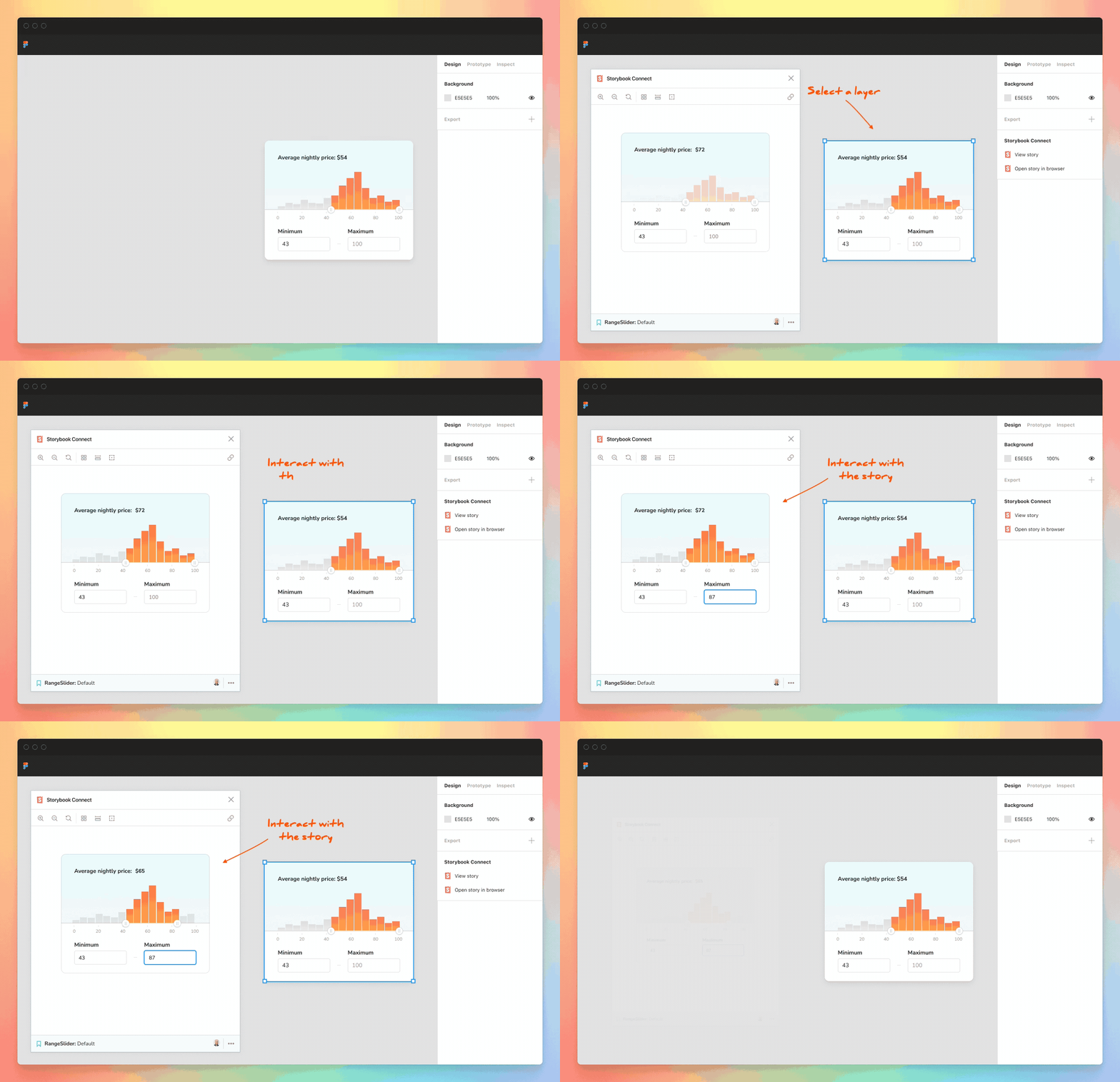
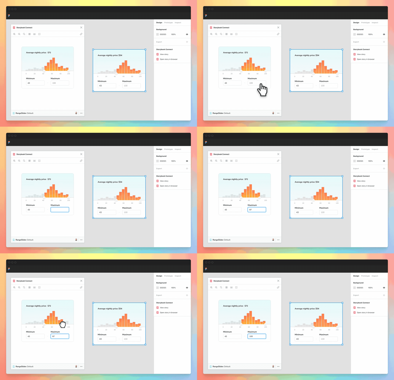
The Figma plugin embeds stories into the design workspace so that designers can cross-reference the live implementation in one place. Open the Storybook Connect window to interact with the real component.

Link components
When you link a component or a variant to a story that link propagates to every instance in Figma. That saves you time by ensuring your collaborators can also see the story link.
No more tabbing between Figma and Storybook during design handoff or searching multiple Storybooks to find out where a component was implemented. Link once and for all.

Compare implementation to the design
The plugin comes with a compact yet powerful story embed that includes familiar tools like the Outline, Measure, Backgrounds, and more. This gives you a quick way to spot check appearance.

Open Storybook from the sidebar
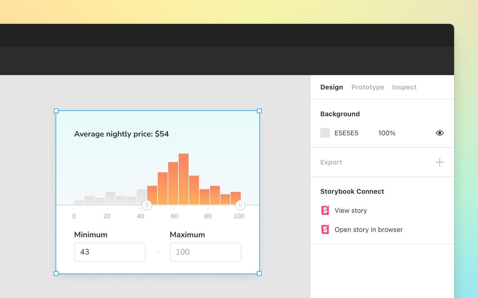
See which components are linked by glancing at the Storybook Connect section in Figma’s sidebar. You’ll find convenient actions to view the story in place or in your web browser.

Sign up for early access
Storybook Connect for Figma brings designers closer to developers by connecting stories (code) to variants (design). It's in active development, hence the sneak peek.
We need your help and feedback to bring it to life. Our mission is to unite component tools in one seamless workflow. Sign up to Storybook’s mailing list below to get notified of early access and project updates. Or join us in Storybook’s Discord chat #design to follow our progress.
The plugin is developed by Jonathan Kolnik, Michael Arestad, Zoltan Olah, and Dominic Nguyen (me!).
Sneak peek of our new Figma plugin!
— Storybook (@storybookjs) January 27, 2022
It brings designers closer to developers by connecting variants to stories.
🤝 Link design components to stories
🕹 Play w interactive stories in Figma
🎯 Compare implementation to design
See more » https://t.co/pGMWBLECbe pic.twitter.com/D38s6K11Mo