In-app tour for new users
Write your first story in just 3 minutes

When you start learning a new skill, there’s nothing better to have than a great teacher. That's also true for Storybook. The world's leading frontend teams use Storybook to build their UIs, but it can feel tricky to understand the basics if you're learning by yourself.
Today, I'm excited to share a sneak peek of the in-app tour developer experience in Storybook 7.1. It teaches new users how to get started with Storybook from within Storybook! That’s helpful for all devs, whether they’re new to frontend or just new to Storybook.
- 🧑🏫 Guided tour of Storybook
- 📝 Write your first story
- ✅ Try it in alpha (React only for now)
Wait, but why?
New users often mention that it’s tough to take the leap from first installing Storybook to actually using it in their apps. Our docs show you how to write stories, but you shouldn’t have to tab between sites to learn how Storybook works.
We’re building onboarding into the new Storybook experience to show how easy it is to write stories for all the variations of your app.
Guided Storybook tour
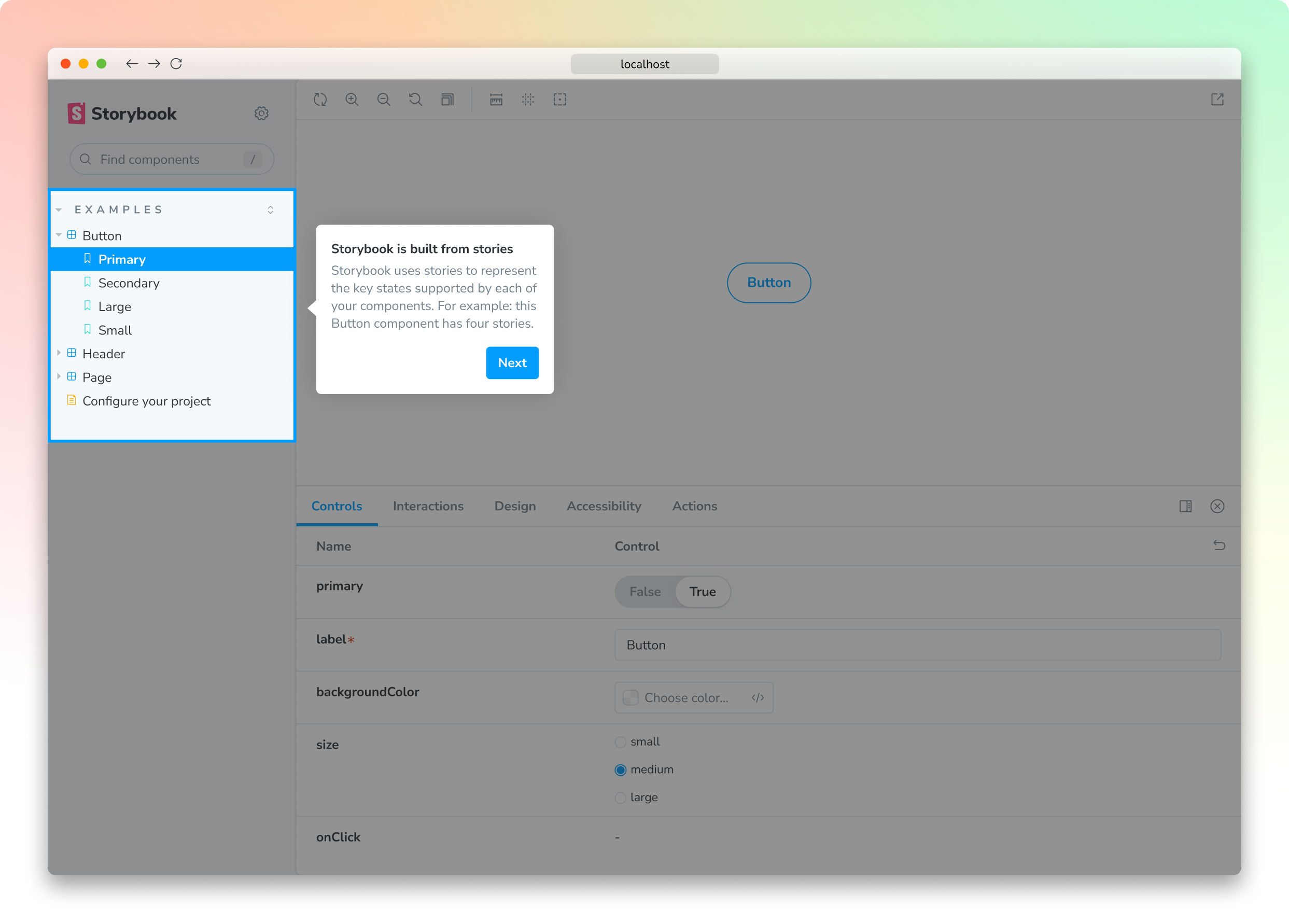
The guided tour is designed to give new folks a sense of what it's like to actually use Storybook. It launches when Storybook initializes in a new React project to show you how the different parts of Storybook's UI work together.
The sidebar shows the contents of your Storybook project.
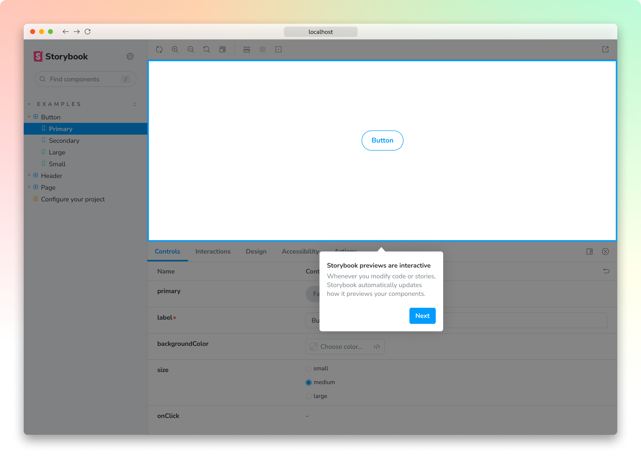
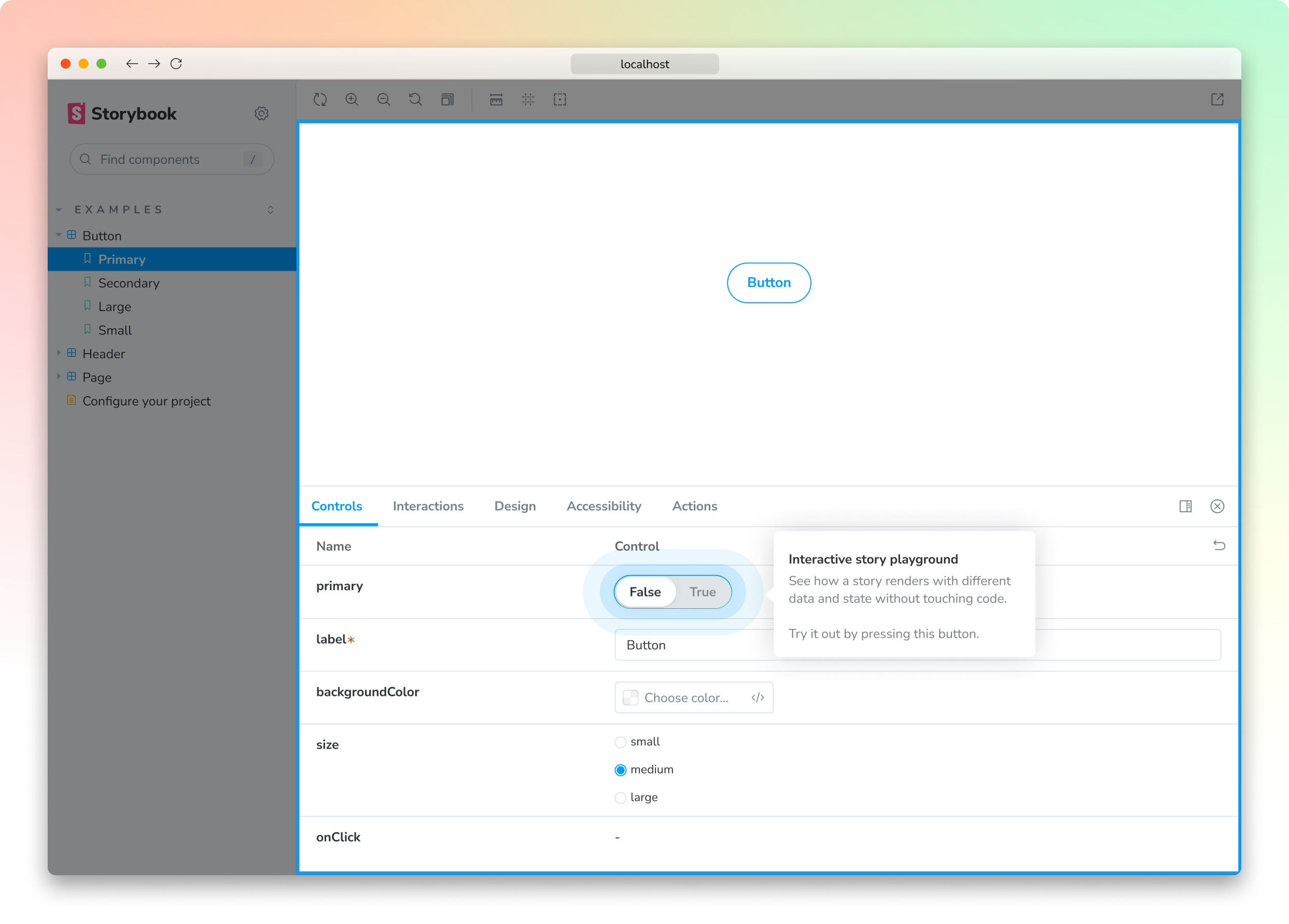
Preview canvas is the isolated iframe where your components render. And controls let you interactively change props and data given to a component to see how it responds, without touching the underlying component code.
How to write a story tutorial
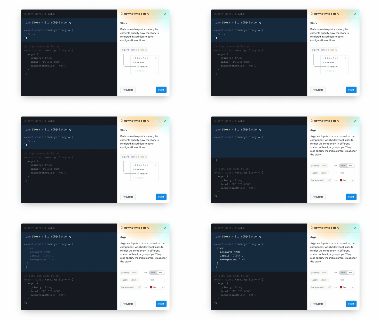
Stories are the key concept of Storybook. Each story represents a different state of your UI. For example, a Button with multiple props could be rendered in several different ways. Storybook's superpower is letting you see all these variations in one place, without you having to load up your app and manually click around to reproduce a state.
The new onboarding teaches you how to write your first story inside the app. It starts with a tour of the essential metadata that underpins the story format.
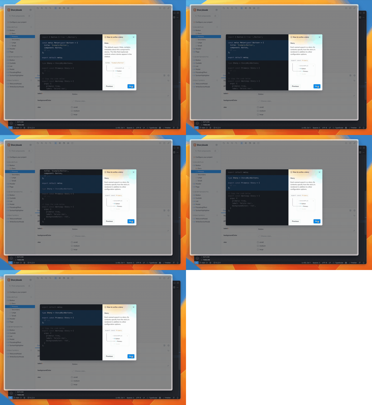
Next you’ll adapt code snippets to generate your own story.
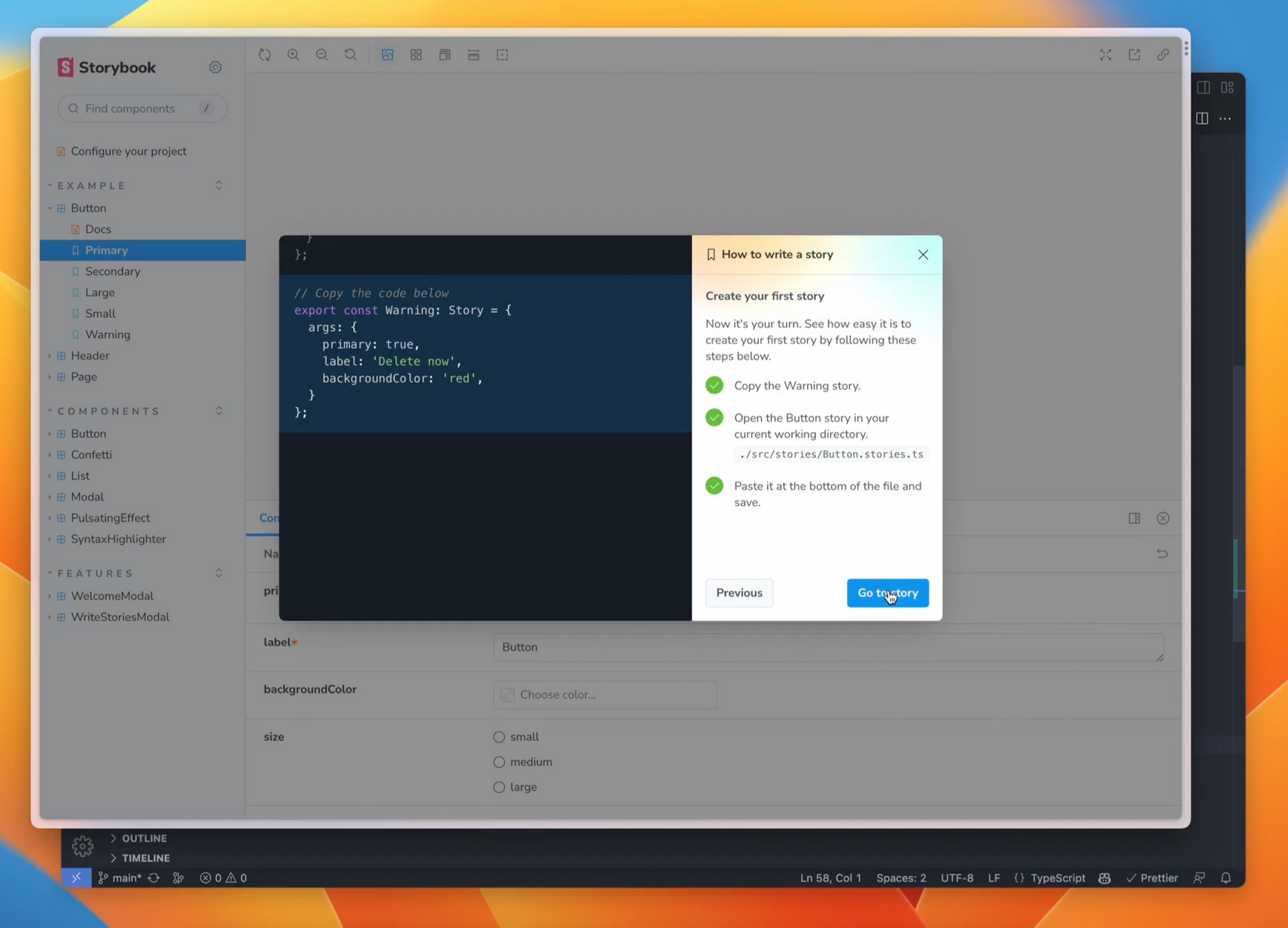
Try it today
Try the new onboarding tutorial now in the latest 7.1 prerelease version. Run this in a new React project without stories:
npx storybook@next initWe’d love to hear what you think, so please share your feedback with us.
Have an issue setting it up? Open up a GitHub Issue or head to the #prerelease support forum in our community Discord.
What's next?
Our goal to help you learn Storybook starting with an in-app tour. Next, we’ll add more tutorial content about Storybook testing and documentation. If you're looking to learn more about these topics, check out our guides and the YouTube channel.
If you're an experienced user and you'd like to help us develop this tour further (or add compatibility for other frameworks), we'd love for you to join our open-source team and contribute. Find out more about getting started or chat with our maintainers in Discord.
Will you support other frameworks?
Yup, we’re incrementally rolling it out to Storybook’s core frameworks Vue, Angular, and Web Components in the future.