
Storybook 7.1
Storybook 7.1 is here! Featuring in-app onboarding, zero-config styling support, TypeScript code snippets, and more.

Storybook is the industry standard workshop for UI component development, documentation, and testing. It’s used by teams at Twitter, GitHub, the BBC, and the New York Times.
After launching Storybook 7.0 back in April, we plan to ship future releases that are both more frequent and smaller in size. That will help Storybook keep in sync with changes across the frontend ecosystem while smoothing the upgrade process for our users.
Today, we’re thrilled to bring you the first of these releases: Storybook 7.1, chock full of improvements.
- 🏄♀️ In-app onboarding to help you learn Storybook
- 💅 Zero-config styling support for Tailwind, Material UI,
styled-componentsand Emotion - 🗃️ API reference documentation
- ✅ TypeScript-first code snippets
- 📗 Vue 3 source snippets and reactivity improvements
- 📇 Table of Contents for docs
- 🎨 Figma Design addon official support
- 💯 Hundreds more fixes and improvements
Let’s dive into the details and share more about where Storybook is headed.
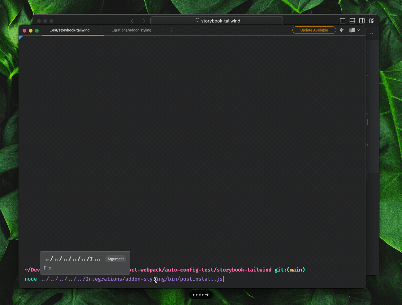
In-app onboarding
Storybook supports React, Vue, Angular, Web components, Svelte, Webpack and Vite and an ecosystem of over 400 integrations. That makes it by far the most powerful component workshop in existence.
However, that power comes at a cost: Storybook isn’t always the easiest to set up in new projects.
In Storybook 7.1, we’re smoothing this learning curve by introducing an onboarding flow for new users. It orients you within Storybook, guides you through writing your first story, and points you towards documentation on how you can customize your project!
To start, the onboarding flow will be available in all new React projects. We’ll expand it to cover all major frameworks in future releases.
Read more about Storybook’s new in-app onboarding:
 Joe Vaughan
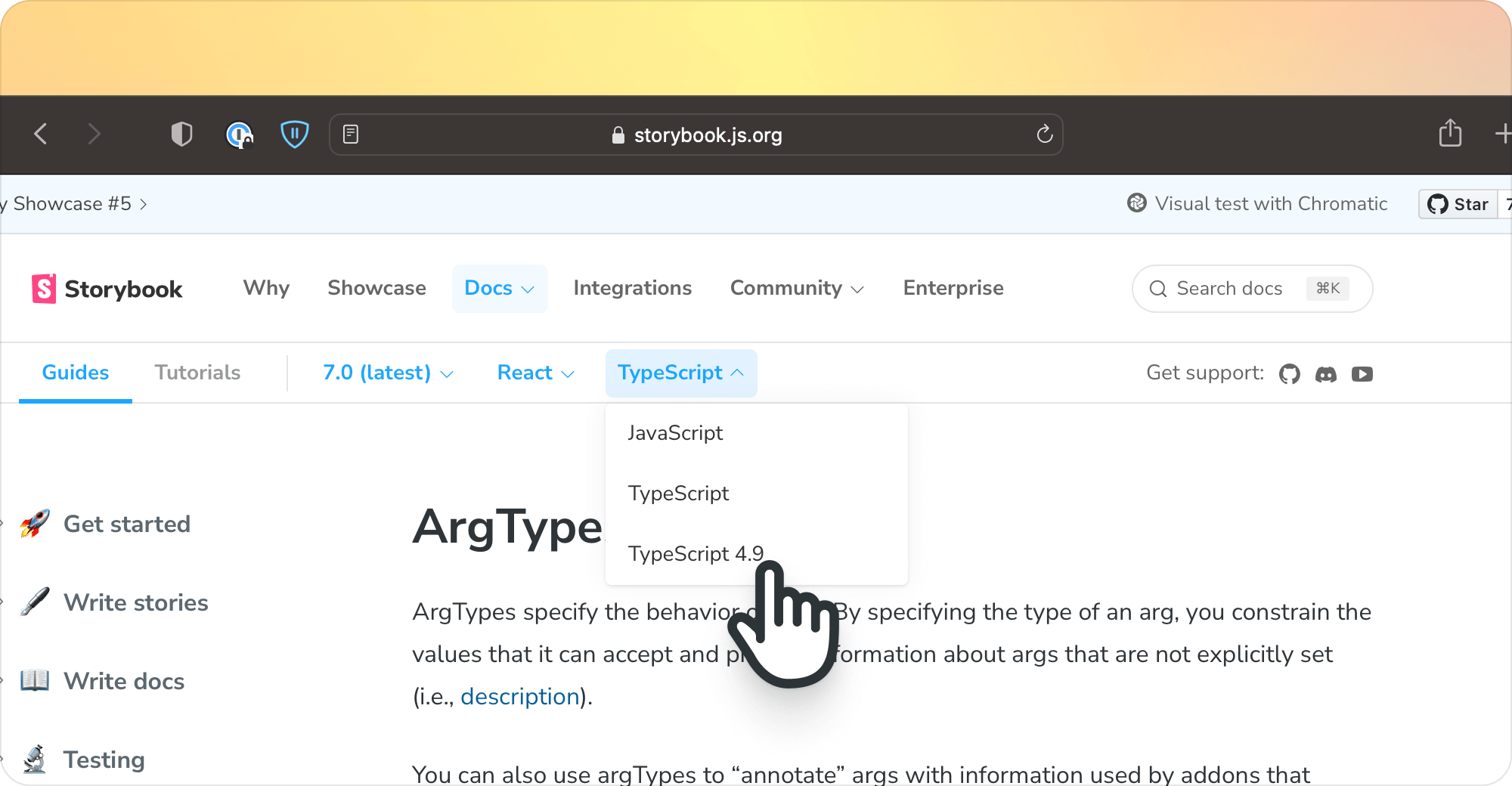
Zero-config styling support
Storybook 7.1 brings extra firepower to Storybook's Styling addon, which can now automatically configure Storybook for Tailwind, Material UI, Emotion and styled-components!
We’ll be adding additional libraries to this list in future releases.
Read more about zero-config styling support in Storybook 7.1:
Shaun Evening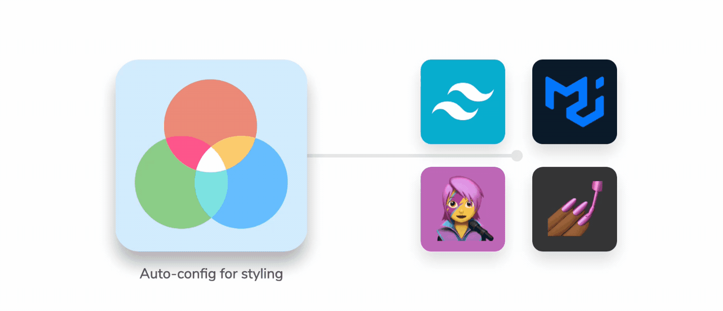
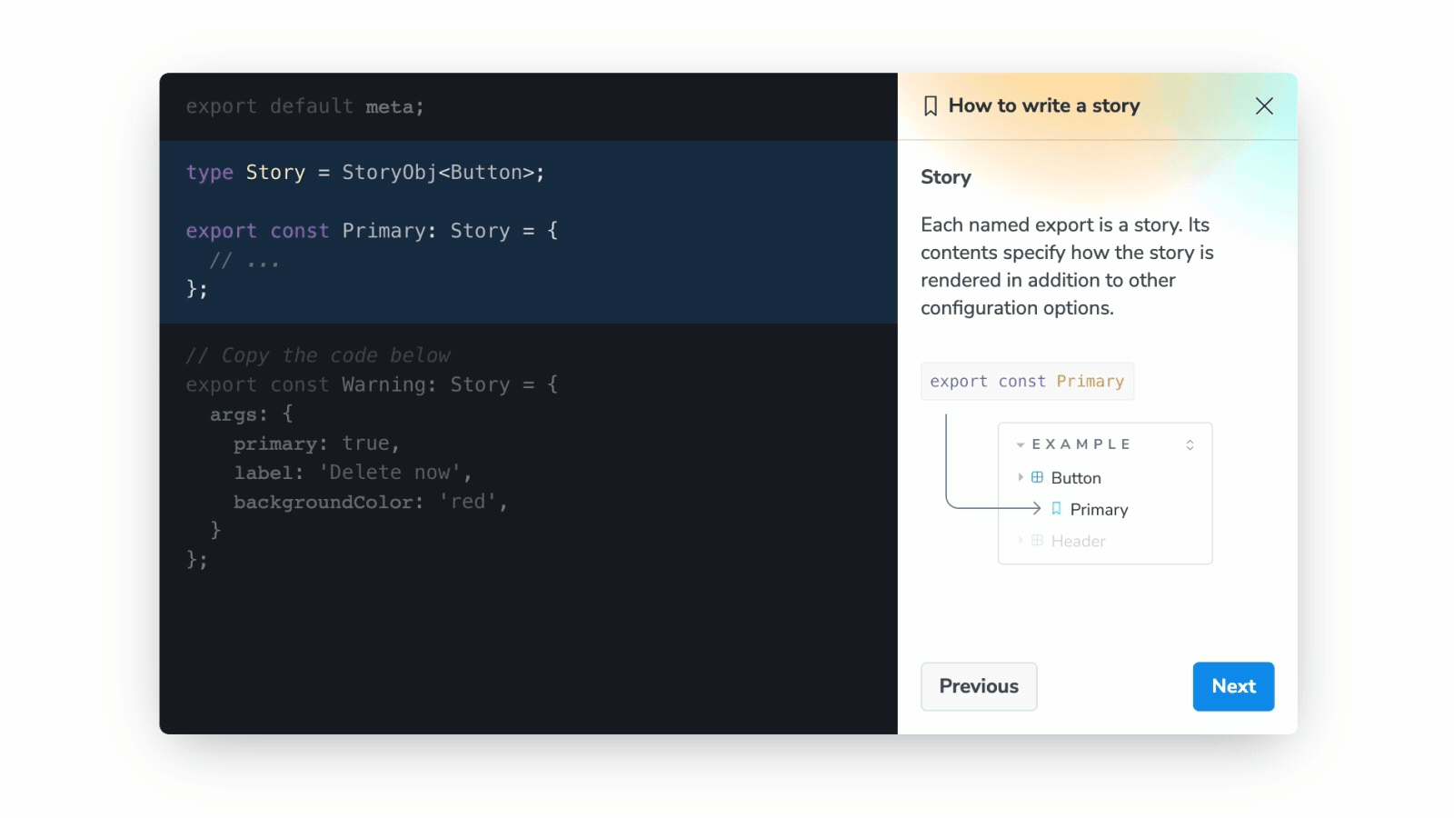
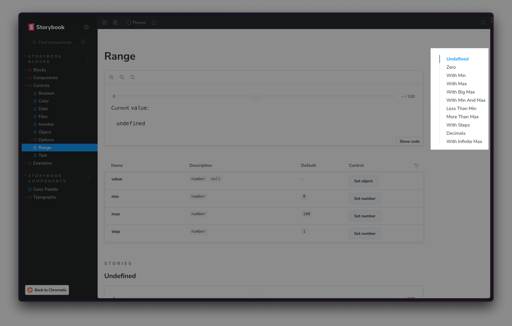
API reference documentation
When we shared a survey with Storybook users earlier this year, the improvement most commonly requested was for proper API documentation. You asked, and we’ve delivered!
Within Storybook’s documentation, we’ve introduced API references for configuration files, ArgTypes, and Doc blocks in Storybook Docs. We’ve also made Storybook's documentation TypeScript-first, as TS accounts for over 80% of all Storybook projects.
Read more about Storybook 7.1's documentation improvements:
Kyle Gach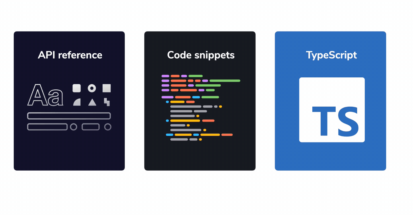
Vue 3 source snippets and reactivity
Vue is Storybook’s second most popular renderer, reaching nearly 500k npm downloads per week. Despite Vue’s popularity, support lagged behind other popular frameworks because there are fewer maintainers.
In 7.1, we have two new Vue maintainers, Chakir Qatab and Kasper Peulen, who’ve dramatically improved the Vue experience. Thanks to them, Storybook 7.1 includes key bugfixes to Vue 3 source snippets and reactive rendering when you update the controls.
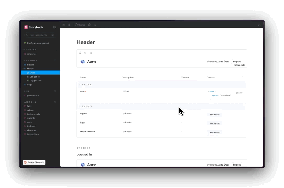
Table of Contents for UI docs
With Storybook 7.0 Docs, we made a sweeping overhaul of our UI documentation feature. It contained huge improvements for most users — dramatically cleaning up the information architecture, MDX handling, and Doc Blocks, among other things.
However, 7.0’s Docs contained particularly disruptive change for heavy Docs users. Rather than showing Docs in a tab, Storybook 7.0 shows them as sidebar menu items. Because there’s no longer a Docs tab, clicking on a story in the sidebar goes directly to the story. That means it’s no longer possible to scroll around within a large Docs page by clicking in the sidebar.
To address this issue, we’ve added an optional Table of Contents that floats on the right hand side of the page. When used in conjunction with the --docs CLI flag that hides stories from the sidebar, you can achieve a documentation-oriented UX similar to the 'classic' docs from Storybook 6.0.
To enable this globally, you can set the docs.toc parameter in your .storybook/preview.js file:
export default {
  parameters: {
    docs: { toc: { /* options */ } }
  }
};
For a full list of options, refer to our documentation.
Figma design addon official support
As part of 7.1, we’ve upgraded the popular Designs addon with Storybook 7.0 compatibility. We’ve also brought it into Storybook’s core for tighter integration. If you currently use storybook-addon-designs, please upgrade to @storybook/addon-designs to get the latest hotness.
Massive shout out to Shota Fuji, who created the addon and continues to help maintain it!
Figma partnership
Storybook integrates with a wide variety of design tools. Among them, Figma is the most popular in our community. That's why we’re excited to be Figma’s official partner for Dev Mode, a new workflow for streamlining developer handoff.
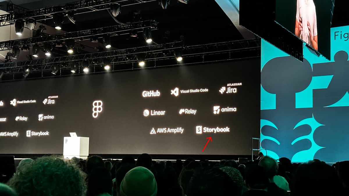
Find out more about bringing Storybook into Figma, and Figma into Storybook:
Dominic Nguyen
Hundreds more improvements
Every release of Storybook contains hundreds of smaller improvements up and down the stack.
Storybook 7.1 contains a number of notable performance improvements:
- Esbuild no longer runs on
node_modules, saving seconds of dev startup time. #23018 - You can now replace Babel with SWC for faster dev and production builds. #22075
- You can now minify with SWC instead of terser for faster production builds. #22843
- We lazy-load
react-docgen-typescriptto speed up React TS dev startup. #23019
We’ve also converted most Storybook packages to strict-mode TypeScript to help catch bugs and improve maintainability. This effort was led by Kasper Peulen with community contributions from Jen Chan, Martin Kuriacka, Efren Aragon, Taehyeon Kim, Fredrick Ugonna, Kyle Tsang, KT, María Simó, and EDuToit.
For more information on the full set of changes, please see the 7.1 prerelease changelogs.
The path to 8.0
Storybook 7.1 is our first stop en route to 8.0. We’ll be improving boot speed, install size/footprint, and stability.
One of the key breaking changes in 8.0 will be to remove the legacy storiesOf API, which was how to write stories from from 2017-2019. If you’re a storiesOf user, please review our RFC to understand what this means for you.
Upgrade to Storybook 7.1
To upgrade your Storybook to 7.1, run:
npx storybook@latest upgrade
For guidance on upgrading from a version of Storybook that's earlier than Storybook 7, check out the Storybook 7 migration guide.
Alternatively, for a fresh install, bootstrap Storybook into an existing app with:
npx storybook@latest init
Get involved
Professional UI developers rely on Storybook every day. When you adopt Storybook, you get a suite of tools, powerful addons, and out-of-the-box integrations that make development faster.
The project is maintained by 2023+ open source contributors and guided by a steering committee. If you are interested in contributing, check out Storybook on GitHub, create an issue, or submit a pull request. Donate on Open Collective. Chat with us in Discord . Stay up to date with Storybook news on Twitter and LinkedIn or sign up to our mailing list.
Credits
Massive thanks to everyone who contributed to Storybook 7.1!
Core team
@cdedreuille @chakas3 @dannyhw @domyen @ianvs @jreinhold @joe-vaughan @jonniebigodes @integrayshaun @kasperpeulen @kylegach @MichaelArestad @ndelangen @shilman (me!) @tmeasday @valentinpalkovic @vanessayuenn @yannbf @winkerVSbecks
Community contributors
@0916dhkim @1234tgk @adityakrmodak @amerlander @andarist @auctumnus @bashmish @benmccann @coliff @darleendenno @daves28 @dschungelabenteuer @dubbs @dxb-story @edutoit @efrenaragon96 @felixrizzolli @fezvrasta @filiptammergard @g-cappai @gitstart @gufah @hcvdhaar @hobbes7878 @honzahruby @idesigncode @jackw @jared-christensen @joaonunomota @joeycozza @joriswitteman @joshbolduc @jpzwarte @junghoe @kolife01 @kubijo @kuriacka @kyletsang @literalpie @liwn9527 @luk-z @manbearwiz @mandarini @mariasimo @mariocadenas @martinnabhan @mdornseif @medihack @michens @miily8310s @mvarendorff @notwoods @noviceguru @orangecms @pascalfiv @pruthvip15 @redbugz @roel-t @sheriffmoose @showrin @sitogi @sjwilczynski @smeagol74 @sookmax @specialdoom @syabro @taehyeon-envoi @thtliife @ubugnu @usrrname @webblocksapp @wise-introvert @ygkn @yilun-sun @youngboy @zachtball