Introducing the Theme Switcher addon
September 2023 Storybook update

Today, we’re thrilled to introduce Storybook’s first dedicated Theme Switcher addon: @storybook/addon-themes!
Read on to learn how the addon works, plus all our latest news from the last month.
Our most on-theme addon yet
One of Storybook’s superpowers is that it lets you document every variation of your UI components and pages within a single interface, so you can test how your UI displays and performs under different conditions, states, and themes.
For testing UI variants across multiple themes, you could create different stories for each themed component. However, that repetition grows unwieldy to maintain in any growing codebase.
Historically, the way to solve this is by creating your own theme switcher within Storybook. We've shared tutorials for doing this in the past.
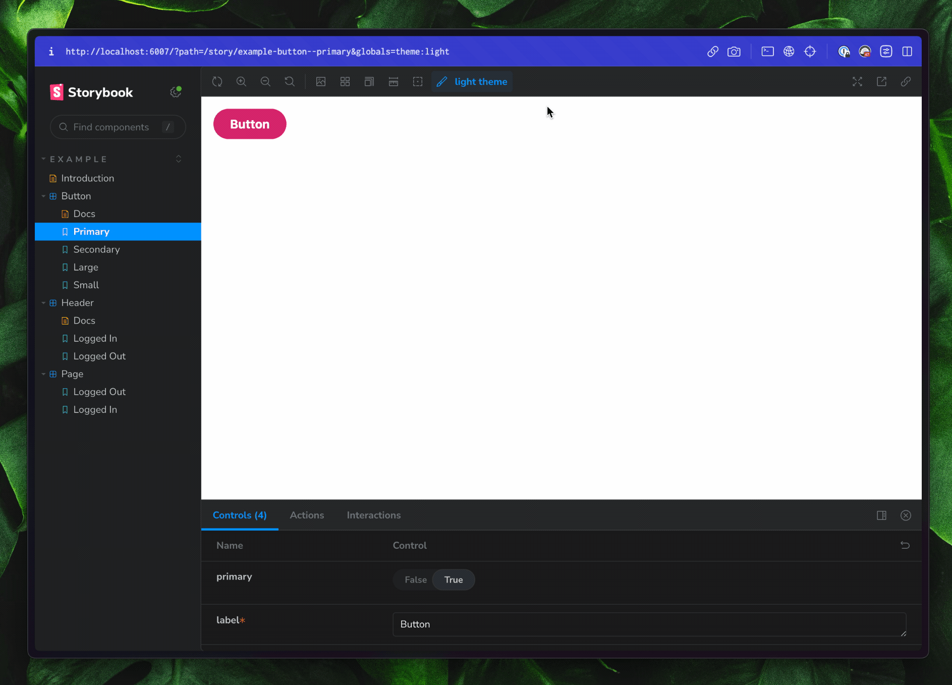
The new Theme Switcher addon (@storybook/addon-themes) takes this one step further, to give you a custom theme switcher straight out the box. The addon lets you switch between different themes inside your stories, without having to write stories for each different themed component.
Today, we’re thrilled to introduce Storybook’s new Theme Switcher addon!
— Storybook (@storybookjs) October 12, 2023
It lets you test multiple variations of your components (think: light mode and dark mode) without having to write more stories.
Read on 👉https://t.co/ybMzGX4UAR pic.twitter.com/WLKraMidlK
Try it now
To get started with the Theme Switcher addon, head to your Storybook project and run npm i -D @storybook/addon-themes.
Then, head to your main.js or main.ts file. If the file contains an addons array, add @storybook/addon-themes into it. If the file doesn't have an addons array, copy and paste the example below.
Then, declare your themes with one of the decorators provided by @storybook/addon-themes. If you’re using a theme provider component, use withThemeFromJSXProvider. If you’re switching themes with a CSS class, use withThemeByClassName. Lastly, if you’d prefer switching themes through data attributes, use withThemeByDataAttribute.
// .storybook/preview.ts
import { withThemeByClassName } from '@storybook/addon-themes';

export default {
  decorators: [
    withThemeByClassName({
      themes: {
        light: 'light-theme',
        dark: 'dark-theme',
      },
      defaultTheme: 'light',
    }),
  ],
};
Wait, wasn’t this part of Storybook’s styling addon? 🧐
Historically, yes!
However, we realized that the styling addon ended up doing way too much. Alongside letting you switch story themes, the styling addon configured styling in Webpack projects and contained autoconfig scripts. Very few projects required all of those functions.
So, we recently @storybook/addon-styling into three new lightweight packages, which can be installed per your project’s specific needs. These new packages are:
@storybook/addon-themes(as already mentioned!)@storybook/addon-styling-webpack: Use this to configure Storybook for styling tools in your Webpack Storybook.@storybook/auto-config: This is an npx-able script that will read your project and configure@storybook/addon-styling-webpackand/or@storybook/addon-themesfor you. Try it by runningnpx @storybook/auto-config stylingornpx @storybook/auto-config themes!
At the same time, we’ll be deprecating the Styling addon. To learn more, head to the Styling addon migration guide, or contact our maintainers in the Storybook Discord.
Add command in Storybook CLI
As a bonus, you can now also use Storybook CLI's add command to install and register an addon!
For addons that have a post-install script (like @storybook/addon-styling-webpack and @storybook/addon-themes), it runs the autoconfig scripts automatically. Get started by using npx storybook@latest add @storybook/addon-styling-webpack.
Other updates
Visual Test addon – beta soon 👀
We’ve made some great progress on Visual Test addon, which lets you run Chromatic’s automated visual tests inside Storybook. The addon entered private alpha at the start of September. Since then, we’ve completed work on its core visual testing workflow.
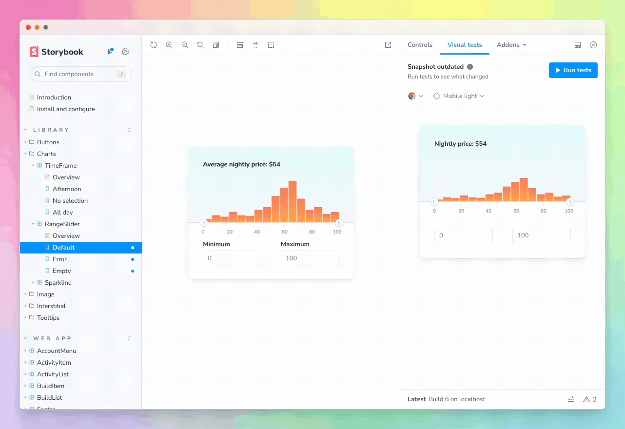
Now, our team of six maintainers are focusing on improving the addon’s onboarding experience. We’re also refining the addon’s performance to ensure it only takes snapshots of stories that have changed.
Visual Tests addon is heading to private beta at the end of this month. If you’re already signed up to our early access list, we look forward to sharing the addon with you soon!
London, Toronto, and Paris meetups
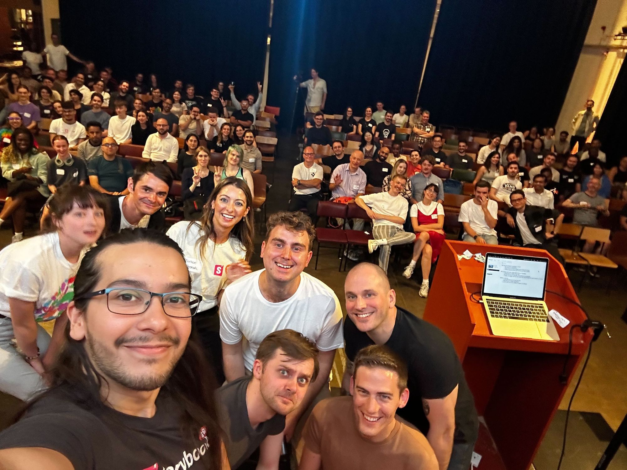
A major highlight from September was that we held our first-ever Storybook meetup in the UK! Over 100 devs were joined by speakers from Figma, Storybook, and Immediate Media to explore the theme of dev-design handoffs. It was a fantastic night and brilliant to meet so many members of our community!
Next up: we have two events coming in October and November!
🇨🇦 Toronto, October 24th: Join us for an evening social with speakers from Rangle, Wealthsimple, and Chromatic, exploring the topic of UI testing. RSVP 👉
🇫🇷 Paris, November 7th: Our first France meetup! Cohosted with the Design System team at Back Market, the night will explore the theme of design system tooling and automation. There'll be presentations by leading design system engineers and Storybook maintainers. RSVP 👉
Storybook 7.4 and 7.5 alpha
Within the last month, we shipped Storybook 7.4 and entered the alpha for Storybook 7.5. Both are packed full of fixes and improvements made by our maintainers and our community. Thank you to all our contributors for helping make Storybook the best it can be!
Check out all the PRs that went into SB 7.4 and 7.5 👉
 storybookjs
If you're interested in contributing to Storybook, there's no better time to start than now! We regularly go through GitHub Issues and identify ‘good first issues’ for first-time contributors. Check them out!
New learning resources
Finally, here are the new learning resources that we shared last month!
Three ways to quickly set up Storybook
How to theme your Storybook
Component Testing IRL
That's all for this month! Thanks for reading, and we'll look forward to bringing you the next update in October. Until then: for all updates from the community, follow us on social media!