
New component finder and sidebar
Navigate component libraries fast

The more components you have the harder it is to find what you need.
Storybook is the industry standard for organizing component libraries. But with teams moving toward component driven UIs, everything from components to full pages are now built in Storybook.
It’s unwieldy to manage hundreds of components and thousands of stories. The new component finder and sidebar in 6.1 is purpose built to help developers navigate large component libraries.
- 🔍 Find components fast with fuzzy search
- 🔄 Jump between recently opened components
- 🔭 Expand and collapse all nodes
- ⚡️ Snappier UI with keyboard navigation
Why now?
Storybook was originally designed for small component libraries. When it launched in 2016 React, Vue, and Angular were new. Best practices on building and managing components didn’t exist yet.
Over the years, Storybook evolved. It became the most popular tool for design systems. Used by folks like Adobe, Shopify, and GitHub.
Today, teams use Storybook to build entire UIs in isolation: starting with components and ending with pages. Global brands like BBC and The Guardian maintain thousands of stories. Storybook’s developer experience needs to scale along with them.
Find components faster
6.1 introduces a re-engineered search experience. Large component libraries are tough to navigate because you lose track of where components are.
The finder helps you locate components by indexing their name and path.
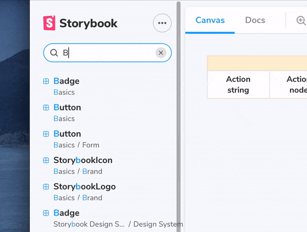
Results appear as you type. When a result matches your query, Storybook highlights the string that it matches on. If there are typos, “fuzzy matching” still shows you the right results.
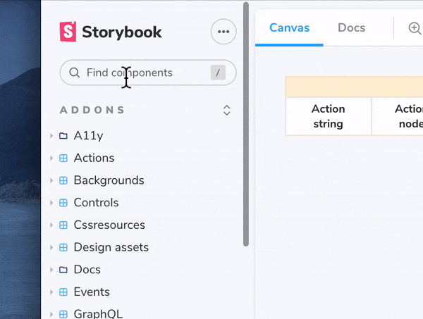
View recently opened components
Jump between components you’re working on with the “recently opened” view. Storybook keeps a history of the components you open and displays them for quick access when you open finder.
Developers often look at a component and its dependents to check for bugs. For example, when developing a CreditCardForm you’ll also want to check its integration on the BillingPage. These components are now a click away.
Expand and collapse the component tree
Expand all nested folders in a given “root” (the top level of component organization). Advanced teams use folders to organize Storybook. But in large libraries it’s tedious to open folders one-by-one to view their contents. Now you can open all folders recursively in one click.
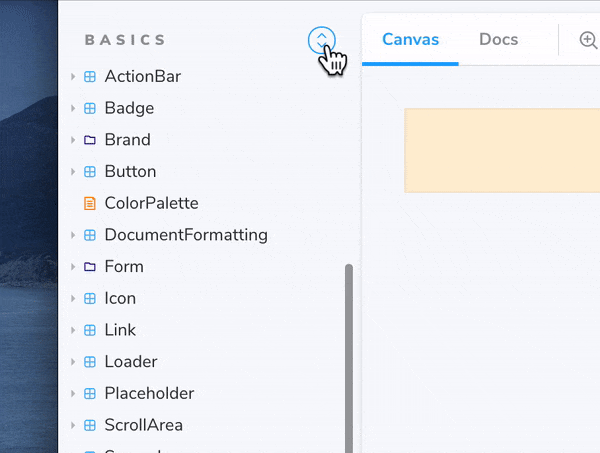
This is particularly useful when there are many subfolders. For example, it used to take 4 clicks to reach the end of this path: /screens/../../AboutScreen. It now takes two clicks.
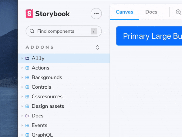
In addition, keyboard navigation helps you browse components without leaving your hand position.
Try it now
Try the new finder and sidebar by upgrading to Storybook 6.1.
npx sb upgradeGet involved
Professional UI developers rely on Storybook every day. Our goal is to streamline common flows so that you can build more with less work.
The new sidebar was developed by Gert Hengeveld and Norbert de Langen. Design by Dominic Nguyen (me!). Thanks to Yann Braga for QA.
Storybook is maintained by 1,176+ open source contributors and guided by a steering committee of top maintainers. If you are interested in contributing, check out Storybook on GitHub, create an issue, or submit a pull request. Donate on Open Collective. Chat with us in Discord — a maintainer is usually online.
Stay up to date with Storybook news on Twitter and by signing up for our mailing list.