Addon Catalog sneak peek
Automate and extend Storybook

Addons are a big part of Storybook’s popularity. The community has over 200 addons that extend your UI development workflow. But using addons is tricky.
It’s tough to figure out how to create an addon, much less share it with others. Most addons are made by ambitious developers or professional teams like Ticketmaster, Rakuten, and eBay.
That's why I’m thrilled to give you a sneak peak of Storybook’s new Addon Catalog app and in-depth guide. We're making it easier to create, find, and reuse addons.

What are addons?
Before we begin, let’s recap why addons exist in the first place. Addons give you superpowers to customize Storybook to fit your workflow. Think VSCode extensions or Figma plugins.
The addon construct provides a clean separation between Storybook’s core APIs and the developer experience. This yields a stable yet extensible architecture for the community to build on. For example:
- Storybook features like Actions, Controls, and Docs are implemented as addons.
- Companies like Ebay, Ticketmaster, and Intuit solve domain-specific workflows with addons.
- Open source projects like Next, CRA, and Nuxt simplify integration with addons.
- Cloud tools like InVision and Abstract streamline the product development cycle with addons.
- Solo developers like Alex Holachek and Shota Fuji scratch their own itches with addons
The new addon ecosystem makes it easier for you to reuse community addons.
“There’s an addon for that”
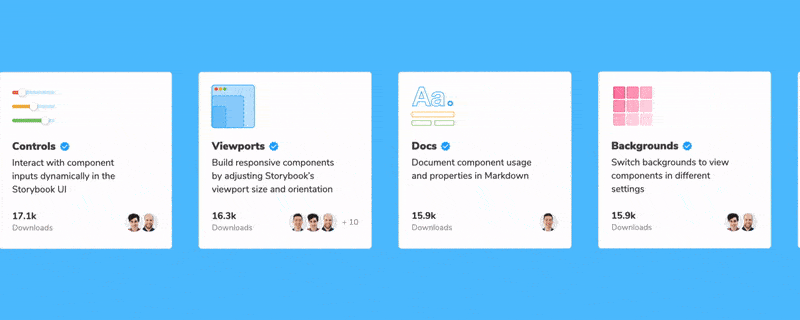
The Addon Catalog showcases every addon in one place. It scans npm, organizes addons by keyword, then ranks according to maintenance heuristics and downloads.
Choose from the most popular or trending addons. Browse by category to see a list of the top addons for specific tasks.
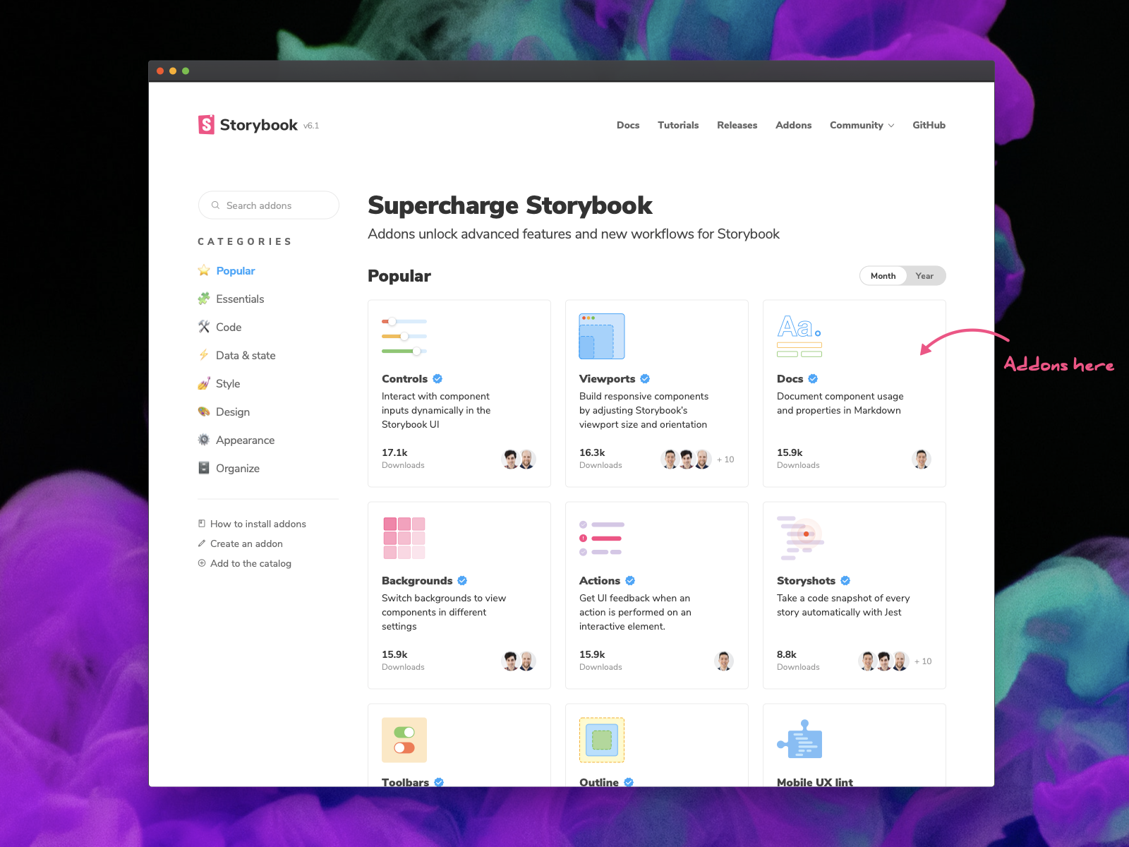
Click on an addon to see install instructions and readme.
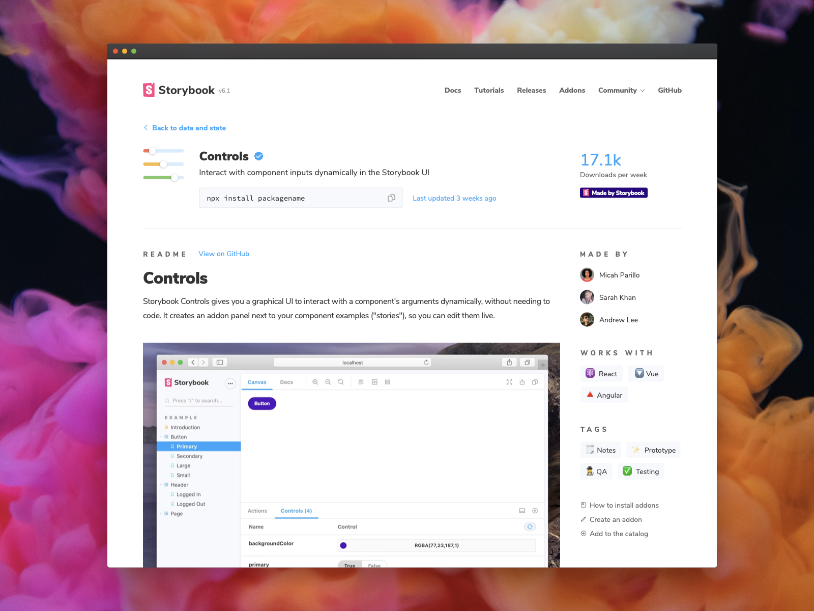
With the Addon Catalog you're able to discern trustworthiness and compatibility in a glance.
How to build an addon
We interviewed developers from Atlassian, Datadog, and Intuit to learn how to make building addons easier. The new API documentation outlines the major addons types along with working code samples.
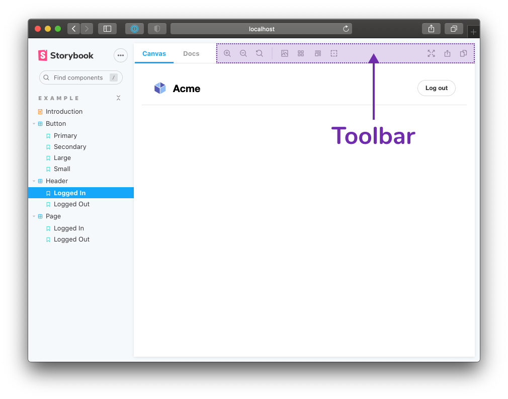
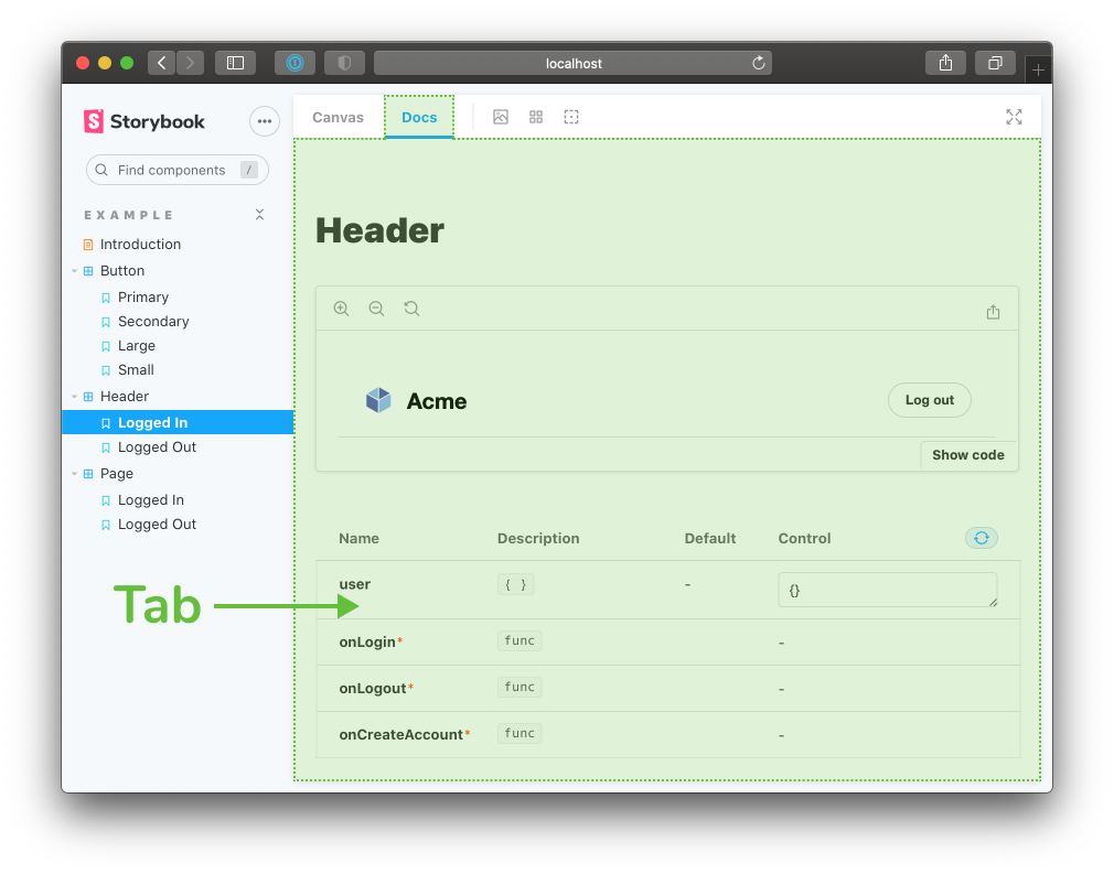
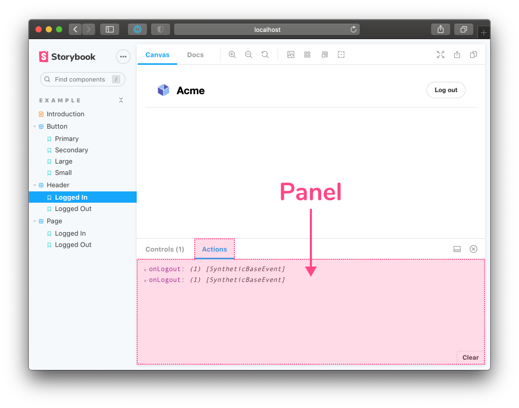
UI-based addons
UI-based addons customize the interface, add shortcuts for repetitive tasks, or display additional information. They impact three areas of the UI: Toolbar, Tab, and Panel.
Preset addons
Preset addons combine a collection of Storybook configurations that get applied automatically. They’re used to integrate Storybook with a specific technology like create-react-app, Next, or SCSS.

@storybook/components
Storybook also ships with @storybook/components, a readymade component library that we use to build the UI. It’s a handy shortcut for styling your addon in a “native” way. The new documentation walks through how to import these components in your project.
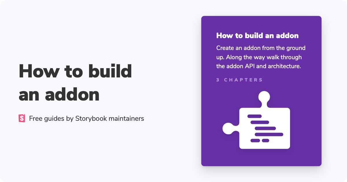
Addon tutorial
In addition, we’re launching a tutorial series “How to build a Storybook addon”. It's a step-by-step guide that takes you from concept to code to publishing on npm. Read the first chapter here.
Join the beta
Addons are a powerful way to extend Storybook. We’re overhauling the addon ecosystem because the entire community benefits when there's an abundance of timesaving addons.
Join the beta by signing up to our mailing list below. You’ll get first access to the Addon Catalog and Storybook news. We’re thrilled to work with you to build robust integrations.
Do you have an existing addon? We’re showcasing useful community addons for launch. Direct message me (@domyen) in Storybook’s Discord.