
How to make Storybook 2-4x faster
Optimize build performance for Storybook 7.6

Storybook 7.6 contains massive performance improvements. Most will become the default in our next major release (Storybook 8.0), but you can adopt them today by opting in manually. Here’s how to get started!
⛳️ --test flag for 2-4x faster test builds
🩺 2.2x faster React docgen
🧳 Streamline essential addons
🌐 SWC for 50% faster Webpack projects
🔬 @storybook/test for more streamlined and performant testing
2-4x faster builds with the --test flag
If you’re building Storybook just for testing purposes, you can improve build speeds considerably by skipping processes like docgen analysis and docs compilation.
To help you do this, we’ve introduced a new --test flag for Storybook build. It lets you create a stripped-down build that completes 2-4x faster than normal. This can be used with the Storybook Test Runner or Chromatic and will be the default for Chromatic Visual Test Addon.
Try your first test build by running:
npx storybook build --test
FAQ: Can I combine the --test and --coverage flags?
The --test flag is designed to be as fast as possible, so it removes addons that are known to slow down build times and are unnecessary for functional tests.
One such addon is @storybook/addon-coverage, which is used in conjunction with the Storybook Test Runner to collect coverage information for your stories.
If you’re using addon-coverage and running Storybook Test Runner against your built Storybook, the --test flag will strip out the coverage information. To configure the --test build to keep coverage information (at the expense of a slightly slower build), update .storbyook/main.js:
// main.ts|js

export default {
  // ...
  build: {
    test: {
      disabledAddons: [
        '@storybook/addon-docs',
        '@storybook/addon-essentials/docs',
      ],
    },
  },
}
2.2x faster React docgen
Generating documentation via TypeScript is extraordinary. It shows how to use your component without you needing to write any docs manually:
Storybook 7 analyzes React components using a tool called react-docgen-typescript. It accurately parses out all your props based on outputs from the TypeScript compiler.
However, there’s a catch: TypeScript is slow. Many modern tools like esbuild and Speedy Web Compiler (SWC) are fast precisely because they removed their TS dependency. In our tests, disabling TS-based docgen alone improved Storybook build speeds by 25% to 50%!
In Storybook 8, we will default to react-docgen instead. It’s based on simple AST processing and doesn’t use any TS, so it’s significantly faster. There are certain patterns that it doesn’t handle as well, but the speed is worth it in most cases.
Try this now in your Storybook 7.6 React project by using the following config:
// .storybook/main.ts
import type { StorybookConfig } from '@storybook/your-framework';

const config: StorybookConfig = {
  framework: '@storybook/your-framework',
  stories: ['../src/**/*.mdx', '../src/**/*.stories.@(js|jsx|mjs|ts|tsx)'],
  typescript: {
    reactDocgen: 'react-docgen', // or false if you don't need docgen at all
  },
};

export default config;
Streamline addon-essentials
Storybook’s addon-docs package lets you autogenerate docs or write them manually using MDX. These doc pages can include many components that all need bundling, which increases the bundle size and Storybook’s build times.
If you’re not using addon-docs, you can remove it from addon-essentials by using the configuration below. In our tests, this change alone improved Storybook’s build time by 25%.
// .storybook/main.ts
import type { StorybookConfig } from '@storybook/your-framework';

const config: StorybookConfig = {
  stories: [
    // make sure you don't have MDX entries
  ],
  addons: [
    // Before
	  //   '@storybook/addon-essentials',
		// After
		{
	   	name: '@storybook/addon-essentials',
		  options: { docs: false },
		},
	],
};

export default config;
Using Webpack? Enable SWC
In Storybook 7.6, you can cut the start times of Webpack projects by 50% or more by switching from Babel to SWC.
Storybook 7.6 sets SWC as default for all new Storybook Webpack projects (aside from Angular). It also fixes SWC support for Preact and React fast-refresh.
If using a Webpack-based framework, update your builder configuration in .storybook/main.ts:
// .storybook/main.ts
import type { StorybookConfig } from '@storybook/your-framework';

const config: StorybookConfig = {
  framework: {
    name: '@storybook/your-framework', // react-webpack5|next|vue-webpack5|etc
    options: { builder: { useSWC: true } }
  }
};Note: the --test flag won’t enable SWC by default. That’s because extra changes might be needed if you’re using Babel plugins (such as the Emotion plugin).
Two test packages for the price of one
Storybook 7.6 replaces the @storybook/jest and @storybook/testing-library packages with @storybook/test. It’s streamlined, smaller than before, and now based on Vitest rather than Jest. It pre-bundles all dependencies, which increases performance by giving the bundler less to do. In our example Mealdrop project, @storybook-test quickened build times by 10%.
To get started, install the addon with your package manager:
# Install the addon with your package manager

npm install -D @storybook/test@next
pnpm add -D @storybook/test@next
yarn add -D @storybook/test@next
Then, update your stories:
- import { expect } from '@storybook/jest';
- import { within, userEvent } from '@storybook/testing-library';
+ import { within, userEvent, expect } from '@storybook/test';
Storybook 7.6 brings performance improvements that make Storybook 2-4x faster!
— Storybook (@storybookjs) December 21, 2023
Many of these will be the default in Storybook 8.0, but here’s how you can use them now!
⛳️ Fast test builds
📷 SWC for Webpack
⚛️ New React docgen
🧩 Optimized addon confighttps://t.co/uq3EVdcJx0
In other news...
The road to Storybook 8.0 has begun
The first version of our next major release, Storybook 8.0, is now available for you to try in alpha. Upgrade by running npx storybook@next upgrade --prerelease. In the months ahead, we’ll be sharing all the goodness coming in 8.0. Follow us for updates on social media (Twitter/LinkedIn/Threads), GitHub or our newsletter, or check out the release plan:
 storybookjs
Storybook for React Server Components
In the first of our Storybook 8.0 posts, we answered one of our community’s most frequent requests: Storybook support for React Server Components. This experimental solution enables you to test RSCs inside Storybook, by rendering your server components in the client, and using mocks to simulate Node.
 Michael Shilman
Chromatic Visual Test Addon reaches private beta
Over 1,000 devs are already signed up for early access to Chromatic Visual Test Addon, which brings 1-click visual tests to your Storybook. Learn more about the private beta and get it now!
Dominic Nguyen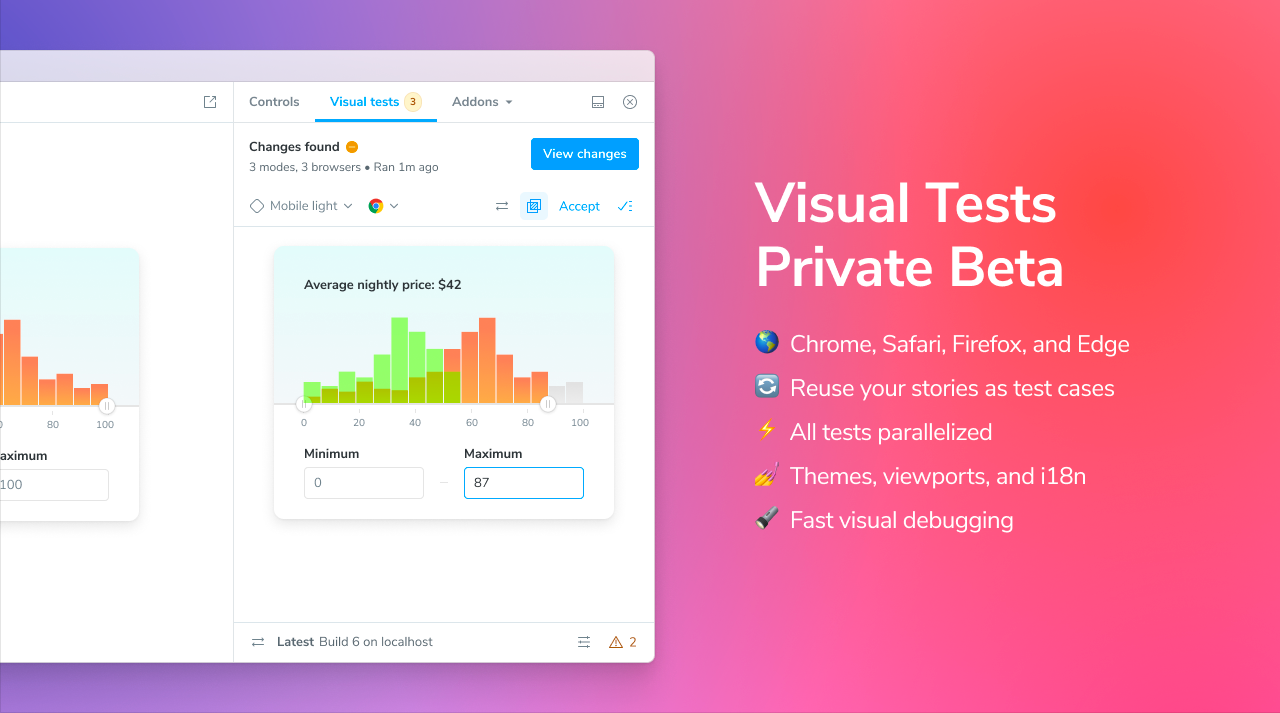
Happy holidays!
Finally, we’d like to wish everyone a very happy holidays. 2023 has been a huge year for Storybook, and 2024 is set to be even stronger. We’ll be sharing a post next week about what’s coming up for Storybook in 2024, so be sure to watch this space.
Thank you for being a part of Storybook’s community this year. We couldn’t do this without you!