
Storybook 4.0 is here!
Major updates to support new build tools and frameworks

Welcome to the latest iteration of Storybook, the world’s favorite UI component workshop.
Storybook improves component development, testing, and documentation for React/React Native/Vue/Angular and more. It’s used by engineering powerhouses like Airbnb, Slack, Squarespace, and Lyft.
Storybook 4.0 (SB4) supports six new view layers and introduces improvements at every level:
- 🖼 View layers: Ember, MarkoJS, Mithril, HTML, Svelte, Riot
- 🛠 Build: Webpack 4, Babel 7
- 📱 Mobile: React Native, Mobile device view
- 🎨 UI: Theming
- ⚙️ Core: Story parameters
Our goal is to help every developer build bulletproof UI components. Regardless of framework or stack. Today we’re one step closer to that goal.
Read on for all the ways that SB4 will supercharge your component development experience.
Storybook supports six new view layers

We’re thrilled to introduce six new view layers to Storybook’s ecosystem of UI component tools and best practices:
- 🔥 Ember by Gabriel J Csapo and Robert Jackson
- 🌈 MarkoJS by Neville Mehta
- ⬛ Mithril by Sangmin Yoon
- 📃 HTML snippets by Filipp Riabchun
- 📦 Svelte by Gavin King
- 🔴 Riot.js by Lionel Ben ychou
Storybook and its addons are view layer agnostic. This means every time someone adds a feature or fixes a bug it benefits every user no matter which framework they choose.
For example, Storybook for Angular dramatically improved Typescript support. React Native improvements will benefit the next-gen web UI. New view layers are great for everyone.
Faster builds with Webpack4 and Babel7

Storybook 4 gets significant performance improvements with upgrades to Webpack 4 and Babel 7 thanks to Filipp Riabchun. Storybook is now compatible with popular frontend tools like create-react-app 2, Gatsby 2, and Next 7.
Webpack 4 and Babel 7 also contain hundreds of other improvements including WebAssembly support in Webpack 4; JS configuration, Typescript, JSX fragments in Babel 7.
If you’re upgrading from an old version, we walk you through step by step with our Storybook 4.0 migration guide.
“Yay the migration is done and everything is working great! Also noticed some crazy perf wins with this, tell everyone I said this is amazing!“ — Josh Callendar, Lyft
First-class support for React Native
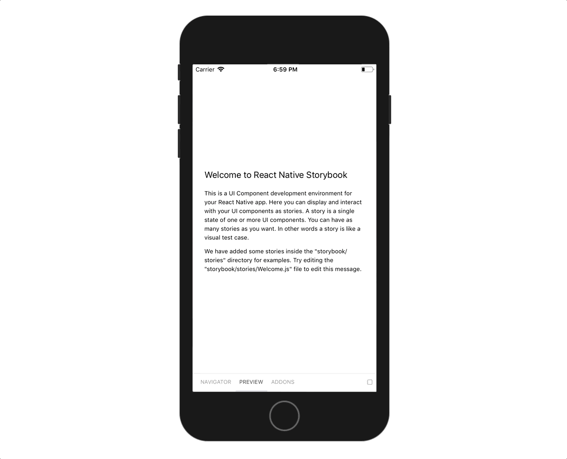
Storybook for React Native also gets a complete overhaul in 4.0.
Now it’s dead simple to distribute Storybook to your team’s mobile devices. It has everything you need to run Storybook as an app without needing to connect to a Storybook server.
New updates to @storybook/react-native improve how it integrates with your app. In addition, Storybook now has on-device UI for popular addons like knobs, notes, and backgrounds.
Gytis Vinclovas led the effort on React Native for Storybook 4.0. He documents the changes in detail in his post.
Theme Storybook to your liking
Developers now have precise control of Storybook’s appearance. Norbert de Langen introduced theming, which allows you to tweak styling to match your brand.
Storybook 4.0 includes a the “dark” theme to show off the possibilities. For theming instructions check out the docs.
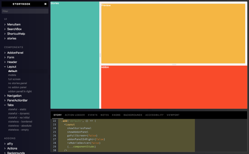
Develop mobile webapps easier

Storybook 4 includes a dedicated mobile view thanks to Denzenin.
When a mobile device user agent is detected, Storybook shows its catalog of stories, the main component preview, and the addons panel in three separate tabs.
Check out a demo by browsing our official Storybook example on your phone, or setting a mobile user agent in your web browser’s dev tools and reloading the page.
Story parameters API
Users and addon authors now have a standard format to configure a story thanks to the new parameters API by Tom Coleman.
For example, instead of using the clumsy withNotes decorator for each story:
storiesOf('My component', module)
  .add('story1', withNotes('some notes')(() => <Component ... />))
  .add('story2', withNotes('other notes')(() => <Component .../>))
You can annotate stories by passing an extra argument when you add a story:
// .storyook/config.js (global decorator, local also supported)
addDecorator(withNotes)

// Component.stories.js
storiesOf('My component', module)
  .add('story1', () => <Component />, { notes: 'some notes' })
  .add('story2', () => <Component />, { notes: 'other notes' })
All official Storybook addons were converted to use story parameters. For more information on how the new API works, please see the docs.
Upgrade to Storybook 4.0
Upgrade to Storybook 4.0 today — it only takes a minute.
If you’re new to Storybook, now’s the best time to get started. Storybook supports the most popular view layers and frontend technologies to help you create durable UI components. Check out the Storybook Tutorial for a step-by-step walkthrough of React/Angular/Vue. Or if you’d rather just jump in:
cd my-project
npx -p @storybook/cli sb init
yarn storybook
Get involved
Have questions or kudos? Say hi on Twitter, Discord, Github, Slack, or in the comments below. Please 👏 applaud this post and share to help more people discover it.
Thanks to the community and sponsors
Storybook continues to be the most popular UI component explorer in the world. We recently passed 30k stars on Github, 4M monthly downloads on NPM, and 500 contributors.
Storybook’s Open Collective is gaining momentum. It receives monthly sponsorship from Facebook, Chromatic, Xebia, Percy, Tipe, and Applitools. Algolia, Airbnb, and José Manual Lucas Muñoz recently gave significant one-time contributions. Many invaluable backers from the community have also stepped up to help the project. The contributions go to hosting, swag for contributors, documentation, and promotion.
–With ❤️ from the Storybook team
Thank you! @a-tokyo @adekbadek @ailrun @alanhogan @andyo729 @astrotim @bastienfp @bmson @br0ken- @brian-mcbride @brycemhammond @camel-floss @choznerol @clehnert-psl @cliedeman @connorholyday @cortopy @danielduan @denzenin @desfero @dimitrijemanic @dioxmio @do7be @domyen @donaldpipowitch @edward1224 @ekhaled @elob @ewolfe @expe-lbenychou @faun @fibo @fran-worley @fvilers @gabrielcsapo @georgewl @glazy @gongreg @grimones @gromchen @hisapy @hypnosphi @ianvs @igor-dv @ikesyo @isoppp @j-kallunki @jalilarfaoui @jamesgorrie @jayphelps @jbaumgardt @jfsiii @jh3y @jhswart @jmiazga @jondot @juhq @keraito @klimentru1986 @kroeder @kumarharsh @langri-sha @libetl @ljharb @lucidpaper @luisdanielroviracontreras @lvarayut @manuel-magnetix @markelog @marob @marshallmick007 @martinmacko47 @meesvandongen @michaelduminy @mizx @mnicole @mrmckeb @mshaaban088 @mvasin @ndelangen @nemodreamer @nm123github @noriste @paradoxxxzero @pascalduez @pelotom @phillduffy @pksunkara @plsr @plumpnation @primigenus @rantelo @rhalff @rwieruch @sanpochew @shilman @silencerweb @sky-franciscogoncalves @skywhale @stephanemw @stijnkoopal @swernerx @swese44 @thekashey @thomasbertet @timothymclane @titonobre @tkh44 @tmeasday @tobilen @tombyrer @tretuna @tsiq-swyx @unional @urikphytech @vertexbz @vidaaudrey @wearymonkey @web-devel @westandy-dcp @wuweiweiwu @yaodingyd @yi-ge @yogu @zgreen