Storybook 7 Docs
New architecture, streamlined UX, and readymade doc blocks

Stories are a powerful way to describe the way your component is used. They can then be used to develop, test, and of course document components.
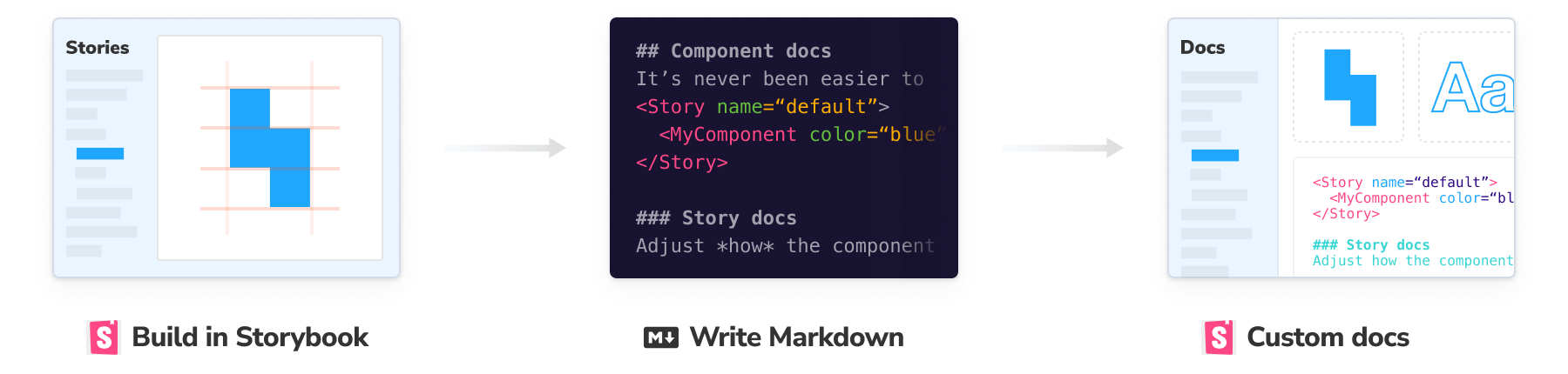
We built Storybook Docs to help teams document their component libraries and design systems. It uses stories and other associated metadata to auto-generate a documentation page (DocsPage) for each component, complete with an API table and live examples.
Storybook 7 revamps Docs from the ground up to offer a sleeker API and improved developer experience.
- 🏛️ New component-centric information architecture
- ⬆️ Upgraded to support MDX2
- 🧱 More powerful and consistent Doc Blocks API
Why revamp Storybook Docs?
Storybook Docs was initially released in 2019. We quickly iterated over several releases to add features including:
- Autodocs: an automatic template including descriptions and stories of a single component.
- MDX support: more control over what’s displayed for a given component using a set of "Doc Blocks".
- Automatic arg type inference: Show a table with the props of your component and even play with the stories inline in your docs.
- Source snippets: Useful and dynamic code snippets showing how to use the component to produce the story currently shown.
Along the way, we learnt a bunch of lessons and got lots of user feedback. Storybook 7.0 gave us a chance to rearchitect the Docs feature and apply those lessons. This also enabled us to set things up for future iterations of Storybook and the ecosystem.
Autodocs are component-centric
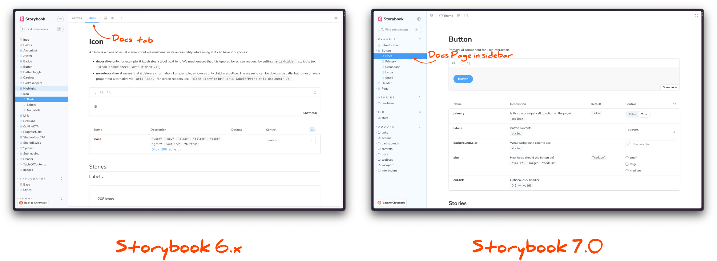
The major change in Storybook 7's docs feature is that you’re documenting components not stories. We now have a single docs entry per component, displayed above the list of stories for that component. This replaces viewing each story in "docs” view mode.
Docs pages are now displayed as first-class entries in the sidebar, bringing them front and center in Storybook and giving you greater control over which components are documented.
Configure automatic documentation via parameters
In the autodocs template we show the name and description of the component, the primary story and a controls block to change its args, and then a static list of all stories for the component with their descriptions:
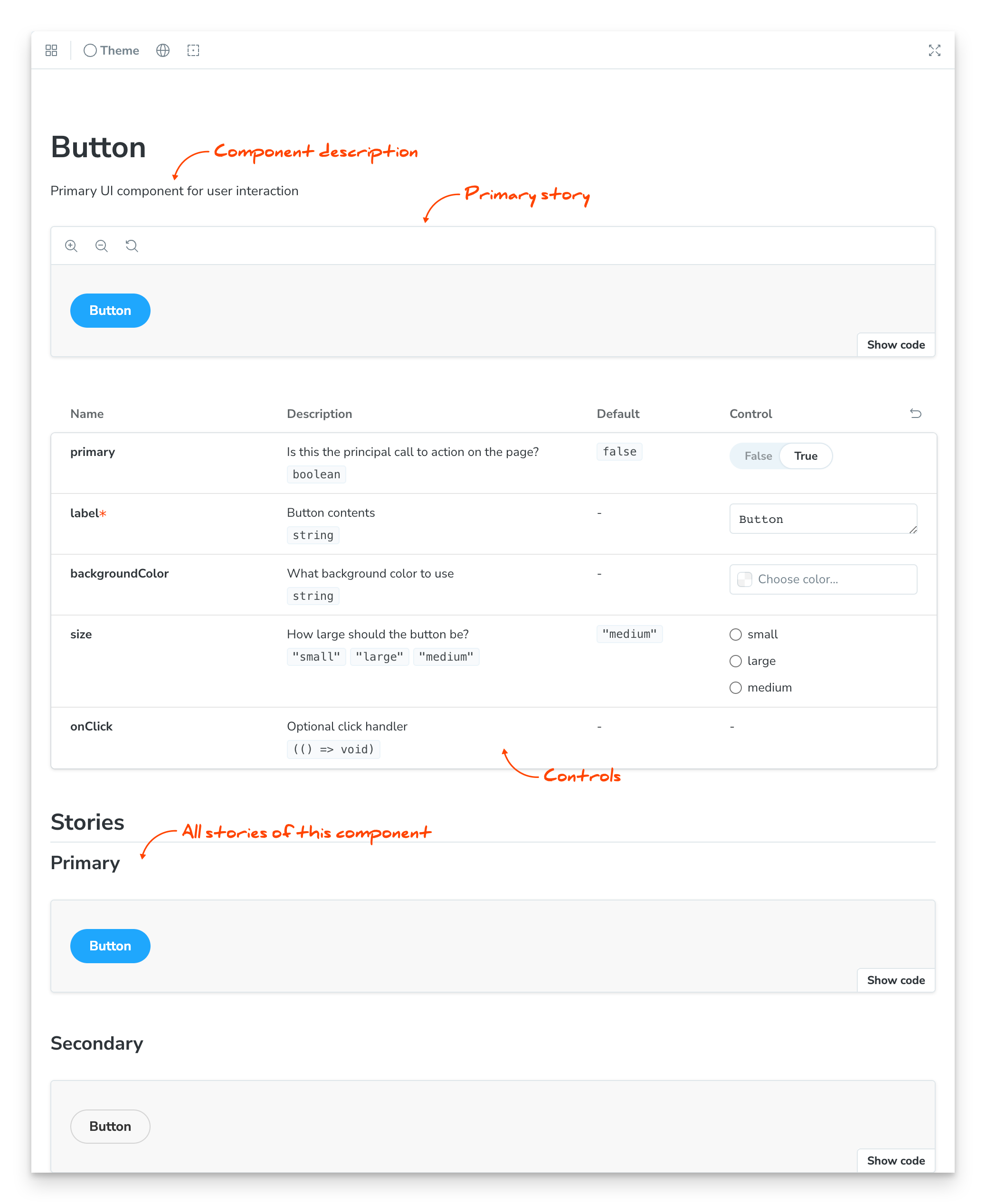
You can control how Autodocs renders each story via parameters. We've reworked the parameters to be more consistent and powerful, and we’ve also improved their documentation.
export const Primary: Story = {
  args: {
    primary: true,
    label: 'Button',
  },
  parameters: {
    docs: {
      story: { inline: true }, // render the story in an iframe
      canvas: { sourceState: 'shown' }, // start with the source open
      source: { type: 'code' }, // forces the raw source code (rather than the rendered JSX).
    },
  },
};
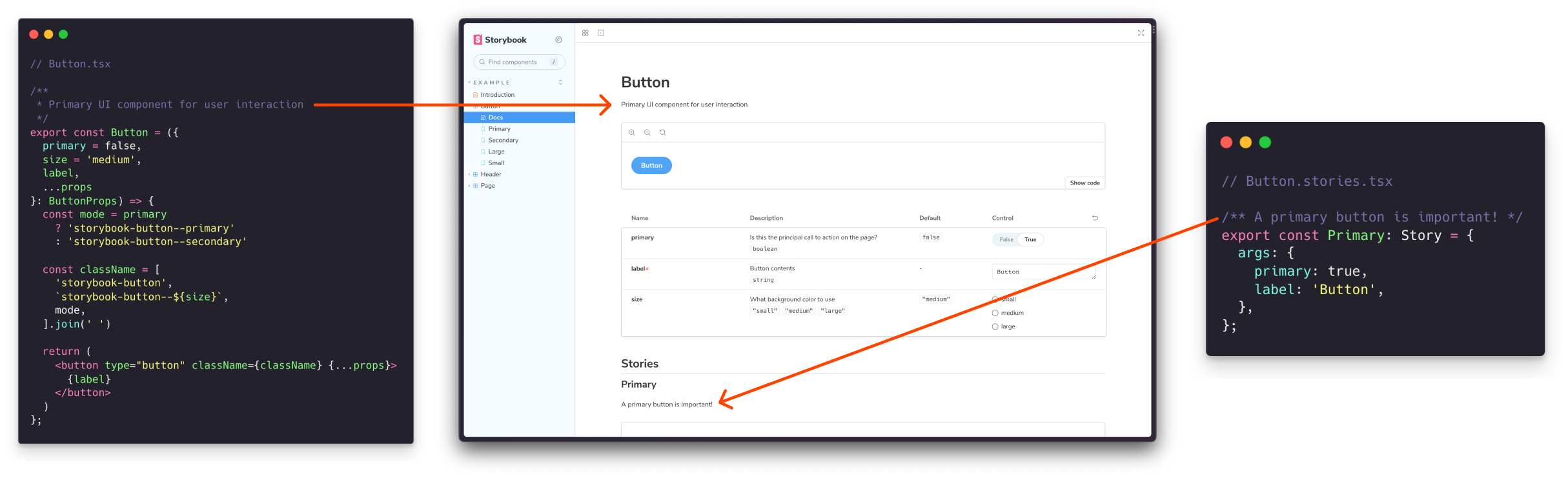
Use JSDoc for component and story descriptions
To control the description of the component and the stories, we’ve leaned into JSDoc as the method of choice — so your docs and your code can stay in sync without any extra effort on your behalf.
Autodocs is now opt-in
Another important change with autodocs is that you have to make the choice of enabling docs page for a component. In Storybook 7, you must add the autodocs tag to your component to generate its autodocs page. This is not enabled by default.
// Button.stories.js|ts

export default {
  component: Button,
  tags: ['autodocs'], // enable automatic documentation page
};
And if you want autodocs applied to all stories, set it in ./storybook/main.js. More options here.
//.storybook/main.js

module.exports = {
  docs: {
    autodocs: true
  }
};
Autodocs keeps the incredible arg type detection that Storybook is known for. Furthermore, the 7.0 architecture establishes the groundwork for a new, more efficient detection architecture that will provide more consistent support for a broader range of frameworks.
Improved manual documentation with MDX 2
You can use MDX to fully customize the documentation page for a component or create standalone (unattached) documentation pages. Storybook 7 includes a simple, consistent API that makes it easier to maintain manual documentation. Additionally, it now supports MDX 2.
MDX 2 is the latest major version of the MDX compiler. This is a notable release and comes with an extensive list of benefits and breaking changes. Storybook will retain opt-in support for MDX 1 for the 7.x timeframe.
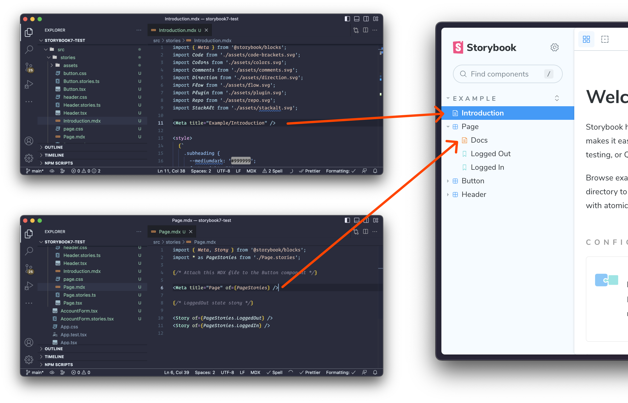
When you write an .mdx file (previously .stories.mdx), a new sidebar entry is created for that file. By default, this is a unattached documentation page. To attach an entry to a component and have it appear above the stories like autodocs, use the <Meta of={}> block.
Doc Blocks API is powerful yet simple
Doc Blocks is our set of components that enable you to render stories and other metadata about your component in an MDX file. A major focus of Storybook 7 Docs was to rethink Doc Blocks in order to make MDX files more maintainable and to enable autocompletion and linting.
The main change you will notice with the Doc Blocks is that stories and components are now referenced by reference, rather than by their Storybook ID (an internal concept).
import * as ButtonStories from './Button.stories';

{/* Attach this MDX file to the Button component */}
<Meta of={ButtonStories} />

{/* Render the Primary story */}
<Story of={ButtonStories.Primary} />
This new API unlocks future features that will allow you to reuse MDX files outside of Storybook (watch this space). We also provide a codemod to help you migrate your existing files to this new format (see below!).
Additionally, we have taken the opportunity to make the API of each block more consistent and streamlined. Specifically, we have aligned the props of each block with the parameters used to control the instance of that block in the autodocs template.
As part of the Storybook 7 release, we shipped overhauled documentation for all Doc Blocks. This should help you write your own MDX doc files if you aren’t already.
We’ve even included a useOf hook to help you write your own custom Doc Block that can use the of={} syntax!
Migration: what you need to know
Storybook 7 is now available! To try it out now for an existing project, run
npx storybook@latest upgrade
A goal of the docs revamp was to keep backwards compatibility for the 7.x series of releases, so you don’t need to migrate of your existing docs code now.
Preparing for MDX 2
With MDX 2, a few syntax changes have been introduced. Check out the Storybook 7 migration guide for tips on migrating your .stories.mdx files to use the MDX 2 syntax before upgrading to Storybook 7.
If you run into problems with MDX 2 and want to revert to using MDX 1, you can add the old compiler back with:
yarn add @storybook/mdx1-csf// .storybook/main.js
export default {
features: {
legacyMdx1: true
}
}
Automigration
However, the future awaits, and if you want to get on the the latest and greatest, first upgrade to Storybook 7, and then you can migrate your existing .stories.mdx files to Storybook 7 native .mdx files with the following migration:
npx storybook@latest migrate mdx-to-csf --glob "**/*.stories.mdx"Note in particular in Storybook 7, defining stories in MDX files is deprecated, and as part of the mdx-to-csf migration we convert any existing MDX files that define stories into an MDX and a CSF file. We heard from a lot of users that they were unsure if they should write stories in MDX files if they were documenting them (they didn’t have to) and what the benefits were (it wasn’t clear there were that many). In order to reduce scope and support future use cases, we decided to deprecate that feature. The migration above will transition such files to a new MDX and separate CSF file.
Future of Storybook Docs
A big part of the docs revamp in Storybook 7 was to break ground for our future direction of Storybook Docs. Aside from general improvements here are a few areas we're considering for future 7.x releases:
Portable Docs: allowing you to reuse the Storybook blocks and even entire MDX files in non-Storybook contexts. Our goal is to allow a fully customized documentation site (using the technology of your choice) that can natively embed stories and other metadata from your CSF and MDX files.
Annotations Server: we are working to extract the arg type inference mechanism of Storybook from its runtime and instead run an on-demand server. This will mean that in development we only generate annotations (for example arg types) for the component being worked on; and in built storybooks all the cost will be paid at build time.
Improved Inference: arg type inference is a lot of work, when you consider all the frameworks Storybook supports. As part of the annotations server work, we want to improve our tooling and test suite around inference to make it easier for contributors to improve annotations for all frameworks. If you are keen for better detection in your framework of choice, watch this space for your chance to help!
Storybook 7 brings a revamped Docs feature with sleeker API and improved developer experience.
— Storybook (@storybookjs) February 23, 2023
🏛️ New component-centric information architecture
⬆️ Upgraded to support MDX2
🧱 More powerful & consistent Doc Blocks APIhttps://t.co/ncJjvnFTcg
🧵/ pic.twitter.com/JAd7n5cCEd