Storybook Docs sneak peek
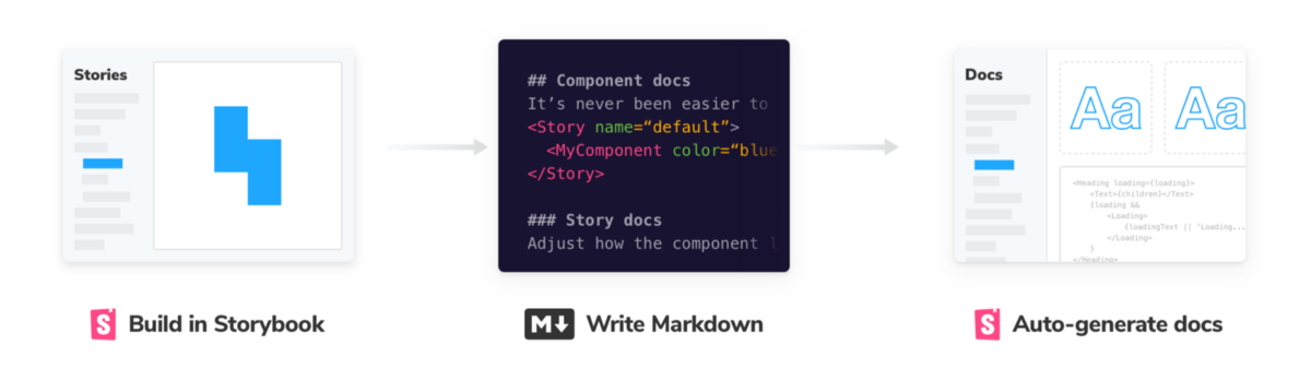
Turning stories into living documentation

Storybook is the world’s favorite UI component workshop. It enables structured UI development and testing for every major view layer including React, Vue, Angular, React Native, and Ember.
Now we’re supercharging Storybook’s documentation features. Stories already capture key states of your components. Storybook Docs makes it easy to automatically turn these stories into world-class documentation.
Wait, but why?
Storybook provides the story construct that captures key component states. With low effort you get basic component documentation, so they are fantastic for nimble teams.
But what if you want in-depth component documentation? Or to create a design system site to scale UI library adoption?
Currently, you’d have to cobble together docs from addons and docgen libraries. Or you’d build a separate docs site using Gatsby, Docz, Styleguidist, etc. That means Storybook users end up spending more time on documentation tooling than actually writing docs.
Storybook makes it dead simple to create design systems
How to scale UI libraries
What if you could press a button and export a beautiful standalone design system ready for your team/users to consume?
With Storybook Docs, you can quickly generate design system documentation (with intuitive defaults), customize it to your liking, and share best practices to your team.
How it works
- 📦 Doc Blocks: A set of documentation components that serve as the building blocks for your docs, available in Storybook and embeddable in any documentation system.
- 📕 Component Story Format: A new format for authoring stories that is more user-friendly and makes it easier to embed Stories in other contexts.
- 📄 MDX support: Expressive doc authoring, integrated with Storybook’s UI and tooling.
- 📤 Templates & Static Export: Best practice design systems implemented in Storybook, and templates that make it easy for anybody to document using their component libraries effectively.

Canvas, Props, Type, Preview, Colors, Icons
Doc Blocks
The first phase of Storybook Docs is building a core set of components for documenting components and stories. Specifically:
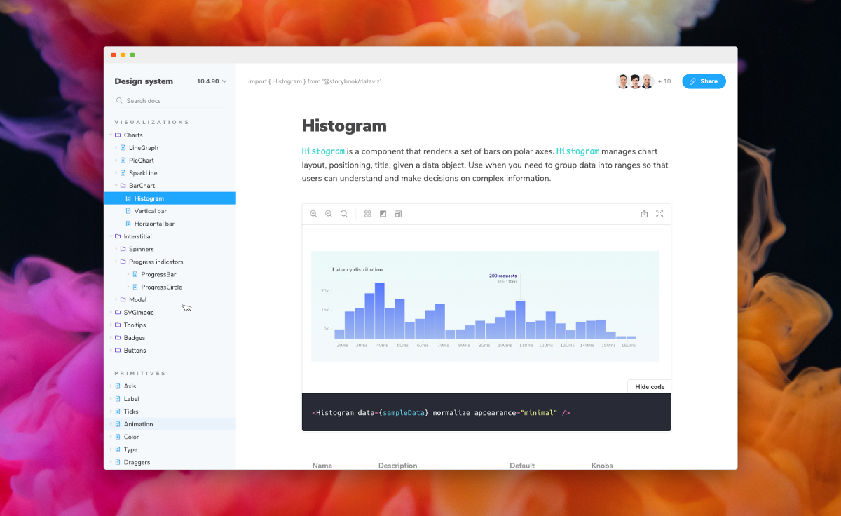
- Canvas. Embed the Storybook Canvas with the toolbar and source
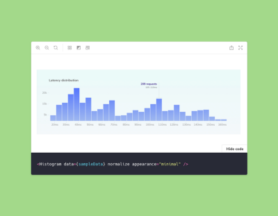
- Props. Document component inputs in a table
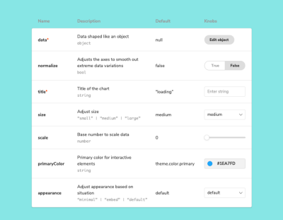
- Type. Show typography scaling and usage
- Preview. Embed arbitrary stories
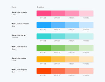
- Colors. Show your color palette
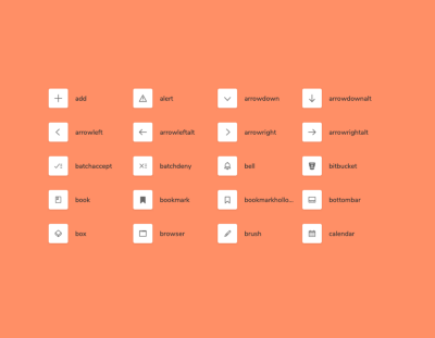
- Icons. Document your icon set
Beautifully crafted by Storybook 5.0 designer Dominic Nguyen, Doc Blocks are embeddable in Storybook’s UI, and will also be compatible with other static site frameworks like Gatsby and Next. Storybook Docs will generate these blocks from React, Vue, and Angular stories; we plan to extend them to other view layers with the community.
As a first deliverable for this project, we will re-implement the Info addon as part of SB Docs, but it will display in the addons panel support multiple view layers.
Component Story Format
Storybook’s current story format exposes Storybook’s data structure (the “story store”) as part of the authoring experience. This makes the authoring experience more cumbersome than it needs to be. It also makes it harder to embed stories in other documentation systems.
Tom Coleman designed an alternative story format and prototyped it in SB5. Docs builds on this format to enable a smooth authoring experience that’s portable to other documentation systems.
MDX Support
The third aspect of Storybook Docs is MDX support. MDX is Markdown for the component era. MDX embeds JSX in Markdown, allowing you to use Markdown’s terse syntax (such as # heading) and JSX for more advanced components. And Storybook’s MDX is compatible with all the view layers we support, including Vue, Angular, and many others.
Docs builds on Norbert de Langen’s improvements to the Notes addon and MDX prototyping by Igor Davydkin. It will attempt to be backwards compatible with existing notes in stories.
The Docs equivalent to the Info addon will be just a specific template instance of a note that’s automatically generated for each story.
Screencast of SB Docs proof-of-concept
Templates & Static Export
Doc Blocks, Component Story Format, and MDX support give developers versatile tools to solve any number of documentation-related use cases.
The final piece of Storybook Docs is to combine these tools into a streamlined best practice workflow that makes authoring docs easier for every Storybook user. To this end we will:
- Research/prototype: Study existing design systems, catalog best practices, and implement those in the documentation for Storybook’s own component library
- Template-ize: Build those features into an off-the-shelf template that encodes best practices for everybody to use.
- Export: Make it easy to statically export a standalone documentation site,
build-docsthat mirrorsbuild-storybookusage. Specifics still TBD.
This is necessarily part of a longer design cycle that is currently in progress.
Get involved
Storybook is maintained by amazing open source contributors and guided by a steering committee of top maintainers.
If you’d like to help bring Storybook Docs to life, come work with us to help build and theme Doc Blocks. Or make sure SB Docs supports your favorite view layer. Or simply give feedback on the design as it evolves— we’d love to have you involved!
Join us in the Storybook’s Discord chat #docs-mode and on GitHub. We welcome contributions from new developers and experienced veterans alike.