Storybook 9 is now in beta
Try the future of UI testing today

Storybook 9 is our most ambitious release yet. Beta signifies that 9 is feature complete and ready for your project, but we still need your help to cross the finish line.
Our goal is to turn Storybook into a lean, mean testing machine. Here’s what’s inside:
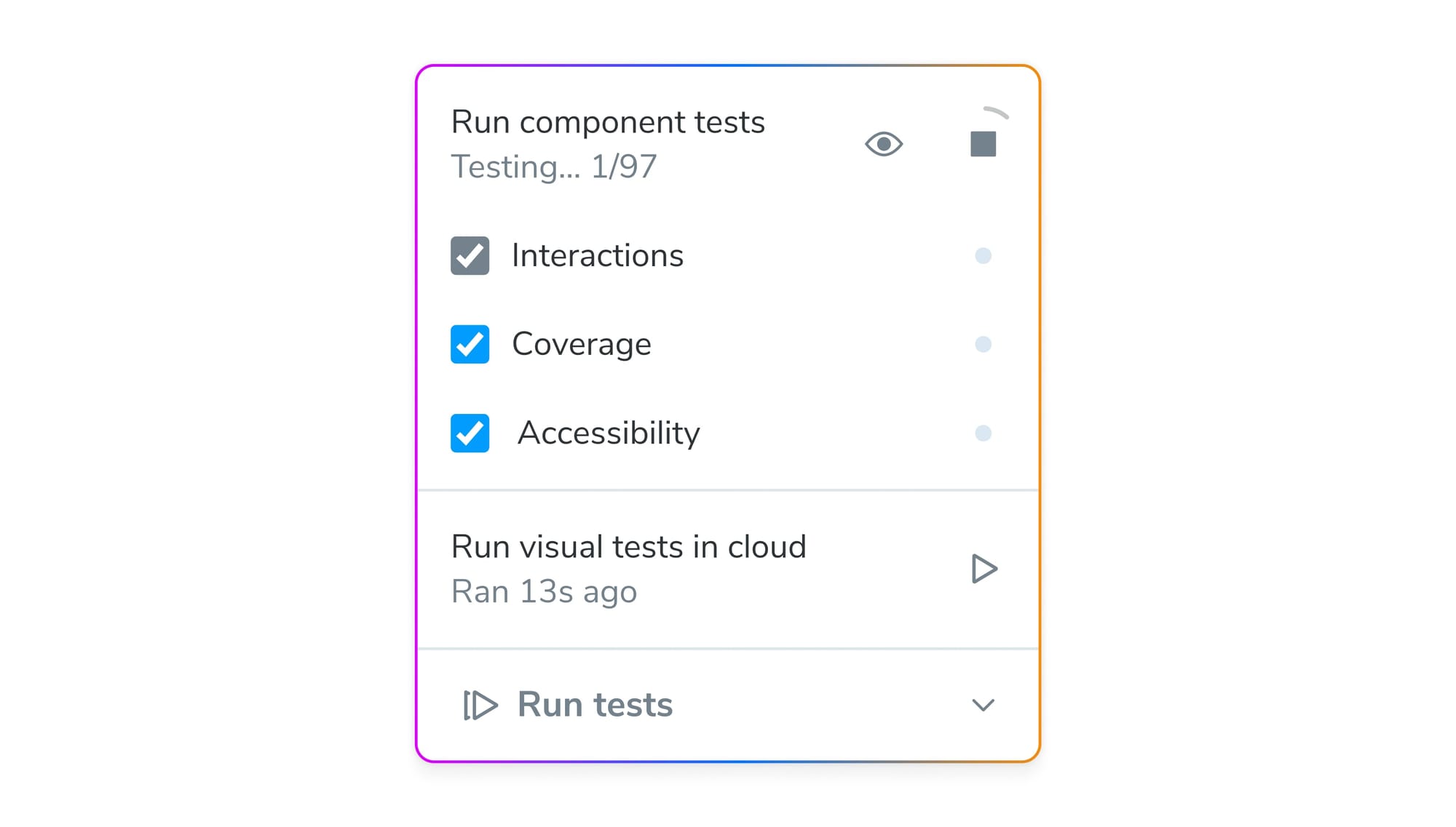
🚥 Component test widget
▶️ Interaction testing
♿️ Accessibility testing
👁️ Visual testing
🛡️ Test coverage
🪶 48% lighter bundle
🏷️ Tags-based organization
⚛️ React Native for device and web
Component testing
Component tests are the Goldilocks of UI tests, combining the speed and reliability of unit tests with the in-browser fidelity of end-to-end (E2E) tests. Unlike E2E tests which are better suited to small numbers of happy-path user flows, it's possible to write and maintain thousands of component tests, giving you full coverage over all your key UI states.
We've teamed up with Vitest, the ecosystem’s fastest test runner, to create a superior tool for testing your components as you develop them.
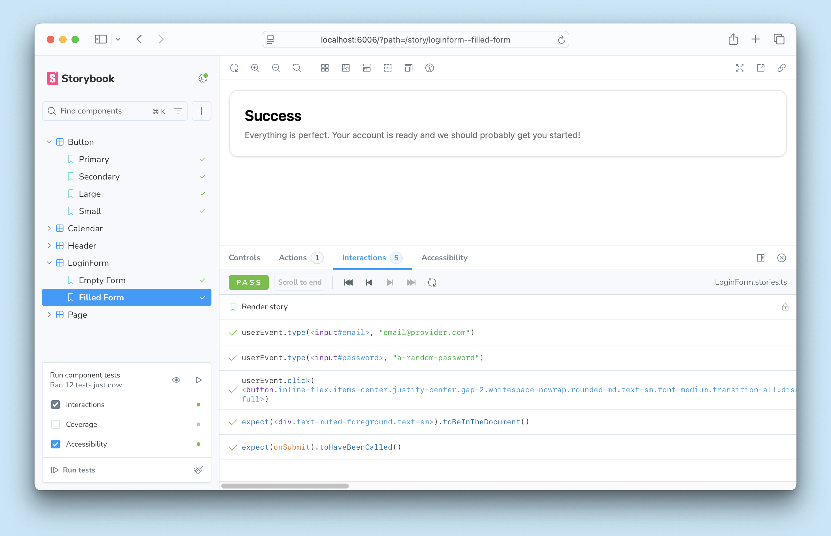
Interaction testing
Interaction tests help you simulate user behavior and assert that components function correctly. They can now be run individually, in a batch, or across the whole Storybook. Enable watch mode to run them whenever you save changes.
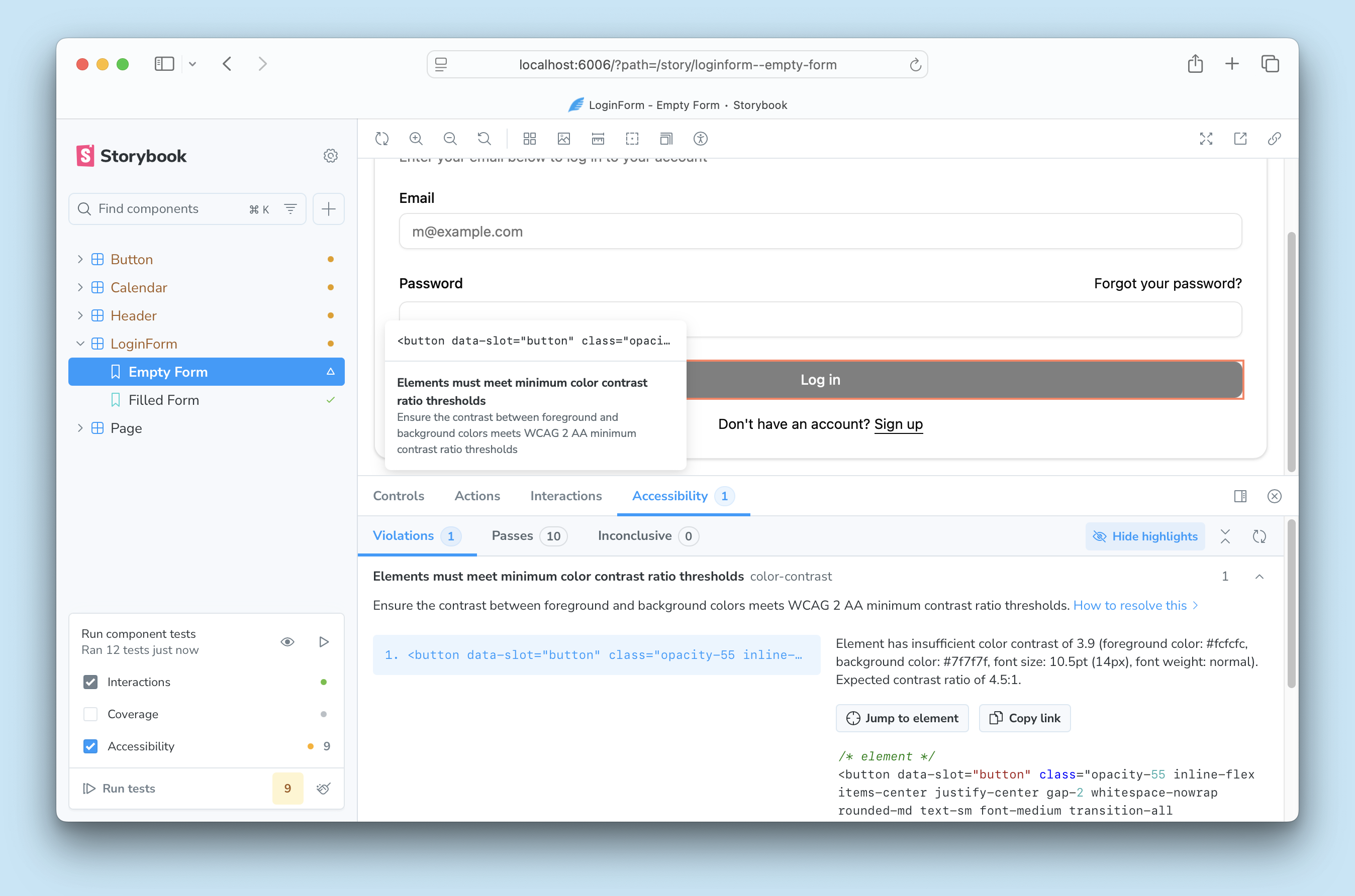
Accessibility testing
We've overhauled our accessibility workflow. Just like the functional tests described above, you can now run accessibility tests across all your stories, and inspect the violations through a new, efficient UI.
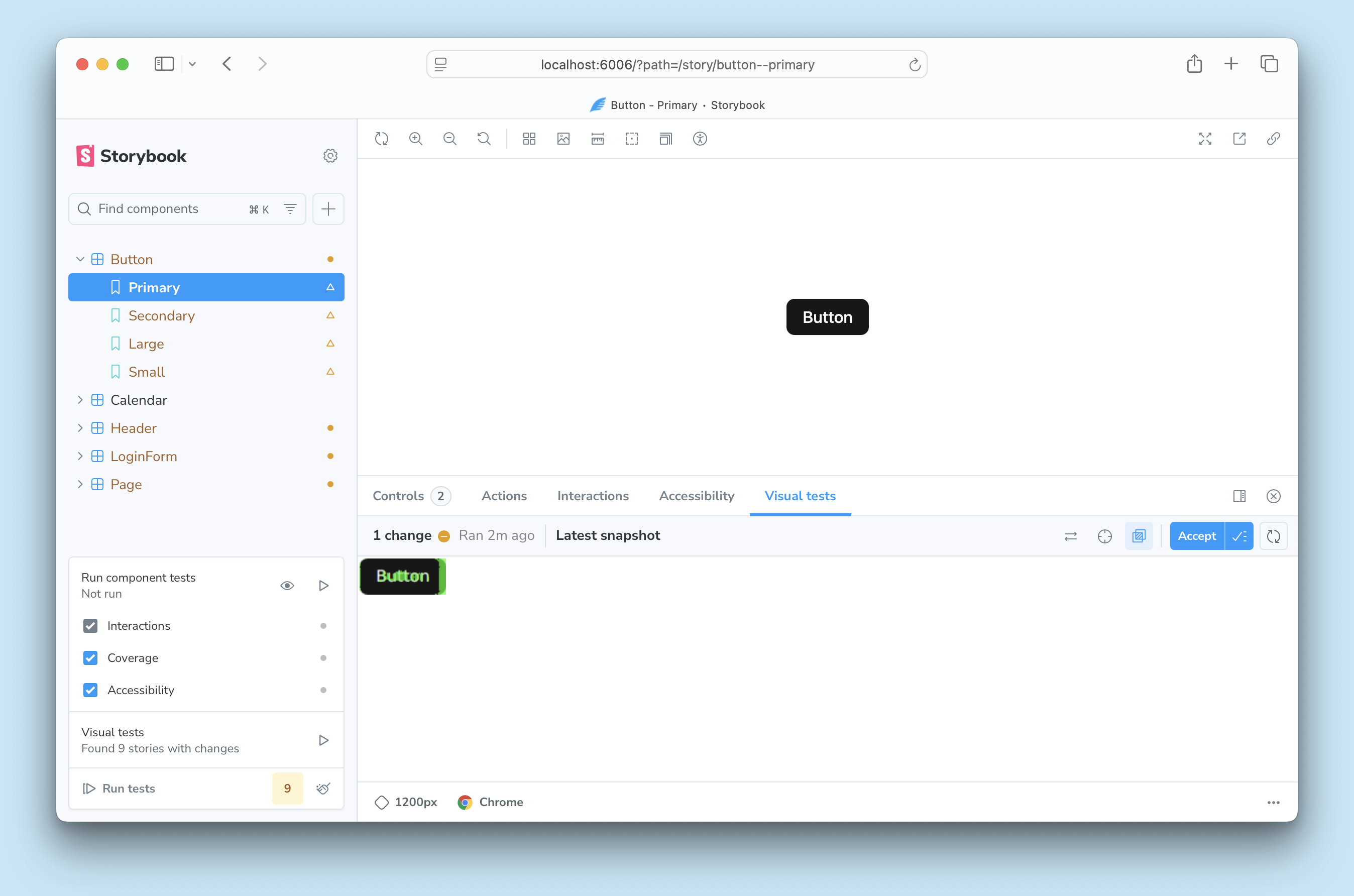
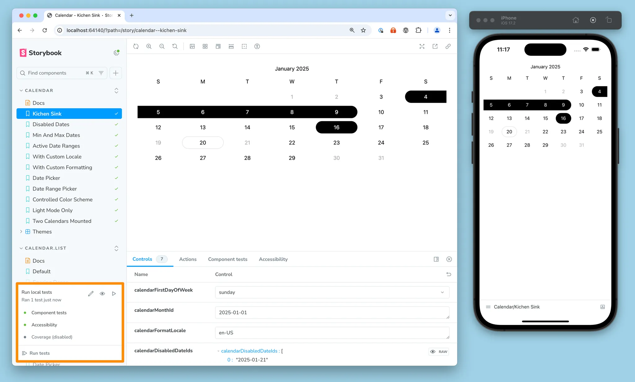
Visual testing
At the click of a button, you can visually test all your stories simultaneously to pinpoint changes down to the pixel.
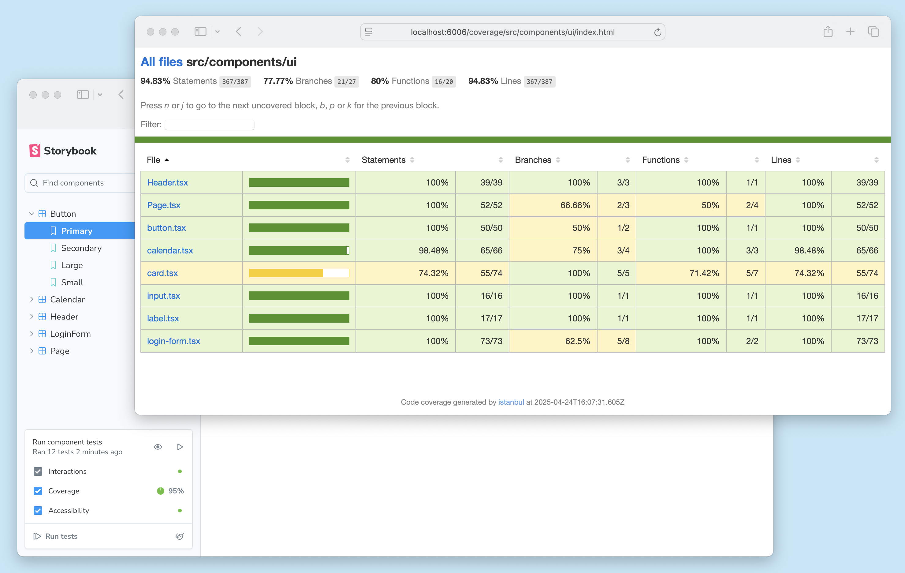
Test coverage
With the click of a button, you can calculate test coverage to find out exactly which lines, functions, and branches are exercised by your component tests.
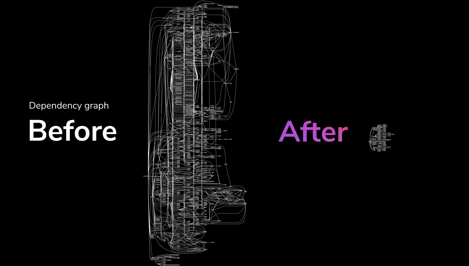
48% lighter weight
Storybook 9 is less than half the size of Storybook 8. Its dependency structure is also much flatter; it installs faster and won't conflict with any of your project dependencies.
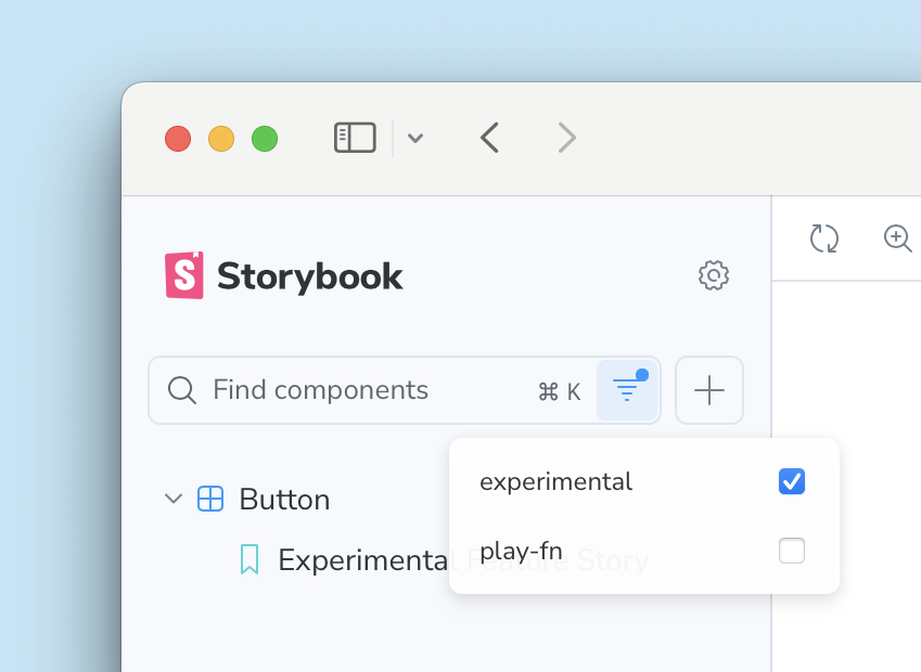
Tags-based organization
Storybook Tags are a new way to organize and filter your stories in the sidebar.
React Native everywhere
We've brought official web support for React Native, bringing full compatibility with Storybook’s documentation and testing features to React Native!
Upgrade easily with automigrations
You can upgrade your project to beta today with a single command:
npx storybook@next upgrade
Our automigration system will detect any relevant breaking changes and guide you through the process step-by-step, providing codemods where possible to automate as much as we can. We’ve also provided a migration guide to help fill in the gaps.
We need your feedback on 9 beta
We've already done rounds of thorough testing, so you should have a smooth upgrade. But the more projects we can test the better. If you have any issues in your project, please let us know by filing a GitHub issue. The entire team is on deck, waiting to fix bugs and answer questions as they come in.
Storybook 9 is now in beta! It’s ready for you to try today. Let’s see what’s inside…
— Storybook (@storybook.js.org) 2025-04-24T20:03:42.562Z