
Storybook addons to manage data & state
Build connected UIs in isolation

Components encapsulate UI appearance and functionality to help you build apps. There are many types of components ranging from purely presentational all the way up to connected pages. Each type can be tricky to build.
We researched teams at BBC, Shopify, Auth0, and the Storybook community to learn the secret to building every UI in isolation.
This article showcases Storybook addons for data and state that help you build components in isolation.
Why build UIs in isolation
Before we begin, it’s worth revisiting why to build UIs in isolation in the first place. Can’t you just develop the UI while working in your app?
Leading teams build UIs in isolation to manage UI complexity. They build interfaces from the “bottom-up,” starting with atomic components then progressively combining them into pages in a process called Component Driven.
For instance, the BBC supports countless permutations of language, device, browser, and UI state. They rely on a component driven development flow to build out the edge cases and automatically test for regressions.

But not everyone is the BBC, so what are the benefits to you?
- Convenience: Use mock data to simulate hard-to-reach states (empty, loading, etc). This saves time and helps you verify that UIs work in different scenarios.
- Testing: It’s easier to pinpoint bugs by testing at the component level. No more delving through stack traces.
- Reuse: Assemble UIs faster by reusing existing components and composing them into new configurations.
- Speed: Parallelize development by decomposing pages into discrete components and spreading the workload.
Storybook and its addon ecosystem make it easy to build entire UIs in isolation. Let’s see how.
Atomic Components
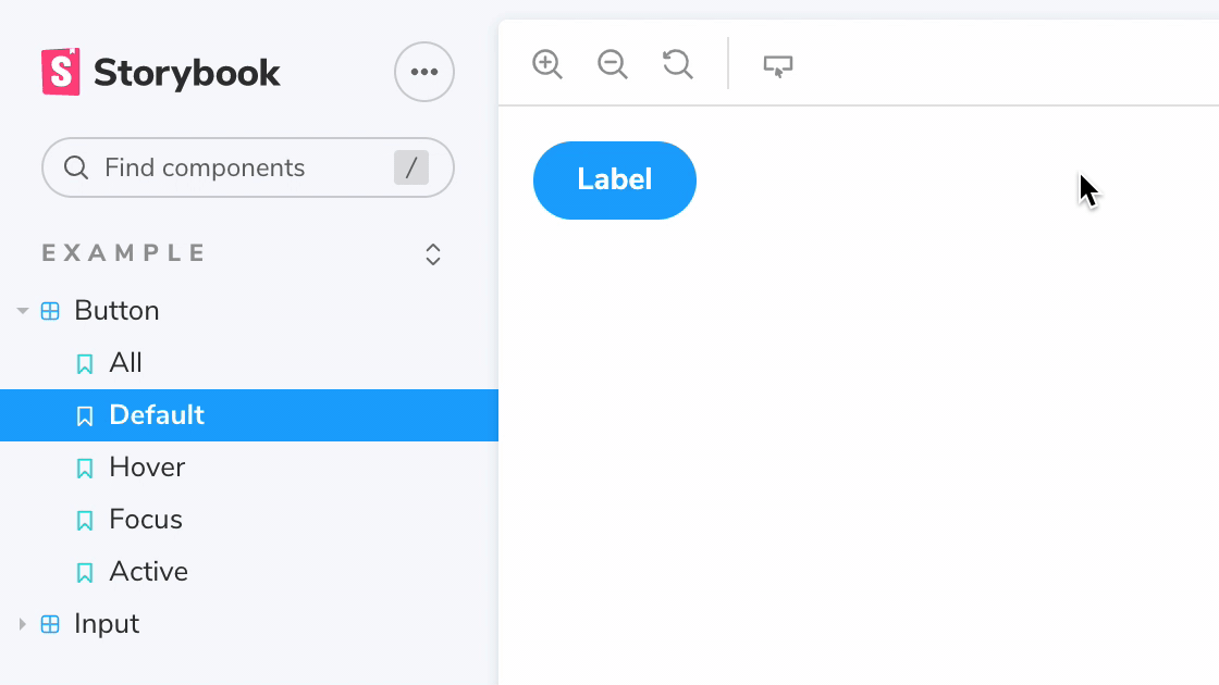
At the core of every UI are a set of atomic components. These components have no state and don’t specify how the data is loaded. They receive data and callbacks exclusively via props. Example: Avatar, Button, Input and Tooltip.
The primary challenge here is to ensure components look like they’re supposed to. In most cases you can reproduce their state via props and save them as stories.
However, some components also rely on CSS pseudo-states, such as hover and focus, to appear in the correct way. It’s tedious to cycle through these states manually via devtools. The Pseudo States addon allows you to quickly toggle between the various states or render them all side-by-side.

The Actions Addon simplifies testing event handlers. Use it to create callbacks that appear in the actions panel of the Storybook UI and verify whether the handler received the correct arguments.
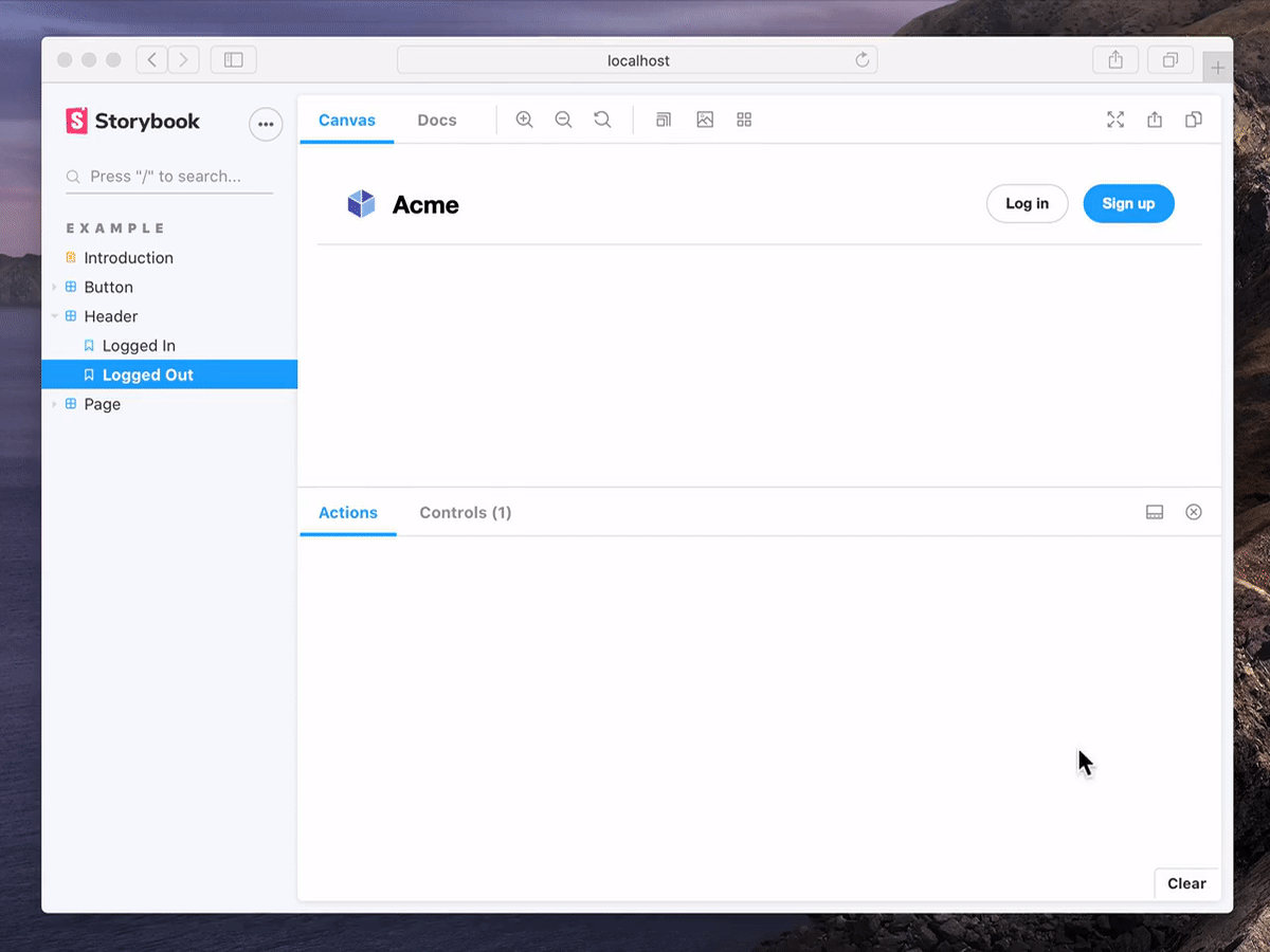
On a related note, Next.js is a leading meta framework for React. It’s used to build apps with hybrid static & server rendering. Therefore, it requires you to use a custom Link component to navigate within the app. The Next router addon simulates navigation events and logs them to the actions panel.

Composed components
You can develop more complex features in isolation by composing components. These composed components also often track application state and pass behaviours down the tree. Example: Forms, Header, List and Cards
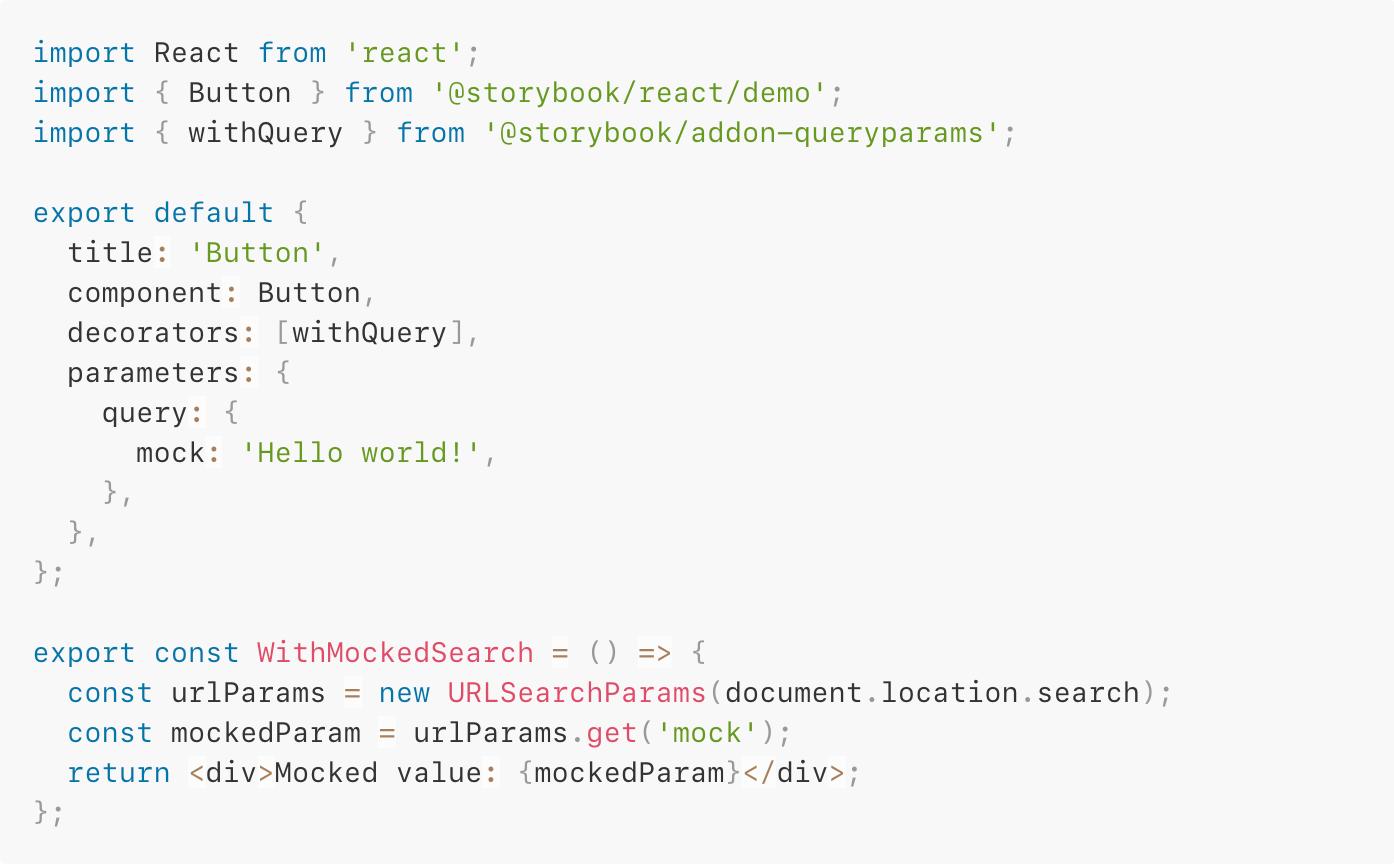
State has many different forms. Some applications track bits of state as query parameters in the URL, which in-turn is parsed by components. The Query params addon allows you to mock query parameters per story so that you can easily reproduce different states of your component.
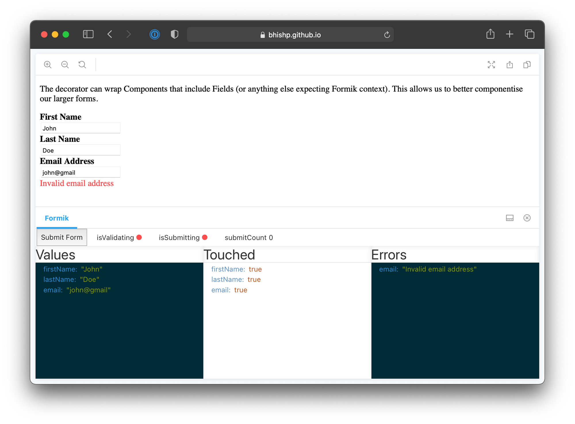
Formik is a popular form library. It manages form values, validations and submission. The Formik addon provides the Formik context and visualizes the form state in a panel.
React applications use context to pass data through the component tree without having to pass props down manually. It’s often used for managing “global” state. Either using hooks & vanilla context or via libraries such as Redux and MobX. In all cases the mechanism for passing data remains React context. The React Context addon allows you to provide and manipulate context inside Storybook. Use it to mock data and actions for more complex scenarios.
import { withReactContext } from 'storybook-react-context';

export const myStory = (_, { context: [state, dispatch] }) => (
  <button onClick={() => dispatch({ text: 'Changed' })}>{state.text}</button>
);

myStory.decorators = [withReactContext({
  initialState: {
    title: 'Initial #1'
  }
})];

myStory.parameters.initialState = {
  initialState: {
    text: 'Initial #2',
  },
};
Pages
As you continue composing components up to the page level, you also have to connect them to data. This is where your UI meets your back-end APIs and services.
In the past, getting your app into a specific state took a lot of effort. You’d have to seed a database, spin up both the back-end and the front-end locally, and navigate to the relevant page.
With Storybook, you can develop entire pages in isolation. The following addons help you mock data to quickly jump into any specific permutation.
Mocking API Services
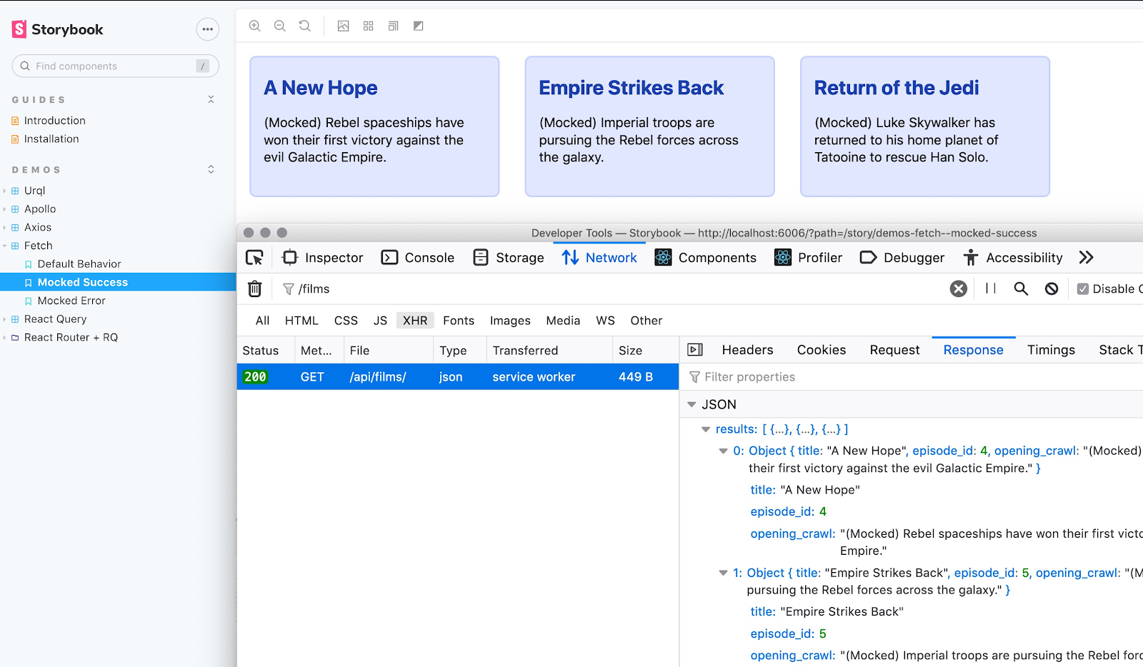
Mock Service Worker (MSW) is an API mocking library. It uses service workers to intercept requests at the network level and provides mocked data in response. The MSW addon brings this functionality to Storybook. Use it to simplify mocking API requests in your stories. It works with both RESTful and GraphQL based back-ends.
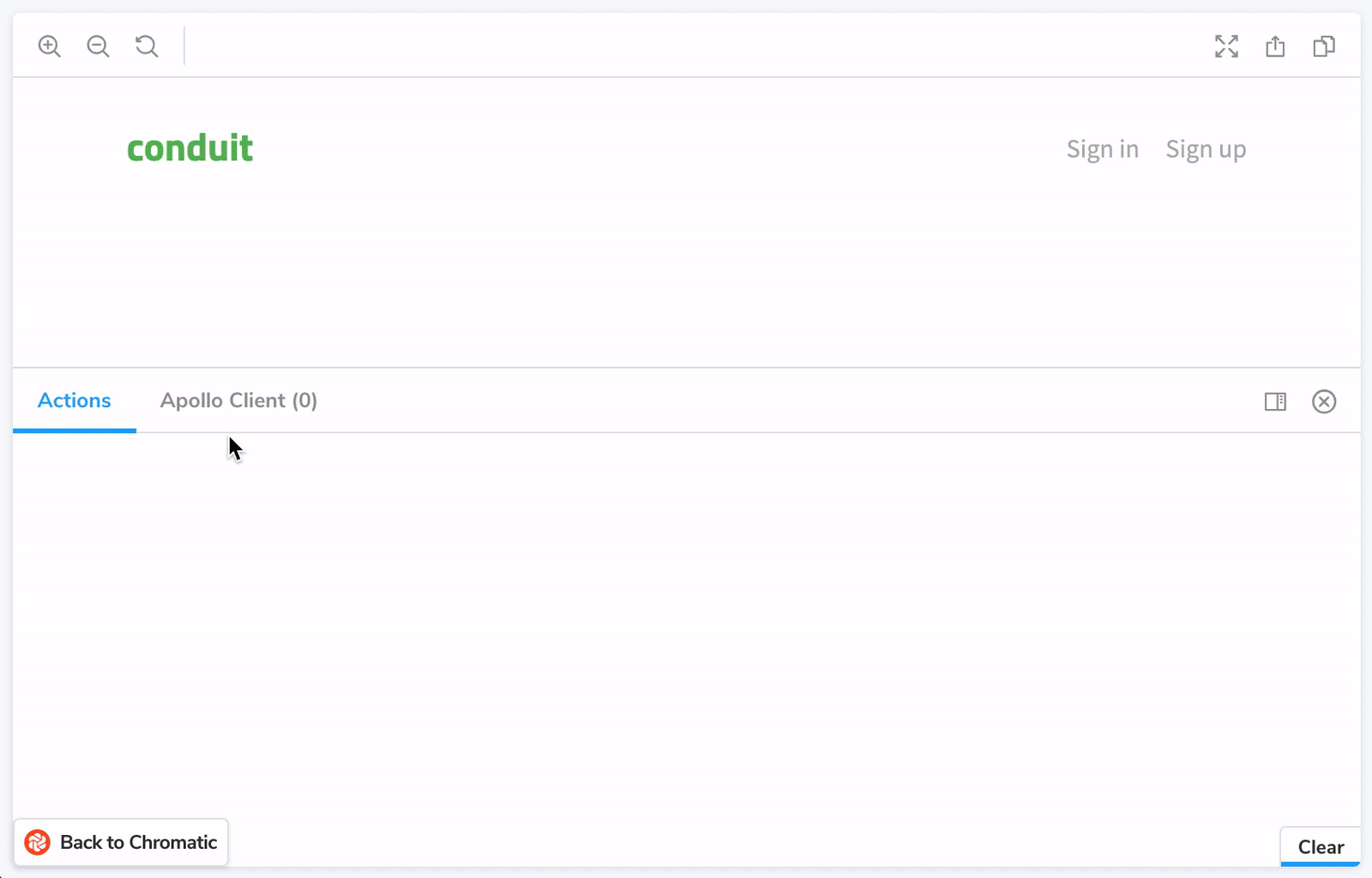
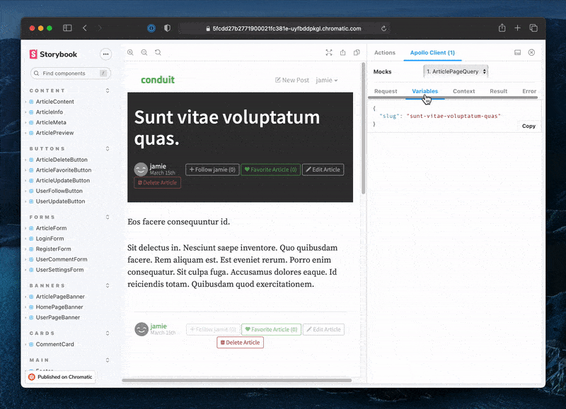
Apollo GraphQL is a widely used GraphQL library. The Apollo Client addon mocks GraphQL data at the page-level. Making it easier to run visual or integration tests at the page level.

URQL and GraphQL Kit offer similar functionality for other flavours of GraphQL.
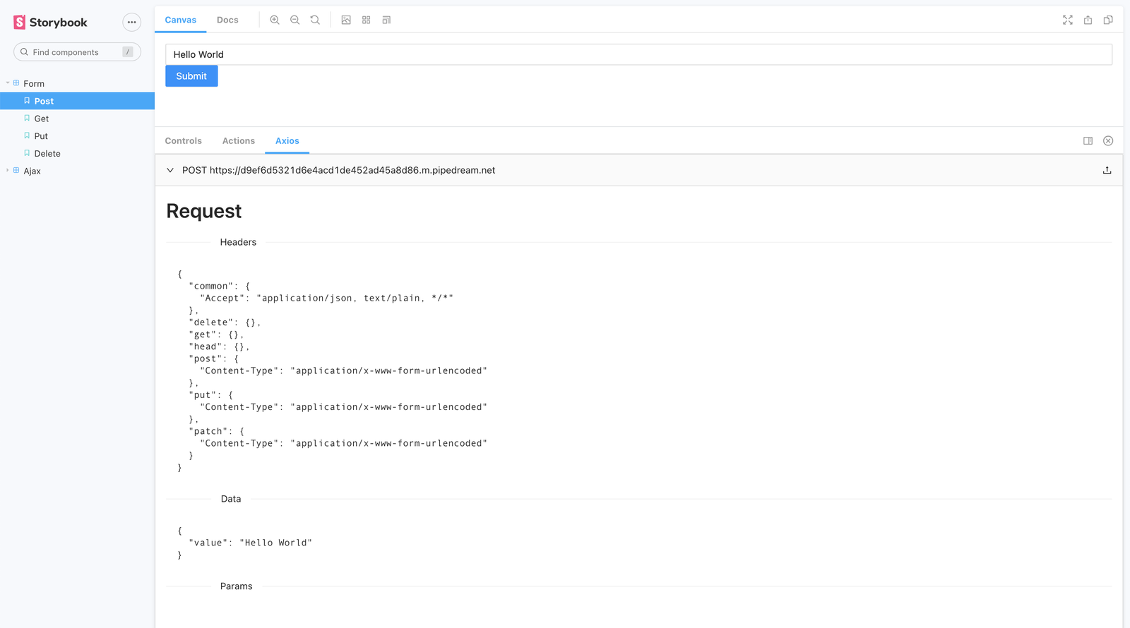
Axios is a ubiquitous HTTP client. The addon visualizes the data being exchanged between your component and a backend or a mocked API.
Conclusion
Decomposing interfaces into components makes it easier to build them and unlocks more forms of automation. However, isolating them can be challenging. You need to account for state, interactions, mock data and even mock API responses. Storybook addons reduce the time and effort required to isolate connected UIs. They enable you to build and test all kinds of components in isolation.
Check out the addon catalog to discover more addons for data and state. Learn how to build an addon using our tutorial and docs. And join the discussion on Twitter below.
Storybook helps you to build and test all types connected UIs. Addons reduce the time and effort required to isolate components:
— Storybook (@storybookjs) January 28, 2021
💽 They Mock data, state and network requests
🕹 Track and observe events
👉 Simulate pseudo-states
Learn more: https://t.co/eAp5Xtvdd4 pic.twitter.com/ZazhMz0ng0