
Storybook 5.1
React Native • Accessibility • Context • Presets • Docs update

Summer is upon us and the Storybook team is excited to bring UI developers new worksaving features. Storybook is the world’s most popular UI component explorer, and 5.1 includes:
- 📱 Mobile: Standalone package architecture for React Native
- 🎟 A11y addon: Realtime accessibility checks and visual feedback
- 🛠 Context addon: New UI for themes, internationalization, & more
- 🎛 Presets: One-line configuration for babel, webpack, & addons
In addition, get a technical preview of Storybook Docs to automatically generate rich docs from your existing stories.
📱React Native returns!
Storybook for React Native (RN) is back and better than ever. RN server is now completely optional. It uses the same codebase as Storybook for Web which resolves compatibility issues (RN 0.59), fixes long-standing bugs, and makes the package much easier to maintain moving forward.
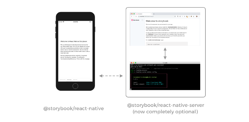
Furthermore, the new ondevice-actions package brings UI for logging user actions onto the device. Another step towards simpler, streamlined RN experience.
Kudos to Benoit Dion for spearheading the RN release, and Igor Davydkin, Gytis Vinclovas, Norbert de Langen, Richard Evans, and Forbes Lindesay for their work on RN support. For upgrade instructions see MIGRATION.md.
🎟 Realtime accessibility testing
Storybook’s a11y addon makes it easy for you to review UI accessibility while building UIs. Now the addon has a new superpower to highlight problems directly on your component UI to help pinpoint the exact location of accessibility issues. Read more about the improvements in the feature post by contributor Alex Wilson!
Overhauled by Alex Wilson, Arman Sargsyan, Dominic Nguyen, and Jimmy Somsanith. Originally contributed by Jaco Bovenschen.
🛠 New Contexts Addon
5.1 also introduces a brand new addon, Contexts, contributed by Leo Y. Li. addon-contexts makes it easy to provide data context to your component with a simple dropdown UI. For example your components might render differently based on a theme or language locale:
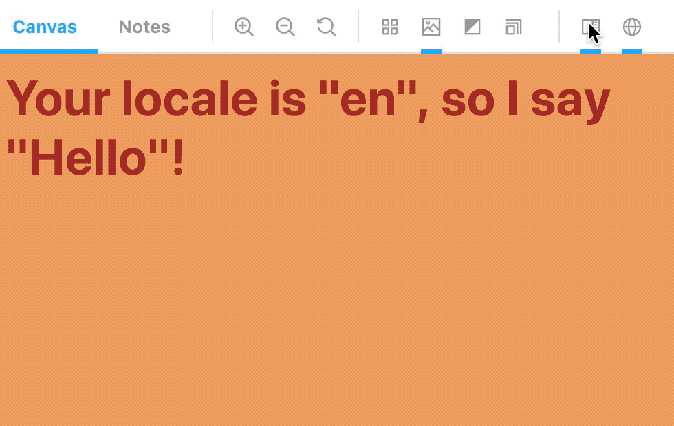
Contexts is simple and flexible. It allows you to specify an icon for the drop-down, a set of options, and an easy way to retrieve the selected option in your stories. For more info, please see the package README.
🎛 Hassle-free configuration with Storybook Presets
Kiss your Storybook configuration problems goodbye!
Did you know that a whopping 18% of Storybook support issues are related to configuration problems?! Many of these can be attributed to building on top of highly flexible tools (babel, webpack) without an appropriate abstraction to go along with it.
Presets solves this with one-line configurations, contributed by Igor Davydkin and Michael Shilman (me). Want to write your stories in Typescript? Add the @storybook/preset-typescript package and add the following line to .storybook/presets.js:
module.exports = ['@storybook/preset-typescript'];Presets can be composed to easily customize Storybook to your liking. For more information on presets, check out the docs.
Upgrade to Storybook 5.1
If you’re running Storybook 5.0, upgrading to 5.1 should be a breeze. If you’re on 4.x, we’ve got 5.0 upgrade guide to walk you through it. And if you’re still on 3.x (horrors!), the 4.0 upgrade guide should help.
New to Storybook? Check out the Storybook Tutorial for a step-by-step walkthrough of React/Angular/Vue. Or just jump in on your own project:
cd my-project
npx -p @storybook/cli sb init
yarn storybook
📚 One more thing… try out Storybook Docs technical preview
I’m thrilled to announce the technical preview of Storybook Docs, an addon that helps you automatically turn existing component stories into rich documentation.
- ⚡️Automatic documentation generation from your existing Storybook
- 🏗 “Doc blocks”, handy documentation components for common use cases like UI preview, prop tables, and source code.
- ✅ Backwards compatibility with legacy documentation from
addon-notesandaddon-info. - 📝 Freeform MDX authoring with story embedding
To test drive the technical release follow the instructions the Storybook Docs Technical preview guide. Feedback and discussion welcome in the #docs-mode channel on our Discord.
// A new story API

<Story name="Your cool story">
  <Button>Send</Button>
</Story>
Initial development by Michael Shilman (me!), Igor Davydkin, Lionel Benychou, Norbert de Langen, and Tom Coleman. Design and theming by Dominic Nguyen. Special thanks to bleeding-edge adopters Pål Nes, Jeroen Reumkens, Bart Ledoux, and Tom Speak.
Thanks to the community
Storybook is the product of nearly 700 community committers and is organized by a steering committee of top maintainers. Thanks also to gracious donations on Open Collective.
If Storybook makes your UI developer workflow easier, help Storybook get better. You can contribute a new feature, fix a bug, or improve the docs. Join us on Discord, support us on Open Collective, or just jump in on Github.
Code contributors:
@44px @aamct2 @alexan @anru @antony @armanio @armujahid @arnabsen @arnaudmanaranche @aspidov @benediktvaldez @bennypowers @benoitdion @breadadams @cam-stitt @clehnert-psl @codebyalex @colinrtaylor @coryhouse @curtishumphrey @devrelm @domyen @dougmacknz @dwightjack @eddiemonge @ehzhang @electricg @elevatebart @eskelcz @evolutionxbox @expe-lbenychou @fonger @forbeslindesay @gaetanmaisse @glazy @glitchperfect @gokatz @hipstersmoothie @hypnosphi @jamisuomalainen @jangerhofer @joefraley @jonrimmer @jsomsanith @kaidjohnson @kennethtruong @kohakukun @konstantindenerz @kroeder @krustal @kudryavtsevmd @lauritzsh @leovanhaaren @leoyli @lgraziani2712 @lhguerra @libetl @lifeiscontent @lonyele @lozinsky @lucas-carl @lukeaskew @malykhinvi @mansoorbashabellary @maraisr @marina-mosti @masup9@mattfwood @maximsagan @means88 @mickaelzhang @mikach @mikaelcarpenter @mohamedmansour @mohsinulhaq @mortal94@mrmckeb @myoxocephalus @mzdunek93 @n1ck @ndelangen @pajter @petekp @pgoforth @philipp-srf @phoenixton @rafaelfbs @rajatrao777 @rmevans9 @robotnicka @sairus2k @samouss @sergeyzwezdin @shaundon @shilman @shimisun @simenb@snowystinger @spy-seth @steffengorenflo @stephanemw @sto3psl @thekogmo @thollander @tmeasday @toshi1127 @trevordmiller @trevoreyre @tzkuei @vanpacheco @viniciuskneves @vpicone @wilau2 @wuweiweiwu @xdvarpunen @yjoer @zewish @zsalzbank