Structuring your Storybook
Best practices for organizing components and stories

The more information you have, the harder it is to find what you're looking for. At first, your Storybook has a handful of components, so it's easy to keep track of things. But as the number of components grows, so does the organizational complexity.
You end up with questions like “Where did we put that component again?” and “Is there a story for this state?” That leads to confusion, or worse, duplicated effort.
Storybook is used by global companies like Audi, IBM, Monday.com, Wix and more. I wanted to learn how the biggest teams approached component organization, so I surveyed 60 production Storybooks. This article shares what I found.
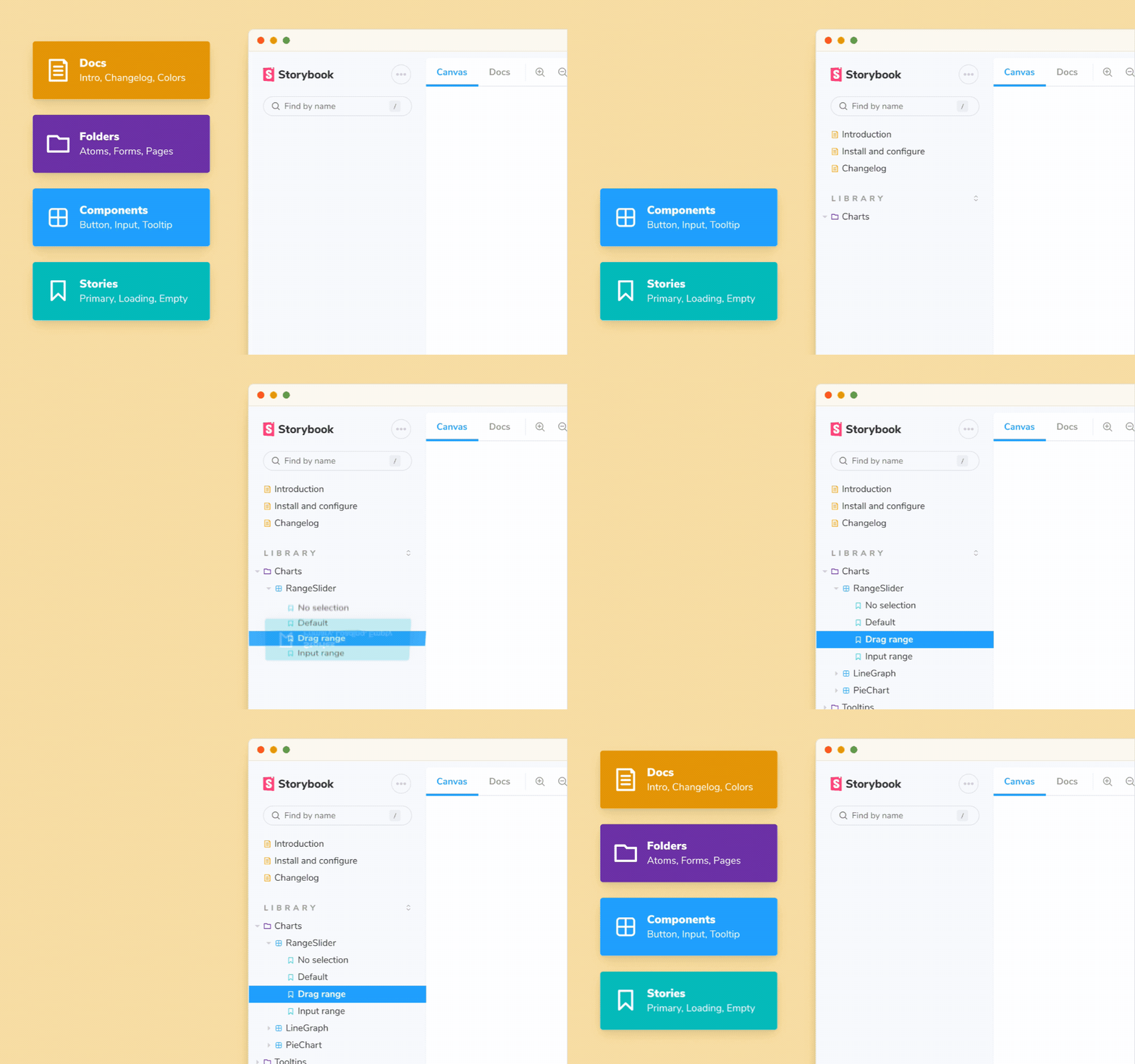
- 📑 Tips for organizing stories at the component level
- 🔍 Strategies for grouping and sorting components
- ✍️ Using documentation pages to showcase design tokens and other usage guidelines
What’s inside a Storybook?
Before diving into organization strategies, let's cover some basics. Storybook primarily houses two things:
- Stories: used to isolate and capture use cases of a component. You specify inputs required to reproduce a specific state as props or via mocked context and API calls.
- Documentation pages: free-form pages constructed using MDX.
1. Introduce your Storybook
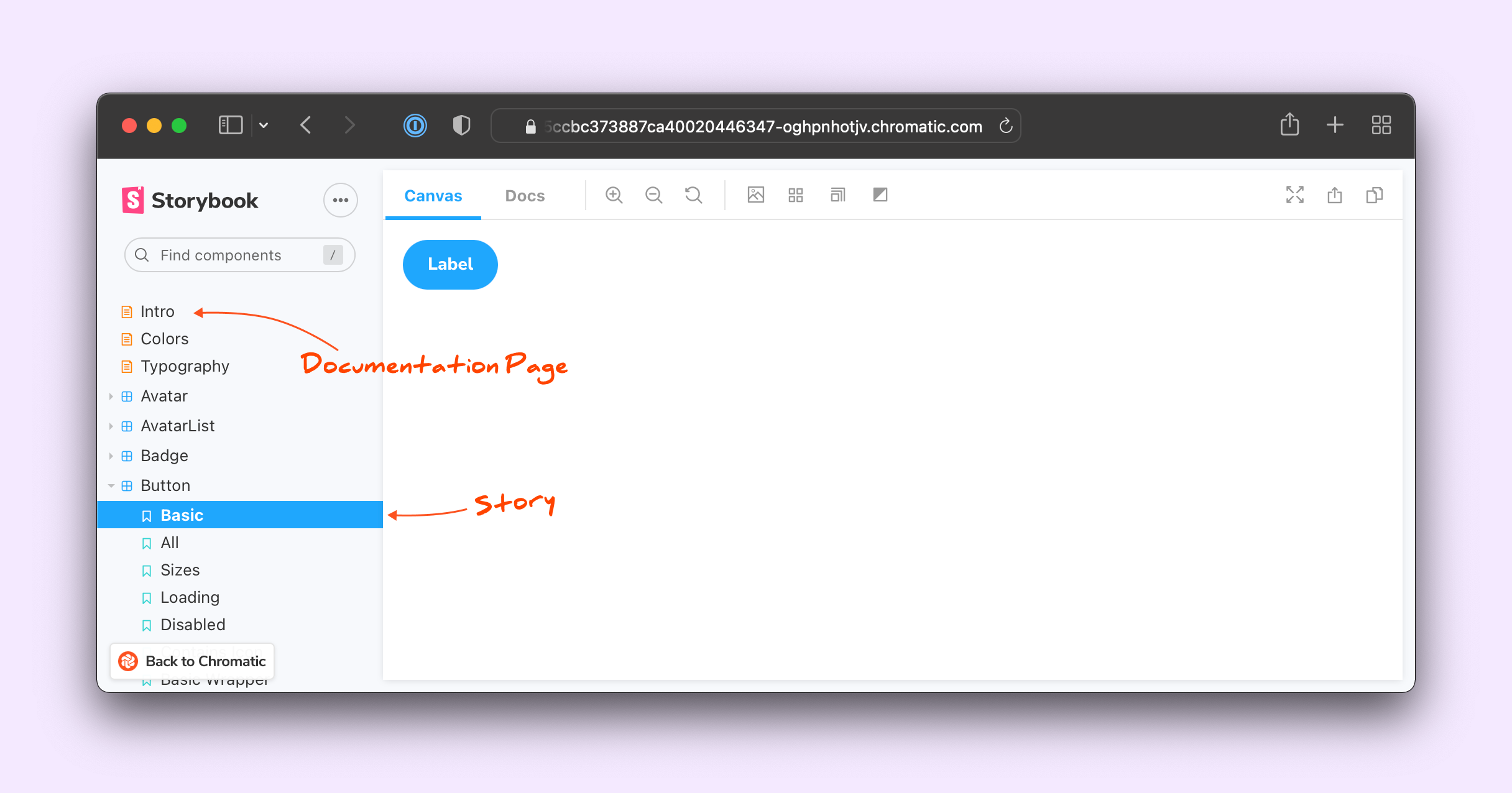
At the top, use Documentation pages to introduce folks to your Storybook and show them how to get started. MDX gives you complete control over the content. You can write prose interspersed with JSX components and embed all kinds of assets using MDX Embed.
Let's look at the different top-level pages that every Storybook needs.
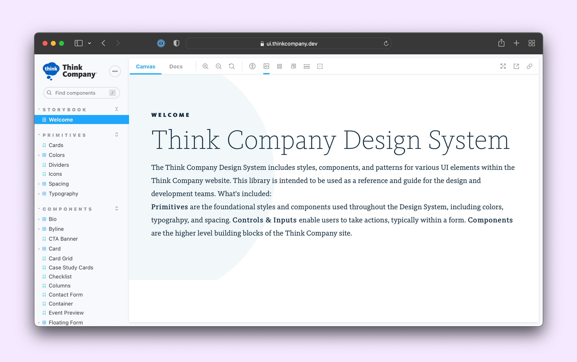
Intro page
Start with a high-level introduction to your Storybook—what's included, who maintains it and how to report issues.
Get started page
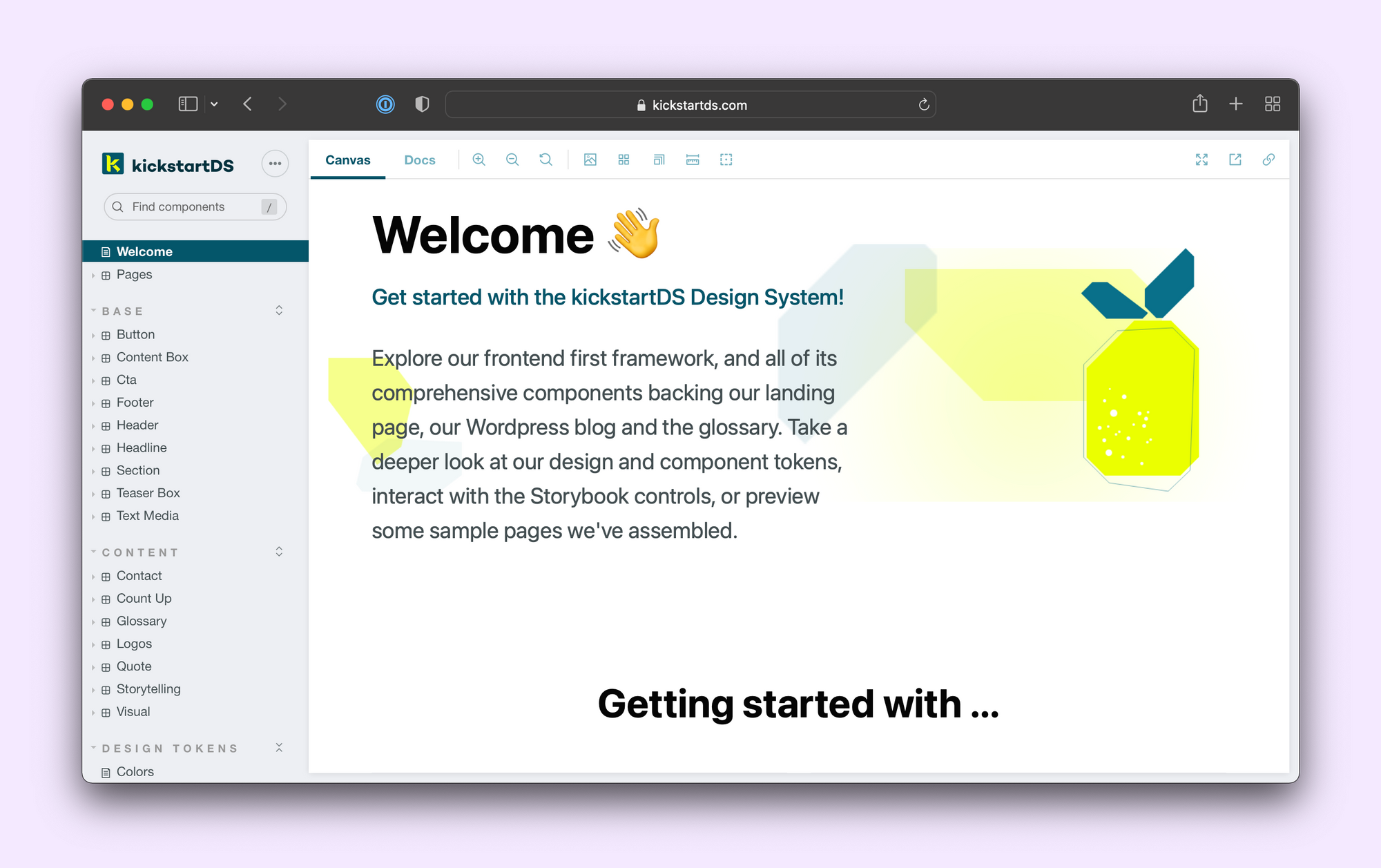
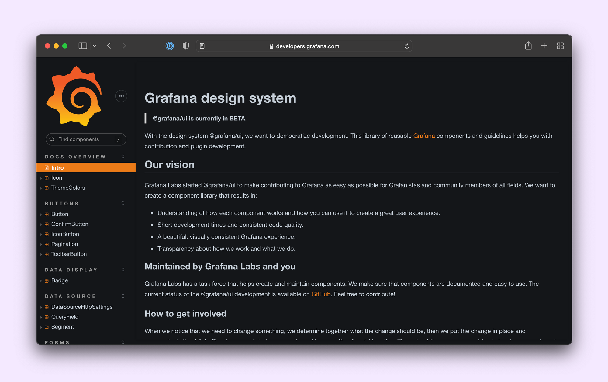
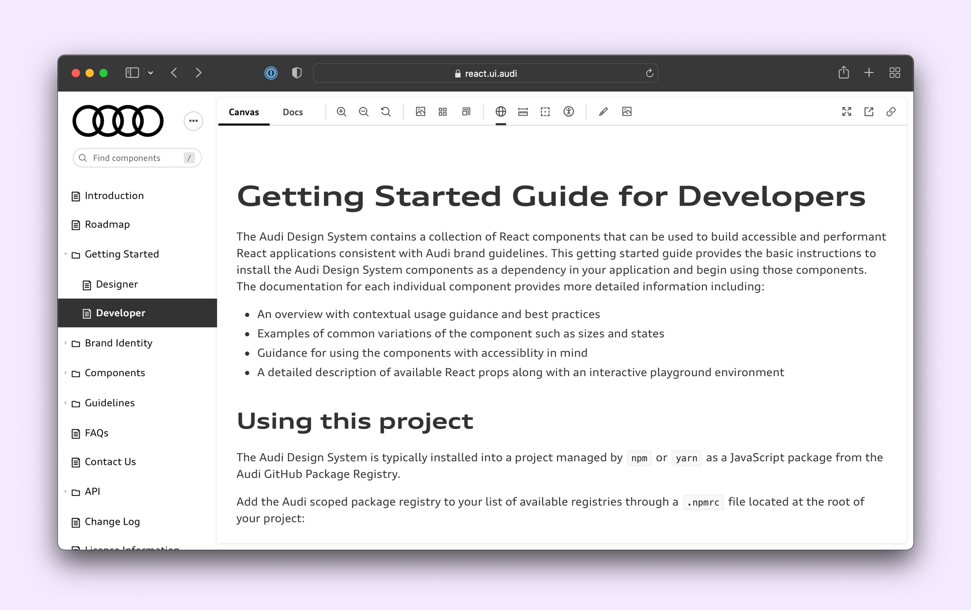
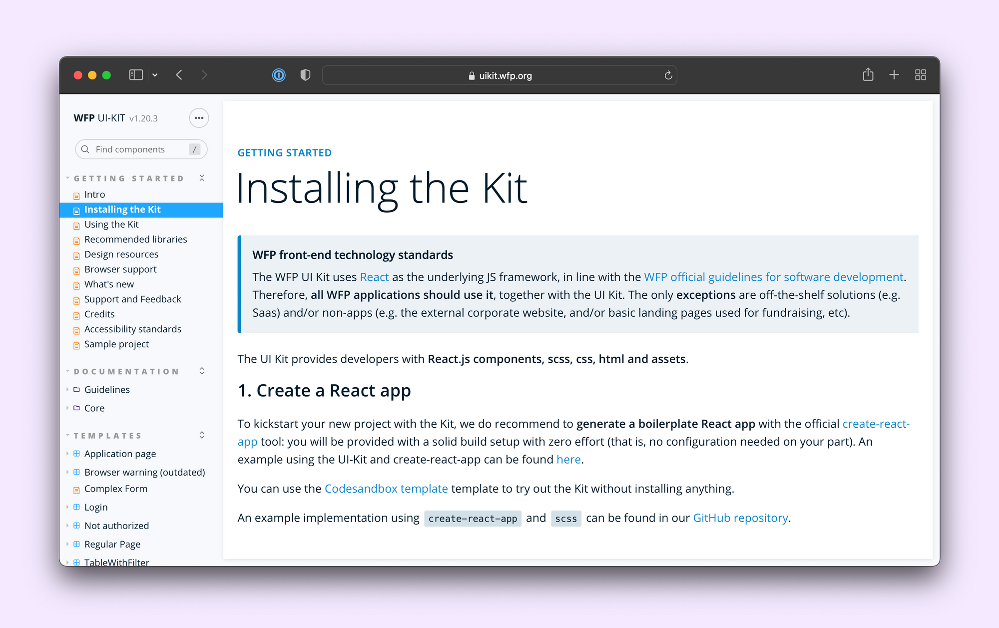
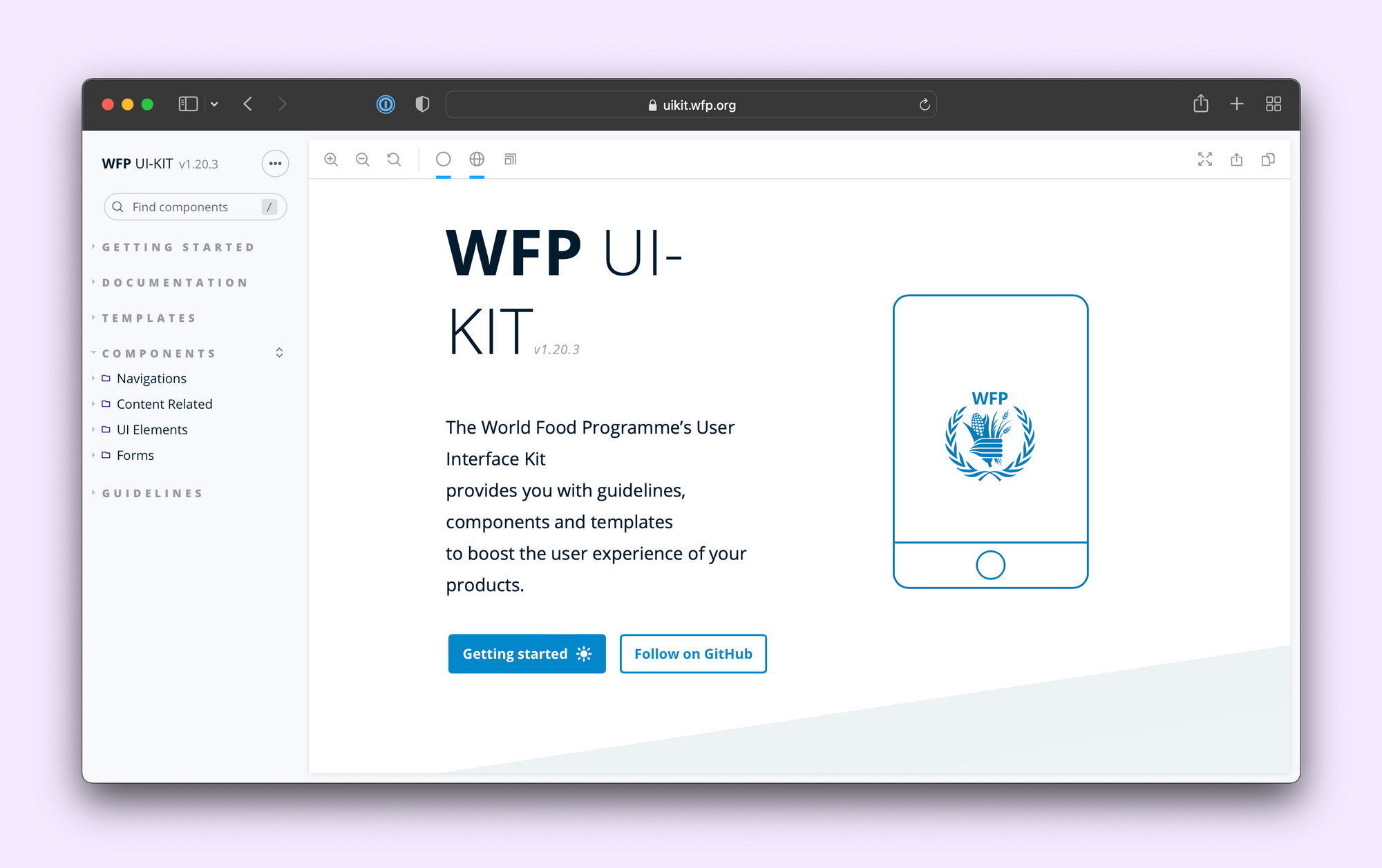
A getting started section shares how to use your Storybook’s components. This might include instructions to install, load CSS, or configure themes. The Audi design system has getting-started guides for both developers and designers. The United Nations World Food Programme has detailed usage guides that explain architectural choices.
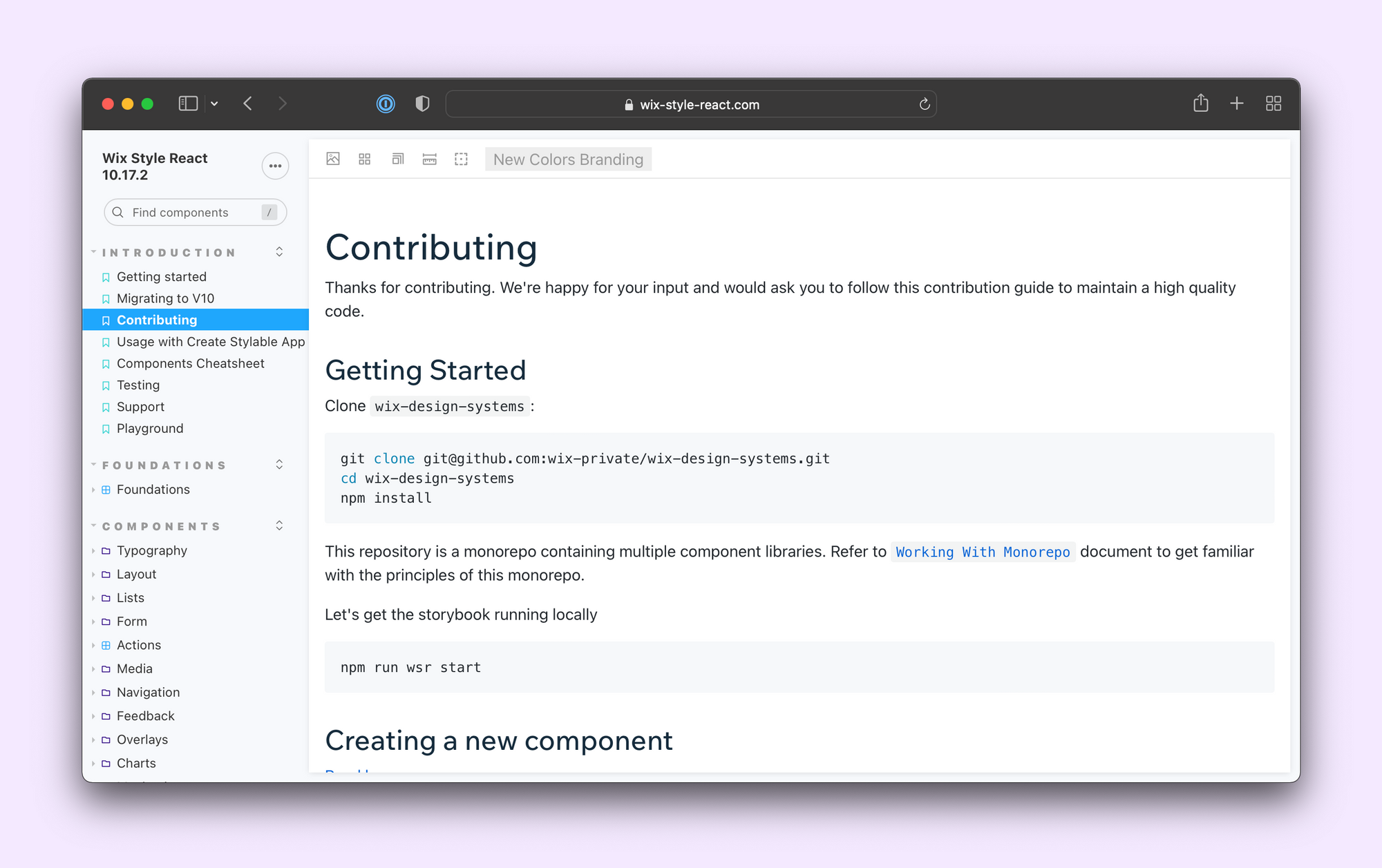
Contribution page
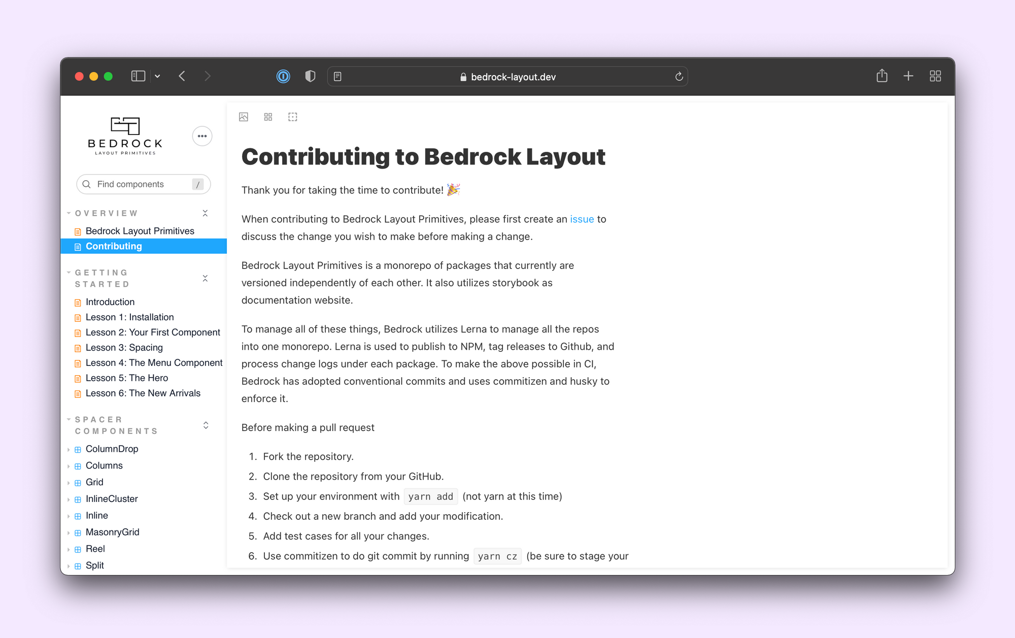
Document how to contribute a feature or bug fix. Contribution pages include instructions for environment setup, how to submit code, and run tests. This is especially important for libraries and design systems that rely on community support.
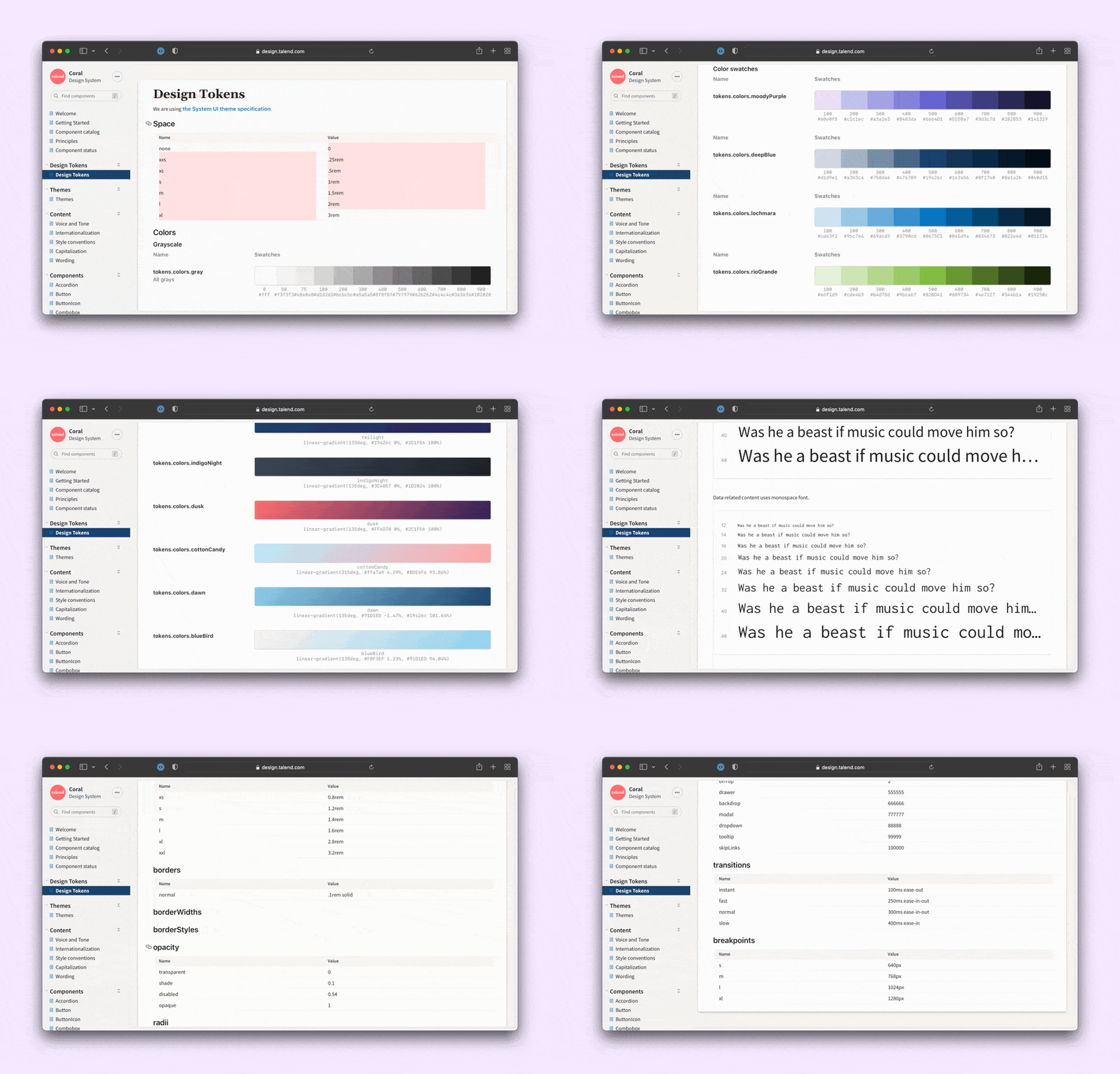
Design Tokens
Components source visual styles such as colors, typography, sizing, and icons via design tokens. Documenting these makes it handy for developers to see what value a token maps to. Use Storybook’s own Doc Blocks to visualize color palettes, typography and icons. Or create your own blocks by importing custom components into the MDX file.
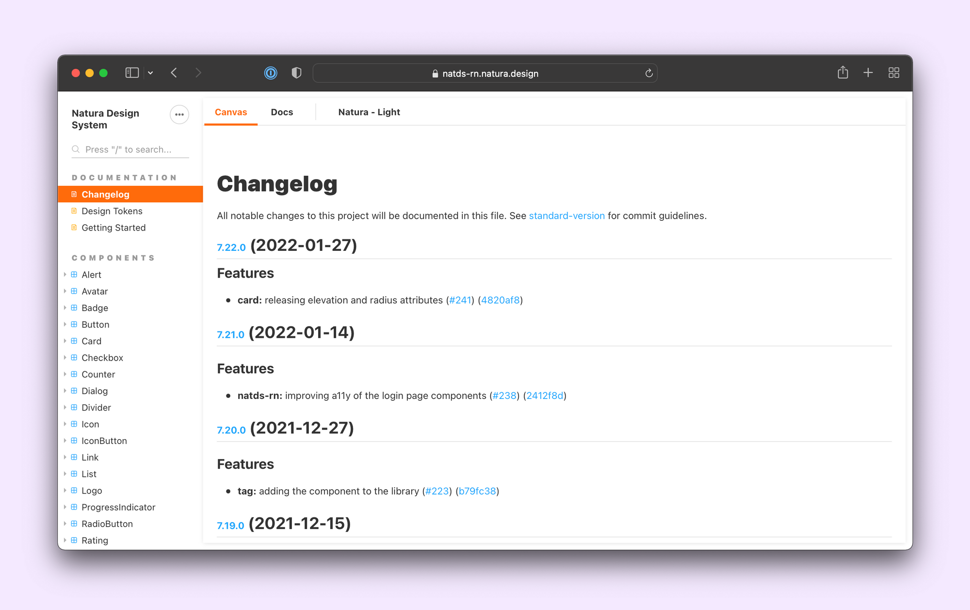
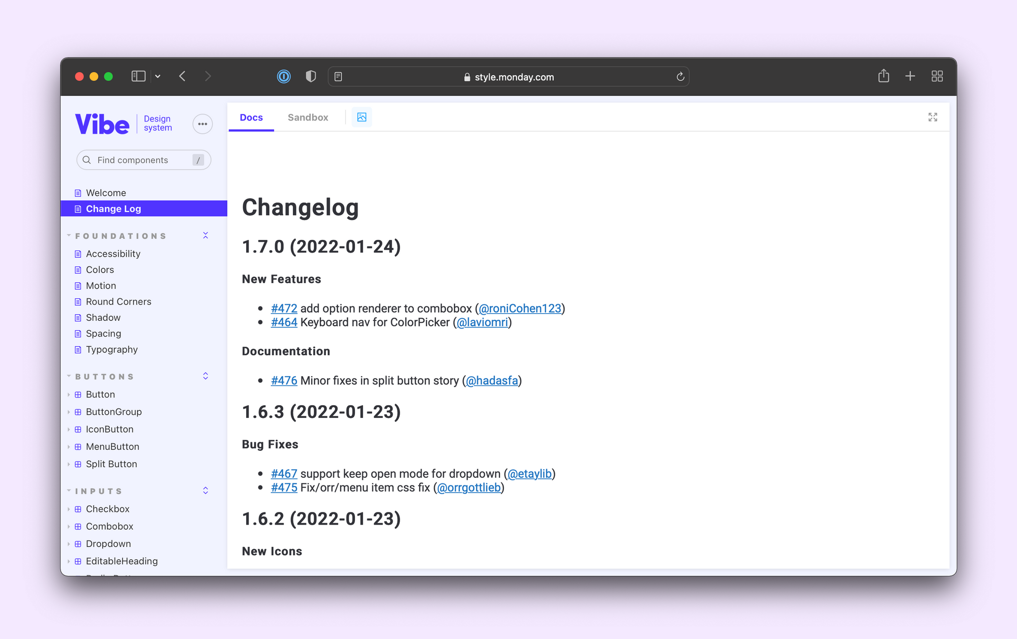
Changelog
Healthy UI libraries and design systems receive constant updates. That means adding or removing components from your library or altering their APIs. The changelog page captures all these updates in one place. It’s also an excellent spot to share your versioning strategy and project roadmap.
2. Group and sort components
Moving on from intro pages to how components are arranged. Stories for a component are automatically grouped together. Storybook also allows you to group multiple components into a category and adjust their order in the sidebar. This makes it much easier to browse through and discover UI elements.
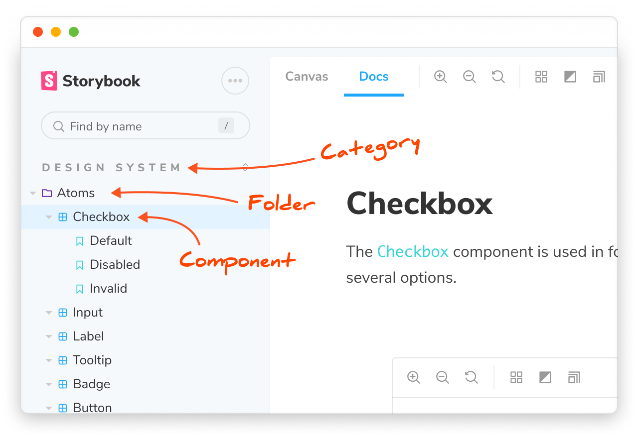
You can create a grouping by adding a prefix to the title property. Each grouping level is separated by a /. For more on this, see: naming components and hierarchy.
// Checkbox.stories.js
import { Checkbox } from './Checkbox';

export default {
 title: 'Design System/Atoms/Checkbox',
 component: Checkbox,
};
Your choice of hierarchy depends on how your team works. While there isn't a right or wrong answer, I’ll share a few popular organizational techniques.
Atomic Design methodology
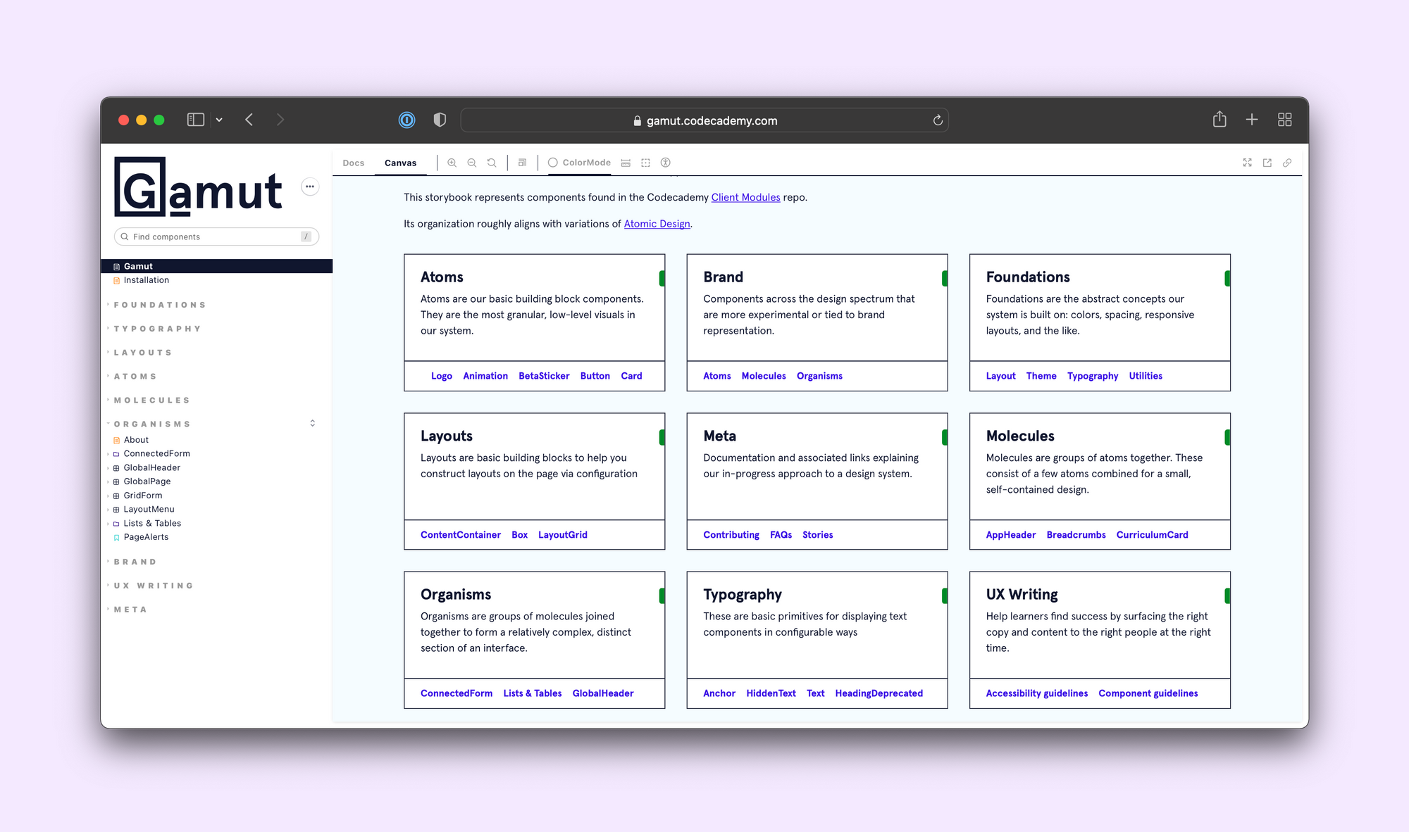
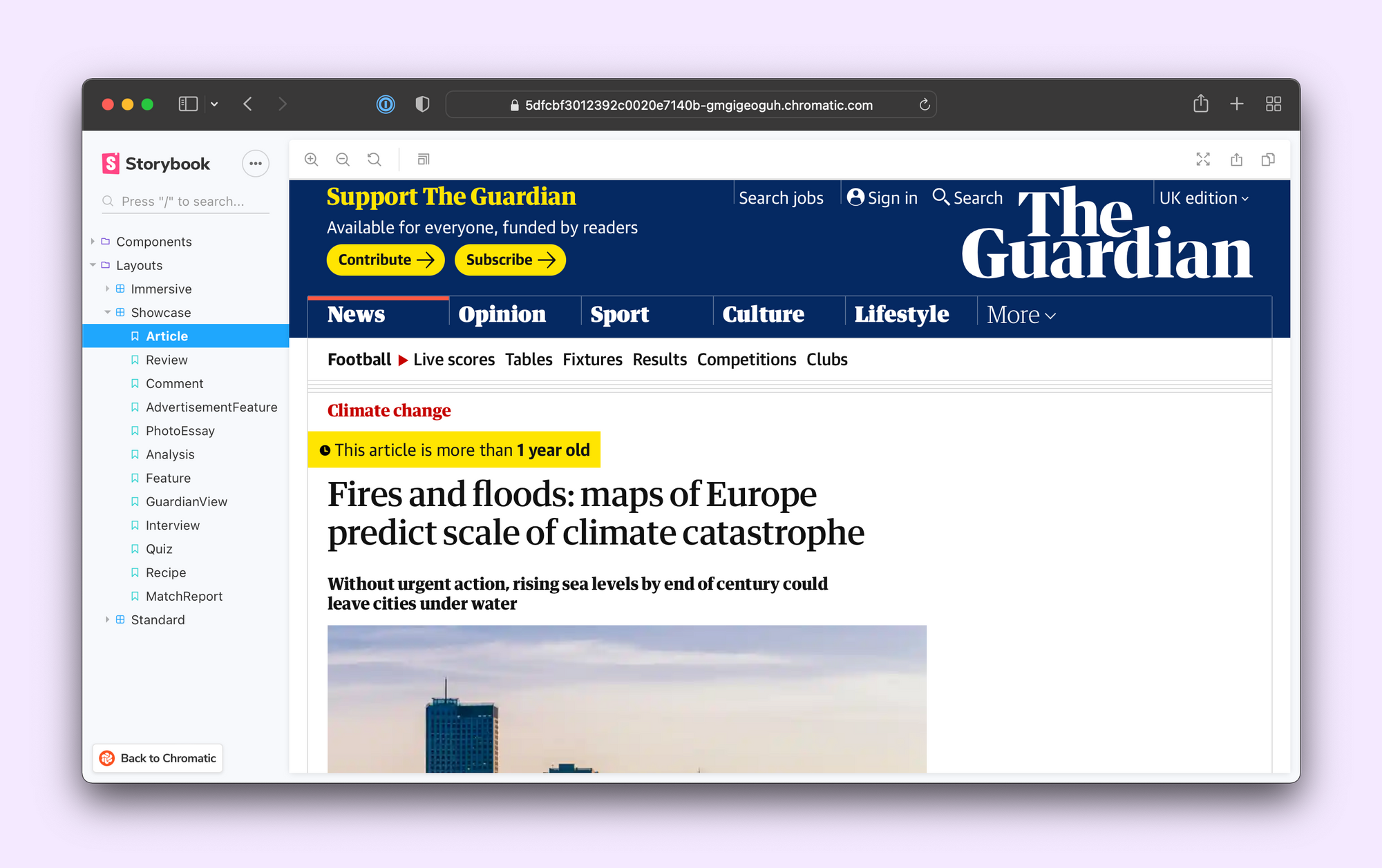
Pioneered by Brad Frost, Atomic Design is a common hierarchical system for UIs. It classifies components into five levels: atoms, molecules, organisms, templates, and pages.
Teams like Codecademy adhere to all levels of the atomic hierarchy. While others, such as The Guardian and United Nations World Food Programme, only use a subset. Refer to Brad's Atomic Design and Storybook article to see how he uses Storybook.
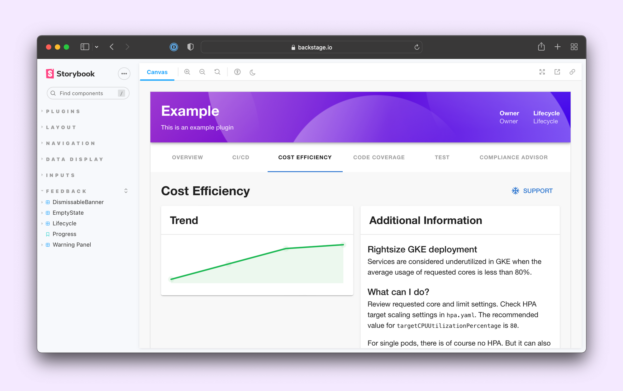
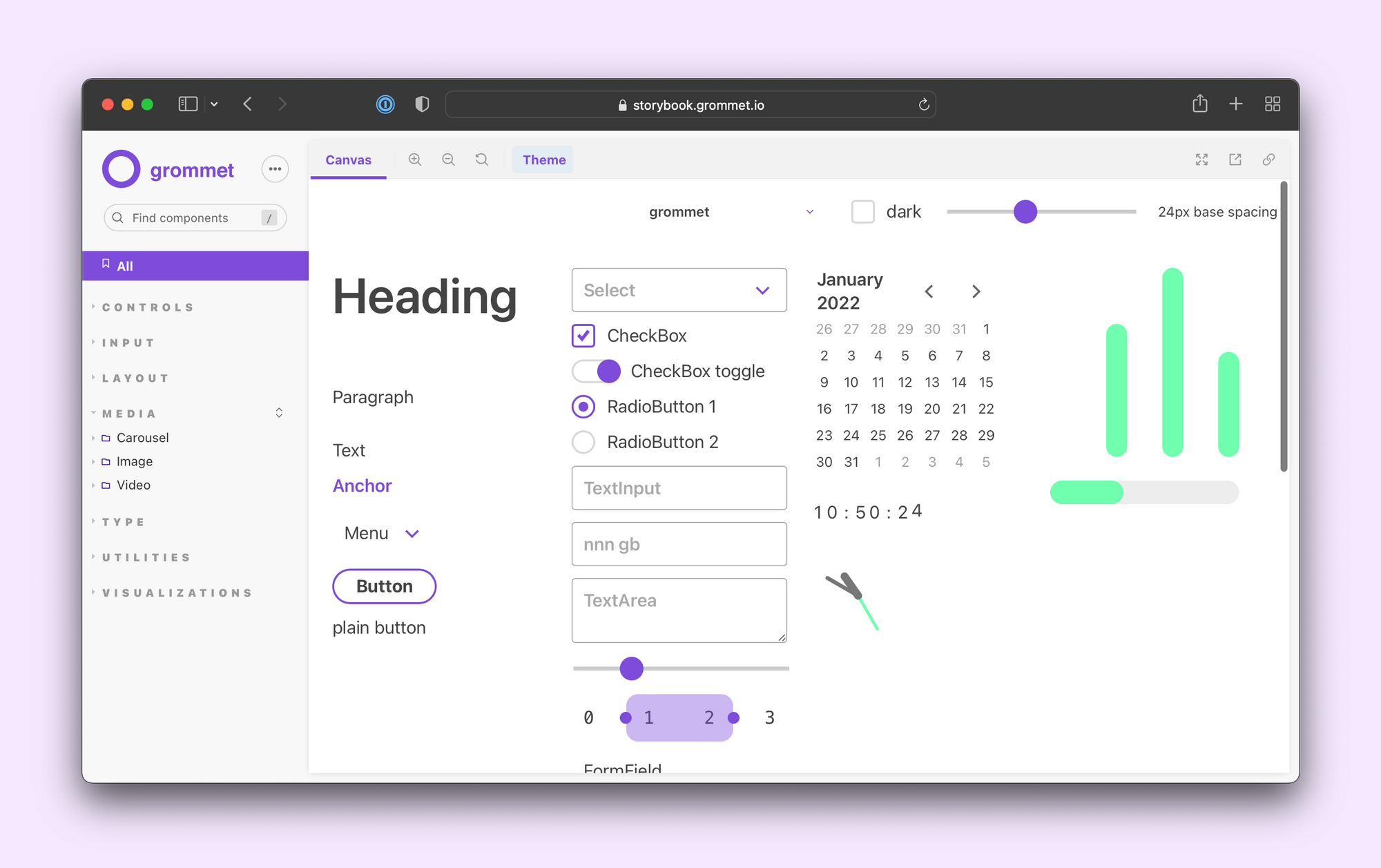
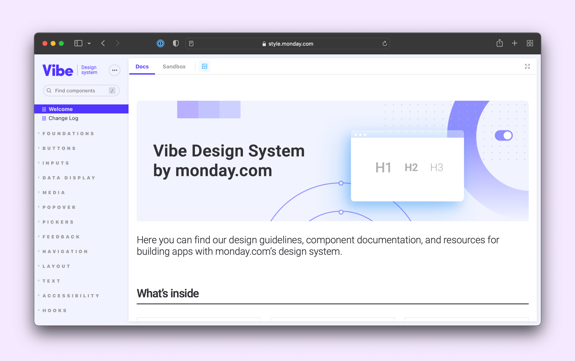
By functionality
Another popular approach is grouping components by their functionality type or role in an app. For example, form controls, buttons, layout utilities, cards or navigation elements.
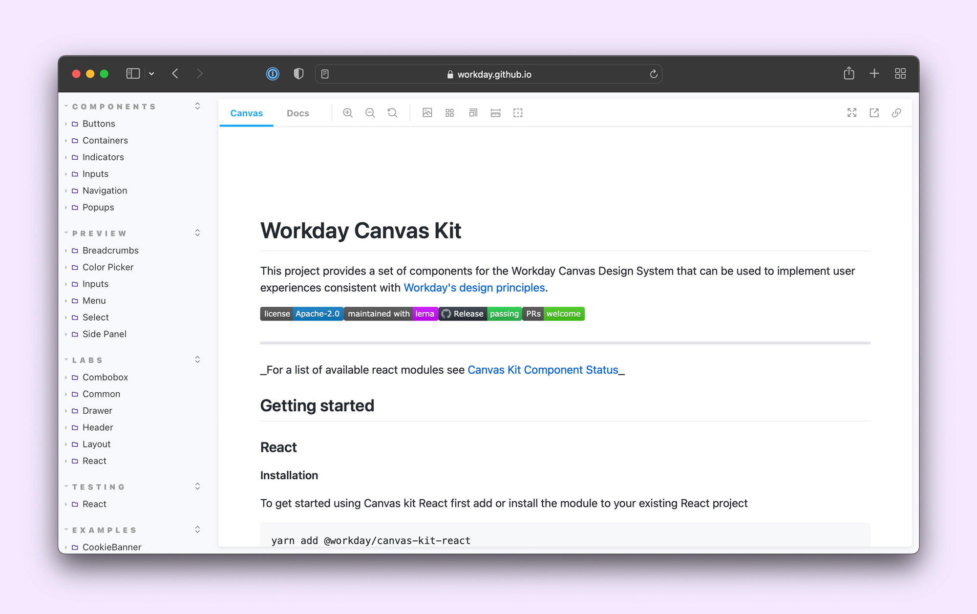
By component status
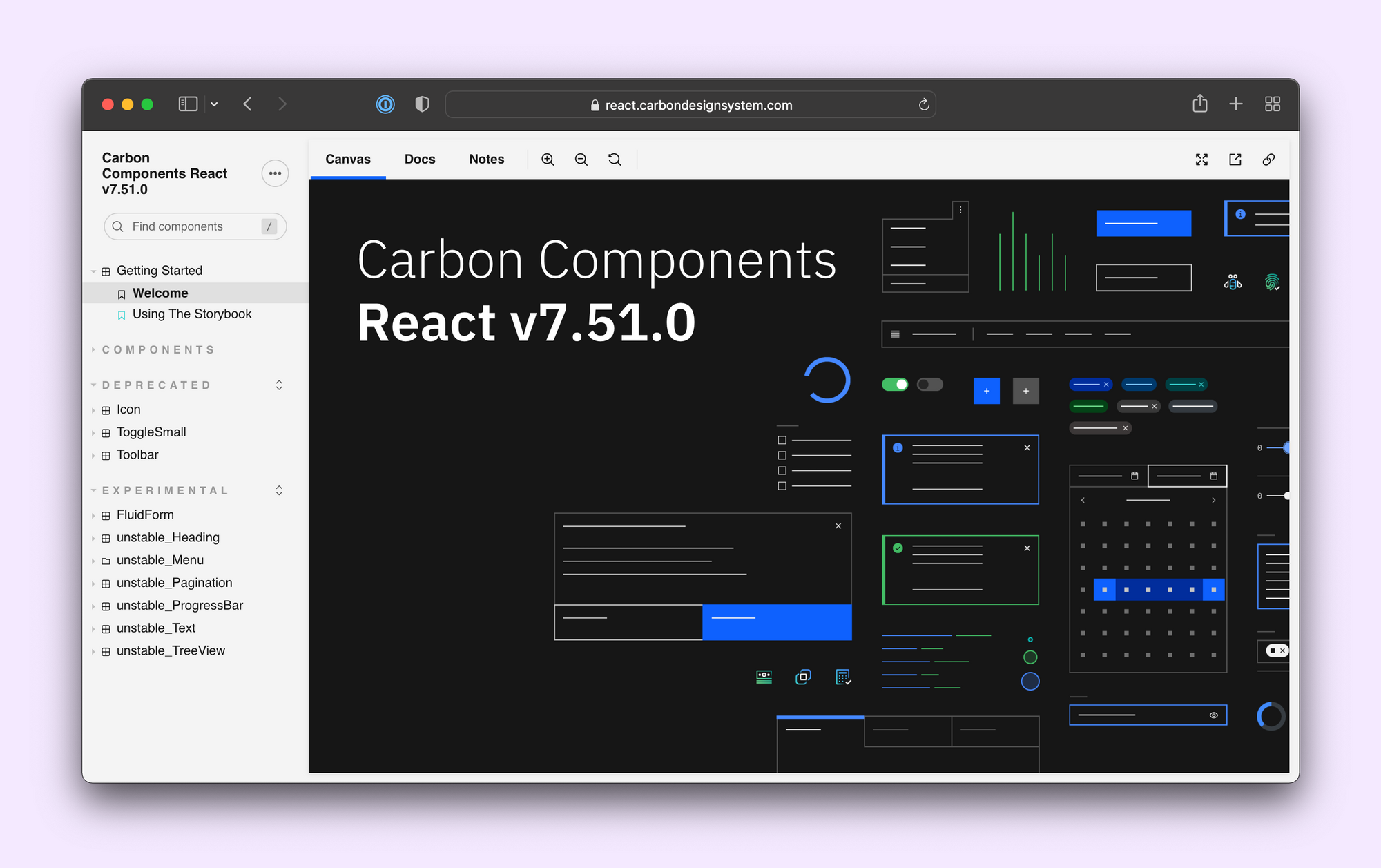
Some teams group their components by status. That is, whether a UI component is ready to be used, experimental, or deprecated.
This strategy works particularly well for design system teams like IBM Carbon and Workday Canvas.
3. Write stories to show what your component does
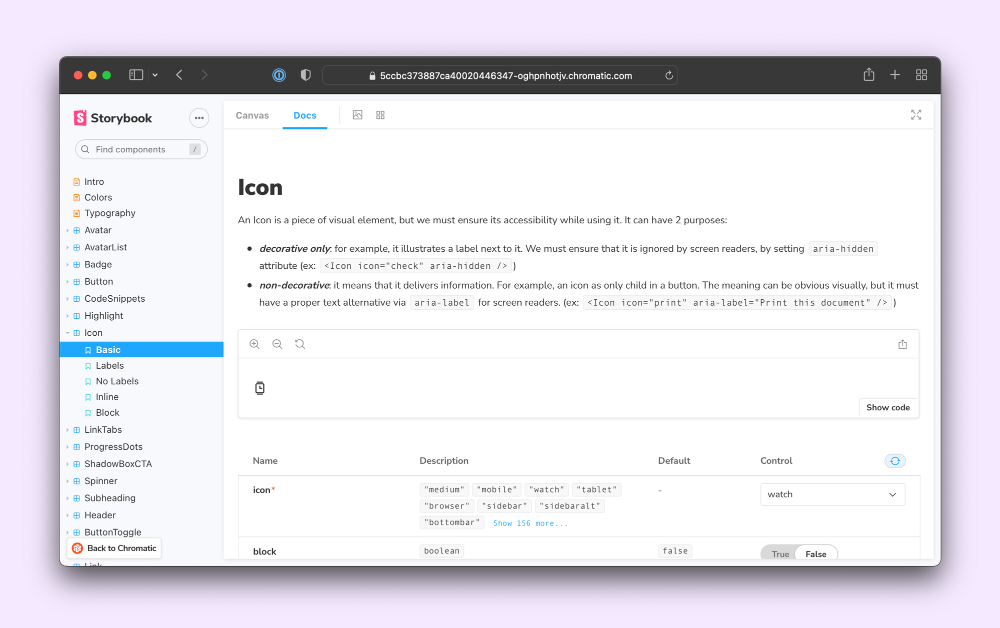
Stories are flexible constructs that enable you to showcase UIs in multiple modalities. There are many types of stories. Some stories help developers, designers and PMs to check if the UI looks right. While others are used for prototyping in the browser without touching code.
Each component’s stories will depend on its use case. For example, an atomic component like an Accordion might warrant an API breakdown that you might not need for a connected component or page.
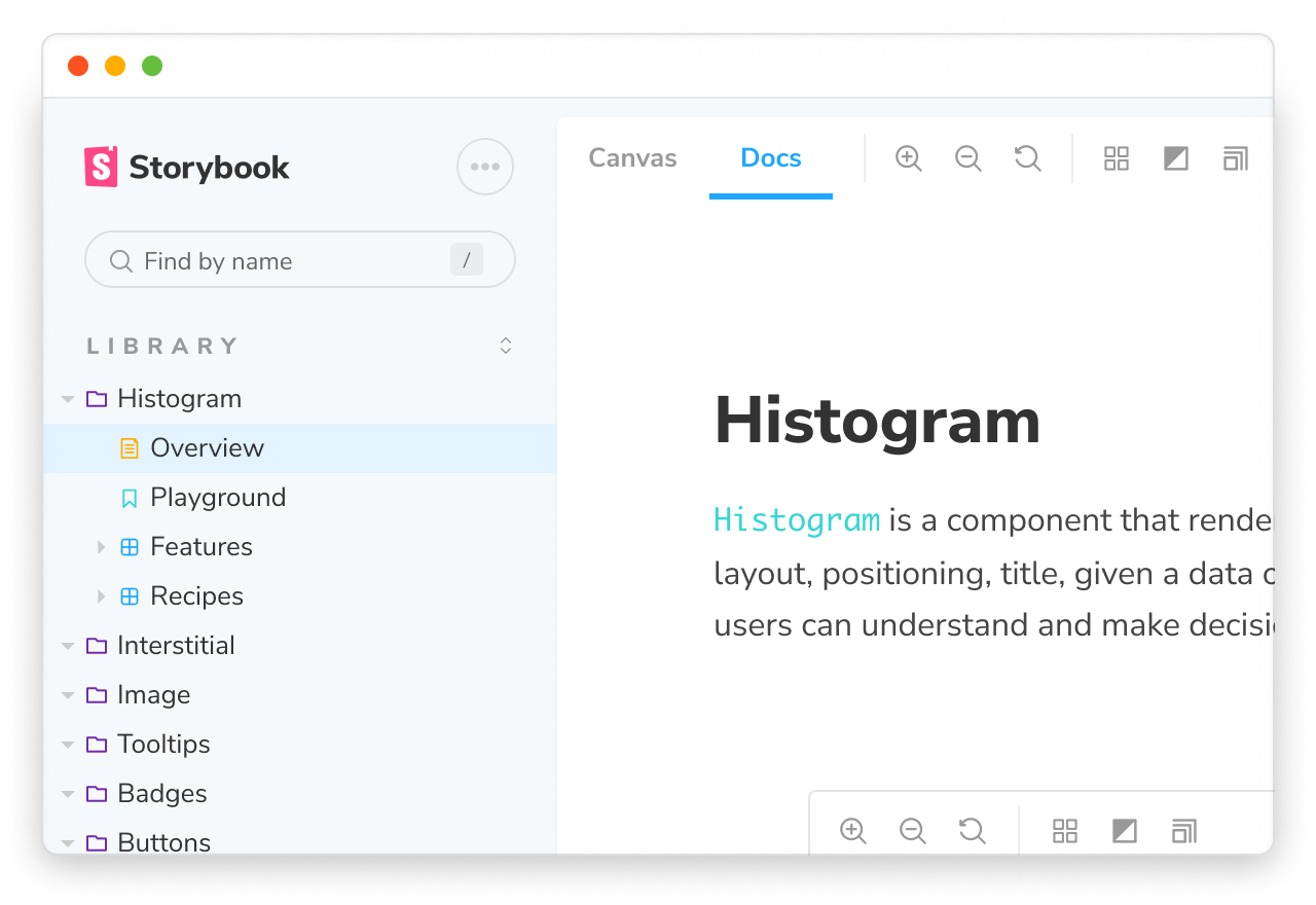
That said, being consistent about how you order your stories for each type of component makes navigation more predictable. The team at Intuit even wrote an article about how consistency improved their UI documentation experience. Let's walk through the different story types.
Overview story
Start with a documentation page explaining what the component does and when to use it. This is also an excellent place to include the design specs, visual guidelines, responsive behaviour, and accessibility do's and don'ts.
Playground story
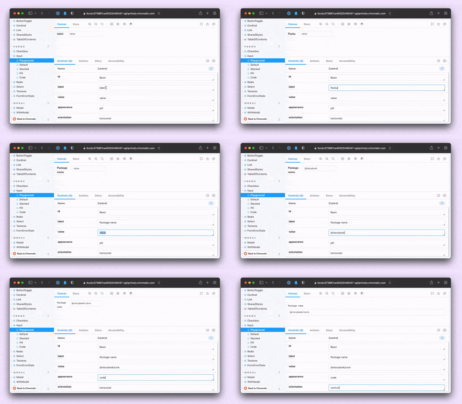
Next is a Playground story, where all the component props are wired up to Storybook controls. This works well for demonstrating the component API and prototyping in the browser.
Feature stories
Feature stories are a set of stories that cover all the states and variants of the component. For JavaScript functions, you often write test cases covering all their use cases. Feature stories play the exact same role for your UI.
What’s more, you can even reuse them as fixtures in testing tools such as Chromatic, Jest or Axe. For more on that, check out the UI Testing Handbook.
When you publish your Storybook, these stories showcase component features using rendered code that users can interact with instead of static images.
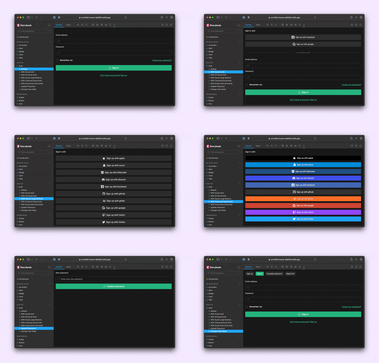
Recipe stories
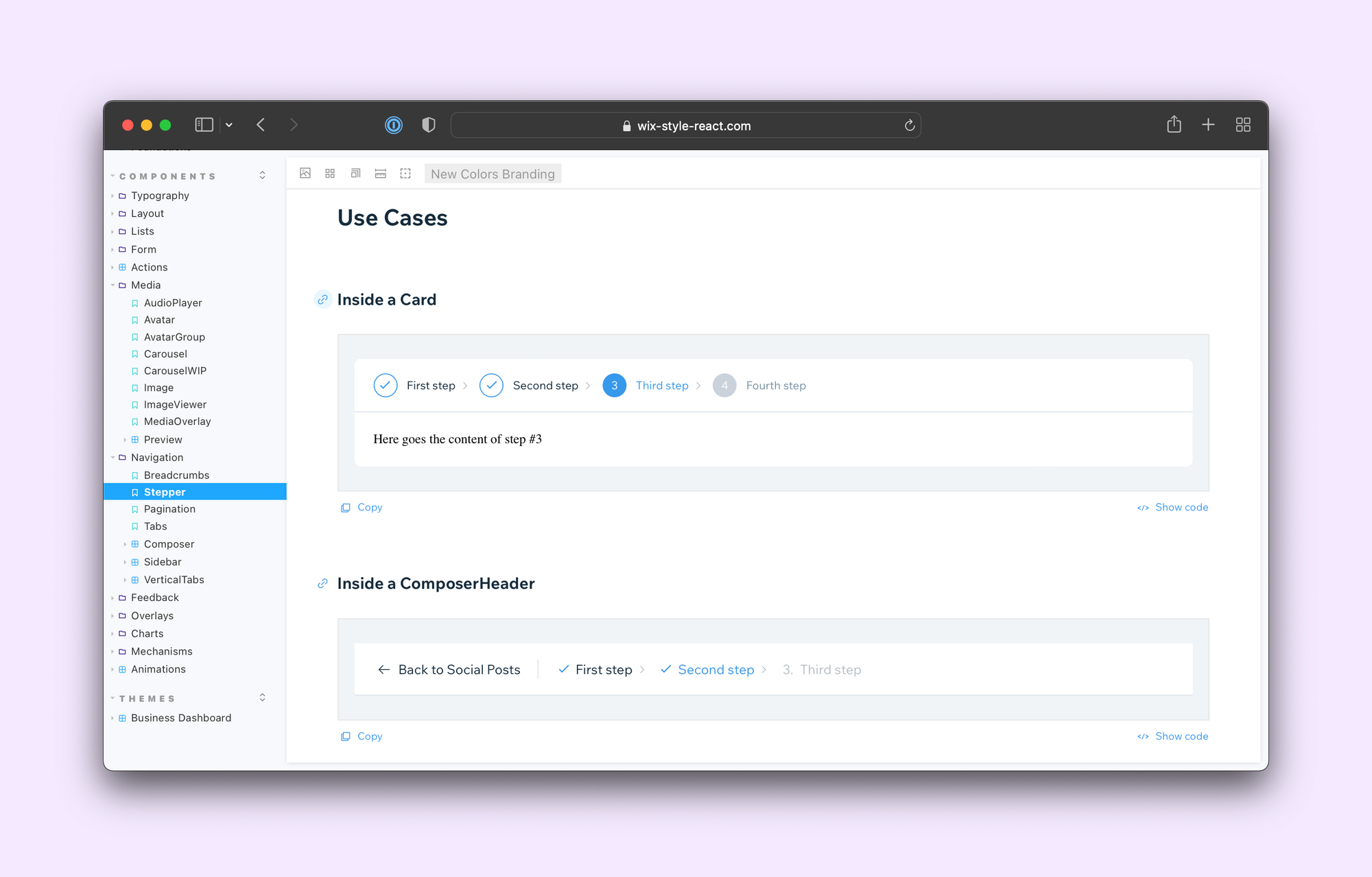
Recipe stories demonstrate how to combine a component with others for real-world scenarios. Similar to an integration test, they show how components work together. For instance, composing an Input with a Label and Buttons to create a form. Or showcasing how different layouts can be constructed using a ProductCard.
Learn from your peers
An app’s directory structure has a major impact on your productivity as a developer. Lack of hierarchy makes it hard to find files and slows you down.
The same is true when it comes to organizing your components and stories. This article shares the best practices I observed from 60 Storybooks. I hope it can be your starting point as you write your own Storybook. For more inspiration, check out the curated list of Storybooks in our docs.
The upcoming Component Encyclopedia has a more exhaustive showcase that you can browse, reference, and learn from. Sign up to the Storybook mailing list below to get Component Encyclopedia updates and early access. Or submit the URL of your own Storybook here.
How are the best Storybooks organized? We surveyed 60 teams to find out.
— Storybook (@storybookjs) February 2, 2022
📑 Use docs pages for intro, usage guides & design tokens
🍱 Use folders to group components and make navigation easier
✍️ Write stories to show what a component does
Read more »https://t.co/Pvy6jlwRRY pic.twitter.com/Pt9XMrPFC4