Styling Addon: configure styles and themes in Storybook
Use the Styling Addon to configure your styling tools and provide themes for your UI components.

How to set up styling tools with Storybook is a common question from the community. There are a ton of articles with instructions, but these aren’t always up to date. That ends up causing you unnecessary headaches and a lot of trial & error.
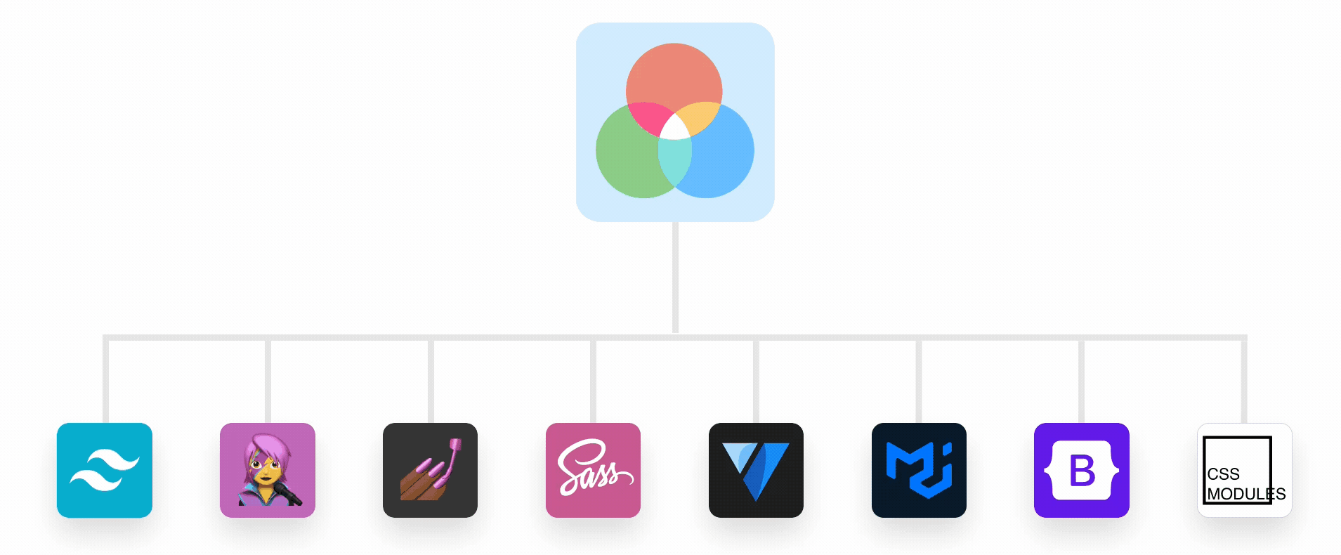
To simplify the setup process for you, we’re introducing the Styling Addon. It’s a framework-agnostic solution that works with Tailwind, Material UI, Chakra, Emotion, Styled-components, SASS, and PostCSS.
- 🌎 Provide global styles
- 🎨 Add theme providers
- 🌗 Switch between themes in a click
- ‼️ Override the theme for a story
Getting started
There are different versions available depending on whether you’re using Storybook 6 or Storybook 7.
# For Storybook 6
yarn add -D @storybook/addon-styling

# For Storybook 7
yarn add -D @storybook/addon-styling@next
Once installed, open up your .storybook/main.js file and add @storybook/addon-styling into the addons array.
module.exports = {
  stories: [
    "../stories/**/*.mdx",
    "../stories/**/*.stories.@(js|jsx|ts|tsx)",
  ],
  addons: [
    "@storybook/addon-essentials",
    "@storybook/addon-styling",
  ],
};
Provide global styles
If your global styles are defined in CSS files, you can import your stylesheets in the .storybook/preview.js file. Storybook will load any files imported here on every story render.
// .storybook/preview.js

import '../src/styles.css'; // Your local styles
import 'bootstrap/dist/css/bootstrap.min.css'; // Styles from node_modules
UI libraries for React (like Material UI) provide their global styles as a React component. To make this component available for your component stories, you can use the included withThemeFromJSXProvider decorator.
// .storybook/preview.js
import { CssBaseline } from "@mui/material";
import { withThemeFromJSXProvider } from "@storybook/addon-styling";

/* snipped for brevity */

export const decorators = [
  withThemeFromJSXProvider({
    GlobalStyles: CssBaseline,
  }),
];
Add theme providers
React libraries often ship with a ThemeProvider component, a wrapper that shares your theme with its children. withThemeFromJSXProvider will take that provider and your theme configuration and wrap all of your stories for you.
// .storybook/preview.js
import { CssBaseline, ThemeProvider } from "@mui/material";
import { withThemeFromJSXProvider } from "@storybook/addon-styling";
import { myCustomTheme } from "../src/theme.js";

/* snipped for brevity */

export const decorators = [
  withThemeFromJSXProvider({
    themes: { myCustomTheme },
    Provider: ThemeProvider,
    GlobalStyles: CssBaseline,
  }),
];
Switch between themes
Users have come to expect multiple themes—such as dark mode and high contrast—for their favourite apps. You’ll need to see how your stories look in each one. The Styling Addon handles this for you! 🎉
When you configure withThemeFromJSXProvider with more than one theme, it will add a dropdown menu to the Storybook toolbar that lets you switch between each theme in a click.
// .storybook/preview.js
import { CssBaseline, ThemeProvider } from "@mui/material";
import { withThemeFromJSXProvider } from "@storybook/addon-styling";
import {
  myCustomTheme,
  myCustomDarkTheme,
  myCustomHighContrastTheme,
} from "../src/theme.js";

/* snipped for brevity */

export const decorators = [
  withThemeFromJSXProvider({
    themes: {
      light: myCustomTheme,
      dark: myCustomDarkTheme,
      highContrast: myCustomHighContrastTheme,
    },
    defaultTheme: "light",
    Provider: ThemeProvider,
    GlobalStyles: CssBaseline,
  }),
];
Not using React or JSX? No problem!
A large portion of Storybook users don’t use JSX or React. If that’s you: don’t worry! We have you covered! The Styling Addon includes two more decorators for folks that change themes based on a parent class or data attribute.
For example, Tailwind lets you activate dark mode when a parent element has the .dark class. In this case, add your theme classes to withThemeFromClassName and choose a default theme to set up the theme selector.
// .storybook/preview.js
import { withThemeByClassName } from "@storybook/addon-styling";

import "../src/tailwind.css";

export const decorators = [
  withThemeByClassName({
    themes: {
      light: "light",
      dark: "dark",
    },
    defaultTheme: "light",
  }),
];
If you’re using a tool like Bootstrap that sets its theme with a data-attribute, you can give withThemeFromDataAttribute your themes, a default theme, and the name of the attribute to set up the theme selector.
// .storybook/preview.js
import { withThemeByDataAttribute } from "@storybook/addon-styling";
import "bootstrap/dist/css/bootstrap.min.css";

export const decorators = [
  withThemeByDataAttribute({
    themes: {
      light: "light",
      dark: "dark",
    },
    defaultTheme: "light",
    attributeName: "data-bs-theme",
  }),
];
Override the theme
If you’re using a tool like Chromatic, you might have snapshots of your stories with different themes applied. To do this, set parameters.theming.themeOverride to the name of the theme you want to be applied for your story.
Configure CSS processing tools
Css processing tools extend the capabilities of CSS so that you can get more out of your styles with less code. That’s why we’ve added options to include Sass and Postcss in your Storybook’s webpack config for you. If you’re using Storybook 7 with Vite or the Next.js framework, this is already handled for you.
Sass
To replace @storybook/preset-sass which is deprecated, the Styling Addon offers configuration options for Sass.
Start by installing a few extra dependencies:
yarn add -D style-loader sass sass-loader resolve-url-loader
Then update the @storybook/addon-styling configuration in .storybook/main.js to include sass:
// .storybook/main.js
module.exports = {
  stories: ["../stories/**/*.mdx", "../stories/**/*.stories.@(js|jsx|ts|tsx)"],
  addons: [
    "@storybook/addon-essentials",
    {
      name: "@storybook/addon-styling",
      options: {
        sass: {
          implementation: require("sass"),
        },
      },
    },
  ],
};
Now you can import your Sass files into .storybook/preview.js.
// .storybook/preview.js

import '../src/styles.scss';
Need a more advanced configuration for Sass? Learn about the full API for options.sass in the addon documentation.
PostCSS
To replace @storybook/preset-postcss, which is deprecated, addon-styling offers configuration options for PostCSS. Update the @storybook/addon-styling configuration in .storybook/main.js to include postCss and it will use the options set in your postcss.config.js file.
// .storybook/main.js
module.exports = {
  stories: ["../stories/**/*.mdx", "../stories/**/*.stories.@(js|jsx|ts|tsx)"],
  addons: [
    "@storybook/addon-essentials",
    {
      name: "@storybook/addon-styling",
      options: {
        postCss: true,
      },
    },
  ],
};
If you need Postcss 8 for Tailwind, make sure to install it, then pass that implementation along in the settings:
// .storybook/main.js
module.exports = {
  stories: ["../stories/**/*.mdx", "../stories/**/*.stories.@(js|jsx|ts|tsx)"],
  addons: [
    "@storybook/addon-essentials",
    {
      name: "@storybook/addon-styling",
      options: {
        postCss: {
          implementation: require("postcss"),
        },
      },
    },
  ],
};
With that configured, you can now import your Tailwind CSS file into .storybook/preview.js and any changes to your code will rebuild your CSS along with your stories.
To learn about the full API for options.postCss, take a look at the addon documentation.
Wrapping up
The Styling Addon simplifies configuring Storybook for all your styling needs, like global styles, theme providers, and CSS processing tools. The addon allows switching between themes and overriding themes for specific stories and the best part is that it’s framework agnostic, helping you to deliver your best work in whichever way you choose!
While this simplifies configuration for your styling tools, we want to make it even easier! Starting with Tailwind, we’re looking to share codemods for the most popular libraries that help set up this configuration automatically for you so that you can get straight to writing your stories.
Are you excited about the Styling Addon? Are there other Storybook integrations you want to see? Tweet at @storybookjs or reach out on the Storybook Discord Server! We can't wait to meet you 🤩
Say goodbye to config headaches!
— Storybook (@storybookjs) March 23, 2023
Our new Styling Addon makes it easy to configure Storybook to work with CSS libraries like @tailwindcss, @MaterialUI & @chakra_ui
🙆 Framework-agnostic
🌎 Handles global styles
🎨 Theme providers, overrides & switcherhttps://t.co/bhBiqwer8g pic.twitter.com/Xj3ITPn6DK