Writing stories in TypeScript
Learn how to type your stories to make them easier to code and more robust

You need to keep a lot of details in your head when developing UI components—prop names, styling, state management, event handlers, etc. By using TypeScript to build your components, you can capture those details better and automate your workflow. Your code editor will type-check your code and offer better autocomplete, saving significant development time and effort.
You get the same improved ergonomics when using TypeScript with Storybook. That's why leading teams such as Microsoft, Github, and Codecademy use TypeScript to write stories.
This article shows you how to write stories with TypeScript. It covers everything from basics to best practices, with code examples for React, Angular, and Vue.
Why write stories in TypeScript?
Writing your stories in TypeScript makes you more productive. You don't have to jump between files to look up component props. Your code editor will alert you about missing required props and even autocomplete prop values. Plus, Storybook infers those component types to auto-generate an ArgsTable.
Using TypeScript also makes your code more robust. When authoring stories, you're replicating how a component will be used within your app. With type checking, you can catch bugs and edge cases as you code.
Storybook has built-in TypeScript support, so you can get started with zero configuration required. Let’s dive into the specifics of typing a story.
Typing stories using Meta and Story utility types
When writing stories, there are two aspects that are helpful to type. The first is the component meta, which describes and configures the component and its stories. In a CSF file, this is the default export. The second is the stories themselves. Storybook provides utility types for each of these, named Meta and Story. Here are some basic examples of how to use those types:
React
// Button.stories.tsx
import * as React from "react";
import { Meta, Story } from "@storybook/react";
import { Button } from "./Button";

export default {
  component: Button,
} as Meta;

export const Primary: Story = (args) => <Button {...args} />;
Primary.args = {
  label: "Button",
  primary: true,
};
For template-based frameworks like Angular and Vue, the shape of the story changes somewhat, but the typing strategy remains the same.
Angular
// Button.stories.ts
import { Meta, moduleMetadata, Story } from "@storybook/angular";
import { CommonModule } from "@angular/common";
import { Button } from "./button.component";

export default {
  component: Button,
  decorators: [
    moduleMetadata({
      declarations: [Button],
      imports: [CommonModule],
    }),
  ],
} as Meta;

export const Primary: Story = (args) => ({
  props: args,
  template: `<app-button></app-button>`,
});
Primary.args = {
  label: "Button",
  primary: true,
};
Vue 3
// Button.stories.ts
import { Meta, Story } from "@storybook/vue3";
import Button from "./Button.vue";

export default {
  component: Button,
} as Meta;

export const Primary: Story = (args) => ({
  components: { Button },
  setup() {
    return { args };
  },
  template: `<Button v-bind="args" />`,
});
Primary.args = {
  primary: true,
  label: "Button",
};
Enabling more specific type checking
Meta and Story types are both generics, so you can provide them with a prop type parameter. By doing so, TypeScript will prevent you from defining an invalid prop, and all decorators, play functions, or loaders will be more fully typed.
// Button.stories.ts
import { Meta, moduleMetadata, Story } from "@storybook/angular";
import { CommonModule } from "@angular/common";
import { Button } from "./button.component";

export default {
  component: Button,
  decorators: [
    moduleMetadata({
      declarations: [Button],
      imports: [CommonModule],
    }),
  ],
} as Meta<Button>;

export const Primary: Story<Button> = (args) => ({
  props: args,
});
Primary.args = {
  label: "Button",
  primary: true,
  size: "xl",
  // ^ TypeScript error: type of `Button` does not contain `size`
};
The above code will show a TypeScript error because Button does not support a size input
Typing a template story function
It is common to extract a template function to share across multiple stories. For example, the story in the snippets above could be written as:
const Template: Story<Button> = (args) => ({
  props: args,
});

export const Primary = Template.bind({});
Primary.args = {
  label: "Primary Button",
  primary: true,
};

export const Secondary = Template.bind({});
Secondary.args = {
  label: "Secondary Button",
  primary: false,
};
In this snippet, the Primary and Secondary stories are cloning the Template function. By enabling the strictBindCallApply TypeScript option, your stories can automatically inherit the type of Template. In other words, you won’t have to redeclare the type on each story. You can enable this option in your tsconfig.
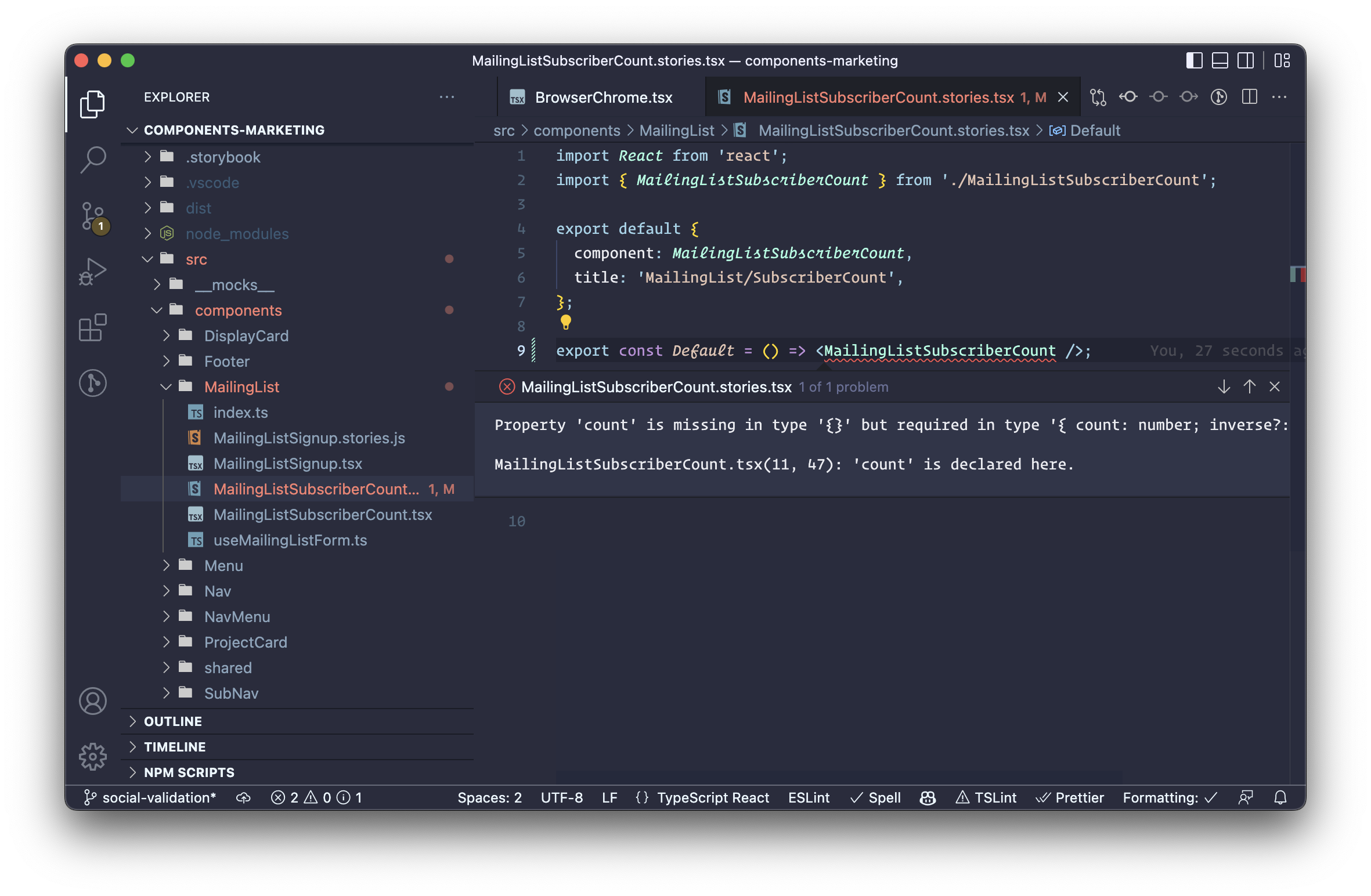
Typing custom args
Sometimes stories need to define args that aren’t included in the component’s props. For example, a List component can contain ListItem components and you may wish to provide a control for the number of ListItems rendered.
For this case, you can use an intersection type to expand what you supply as a type variable for args:
// List.stories.ts
import { Meta, moduleMetadata, Story } from "@storybook/angular";
import { CommonModule } from "@angular/common";
import { List } from "./list.component";
import { ListItem } from "./list-item.component";
export default {
component: List,
subcomponents: { ListItem },
decorators: [
moduleMetadata({
declarations: [List, ListItem],
imports: [CommonModule],
}),
],
} as Meta<List>;
// Expand Story’s type variable with `& { numberOfItems: number }`
export const NumberOfItems: Story<List & { numberOfItems: number }> = ({
numberOfItems,
...args
}) => {
// Generate an array of item labels, with length equal to the numberOfItems
const itemLabels = [...Array(numberOfItems)].map(
(_, index) => `Item ${index + 1}`
);
return {
// Pass the array of item labels to the template
props: { ...args, itemLabels },
// Iterate over those labels to render each ListItem
template: `<app-list>
<div *ngFor="let label of itemLabels">
<app-list-item [label]="label"></app-list-item>
</div>
</app-list>`,
};
};
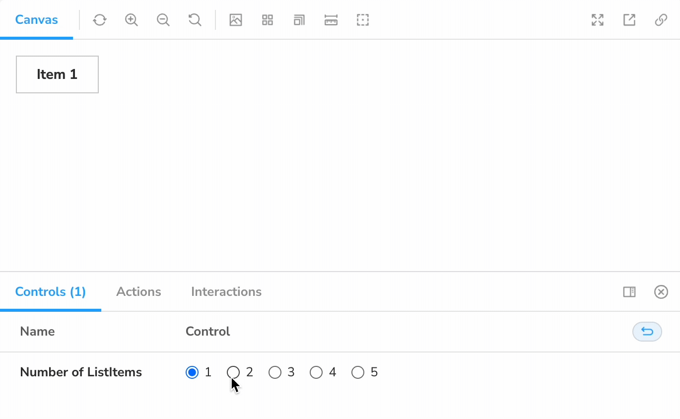
NumberOfItems.args = {
numberOfItems: 1,
};
NumberOfItems.argTypes = {
numberOfItems: {
name: "Number of ListItems",
options: [1, 2, 3, 4, 5],
control: { type: "inline-radio" },
},
};
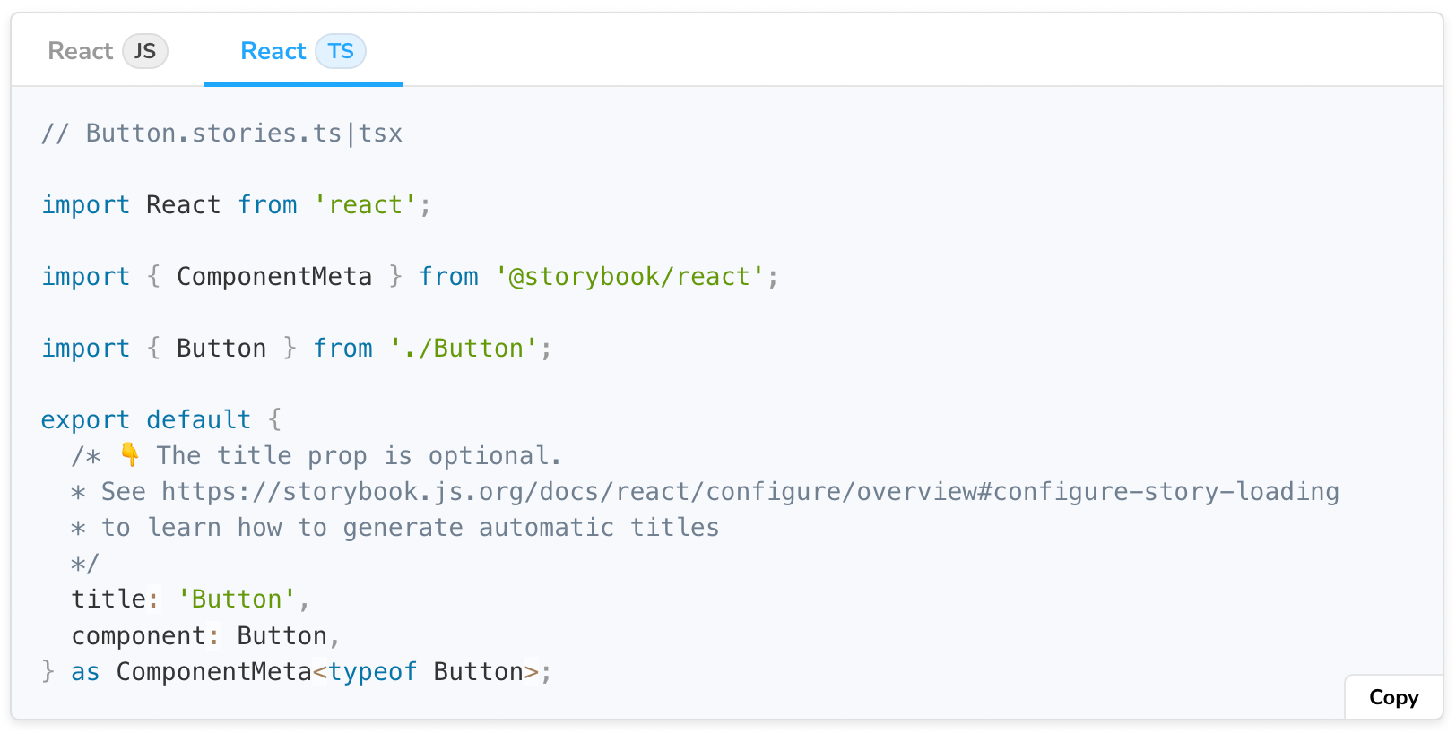
React-specific utility types
React components often don't export a type for their props. For this reason, Storybook for React exposes the ComponentMeta and ComponentStory types. They are equivalent to the Meta and Story generic types but can infer props type from the component itself.
// Button.stories.tsx
import * as React from "react";
import { ComponentMeta, ComponentStory } from "@storybook/react";
import { Button } from "./Button";

export default {
  component: Button,
} as ComponentMeta<typeof Button>;

export const Primary: ComponentStory<typeof Button> = (args) => (
  <Button {...args} />
);
Primary.args = {
  label: "Button",
  primary: true,
};
These utilities use the typeof operator to infer a component's prop types. Therefore, they cannot be used to accommodate custom args, as demonstrated in the previous section.
Instead, you can use the Meta and Story types along with React's ComponentProps utility. For example:
// Button.stories.tsx
import * as React from "react";
import { Meta, Story } from "@storybook/react";
import { Button } from "./Button";

type ButtonProps = React.ComponentProps<typeof Button>;

export default {
  component: Button,
} as Meta<ButtonProps>;

export const WithCustomArg: Story<ButtonProps & { customArg: number }> = (args) => (
  <Button {...args} />
);
Primary.args = {
  label: "Button",
  primary: true,
  customArg: 3,
};
Changes coming in Storybook v7
All of the snippets above are written in the CSF 2 format. Storybook 6.3 introduced CSF 3 as a more compact and composable way to write stories. Here’s the first snippet, rewritten to CSF 3:
// Button.stories.ts
import { Meta, moduleMetadata, StoryObj } from "@storybook/angular";
import { CommonModule } from "@angular/common";
import { Button } from './button.component';

export default {
  component: Button,
  decorators: [
    moduleMetadata({
      declarations: [Button],
      imports: [CommonModule],
    }),
  ],
} as Meta<Button>;

export const Primary: StoryObj<Button> = {
  args: {
    label: "Button",
    primary: true,
  },
};
Note the StoryObj utility type. In Storybook 7.0, CSF 3 will become the default, the StoryObj type will be renamed to Story (to match its default nature), and the type used for CSF 2 will be renamed from Story to StoryFn.
There are also corresponding changes regarding ComponentStoryObj, ComponentStory, and ComponentStoryFn.
Finally, the CSF 3 versions of the types are still generic, accepting a type variable for the component or its args, depending on the type.
The documentation for Storybook 7.0 has already been updated to reflect these changes.
Wrapping up
Writing stories in TypeScript makes it easier to develop more robust components. You gain type safety and error checking, autocomplete suggestions, and more.
Storybook offers zero configuration TypeScript support. You can further customize this setup to better suit your needs. Plus, all code snippets in the Storybook docs are provided in both JavaScript and TypeScript flavors.
If you’d like to continue the discussion, please join us in the #typescript channel in the Storybook Discord. I’ll see you there!
Writing stories in @typescript makes you more productive.
— Storybook (@storybookjs) August 4, 2022
Your IDE catches errors as you code and you get better autocomplete!
Check out our new guide to learn how to type stories. It covers Storybook utility types & best practices for complex stories.https://t.co/HF8pvlqIqQ