
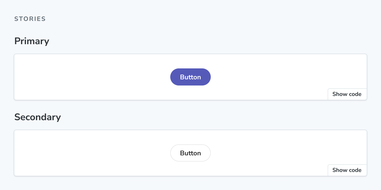
Stories
The Stories block renders the full collection of stories in a stories file.
import { Meta, Stories } from '@storybook/addon-docs/blocks';
import * as ButtonStories from './Button.stories';

<Meta of={ButtonStories} />

<Stories />
Stories
import { Stories } from '@storybook/addon-docs/blocks';Stories is configured with the following props:
includePrimary
Type: boolean
Default: true
Determines if the collection of stories includes the primary (first) story.
Set includePrimary={false} to omit the primary story from the rendered collection. If the primary story is the only story in the file, the Stories block will render nothing.
title
Type: string
Default: 'Stories'
Sets the heading content preceding the collection of stories.