Integrate Tailwind CSS with Storybook
This recipe assumes that you have a React app using Tailwind CSS and have just set up Storybook >=7.0 using the getting started guide. Don’t have this? Follow Tailwind's setup instructions then run:
# Add Storybook:
npm create storybook@latest
1. Configure PostCSS
Tailwind uses PostCSS to compile your CSS. If you are using:
vite@storybook/nextjs@storybook/preset-create-react-appwithreact-scripts@2.0.0@storybook/angular
then you can skip to the next step.
For Webpack users, you'll need to install the @storybook/addon-styling-webpack addon.
Run the following script to install and register the addon:
npx storybook@latest add @storybook/addon-styling-webpackThis will run a configuration script that will walk you through setting up the addon. If prompted, select PostCSS from the configuration options.
Did the configuration script fail?
Under the hood, this command runs npx @storybook/auto-config styling, which is responsible for reading your project and attempting to configure your Storybook Webpack for your desired tools. If running that command directly does not resolve your issue, please consider filing a bug report on the @storybook/auto-config repository so that we can further improve it. For manual configuration instructions for PostCSS, you can refer to the documentation here.
2. Provide Tailwind to stories
Now you can import the tailwind.css file into your .storybook/preview.js file. This will make Tailwind’s style classes available to all of your stories.
// .storybook/preview.js

import '../src/tailwind.css'; // replace with the name of your tailwind css file
2.1. Angular
If you are using Angular, you will need to add the tailwind.css file to your angular.json file instead. This will make sure your styles are processed with PostCSS and are injected into the preview iframe where your stories are rendered.
// angular.json
{
 "storybook": {
    "builder": "@storybook/angular:start-storybook",
    "options": {
      "browserTarget": "my-default-project:build",
      "styles": ["src/tailwind.css"]
    }
  }
}
3. Add a theme switcher tool
Tailwind comes out of the box with a light and dark theme. You can override those themes and add more. To get the most out of your stories, you should have a way to toggle between all of your themes.

First of all, update your tailwind.config.js file to change themes based on a class or data-attribute. This example uses a data-attribute.
// tailwind.config.js

module.exports = {
  content: ['./src/**/*.{js,jsx,ts,tsx}'],
  // Toggle dark-mode based on .dark class or data-mode="dark"
  darkMode: ['class', '[data-mode="dark"]'],
  theme: {
    extend: {},
  },
  plugins: [],
};
Next, install the @storybook/addon-themes addon to provide the switcher tool.
Run the following script to install and register the addon:
npx storybook@latest add @storybook/addon-themesThis will run a configuration script that will walk you through setting up the addon.
Did the configuration script fail?
Under the hood, this runs npx @storybook/auto-config themes, which should read your project and try to configure your Storybook with the correct decorator. If running that command directly does not solve your problem, please file a bug on the @storybook/auto-config repository so that we can further improve it. To manually add this addon, install it, and then add it to the addons array in your .storybook/main.ts.
3.1. Toggle themes by class name
Add the withThemeByClassName decorator to your Storybook from @storybook/addon-themes.
// .storybook/preview.js
import { withThemeByClassName } from '@storybook/addon-themes';

/* snipped for brevity */

export const decorators = [
  withThemeByClassName({
    themes: {
      light: 'light',
      dark: 'dark',
    },
    defaultTheme: 'light',
  }),
];
3.2. Toggle themes by data-attribute
Add the withThemeByDataAttribute decorator to your Storybook from @storybook/addon-themes.
// .storybook/preview.js
import { withThemeByDataAttribute } from '@storybook/addon-themes';

/* snipped for brevity */

export const decorators = [
  withThemeByDataAttribute({
    themes: {
      light: 'light',
      dark: 'dark',
    },
    defaultTheme: 'light',
    attributeName: 'data-mode',
  }),
];
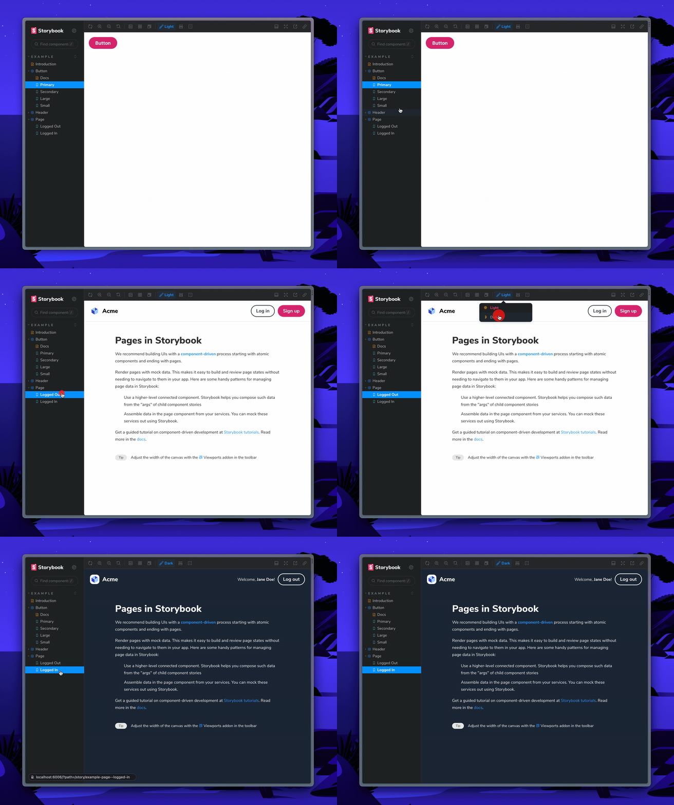
This code will create a new toolbar menu to select your desired theme for your stories.
Get involved
Now you're ready to use Tailwind with Storybook. 🎉
If you use Tailwind at work, we'd love your help making this setup even easier. Join the maintainers in Discord to get involved, or jump into addon docs.
- ShaunEvening