Capgemini DCX React Library
dcx-react-library is a react library with a set of components ready to use in your project. There're plenty of libraries available in react that will help you to increase your productivity however most of them contain a lot of css and are really hard to style based on your project's requirements. dcx-react-library is UI/UX agnostic so you need to provide styling for the look and feel of your preference.

Storybook
npm install @capgeminiuk/dcx-react-library

Button
1
CopyToClipboard
4
Date
7
Details
3
Group
4
Input
5
InputMasked
1
live
1
live
1
live
1
live
1
live
1
live
1
live
1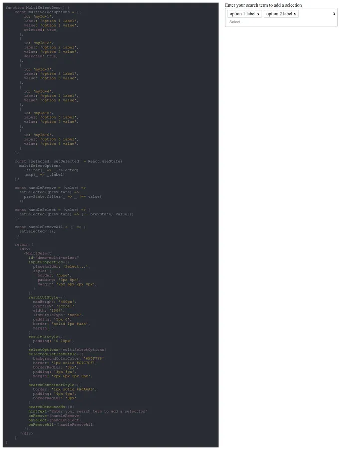
live
1
live
1
live
1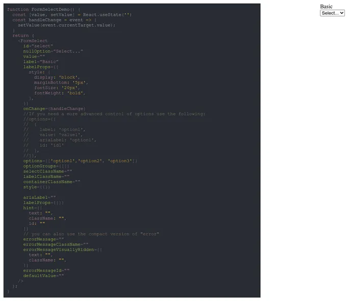
live
1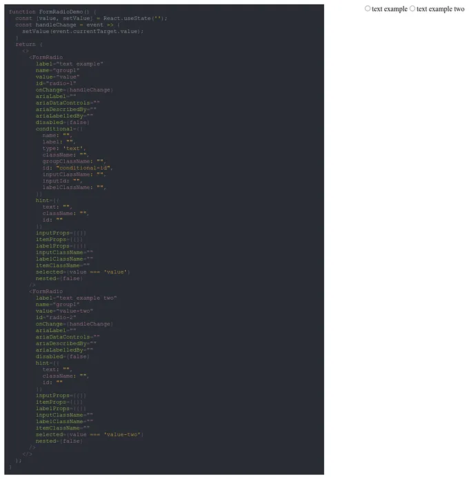
live
1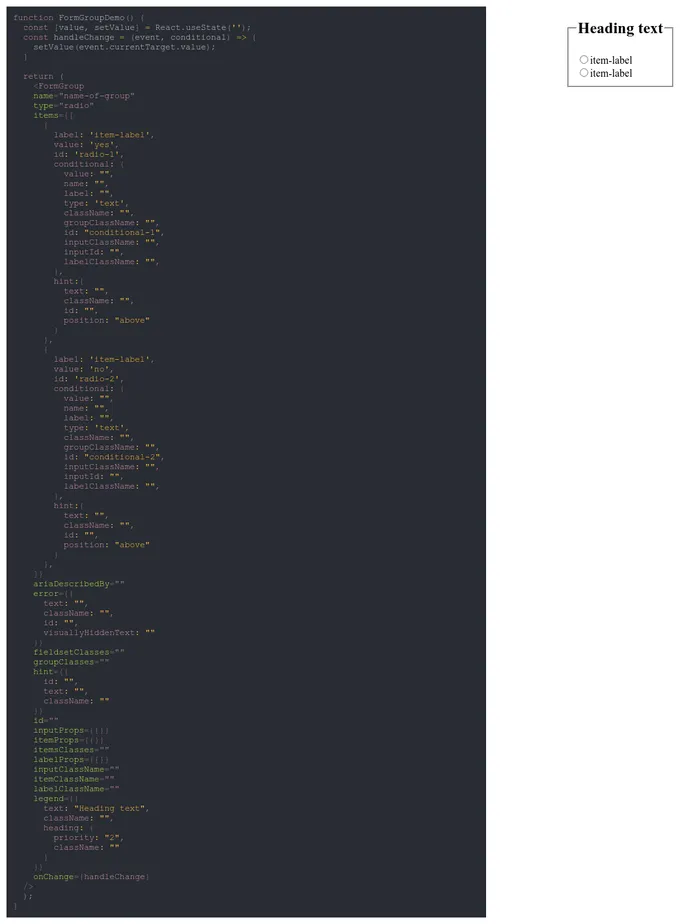
live
1Addons in this project
Docs
Document component usage and properties in Markdown
2.4M
Downloads
- + 2
Controls
Interact with component inputs dynamically in the Storybook UI
2.3M
Downloads
- + 2
Links
Link stories together to build demos and prototypes with your UI components
2.1M
Downloads
- + 2
Accessibility
Test component compliance with web accessibility standards
816k
Downloads
- + 2
Similar projects
Add your project
Design System


Primer React


