
Why Storybook?
The problem
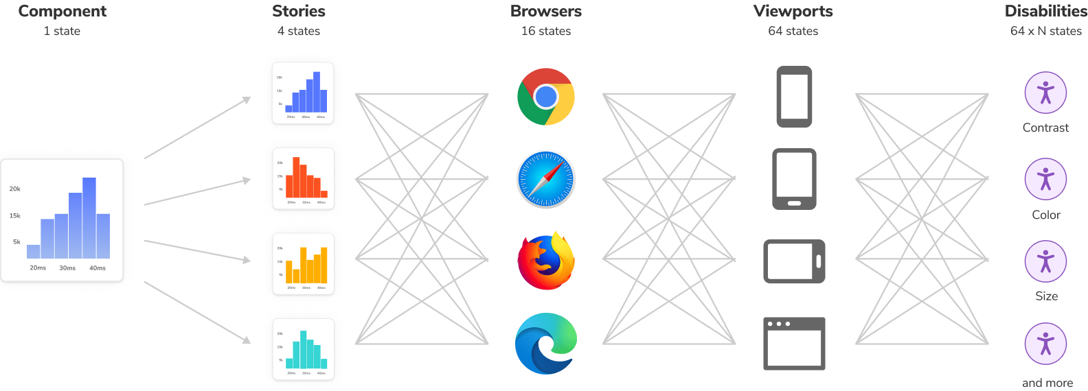
The web’s universality is pushing more complexity into the frontend. It began with responsive web design, which turned every user interface from one to 10, 100, 1000 different user interfaces. Over time, additional requirements piled on like devices, browsers, accessibility, performance, and async states.
Component-driven tools like React, Vue 3, and Angular help break down complex UIs into simple components but they’re not silver bullets. As frontends grow, the number of components swells. Mature projects can contain hundreds of components that yield thousands of discrete variations.
To complicate matters further, those UIs are painful to debug because they’re entangled in business logic, interactive states, and app context.
The breadth of modern frontends overwhelm existing workflows. Developers must consider countless UI variations, yet aren’t equipped to develop or organize them all. You end up in a situation where UIs are tougher to build, less satisfying to work on, and brittle.
The solution
Build UIs in isolation
Every piece of UI is now a component. The superpower of components is that you don't need to spin up the whole app just to see how they render. You can render a specific variation in isolation by passing in props, mocking data, or faking events.
Storybook is packaged as a small, development-only, workshop that lives alongside your app. It provides an isolated iframe to render components without interference from app business logic and context. That helps you focus development on each variation of a component, even the hard-to-reach edge cases.
Capture UI variations as “stories”
When developing a component variation in isolation, save it as a story. Stories are a declarative syntax for supplying props and mock data to simulate component variations. Each component can have multiple stories. Each story allows you to demonstrate a specific variation of that component to verify appearance and behavior.
You write stories for granular UI component variation and then use those stories in development, testing, and documentation.
// Replace your-framework with the framework you are using, e.g. react-vite, nextjs, nextjs-vite, etc.
import type { Meta, StoryObj } from '@storybook/your-framework';

import { Histogram } from './Histogram';

const meta = {
  component: Histogram,
} satisfies Meta<typeof Histogram>;

export default meta;
type Story = StoryObj<typeof meta>;

export const Basic: Story = {
  args: {
    dataType: 'latency',
    showHistogramLabels: true,
    histogramAccentColor: '#1EA7FD',
    label: 'Latency distribution',
  },
};
Storybook keeps track of every story
Storybook is an interactive directory of your UI components and their stories. In the past, you'd have to spin up the app, navigate to a page, and contort the UI into the right state. This is a huge waste of time and bogs down frontend development. With Storybook, you can skip all those steps and jump straight to working on a UI component in a specific state.
Where does Storybook fit into my project?
Storybook is packaged as a small, development-only, workshop that lives alongside your app. Install it by running a command.
During development, run it in a separate node process. If you’re working on UI in isolation, the only thing you’ll need to run is Storybook.
Does Storybook work with my favorite libraries?
Storybook aims to integrate with industry-standard tools and platforms to simplify setup. Thanks to our ambitious developer community, we’ve made significant progress. There are hundreds of addons and tutorials that walk through how to set up Storybook in all types of projects.
If you’re using a niche framework or a recently launched tool, we might not have an integration for it yet. Consider creating a proof of concept yourself first to lead the way for the rest of the community.
What’s the recommended Storybook workflow?
Every team is different and so is their workflow. Storybook is designed to be incrementally adoptable. Teams can gradually try features to see what works best for them.
Most community members choose a Component-Driven workflow. UIs are developed in isolation from the “bottom up” starting with basic components then progressively combined to assemble pages.
- Build each component in isolation and write stories for its variations.
- Compose small components together to enable more complex functionality.
- Assemble pages by combining composite components.
- Integrate pages into your project by hooking up data and business logic.
Benefits
When you write stories for components, you get a bunch of additional benefits for free.
📝 Develop UIs that are more durable
Isolate components and pages and track their use cases as stories. Verify hard-to-reach edge cases of UI. Use addons to mock everything a component needs—context, API requests, device features, etc.
✅ Test UIs with less effort and no flakes
Stories are a pragmatic, reproducible way of tracking UI states. Use them to spot-test the UI during development. Storybook offers built-in workflows for automated Interaction, Accessibility, and Visual testing. Or use stories as test cases by importing them into other JavaScript testing tools.
📚 Document UI for your team to reuse
Storybook is the single source of truth for your UI. Stories index all your components and their various states, making it easy for your team to find and reuse existing UI patterns. Storybook also auto-generates documentation from those stories.
📤 Share how the UI actually works
Stories show how UIs actually work, not just a picture of how they're supposed to work. That keeps everyone aligned on what's currently in production. Publish Storybook to get sign-off from teammates. Or embed them in wikis, Markdown, and Figma to streamline collaboration.
🚦Automate UI workflows
Storybook is compatible with your continuous integration workflow. Add it as a CI step to automate user interface testing, review implementation with teammates, and get signoff from stakeholders.
Write stories once, reuse everywhere
Storybook is powered by Component Story Format, an open standard based on JavaScript ES6 modules. This enables stories to interoperate between development, testing, and design tools. Each story is exported as a JavaScript function enabling you to reuse it with other tools. No vendor lock-in.
Reuse stories with Jest or Vitest and Testing Library to verify interactions. Put them in Chromatic for visual testing. Audit story accessibility with Axe. Or test user flows with Playwright and Cypress. Reuse unlocks more workflows at no extra cost.
Storybook is purpose-built to help you develop complex UIs faster with greater durability and lower maintenance. It’s used by 100s of leading companies and thousands of developers.