Shopify Polaris React
Shopify’s design system to help us work together to build a great experience for all of our merchants.

- + 25
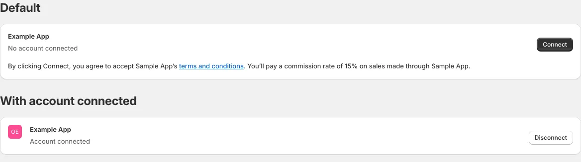
AccountConnection
3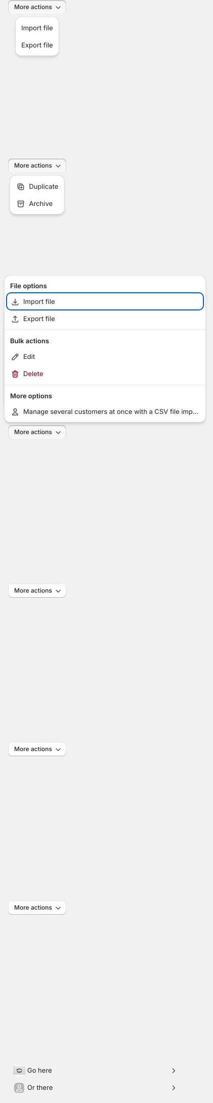
ActionList
10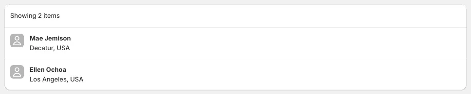
AppProvider
3
Autocomplete
9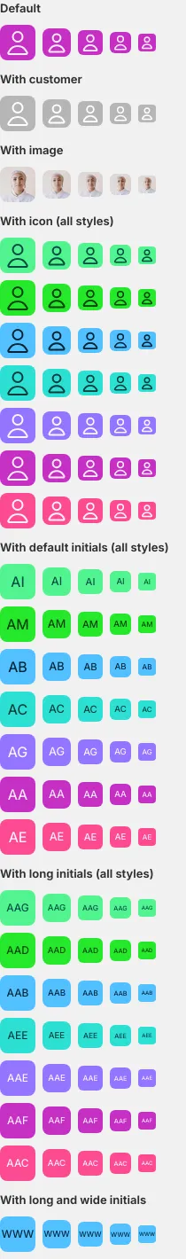
Avatar
7
Badge
13
Banner
15
Bleed
6
BlockStack
12
Box
6
BulkActions
2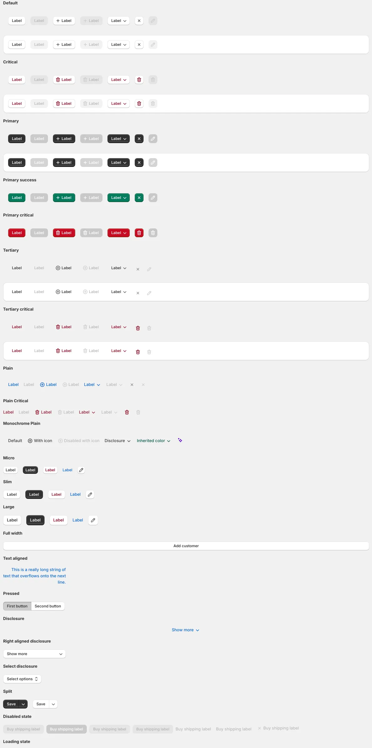
Button
24
ButtonGroup
5
CalloutCard
5
Card
22
Checkbox
6
ChoiceList
7
Collapsible
4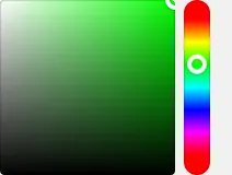
ColorPicker
4
Combobox
7Addons in this project
Similar projects
Add your projectAnyVisionUI Components
UI Components


Design System


Palmetto Components


Narmi Design System
