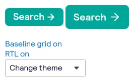
Sass button components
48 buttons are styled using Sass. A button is a clickable interactive element that triggers a response. You can place text and icons inside of a button. Buttons are often used for form submissions and to toggle elements into view. Sass is a styling format that is compiled into CSS. It extends CSS with advanced features like scripting, mixins, and nesting. Sass is used to style 16 projects.
48components205storiesLast updated 8 days ago

button

Button


