New
Storybook 7.6Visual test with Chromatic
Star81,120
Back to glossary
Add your project

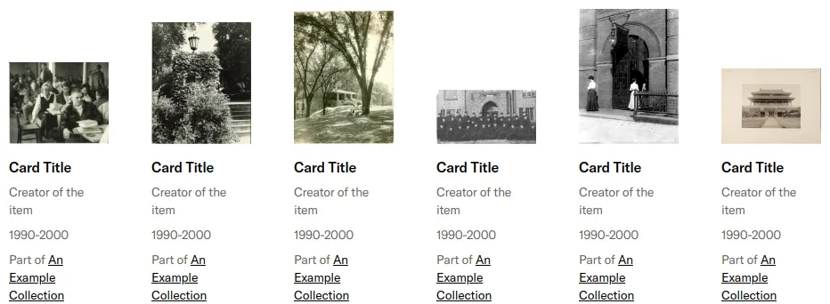
React card components

69 cards are developed with React. A card is a content container that represents a single object and related actions. For example, an article or task. React is the most popular frontend library for developing component-driven user interfaces. It’s used for developing single page, mobile, and server-rendered applications. React is used to develop 71 projects.

69components367storiesLast updated yesterday
Tweet
Add your component
Product Card
PetSmart
23
Image Card
JSTOR
14
Card
kiwicom
13
Circular Progress Indicator
Natura Cosmeticos
13
ResultItemCard
Spaziodati
12
MediaCard
Shopify
9
Card
Microsoft
8
bpk-component-accordion
Skyscanner
9
Select Card
SpaceONE
9
Card
Grafana
8
GridCard
Spaziodati
8
List Card
SpaceONE
8
SLDSCard
Salesforce
7
PictureCard
kiwicom
7
chart-legend
GitLab
6
Hero Card
Culture Amp
6
Card
Shopify
5