New
Automatic visual tests in Storybook, plus 2.2x faster build times for React+TSVisual test with Chromatic
Star80,420
Back to glossary
Add your project

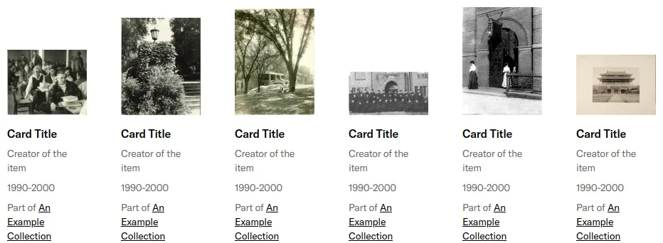
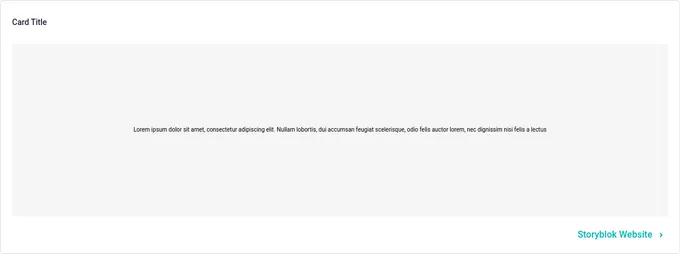
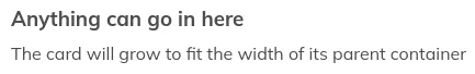
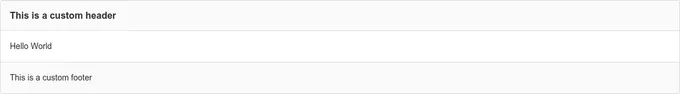
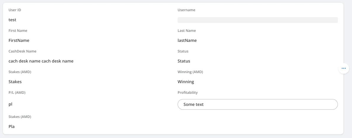
Sass card components

21 cards are styled using Sass. A card is a content container that represents a single object and related actions. For example, an article or task. Sass is a styling format that is compiled into CSS. It extends CSS with advanced features like scripting, mixins, and nesting. Sass is used to style 19 projects.

21components146storiesLast updated yesterday
Tweet
Add your component
Product Card
PetSmart
23
MediaCard
Shopify
9
bpk-component-accordion
Skyscanner
9
Select Card
SpaceONE
9
Card
Grafana
8
List Card
SpaceONE
8
chart-legend
GitLab
6
Card
Shopify
5
Card
Narmi
6
bpk-component-card
Skyscanner
6
Card
SpaceONE
6
CalloutCard
Shopify
4
SbCard
Storyblok
4
Card
WFP
3
Card
PetSmart
2
ContentCard
Narmi
2
Card Item
SpaceONE
2
card
GitLab
1