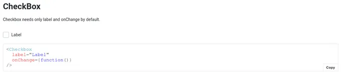
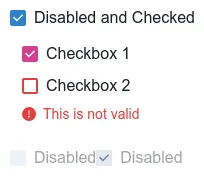
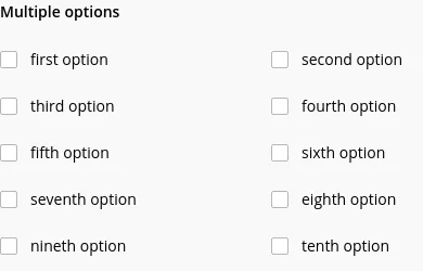
Emotion checkbox components
16 checkboxes are styled using Emotion. An a checkbox is a square box that can be activated or deactivated when ticked. Use checkboxes to select one or more options from a list of choices. Emotion is a styling library that allows you to write styles in JavaScript. This technique is known as CSS-in-JS. When you write CSS alongside your JavaScript component files, you’re naturally encouraged to scope styling at the component level. Emotion is used to style 13 projects.
16components77storiesLast updated 8 days ago