Sass checkbox components
17 checkboxes are styled using Sass. An a checkbox is a square box that can be activated or deactivated when ticked. Use checkboxes to select one or more options from a list of choices. Sass is a styling format that is compiled into CSS. It extends CSS with advanced features like scripting, mixins, and nesting. Sass is used to style 16 projects.
17components61storiesLast updated 8 days ago
bpk-component-checkbox


Checkbox

Checkbox

Checkbox


Checkbox

Checkbox


Checkbox


Checkbox

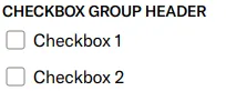
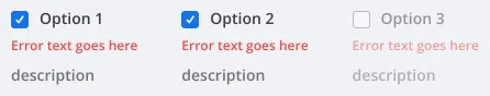
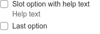
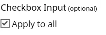
Checkbox Group

SbCheckbox

Checkbox

CheckboxGroup

form checkbox

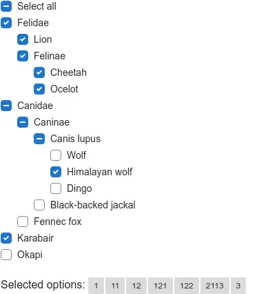
form-checkbox-tree
InputCheckBox

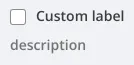
Checkbox
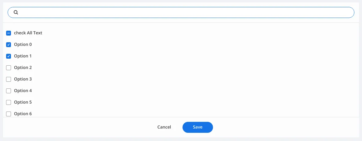
CheckboxGroupWithSearch