Docs
Addons
Showcase
Blog
Visual Test
Enterprise
86,825
Search docs
⌃
K
Back to glossary
Add your project
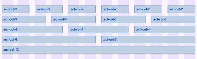
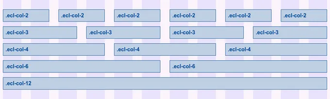
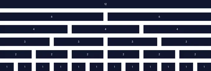
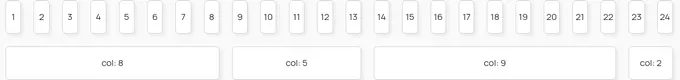
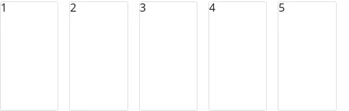
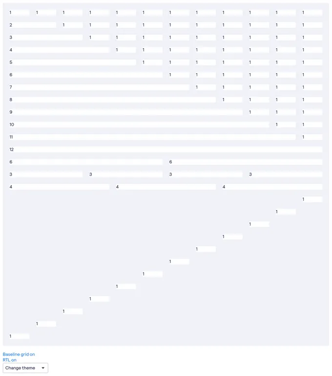
Grid components
Grid is a container used to build layouts that align to a user-defined system of columns and rows.
36
components
162
stories
Last updated 3 years ago
Copy link
Tweet
Other Names
Layout
All frameworks
All CSS
Open source
Add your component
Popular
GridForm
Codecademy
21
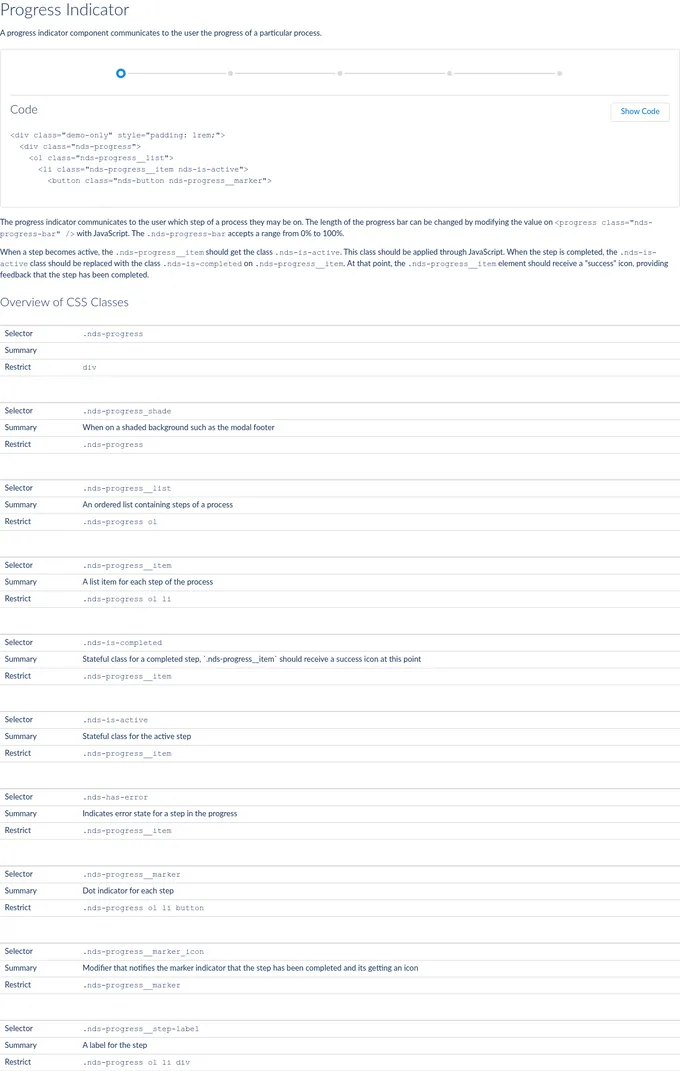
Circular Progress Indicator
Natura Cosmeticos
13
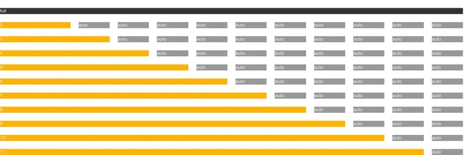
Grid
Carbon Design System
10
SLDSProgressIndicator
Salesforce
9
Linear Progress Indicator
Natura Cosmeticos
9
Grid
EU
6
Grid
EU European Commission
6
Progress Wizard
SpaceONE
6
SimpleGrid
Chakra
4
Grid
AppNexus
5
progress-indicator
SalesForce
6
LayoutGrid
Codecademy
5
GridLayout
Telefonica
5
GridItem
Natura Cosmeticos
5
Grid
Melishev
5
Grid Layout
SpaceONE
5
bpk-component-grid
Skyscanner
4
Grid
Scaleway
4
Grid
Bedrock
4
Image Grids
Think Company
4
Load more components
Related tags
Flex