Styled Components icon components
16 icons are styled using Styled components. An icon is a visual symbol that indicates the purpose of an interface element. It’s used to represent ideas, content types, and actions. Styled-components is a styling library that allows you to write styles in JavaScript at the component-level. This technique is known as CSS-in-JS. Styled components is used to style 8 projects.
16components23storiesLast updated 8 days ago

Icon


IconButton


Icon

IconButton
Icon label


Icon plain

Item with icon

Email with icon

Icon

SegmentedControl.IconButton

IconImportant

Design component API

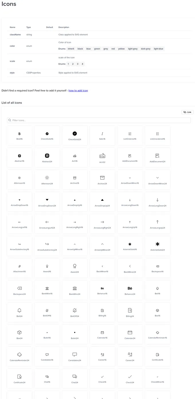
Icons
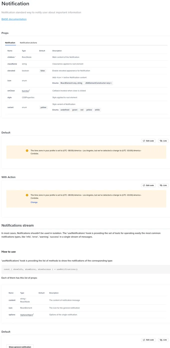
Notification
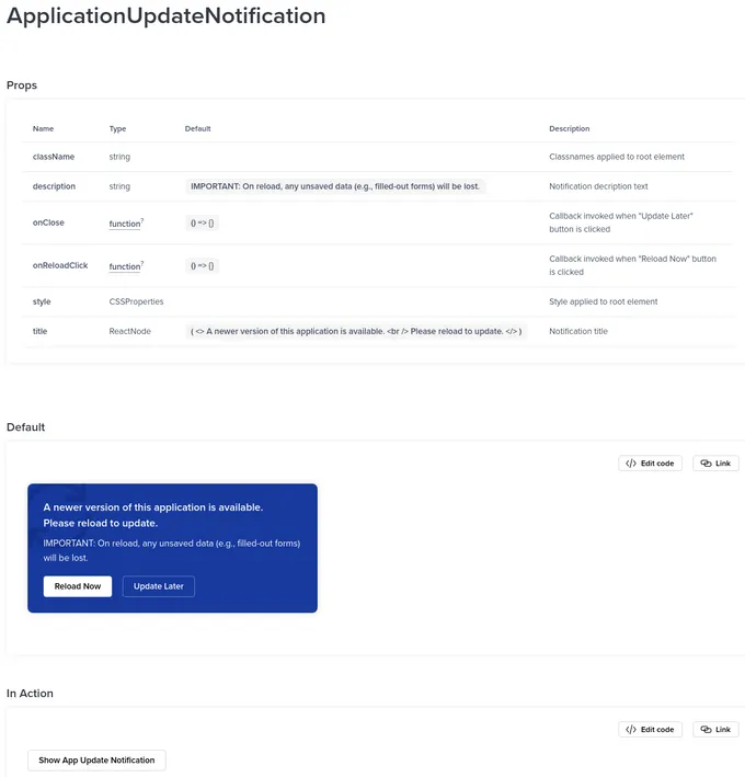
ApplicationUpdateNotification
Introduction