Sass menu components
21 menus are styled using Sass. A menu is an interactive list of options that a user can choose. The options are hidden by default and revealed when a user interacts with an element. Menu is often used to show actions or navigation. It’s different from Select because it’s not a form input. Sass is a styling format that is compiled into CSS. It extends CSS with advanced features like scripting, mixins, and nesting. Sass is used to style 16 projects.
21components131storiesLast updated 3 years ago
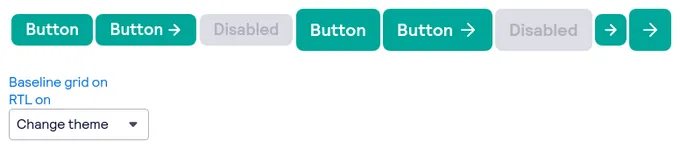
bpk-component-button

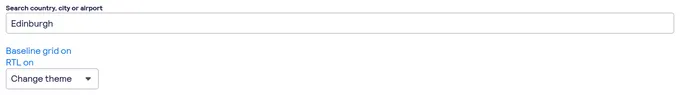
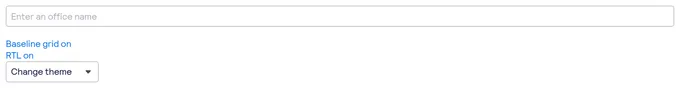
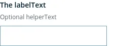
bpk-component-input
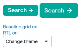
bpk-component-loading-button
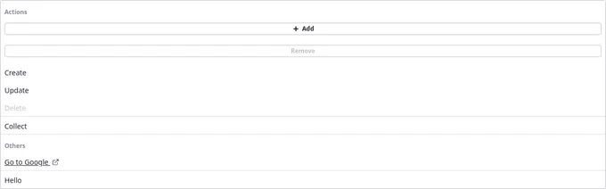
Context Menu

bpk-component-autosuggest
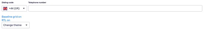
bpk-component-phone-input
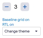
bpk-component-nudger

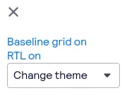
Menu

Context Menu Item
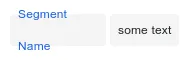
SegmentInput

NumberInput


NumberInput


OverflowMenu
bpk-component-blockquote
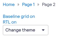
bpk-component-breadcrumb

ContextMenu
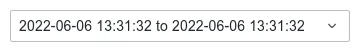
TimeRangeInput
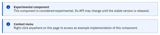
ContextMenu

animated-number

bpk-component-close-button