Sass modal components
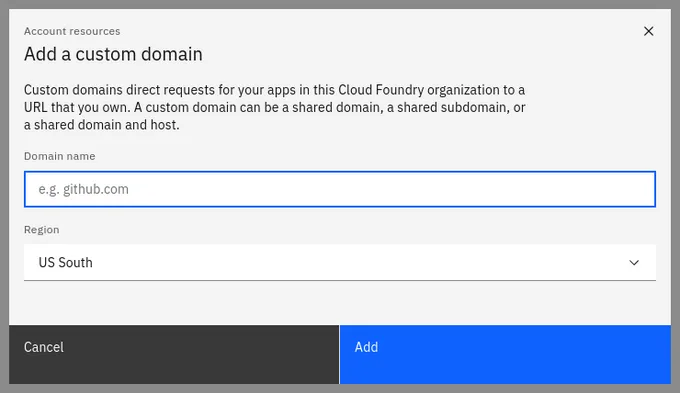
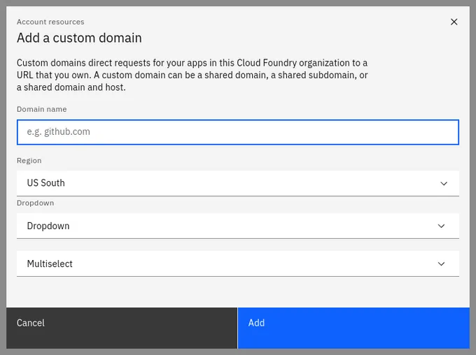
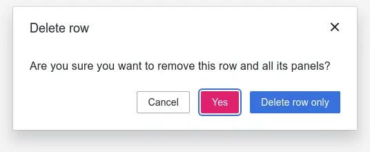
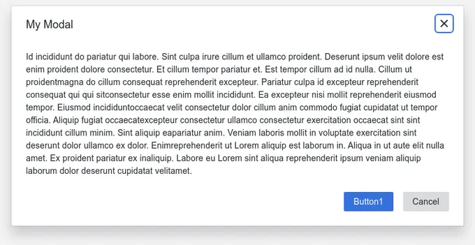
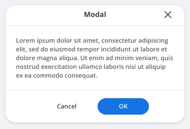
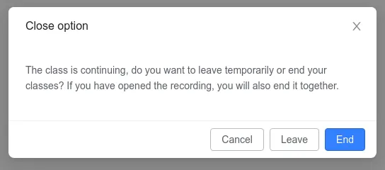
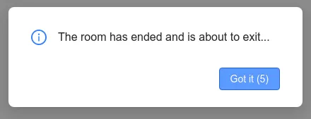
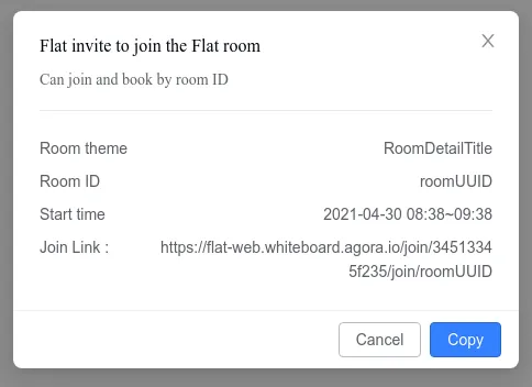
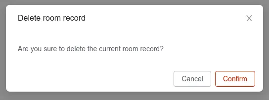
25 modals are styled using Sass. A modal is a full screen overlay that sits atop the page content. It’s used to focus attention on an important task or message and requires user input to be dismissed. Sass is a styling format that is compiled into CSS. It extends CSS with advanced features like scripting, mixins, and nesting. Sass is used to style 16 projects.
25components77storiesLast updated 15 days ago
Other Names

ModalWrapper

Modal
