Progress components
Progress is a visual indicator that shows the users progress through a series of steps. It’s often used to keep the user focussed toward completing a task.
82components317storiesLast updated 4 months ago

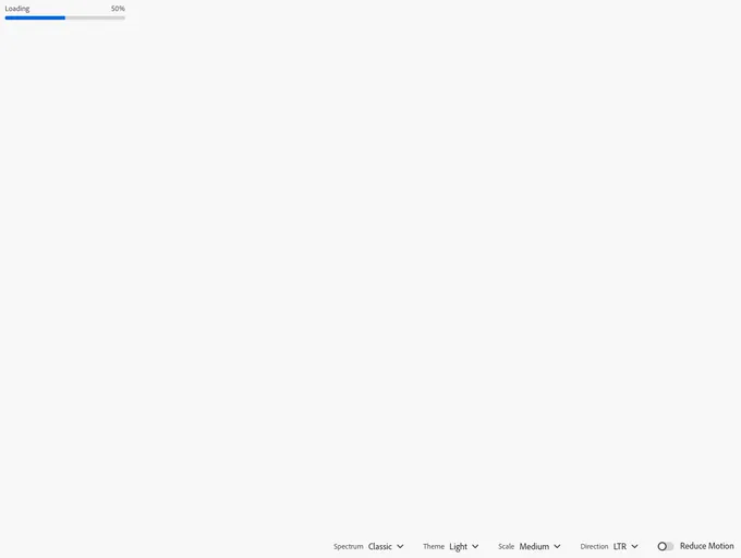
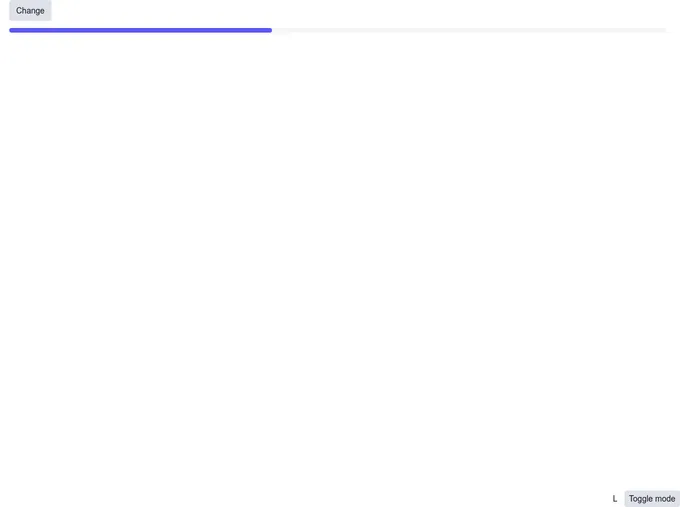
LinearProgress


Progress


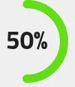
Circular Progress Indicator

GaugeProgress

SLDSProgressIndicator

Progress Bar


Linear Progress Indicator

ProgressBar


ProgressCircle

LinearProgressSimple

SLDSProgressRing

ProgressLinear


Progress Indicator

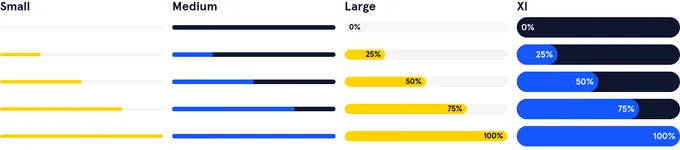
ProgressBar


Progress


SLDSProgressBar

CreationProgress

Progress

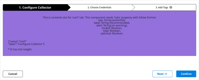
Progress Wizard


ProgressRadial