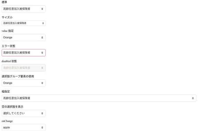
Styled Components select components
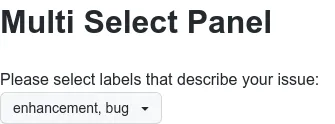
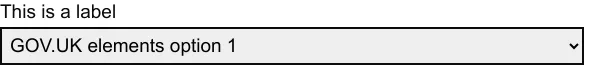
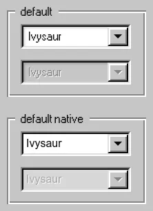
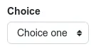
10 selects are styled using Styled components. A select is a type of input that allows users to choose one or more options from a list of choices. The options are hidden by default and revealed when a user interacts with an element. It shows the currently selected option in its default collapsed state. Styled-components is a styling library that allows you to write styles in JavaScript at the component-level. This technique is known as CSS-in-JS. Styled components is used to style 8 projects.
10components23storiesLast updated 8 days ago