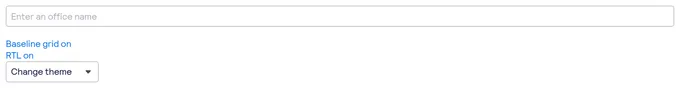
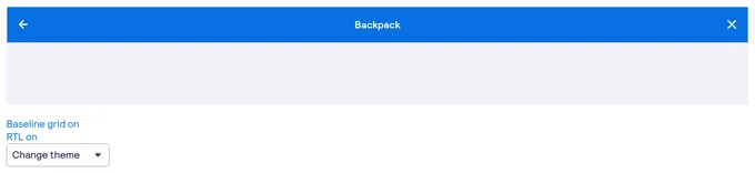
React tag components
103 tags are developed with React. A tag is a compact label that appears beside a primary interface area which is used to represent status or metadata for that area. React is the most popular frontend library for developing component-driven user interfaces. It’s used for developing single page, mobile, and server-rendered applications. React is used to develop 65 projects.
103components368storiesLast updated 8 days ago

ColoredTag


Tag
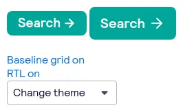
bpk-component-loading-button

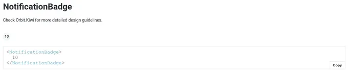
NotificationBadge

bpk-component-badge

bpk-component-image
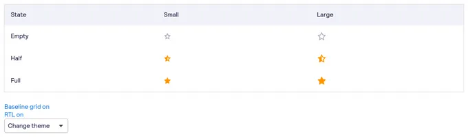
bpk-component-star-rating

Contextual Badge (Tag)


Tags


Bottom Navigation Action

DateRangePicker (DRP)


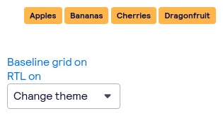
TagGroup
bpk-component-autosuggest
bpk-component-navigation-bar
CloudStorageUploadItem


Tag

bpk-component-floating-notification
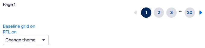
bpk-component-pagination
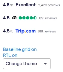
bpk-component-rating
TagGroup
