Assemble a composite component
Last chapter we built our first component; this chapter extends what we learned to build TaskList, a list of Tasks. Let’s combine components together and see what happens when more complexity is introduced.
Tasklist
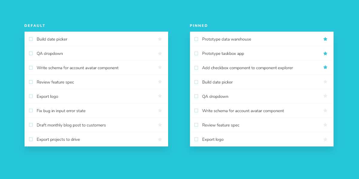
Taskbox emphasizes pinned tasks by positioning them above default tasks. This yields two variations of TaskList you need to create stories for: default items and default and pinned items.
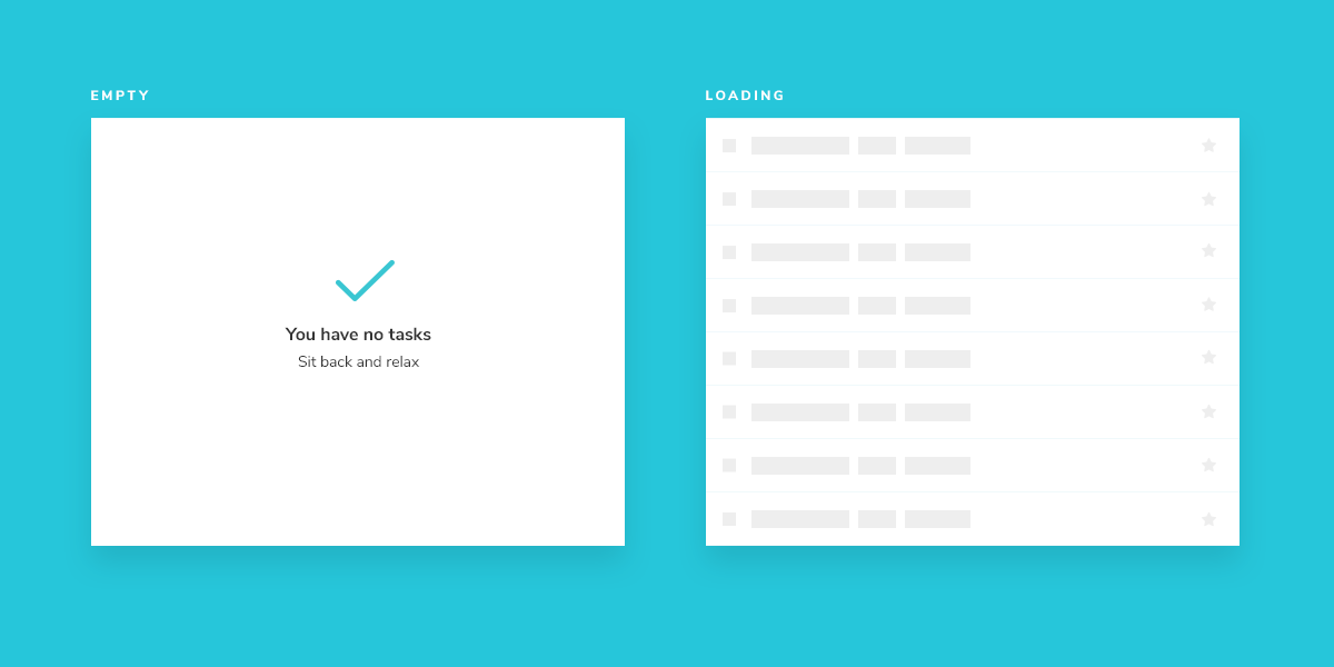
Since Task data can be sent asynchronously, we also need a loading state to render in the absence of a connection. In addition, an empty state is required when there are no tasks.
Get set up
A composite component isn’t much different than the basic components it contains. Create a TaskList template and an accompanying story file: app/components/task-list.hbs and app/components/task-list.stories.js.
Start with a rough implementation of the TaskList. You’ll need to import the Task component from earlier and pass in the attributes and actions as inputs.
{{#if @loading}}
 <div class="list-items">loading</div>>
{{else if @tasks}}
  {{#each @tasks as |task|}}
    <Task
      @task={{task}}
      @pin={{fn @pinTask task.id}}
      @archive={{fn @archiveTask task.id}}
    />
  {{/each}}
{{else}}
  <div class="list-items">
    empty
  </div>
{{/if}}
Next create Tasklist’s test states in the story file.
import { hbs } from 'ember-cli-htmlbars';

import * as TaskStories from './task.stories';

export default {
  title: 'TaskList',
  component: 'TaskList',
};

const Template = args => ({
  template: hbs`
    <div style="margin: 3em">
      <TaskList
        @tasks={{this.tasks}}
        @pinTask={{fn this.onPinTask}}
        @archiveTask={{fn this.onArchiveTask}}
        @loading={{this.loading}}/>
    </div>`,
  context: args,
});

export const Default = Template.bind({});
Default.args = {
  // Shaping the stories through args composition.
  // The data was inherited from the Default story in task.stories.js.
  tasks: [
    { ...TaskStories.Default.args.task, id: '1', title: 'Task 1' },
    { ...TaskStories.Default.args.task, id: '2', title: 'Task 2' },
    { ...TaskStories.Default.args.task, id: '3', title: 'Task 3' },
    { ...TaskStories.Default.args.task, id: '4', title: 'Task 4' },
    { ...TaskStories.Default.args.task, id: '5', title: 'Task 5' },
    { ...TaskStories.Default.args.task, id: '6', title: 'Task 6' },
  ],
  ...TaskStories.actionsData,
};

export const WithPinnedTasks = Template.bind({});
WithPinnedTasks.args = {
  // Shaping the stories through args composition.
  // Inherited data coming from the Default story.
  ...Default.args,
  tasks: [
    ...Default.args.tasks.slice(0, 5),
    { id: '6', title: 'Task 6 (pinned)', state: 'TASK_PINNED' },
  ],
};

export const Loading = Template.bind({});
Loading.args = {
  tasks: [],
  loading: true,
};

export const Empty = Template.bind({});
Empty.args = {
  ...Loading.args,
  loading: false,
};
By importing TaskStories, we were able to compose the arguments (args for short) in our stories with minimal effort. That way the data and actions (mocked callbacks) expected by both components is preserved.
Now check Storybook for the new TaskList stories.
Build out the states
Our component is still rough but now we have an idea of the stories to work toward. You might be thinking that the .list-items wrapper is overly simplistic. You're right – in most cases we wouldn’t create a new component just to add a wrapper. But the real complexity of TaskList component is revealed in the edge cases withPinnedTasks, loading, and empty.
For the loading edge case, we're going to create a new component that will display the correct markup.
Create a new file called loading-row.hbs and inside add the following markup:
<div class="loading-item">
  <span class="glow-checkbox" />
  <span class="glow-text">
    <span>Loading</span>
    <span>cool</span>
    <span>state</span>
  </span>
</div>
And update task-list.hbs to the following:
{{#if @loading}}
  <LoadingRow />
  <LoadingRow />
  <LoadingRow/>
  <LoadingRow />
  <LoadingRow />
{{else if this.tasksInOrder}}
  {{#each this.tasksInOrder as |task|}}
    <Task
       @task={{task}}
       @pin={{fn @pinTask task.id}}
       @archive={{fn @archiveTask task.id}}
    />
   {{/each}}
{{else}}
  <div class="list-items">
    <div class="wrapper-message">
      <span class="icon-check" />
      <div class="title-message">You have no tasks</div>
      <div class="subtitle-message">Sit back and relax</div>
    </div>
  </div>
{{/if}}
And finally create a new file called task-list.js to the following:
import Component from '@glimmer/component';

export default class TaskList extends Component {
  // computed property to arrange the tasks per their state
  get tasksInOrder() {
    return [
      ...this.args.tasks.filter(t => t.state === 'TASK_PINNED'),
      ...this.args.tasks.filter(t => t.state !== 'TASK_PINNED'),
    ];
  }
}
The added markup results in the following UI:
Note the position of the pinned item in the list. We want the pinned item to render at the top of the list to make it a priority for our users.
Automated testing
Since TaskList adds another layer of complexity we want to verify that certain inputs produce certain outputs in a way amenable to automatic testing. To do this we’ll create unit tests using Qunit coupled with a test renderer.
Unit tests with Qunit
Storybook stories paired with manual visual tests go a long way to avoiding UI bugs. If stories cover a wide variety of component use cases, and we use tools that ensure a human checks any change to the story, errors are much less likely.
However, sometimes the devil is in the details. A test framework that is explicit about those details is needed. Which brings us to unit tests.
In our case, we want our TaskList to render any pinned tasks before unpinned tasks that it has passed in the tasks prop. Although we have a story (WithPinnedTasks) to test this exact scenario, it can be ambiguous to a human reviewer that if the component stops ordering the tasks like this, it is a bug. It certainly won’t scream “Wrong!” to the casual eye.
So, to avoid this problem, we can use Qunit to render the component and run some DOM querying code to verify salient features of the output.
Create a test file called tests/integration/task-list-test.js. Here, we’ll build out our tests that make assertions about the output.
import { module, test } from 'qunit';
import { setupRenderingTest } from 'ember-qunit';
import { render } from '@ember/test-helpers';
import { hbs } from 'ember-cli-htmlbars';
module('Integration | Component | TaskList', function(hooks) {
setupRenderingTest(hooks);
const taskData = {
id: '1',
title: 'Test Task',
state: 'TASK_INBOX',
updatedAt: new Date(2018, 0, 1, 9, 0),
};
const tasklist = [
{ ...taskData, id: '1', title: 'Task 1' },
{ ...taskData, id: '2', title: 'Task 2' },
{ ...taskData, id: '3', title: 'Task 3' },
{ ...taskData, id: '4', title: 'Task 4' },
{ ...taskData, id: '5', title: 'Task 5' },
{ ...taskData, id: '6', title: 'Task 6 (pinned)', state: 'TASK_PINNED' },
];
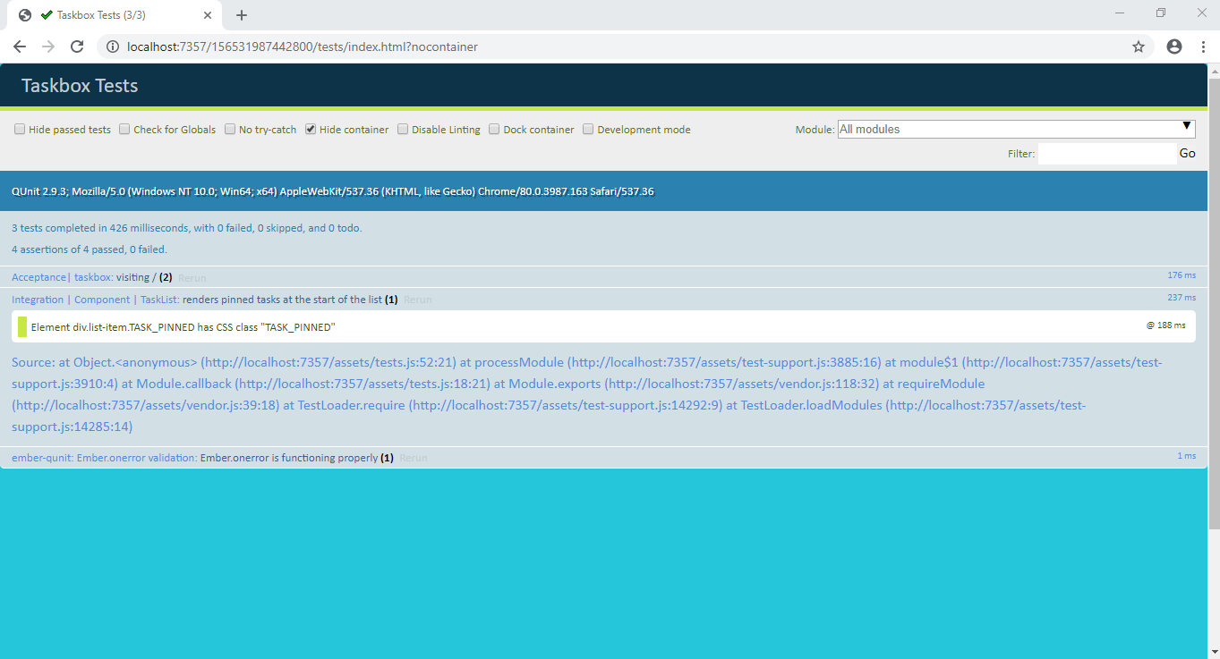
test('renders pinned tasks at the start of the list', async function(assert) {
this.tasks = tasklist;
await render(hbs`<TaskList @tasks={{this.tasks}}/>`);
assert.dom('[data-test-task]:nth-of-type(1)').hasClass('TASK_PINNED');
});
});
Contrary to the other versions of this tutorial, with Ember we can't import the data and stories used in our story file created earlier, without introducing a lot of complexity and that's beyond the scope of the tutorial. For now we'll copy over the values used in the story file to help out with our tests.
Notice as well that this test is quite brittle. It's possible that as the project matures, and the exact implementation of the Task changes --perhaps using a different classname or a textarea rather than an input--the test will fail, and need to be updated. This is not necessarily a problem, but rather an indication to be careful about liberally using unit tests for UI. They're not easy to maintain. Instead rely on visual, snapshot, and visual regression (see testing chapter) tests where possible.