Revamping Storybook’s addon ecosystem
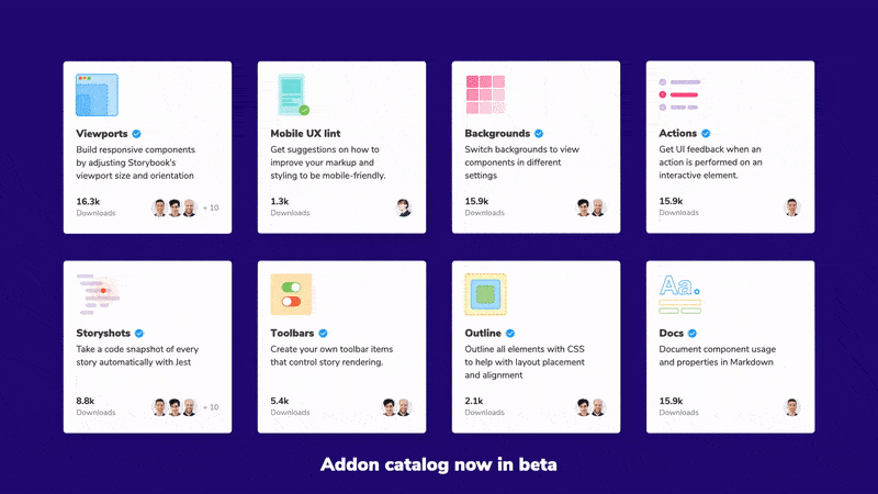
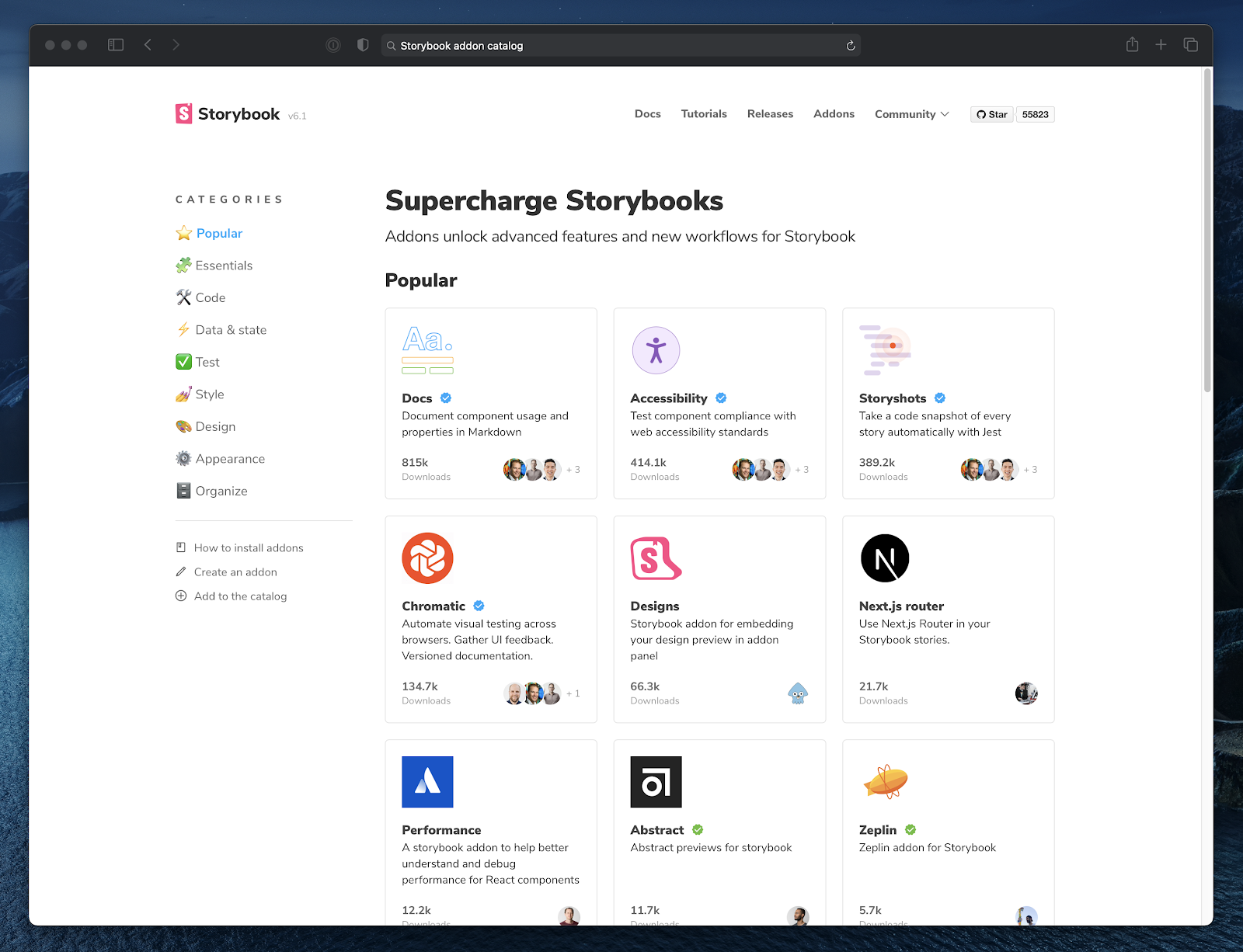
Addon Catalog beta with updated documentation

Storybook has over 200 addons that enable new features and integrations. Similar to VSCode extensions, addons are a convenient way to customize Storybook to fit your UI development workflow.
The addon ecosystem is one of the main reasons why teams adopt Storybook. But until now, finding the right addon for your use case involved plunging the depths of NPM. I’m excited to highlight Storybook’s best addons in the new addon catalog (beta).
Who uses addons and why?
Storybook’s addon API is one of its core innovations. Not only does it allow users to extend and configure Storybook in countless ways, but many of these addons are automatically cross-framework (i.e. usable in React, Vue, Angular, etc.) without modifications. This means, if you write an addon for your React project, you can reuse it in over 60,000 public Storybooks.
“Storybook is a well documented platform, letting us build an Addon that unlocks value to our users in a short period of time.”
– Brendan Mahony at Contrast YC18
Thanks to the addon APIs versatility, the number of addons has skyrocketed. To understand what’s possible, let’s take a look at who uses addons and why.
Large organizations
Addons simplify sharing integrations with different Storybooks. Large companies use them to integrate company-specific libraries and promote UI hygiene.
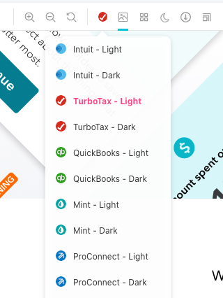
Intuit centralizes UI component design and development documentation with addons. Every UI developer has a standardized template for component documentation and the theme support.
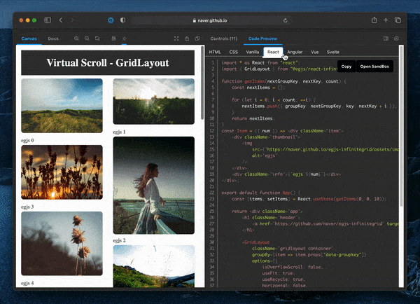
Naver, the #1 search engine in South Korea, created an addon to preview component code in multiple frameworks. That makes it easy to browse a component’s documentation for React, Vue, or Angular.
Leading agencies
Addons streamline the UI development handoff for agencies. With a constant stream of new projects, speeding up build outs results in happier clients and higher margins.
Whitespace’s HTML addon renders a component’s HTML output in an addon panel. Even though it replicates what developers already do with browser devtools, the small convenience results in big time savings in the long run.
“We often work for tech companies with inhouse backend devs. Getting direct access to HTML without having to set up the project saves time.” –Fredrik, tech lead at Whitespace
Etch takes developer productivity to the next level. Their addons integrate Storybook with Bugherd and add component status labels.
Software companies
Addons help companies tame the countless states in modern UIs. Developers at these companies have to deal with the combinatorial explosion of stories and screen sizes. They build addons to stress test a component’s edge cases.
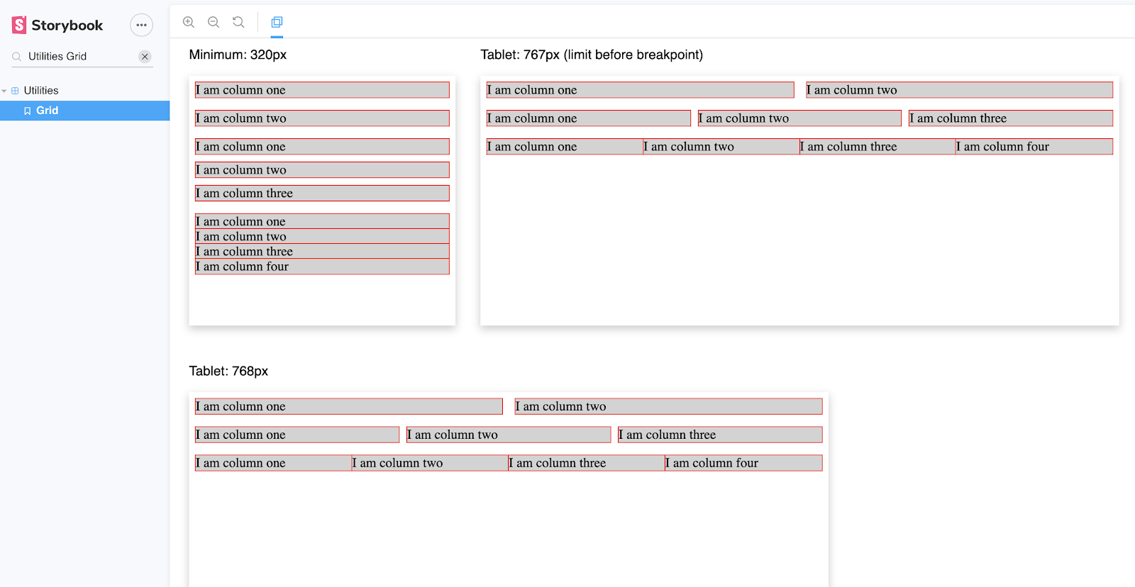
EatWith, the self-proclaimed AirBnb of food, created an addon that previews components in multiple viewport widths simultaneously. That ensures their UI looks great on every screen.
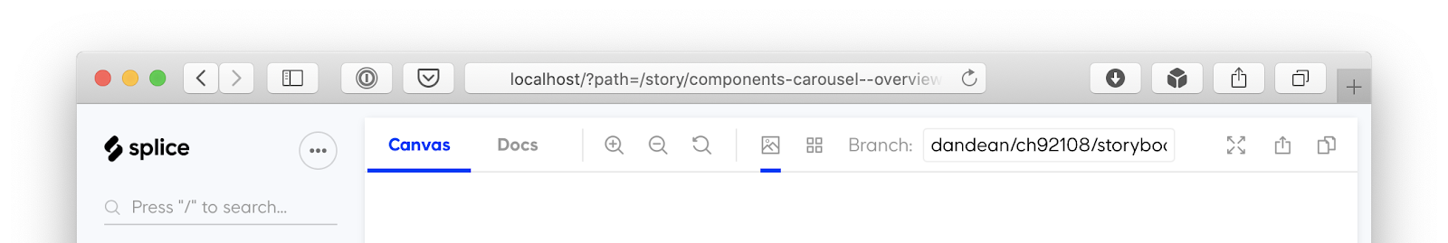
Splice, a sound catalog for audio engineers and musicians, made the preview-branch addon which helps engineers swap between feature-branches fast. If you’ve ever wondered “what does that component look like on master?”, this addon is for you.
Solo developers and nimble teams
Storybook does the heavy-lifting for addon authors. Typically, it takes a few hours to write an addon; even faster if you follow our guides and docs. This allows folks to quickly integrate with their favorite tools and prototype new workflows.
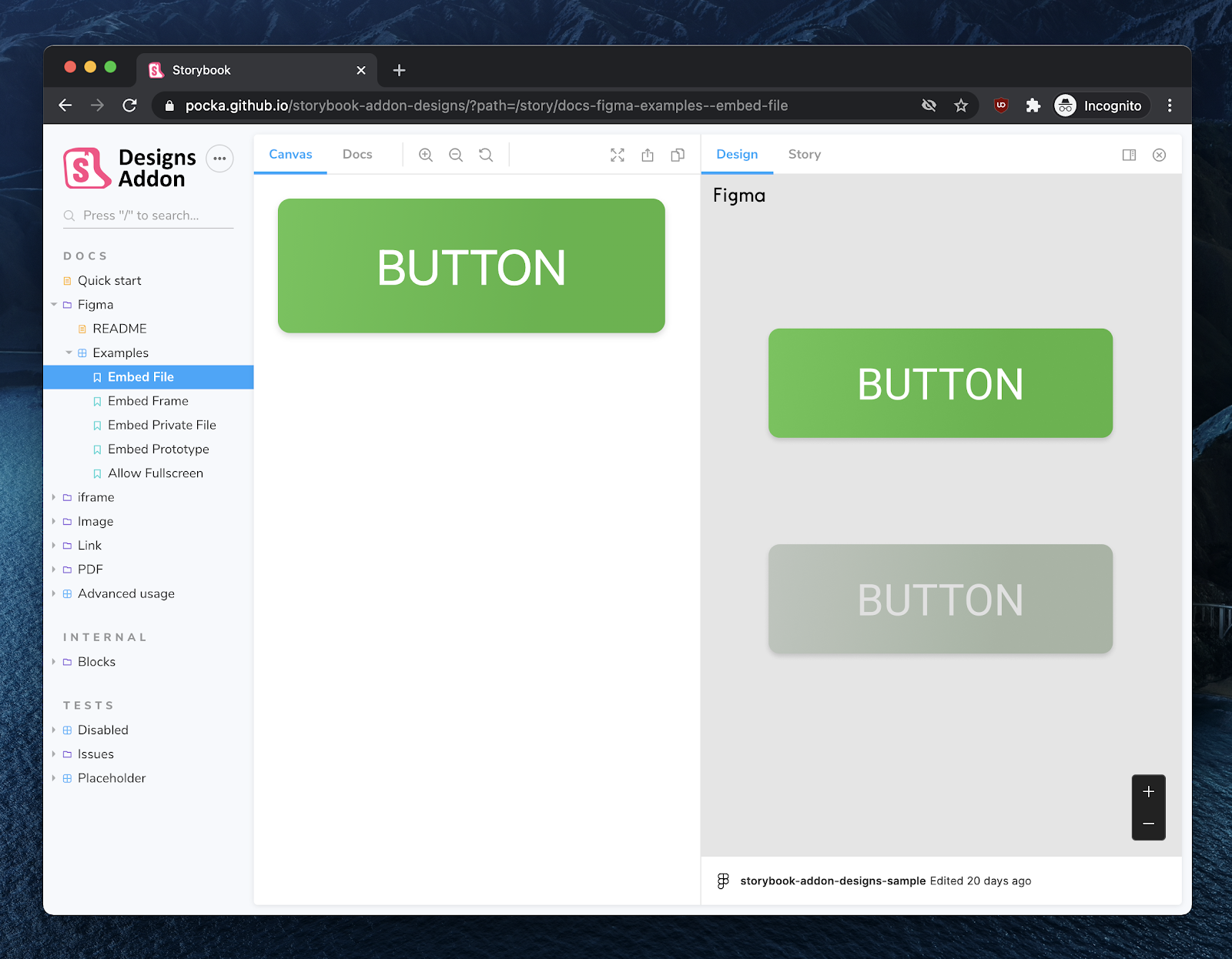
Shota Fuji initially created the Figma addon as a side project to speed up his agency. This year it ballooned to 320k+ monthly downloads and inspired addons for AdobeXD, Abstract, and Zeplin.
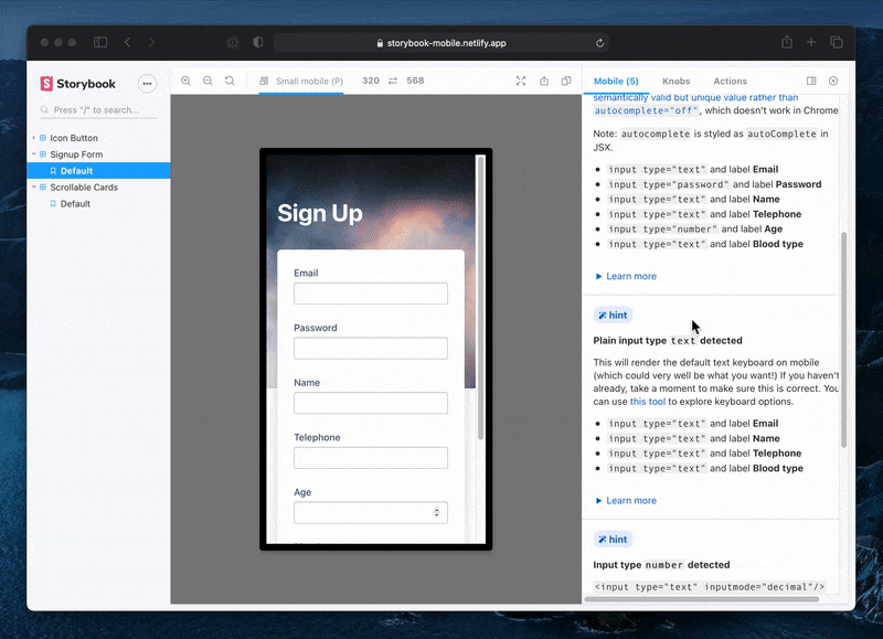
Meanwhile, Alex Holachek launched Storybook Mobile, an addon that helps developers build mobile web UIs by showing contextual hints. It’s the first linter for mobile web UIs.
“Mobile-web browsers account for about 50% of website visits, yet many mobile web best practices are frequently overlooked.”
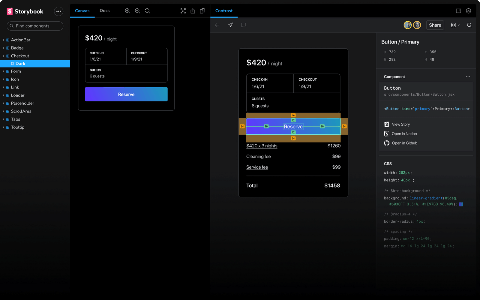
Contrast (YC18) shipped a design handoff workflow that highlights the difference between code and Figma design--“a spell checker for your UI.” Developers can reference layout, spacing, fonts, and colors without leaving Storybook.
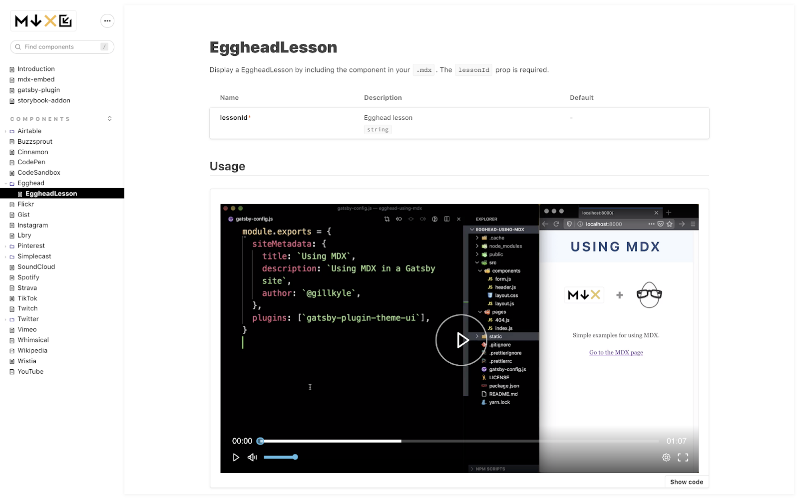
Paul Scanlon built MDX Embed, an addon for embedding rich media like Codepen, Egghead, and GitHub into your design system or component documentation.
How to write an addon
We surveyed developers from Shopify, Algolia, and Godaddy to understand how they use addons. The main barrier to building addons is lack of documentation. That was a straightforward fix: we overhauled the addon docs and learning materials.
📖 New addon documentation breaks down everything you need to write an addon. It covers the API, project setup, and use cases.
🗺 “How to build a Storybook addon” is an upcoming tutorial that provides a step-by-step instructions on building an addon. Read the first chapter now.
Get notified when the catalog launches
Thousands of teams use addons to customize Storybook. Maintainers Dominic Nguyen (me!), Varun Vachhar, João Cardoso, and Michael Shilman are revamping the addon ecosystem so the community can share addons. That means every Storybook user can ship more UIs with less work.
Browse the addon catalog beta now. Like what you're seeing? Join the discussion on Twitter below.
We're revamping Storybook's addon ecosystem! The goal is to highlight Storybook's best addons and help you build your own. Making lots of progress.
— Storybook (@storybookjs) December 15, 2020
✅Launched catalog (beta): find all addons in 1 place
✅New API docs: Learn how to build addons
Read https://t.co/PmsbX1vcdi pic.twitter.com/ywKed2YTTb
Are you building an addon? I’d love to learn how we can help you. Direct message me (@domyen) in Storybook’s Discord.