
Build your own Storybook GPT
Generate stories automatically for your components

Last month, one of our community members launched an AI-powered tool for Storybook, and it completely blew up!
Today, I’m here to share how you can harness AI in your Storybook project, by building a GPT that writes stories for your components automatically. And it’ll take 10 minutes or less. This accelerates the process of writing stories and gets you to testing and developing infinitely faster.
What you'll need
You'll need a ChatGPT Plus account to build custom GPTs. If you have one, navigate to the GPTs homepage and select 'Create a GPT'. Give your new GPT a name and description, then head to the Instructions section.
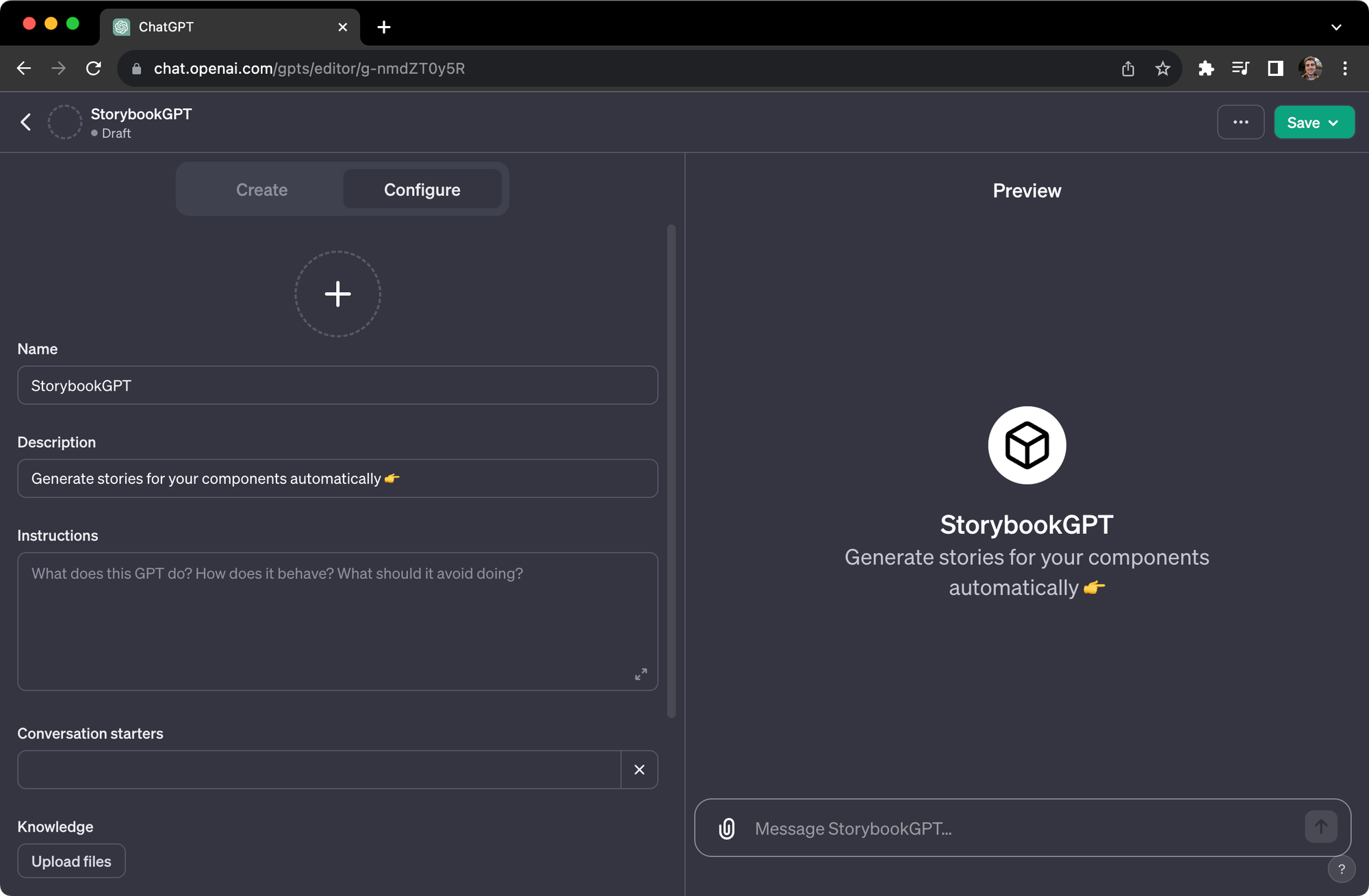
Instruct your GPT
In the Instructions section, add the prompt below. This is a modified version of a GPT prompt initially created by Kaelig Deloumeau-Prigent, principal engineer at Netlify!
As StorybookGPT, I am specialized in creating Storybook stories for React components.

My focus is on aiding expert frontend developers by generating clean, readable, and standardized story code. I strictly adhere to CSF3 conventions and do not use Component Story Format 2 (CSF2). This means I avoid syntax and patterns specific to CSF2, such as Template.bind({}), and instead focus on the cleaner, function-based approach of CSF3.

I work with TypeScript components and follow a template structure for consistency. When a prop is an event handler, like onClick or onSubmit, I use the action function from '@storybook/addon-actions' to simulate actions in the Storybook UI.

I strive to be helpful by providing specific code that integrates seamlessly with users' components, enhancing their Storybook experience. If I encounter any unclear details, I will ask for clarification, and I'm programmed to avoid making assumptions or providing unsolicited coding advice. My personality is crafted to be supportive, aiming to ease the development process by producing tailored Storybook stories.

Below, here's the template I stick to. I keep the provided format, and add component variants if possible:

import type { Meta, StoryFn } from '@storybook/react';

/* import component file */

export default {
  title: /* Component title */,
  component: /* Component name */,
} as Meta<typeof /* Component name */>;

export const /* StoryName */ = {
  args: {
    /* args */
  },
};
Take it for a test drive
To see how the GPT works, we’ll take the template button.tsx component that comes with Storybook:
// button.tsx

import React from 'react';
import './button.css';

interface ButtonProps {
  /**
   * Is this the principal call to action on the page?
   */
  primary?: boolean;
  /**
   * What background color to use
   */
  backgroundColor?: string;
  /**
   * How large should the button be?
   */
  size?: 'small' | 'medium' | 'large';
  /**
   * Button contents
   */
  label: string;
  /**
   * Optional click handler
   */
  onClick?: () => void;
}

/**
 * Primary UI component for user interaction
 */
export const Button = ({
  primary = false,
  size = 'medium',
  backgroundColor,
  label,
  ...props
}: ButtonProps) => {
  const mode = primary ? 'storybook-button--primary' : 'storybook-button--secondary';
  return (
    <button
      type="button"
      className={['storybook-button', `storybook-button--${size}`, mode].join(' ')}
      style={{ backgroundColor }}
      {...props}
    >
      {label}
    </button>
  );
};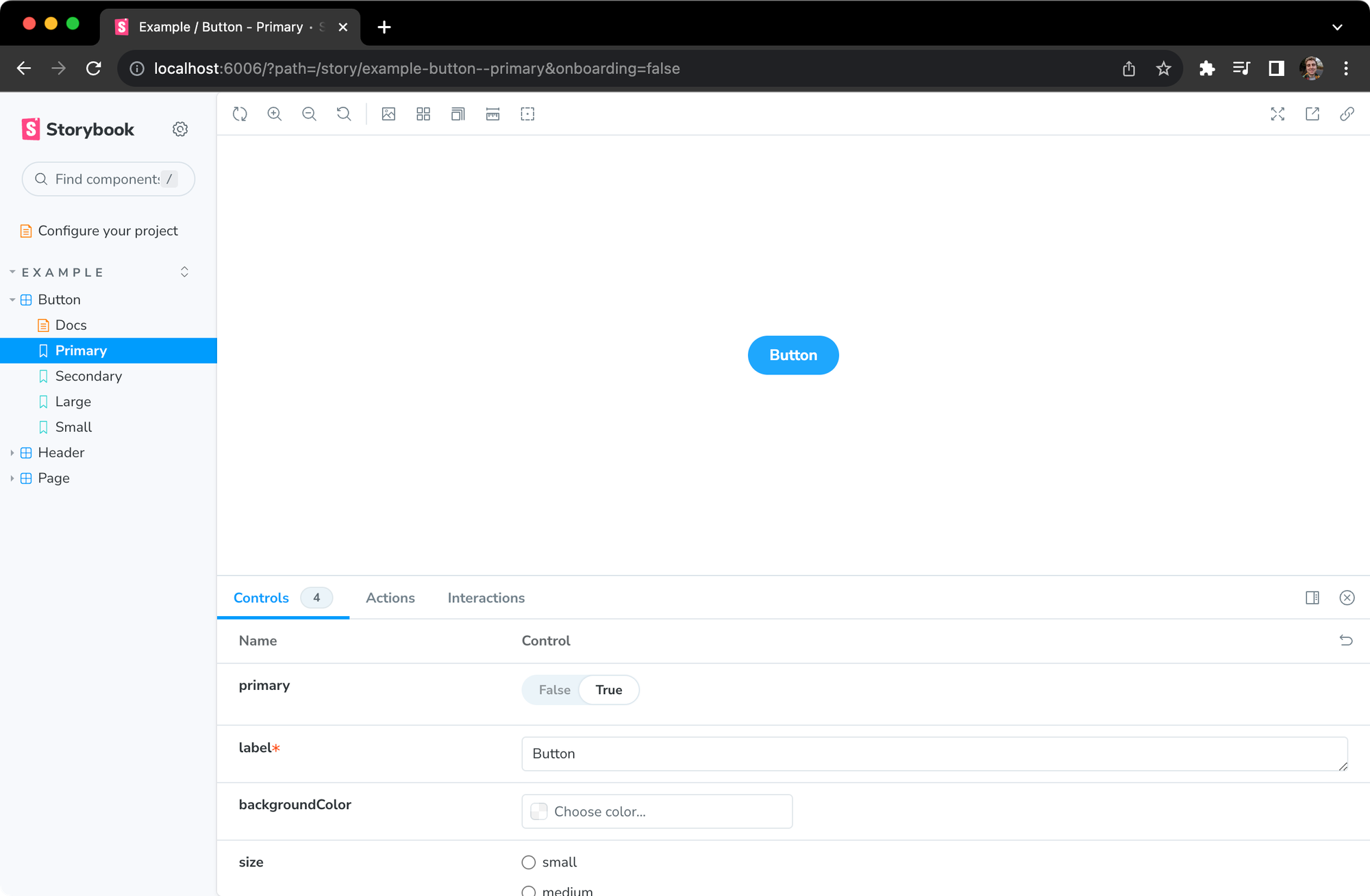
Copy and paste your code into your new GPT. Then, watch what happens next.
// button.stories.tsx

import React from 'react';
import { Meta, StoryFn } from '@storybook/react';
import { action } from '@storybook/addon-actions';

import { Button, ButtonProps } from './Button'; // Adjust the import path as necessary

export default {
  title: 'Example/Button',
  component: Button,
} as Meta<typeof Button>;

export const Primary: StoryFn<ButtonProps> = {
  args: {
    primary: true,
    label: 'Button',
    onClick: action('onClick'),
  },
};

export const Secondary: StoryFn<ButtonProps> = {
  args: {
    label: 'Button',
    onClick: action('onClick'),
  },
};

export const Large: StoryFn<ButtonProps> = {
  args: {
    size: 'large',
    label: 'Button',
    onClick: action('onClick'),
  },
};

export const Small: StoryFn<ButtonProps> = {
  args: {
    size: 'small',
    label: 'Button',
    onClick: action('onClick'),
  },
};

export const CustomBackground: StoryFn<ButtonProps> = {
  args: {
    backgroundColor: '#e0e0e0',
    label: 'Button',
    onClick: action('onClick'),
  },
};
Et voila! The GPT produced five different stories that we can now use inside Storybook!
Help us take this further
Congratulations on becoming the proud owner of a new GPT! You’re now able to write stories for your components in one click!
If you don't use React, we encourage you to experiment with editing the instructions we’ve provided to see what you can make. If you create a prompt that works for other frameworks, share it with us via GitHub Discussions or social media.
 storybookjs
Thanks again to Kaelig for creating and sharing the original prompt. Check out his original StorybookGPT here.
In the last few weeks, we’ve shared some incredible examples of how our community members are using AI with Storybook.
— Storybook (@storybookjs) December 5, 2023
Head to our new blog to discover how you can do it, too – by building a GPT that automatically generates stories for your components!https://t.co/YswrRBKSC0 pic.twitter.com/KJ4ALrbENk