
Storybook 7.6
Improving performance, UX, and integrations ahead of Storybook 8

Storybook 7.6 is here! This is the final minor release in the Storybook 7 series. 7.6 improves Storybook’s performance and UX, enhances our integrations with tools across the frontend ecosystem, and paves the way for our next major release: Storybook 8.
- 🔥 Improved SWC support
- 🧪 New test utilities and fast build mode
- 🔼 NextJS SWC + avif support & fixes
- 🇸 SvelteKit page and navigation mocking
- ⚛️ React-docgen upgrade
- 🎨 Background theming, viewports, and improved accessibility for Controls
- 🩺 CLI: Diagnose errors with storybook-doctor!
- 🚫 Addons: React removed as a peer dependency
- 📚 New and improved docs site
- 🪦 Storyshots and Vue2 deprecated
Improved SWC support
Storybook 7.6 cuts start times in Webpack projects by 50% or more. We achieved this by switching from Babel to Speedy Web Compiler (SWC) (#24805). Starting in 7.6, all new Webpack projects aside from Angular will use SWC. We also fixed SWC for Preact and React fast-refresh.
If using a Webpack-based framework, update your builder configuration in .storybook/main.js:
// .storybook/main.js

export default {
  framework: {
    name: '@storybook/your-framework', // react-webpack5|next|vue-webpack5|etc
    options: { builder: { useSWC: true } }
  }
};
NextJS: Adds SWC, avif support, and other fixes
Experimental SWC support brings significant gains for Next.js users (#24852). It makes Storybook much faster and matches Next.js behavior more closely. You can opt into this feature by editing your .storybook/main.js configuration:
// .storybook/main.js

export default {
  framework: {
    name: '@storybook/nextjs',
    options: { builder: { useSWC: true } }
  }
};
We’ve taken Next.js support further through new avif support (#24611), fixing ref forwarding for the Image component (#24648), and restoring image context CJS exports for Jest compatibility (#24885)!
New testing utilities and faster build mode
Storybook 7.6 introduces a more performant testing library and a “test build mode” that drastically reduces static build times when testing.
@storybook/test: This testing package switches from Jest to Vitest's expect package, which brings a set of new utilities for spying on your components, interacting with them in the browser, and asserting the results. Plus, it has better performance and a smaller size. In addition, it introduces improved patterns for writing actions/spies in your stories, which helps stories load faster and makes them more portable for reuse in other tools. Learn more in our announcement.- Test mode: We’re accelerating testing by 2-4x with a new
--testflag forstorybook build. It bypasses processes that are unnecessary for testing in Chromatic or Storybook’s Test Runner, like running docgen analysis and compiling documentation. Learn more in the docs.
SvelteKit page and navigation mocking
Storybook 7.6 introduces new experimental SvelteKit mocks (#24795). You can use these to safely write stories for any components that import SvelteKit-specific modules, like page data or navigation functions. Any navigation caused by clicking an anchor or invoking goto() is now handled by Storybook and logged to the Actions panel.
Use the new sveltekit_experimental parameter to supply handlers and mock stories for custom page data (on a story, meta, or global level). Many thanks to Paolo Ricciuti (@paoloricciuti) for contributing these changes. Learn more in Paolo’s blog post, the PR, or the Storybook for SvelteKit readme.
Lastly, 7.6 contains key bugfixes for Svelte decorators – the configurable functions that wrap your stories. Storybook no longer runs decorators twice (#29421). Additionally, it now correctly displays decorated stories without the pesky SlotDecorator in source snippets (#24800)!
react-docgen upgrade
A major performance upgrade in Storybook 8 will be the switch to react-docgen for autogenerated controls. This might sound small but it will speed up startup times by 2x or more. For example: react-docgen 6 reduced startup times for our benchmark Mealdrop project (which we use for many tests) from 8.9s to 4.0s!

We previously announced this move in Storybook 7.5, when the upgrade to react-docgen v6 dramatically improved its handling of TypeScript types. Storybook 7.6 upgrades docgen to v7 (#24530), a new release specifically cut to address Storybook feedback. Huge props to react-docgen maintainer Daniel Tschinder (@danez) for being so responsive and making this happen!
To opt into react-docgen in your React project, update .storybook/main.js:
// .storybook/main.js

export default {
  // ...
  typescript: { reactDocgen: 'react-docgen' },
}
Background theming, viewports, and improved accessibility for Controls
Storybook’s UI got a smattering of fixes to help you be more productive.
- Improved accessibility for Controls addon addon: Storybook controls let you interactively experiment with your components. They are written with accessibility (a11y) in mind so that the tool can be used by the widest range of users. 7.6 improves the accessibility structure of the boolean control for a much better screen reader experience (#24418).
- Background theming: We added a new theming variable,
appPreviewBg, to control the preview’s background color (#24575). For a variety of reasons, we defaulted the background to white in 7.0, and this broke dark mode testing. The new variable brings this back. - Device viewports: Just like your dad who’s stuck on an outdated cell phone, Storybook’s Viewports addon was a few years behind the times. 7.6 fixes this with viewport definitions for all the latest iPhones (#24777).
Diagnose issues via CLI with storybook-doctor
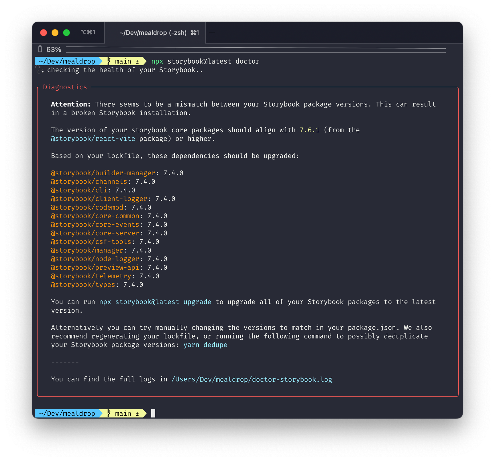
Over the years, we’ve supported thousands of users upgrading their Storybooks. This led to the creation of automigrations – codemods that run automatically on each upgrade to make your life easier. But some checks are not specific to particular upgrades and are more suited to monitoring your project's general health and troubleshooting bugs.
That’s where the the new storybook doctor command comes in (#22236). It performs general project health checks such as when:
- A project contains mismatching Storybook versions
- A project contains duplicated dependencies
- A project contains addons which are incompatible
For every issue it finds, it describes the problem and provides references and possible followups.
Addons: React removed as a peer dependency
One of Storybook 7’s major victories was official support for pnpm, our new favorite package manager. But that came at a cost, which is that we required users to install React into their projects as a peer dependency. This understandably left non-React users with a bad taste in their mouths.
Now, in preparation for Storybook 8, we’re cleaning that up. Storybook 7.6 removes React as a peer dependency for all Storybook packages (#24676) except for Storybook Docs (@storybook/addon-docs), which we plan to address in 8.0. If you’re an addon author, please see our migration guide for how to remove the React peer dependency from your addon.
Vue, Angular, Web components, Svelte, Ember, Solid, and Qwik users: we look forward to a day soon where you can remove React from your package.json!
New and improved docs site
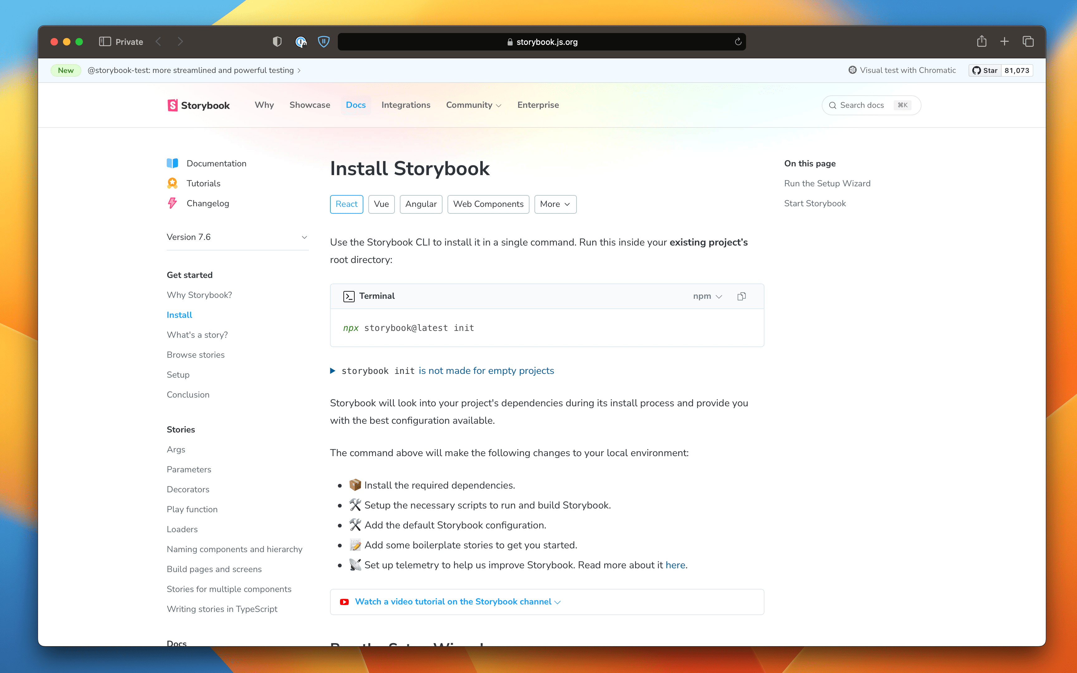
We've taken the 7.6 launch as a moment to make Storybook's docs site more useful and clear. The biggest change is that we now remember your preferred renderer (React, Vue, Angular, Web Components, etc.), package manager (npm, pnpm, yarn), and code language (TypeScript, TypeScript 4.9+, JavaScript). This let us remove the renderer from URLs, ensuring that when you visit a docs link (even old ones that did include a renderer), your preferences are always remembered. Choosing your preferences is also more obvious, with the pills under the page title and menus attached to the relevant code snippets.
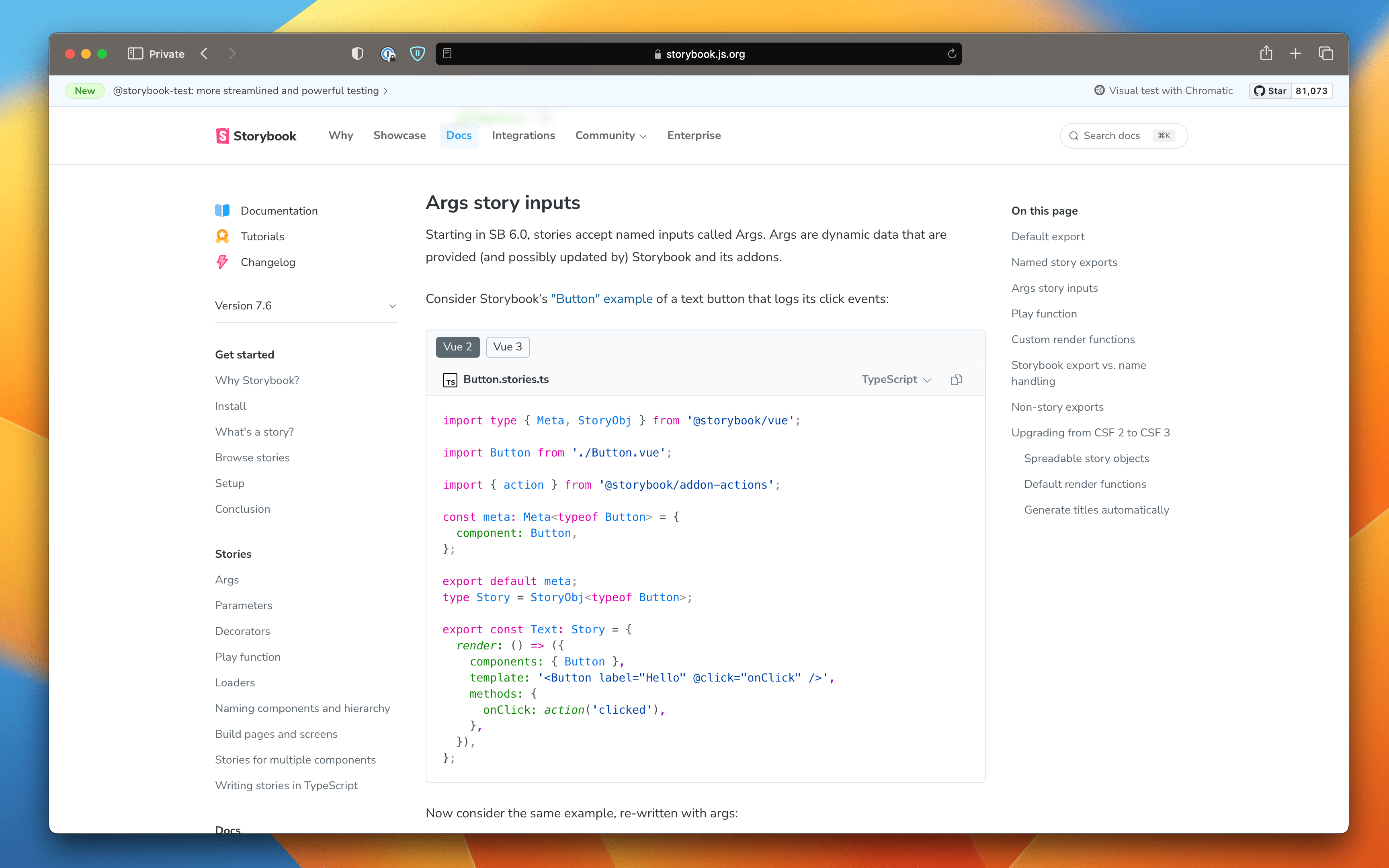
We also added or polished a number of design elements, like:
- New right sidebar containing an 'On this page' table of contents
- Simplified header and sidebar navigation
- Clarified code snippet design, including syntax highlighting support for Vue and Svelte SFCs
We’re hopeful these updates will provide a more helpful experience as you learn about Storybook. And like the rest of the SB 7.6 release, this work lays the foundation for many more improvements to come.
Storyshots and Vue2 deprecated
Finally, to keep Storybook moving forward, we have to leave some things behind.
- Storyshots. Storyshots (
@storybook/addon-storyshots) was Storybook's original testing solution. It provided automatic snapshot testing and rich configurability. However, it was fundamentally incompatible with Storybook 7's high-performance on-demand architecture and it suffered other limitations. So we created its successor, Storybook test-runner, in 2021. It’s now two years later, and we plan to drop Storyshots in Storybook 8. In anticipation, and to give users fair warning, we’re deprecating Storyshots in 7.6. We’ve also created a migration guide to get existing users onto a forward-compatible solution. - Vue2. Likewise, Storybook 8 will be dropping support for Vue2. This move coincides with the Vue Core Team’s decision to end-of-life Vue2 at the end of this year. For more information on the decision, please see our RFC: Discontinue Vue2 support in SB8.
8.0 – here we come!
Storybook 7.6 concludes the 7.x release series, which has seen numerous changes to Storybook and to our development process.
We went from releasing quarterly to releasing 7.2/3/4 on a rapid-fire two week cadence. That was too fast, so we dialed it back to shipping minor releases 7.5 and 7.6 every six weeks.
Next we’re turning our attention to Storybook 8 (SB8), our annual major release. SB8 will focus on performance and compatibility, culminating months of preparation across the 7.x series!
Upgrade to Storybook 7.6
To upgrade to Storybook 7.6, run:
# Upgrade your Storybook to 7.6
npx storybook@latest upgrade
For guidance on upgrading from a version of Storybook that predates Storybook 7, check out the Storybook 7 migration guide.
Alternatively, for a fresh install, bootstrap Storybook into an existing app with:
# Install a fresh Storybook
npx storybook@latest init
Credits
Huge shoutout to the 40 contributors whose PRs feature in Storybook 7.6! Including: @cdedreuille, @dannyhw, @epreston, @halitiince, @henkerik, @ianvs, @integrayshaun, @joevaugh4n, @jonniebigodes, @jreinhold, @kasperpeulen, @kota-kamikawa, @kshmidt-digma, @kuriacka, @kylegach, @lucavazz, @maheshchandra10, @martinnabhan, @mickmcgrath13, @ndelangen, @nikospapcom, @paoloricciuti, @piratetaco, @samvv, @shilman, @speelbarrow, @taozhou-glean, @thapasusheel, @tmeasday, @tomo5524, @valentinpalkovic, @vanessayuenn, @wilson2k, @wjdtjdgns, @wouterk12, @wuzhuobin, @xueyawei, @yannbf, and @yoshi2no.
Storybook 7.6 is here! 🥳
— Storybook (@storybookjs) November 30, 2023
🔥 Improved SWC support
🧪 New test utilities and fast build mode
⚛️ react-docgen upgrade
🔼 NextJS SWC + avif support and fixes
🇸 SvelteKit page and navigation mocking
🩺 Diagnose errors via CLI w/ Storybook doctor
🎉 New docs site
🧵 pic.twitter.com/OXsL8yXYyS