Declarative Storybook configuration
Use a single main.js file to configure your Storybook

Everyone benefits when dev tools integrate to unlock new workflows. Storybook is an open source platform for UI development that has hundreds of addons and is used by Airbnb, Lyft, Slack, and Twitter.
I’m excited to share the new simpler, more declarative way to configure Storybook in 5.3. This makes it easier to accomplish common configuration tasks like adding addons and decorators. It also makes it easy for design, visual regression testing and visual review addons to understand your Storybook.
New, clearer configuration files
We renamed Storybook’s configuration file to make it clearer what they do. This should remove confusion for Storybook users which settings should go in which file.
The 3 important files are: main.js, preview.js, and manager.js, but chances are you’ll only need the first. Let’s take a look at the before and after of a typical configuration:
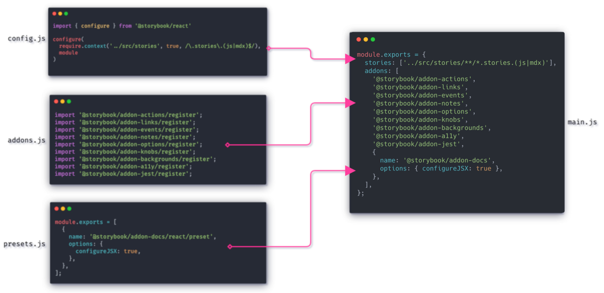
main.js
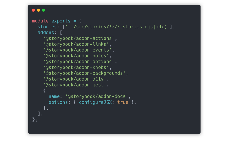
This file is an evolution of the presets.js file. As the main configuration file, it controls the generation of your Storybook. As such, it concerns itself with the location of your story files, management of presets (which configure Webpack and Babel to allow different file types), and generalized webpack configuration. You can also do basic addon registration in main.js.
The key configuration is the stories property. This now allows you to tell Storybook where your story-files are located declaratively with a glob! This is a very welcome improvement over using the webpack-only api of require.context().
The list of story files is retrievable without running a line of your code. When combined with Component Story Format (which uses static ES6 exports), the total list of stories is also retrievable. This is a boon for addons and integrations that need to understand your story list.
Addon configuration also got a lot simpler. Just add an entry to the addons field and that will register the addon or use its built-in configuration preset if one is available.
preview.js
This file replaces config.js and controls the rendering of your stories. Unlike config.js, preview.js is not responsible for loading any stories. Its main purpose is to add global parameters and decorators should you need them. Other uses are importing global CSS, adding extra polyfills if needed, and similar browser-side tweaks.
In practice, many simple Storybooks will not need this file.
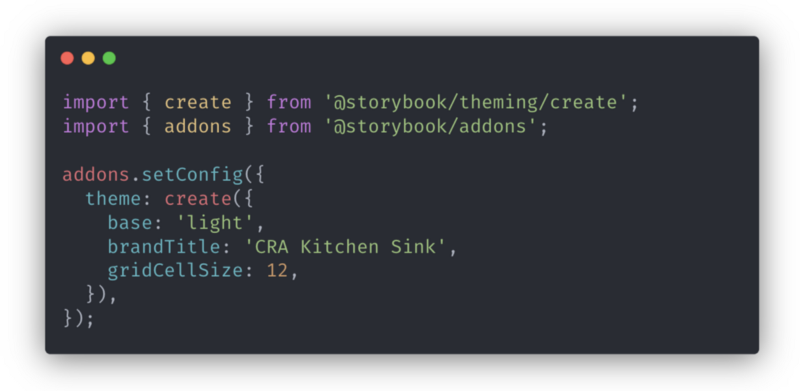
manager.js
This file replaces addons.js and allows you to customize how Storybook’s app UI renders. That is, everything outside of the Canvas (preview iframe).
In common cases, you probably won’t need this file except when you’re theming Storybook.
Simpler story file locations
A key benefit of this change is the ability to tell Storybook about the location of your story files with a single export in your main.js:
module.exports = {
  stories: ['../src/*.stories.js'],
}
This syntax replaces the obtuse Webpack require.context() syntax for importing a collection of story files at once. It’s better for a few reasons:
- Allows static analysis: A simple glob like the above combined with the static exports from CSF means that it is now possible extract a list of your stories from the source files of your Storybook without executing those files directly. This is great for tooling that wants to link to individual stories in you Storybook or run a test for each story.
- Moves away from Webpack-specific syntax. Although Storybook continues to use Webpack by default, efforts are underway to expand Storybook to run inside non-Webpack contexts (other bundlers like Parcel, Meteor, or even non-JavaScript systems). Having a common configuration for different environments means that external tools can be compatible with those environments whilst only supporting a single syntax.
For example, Storyshots, our homegrown Jest snapshot testing tool, will be much easier to setup. And in the future, you’ll be able to use Storyshots no matter what bundler you use when you run your Storybook.
Hierarchy separators
Hierarchy separators are used to designate the grouping of components and stories in Storybook’s sidebar (a.k.a., the treeview). Alongside the move to main.js, we will rationalize the hierarchy separators in Storybook 5.3 to make static analysis and documentation more straightforward.
From 5.3 on, the best practice is to always use / as a separator. For example, Components|Buttons.ButtonGroup turns intoComponents/Buttons/ButtonGroup.
Migration
The old config.js syntax and configurable hierarchy separators will be supported until Storybook version 6.0. You can read more the ins and out of migrating in the 5.3 Migration docs.
We’d love you to try out the new main.js configuration in Storybook 5.3. You can upgrade by running:
npx npm-check-updates ‘/storybook/’ -u
npm install # or yarn if you prefer
What’s next?
So far, the changes are pretty mechanical. But look a little closer, and you might glimpse the possibilities that the declarative syntax unlocks:
- 📦 Automatic bundle splitting: to increase performance.
- 📄 Creating a separate page per component: for improved isolation.
- ⤵️ Including Storybooks in each other: for quicker cross referencing.
- 🎨 Rich theming: for greater customization.
- 📊 Generate stats for all stories: for improved insights & understanding.
- ⚙️ Generate pre-rendered html: for checking server-side render-ability.
Some of these features are in progress, and others haven’t been started yet. If you’re interested in helping build them, we’d love to learn and support you. Chat with the maintainers in Discord chat #maintainers channel.
Storybook is maintained by 850+ open source contributors and guided by a steering committee of top maintainers. If you are interested in contributing, check out Storybook on GitHub, create an issue, or submit a pull request. Join us also in the Discord chat. Donate on Open Collective.