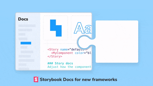
Storybook Docs for new frameworks
Best practice docs for Vue, Angular, Web components, and Ember

Storybook is the standard UI component workshop for React, Vue, Angular, Ember, and more. It’s used by Airbnb, Lyft, Squarespace, Slack, Dropbox, and 33,000+ public GitHub projects.
In Storybook 5.3, we’re doubling down on our commitment to Vue, Angular, Ember, and Web Component developers. It starts with Storybook Docs, a bold project to automatically generate best practice docs for UI components and libraries.
SB Docs has been battle-tested and refined in production React apps and design systems over the past 4 months. Now, SB Docs is finally available with first-class support for Vue, Angular, Ember, and Web Components! What you’ll get:
- 📚 Docs. Storybook helps get you best-practice documentation “for free” when you write stories as normal. These docs can then be customized and elaborated as much as you like using MDX, a format that lets you write docs and stories (component examples) in the same file.
- 📦 DocBlocks. DocBlocks are a beautiful set of readymade components that can be mixed and matched to build styleguides and component documentation pages (Prop Tables, Color Palettes, etc.).

🏆 Storybook is a universal tool for UI docs
Storybook’s goal is to provide best possible developer experience for building component-driven web UIs. That’s why more than a dozen view layers are supported and the Storybook app is architected to be framework agnostic.
Our universally compatible approach to modern web technologies and frameworks is paying off for the community. Every time someone adds a feature or fixes a bug it benefits everyone, no matter which framework they choose.
Six months ago, I announced Storybook Docs as an ambitious project to streamline building component libraries and design systems. Our first beta releases focused on React, Storybook’s largest segment of users.
Today, I’m excited to announce first-class Vue, Angular, Ember, and Web Component documentation support — enabled by our universally compatible architecture and contributed by the amazing Storybook community .
📚 How does Storybook Docs work again?
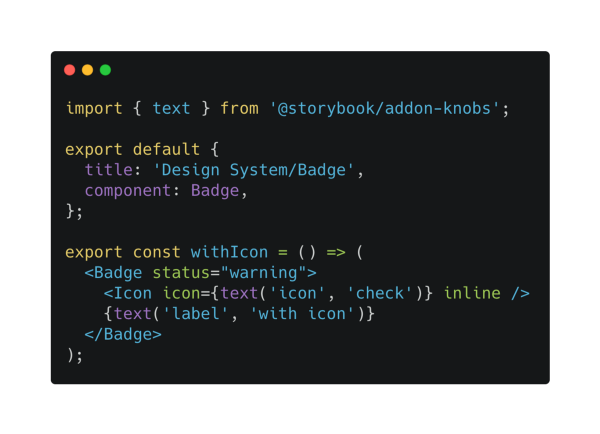
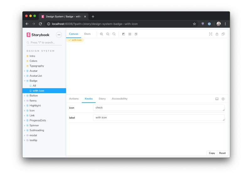
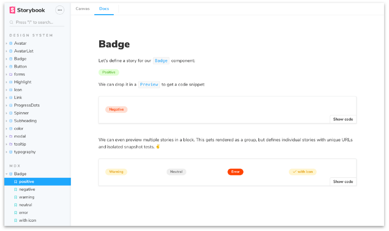
Storybook’s core experience is a Canvas that shows stories, which are isolated component examples. For instance, the variations of theBadge component below are recorded as stories similar to standard ES6 module. Storybook then displays Badge:withIcon in an isolated dev environment.
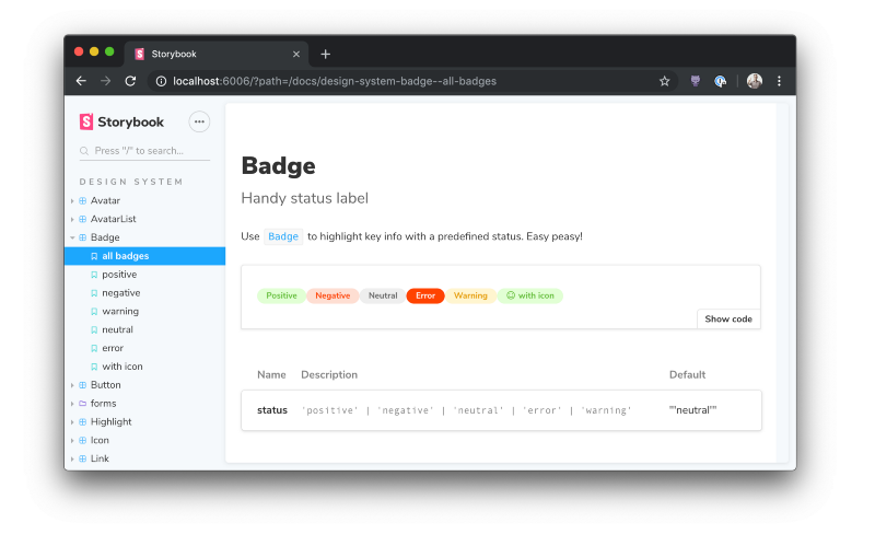
Storybook Docs evolves the dev environment into a UI documentation tool. When you install addon-docs in your project, you get auto-generated component documentation that adheres to best practices from community members like Auth0, Airbnb, and Microsoft.
If you want more flexibility, Storybook MDX is a convenient way to write fully custom long-form documentation and stories side by side in the same file:
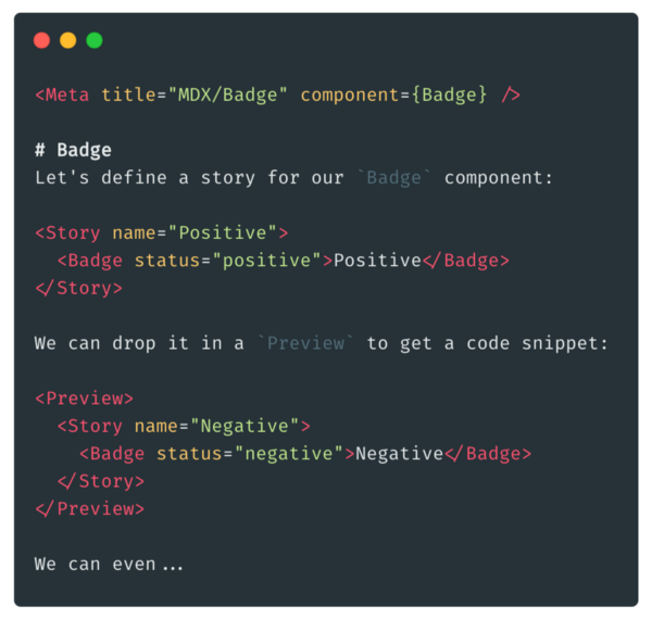
It also allows you to mix and match DocBlocks, high quality building blocks for component and styleguide documentation:
🎁 Docs for more frameworks
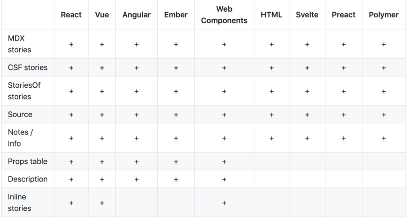
Storybook Docs for React was released in 5.2 and quickly became one of the leading UI documentation tools. In 5.3, Storybook Docs extends support to Vue, Angular, Web components, and Ember. That includes:
- 🗂 Props table generation. Extract names, descriptions, types, and default values for all component metadata.
- 📄 Component descriptions. Extract component description from JSDoc comments and display them in the docs.
- 🌮 Inline story rendering. Optionally render stories inline (rather than in an iframe) for improved performance and compatibility with dev tools.
This brings Vue, Angular, Web components, and Ember to near-parity with the React integration.
Here’s what the props tables look like for the new frameworks. Unlike React prop tables, these new prop tables are divided into sections, since these new frameworks support different kinds of metadata, such as inputs, outputs, events, slots, and so forth.
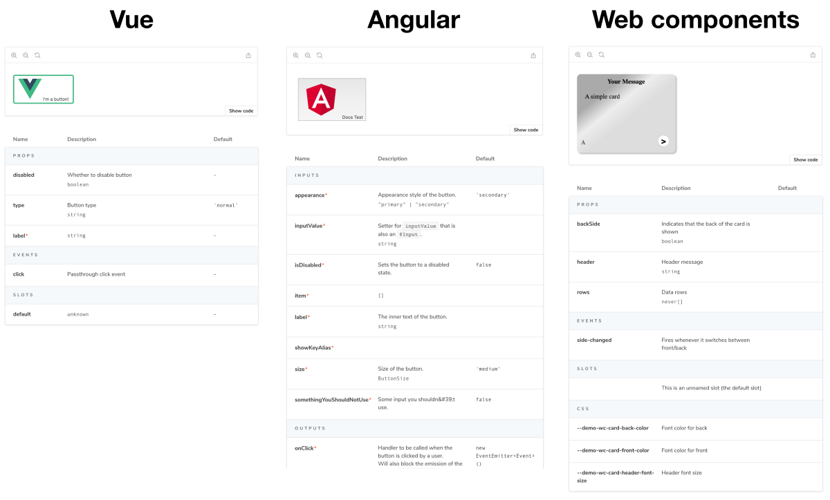
Storybook Docs for Vue by Aaron Pool uses Shota Fuji’s and Bart Ledoux’s vue docgen libraries to fully support Vue component data such as props, events, and slots.
Storybook Docs for Angular by Kai Röder uses compodoc to fully support angular-specific component data including inputs, outputs, properties, methods, and view children.
Storybook Docs for Ember by Matthew Irish uses JSONDoc to display component props.
Storybook Docs for Web components by Thomas Allmer uses custom-elements.json to display web component attributes, props, events, slots, and even CSS.
⚡️ 1 minute installation
Want it? First upgrade your project to Storybook 5.3:
npx npm-check-updates '/storybook/' -u
npm install # or yarn if you prefer
Then add docs to an existing project:
npm install @storybook/addon-docs --save-dev # or yarnFinally, add the following line to your .storybook/main.js file:
module.exports = { addons: ['@storybook/addon-docs'] };For more information on configuring Storybook for your framework check out the README for Vue, Angular, Ember, Web components, or React.
🚀 We need your help to make Storybook Docs great
The easiest thing you can do to help is install Storybook 5.3 in your project and ask questions and/or file bugs in our GitHub project. And if you see a bug you can fix, we welcome all contributions!
We’ve created an easy-to-follow checklist to optimize Storybook Docs to your favorite framework, so you can expect more community-contributed optimizations coming soon.
🙏 Thanks to the community
Storybook Docs is being developed by Michael Shilman (me!), Atanas Stoyanov, Patrick Lafrance, Francis Thibault, Aaron Pool, Kai Röder, Tom Coleman, Norbert de Langen, Lionel Benychou, Matthew Irish, Thomas Allmer, and Igor Davydkin. Design and theming by Dominic Nguyen. Special thanks to MDX early adopters Austin McDaniel, Vince Speelman, Kevin Suttle, Alex Wilson, and Tom Speak. Huge 🙌 to Brad Frost for design systems project guidance.
If Storybook makes your UI developer workflow easier, help Storybook get better. You can contribute a new feature, fix a bug, or improve the docs. Join us on Discord, support us on Open Collective, or just jump in on GitHub.