Storybook 5.3
Build production design systems faster

Storybook began with a simple goal: help developers build UI components and their key states. This is the easiest, most efficient way to think through component hierarchies.
We nailed this workflow and, as a result, Storybook is now the tool of choice for teams across the industry at places like Airbnb, Lyft, Slack, Twitter, and thousands more.
However, the bar on UI development has also been raised. In 2020, it’s not enough to provide great tooling for building and testing components. Today’s modern frontend teams also need to document and package their components into reusable design systems.
Storybook has been rapidly evolving to meet this challenge. Now I’m excited to announce our latest release — Storybook 5.3 supercharges building and documenting production design systems:
- 📝 Write stories and docs in MDX, the easiest way to interleave Javascript and Markdown.
- ✨ Generate best-practice documentation from your existing stories.
- 🌈 Available for major frameworks including React, Vue, Angular, Ember, Web components, and over a dozen others.
- ⚙️ Declarative configuration to simplify project setup and improve interoperability.
- 🔌 Design integrations to connect Sketch, Figma, Adobe XD, and more.
This is all fully compatible with Component Story Format (CSF) and the entire Storybook ecosystem of tools and workflows.
📝 Write stories and docs in MDX
One of the biggest features of Storybook 5.3 is a whole new way to write Markdown documentation and stories (component examples) side-by-side in the same file. The new story format, MDX, is a graceful combination of flexibility and ergonomics.
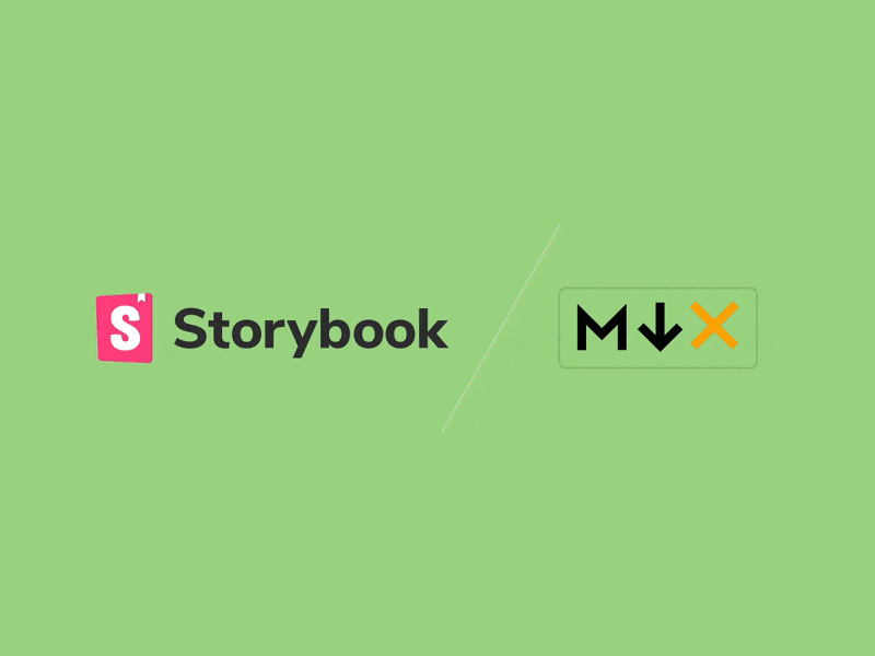
On one hand, it simplifies the process of creating fully custom docs for developers because you can define stories and docs all at once in the same place.
On the other hand, Markdown is natural and familiar for non-technical teammates. Designers and product managers can edit UI documentation themselves in Storybook (without needing your help).
MDX is a significant developer experience upgrade whose positive impacts are already beginning to surface via Storybook’s alpha/beta users. In a nutshell, MDX makes it easier for multi-functional teams to create a single source of truth for UI engineering.
Read the Storybook MDX announcement »
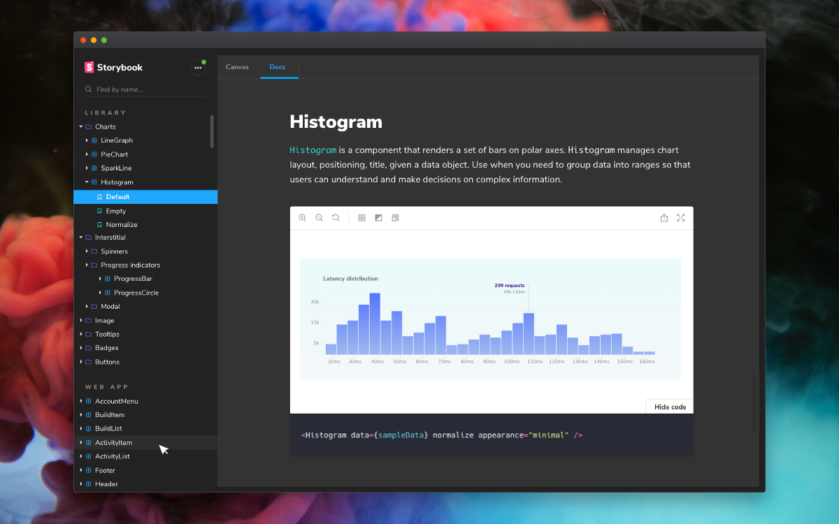
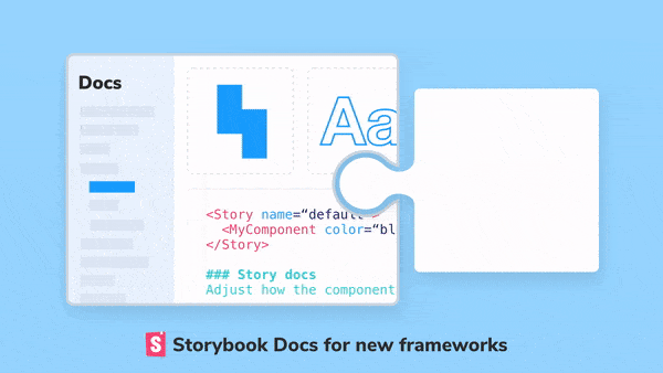
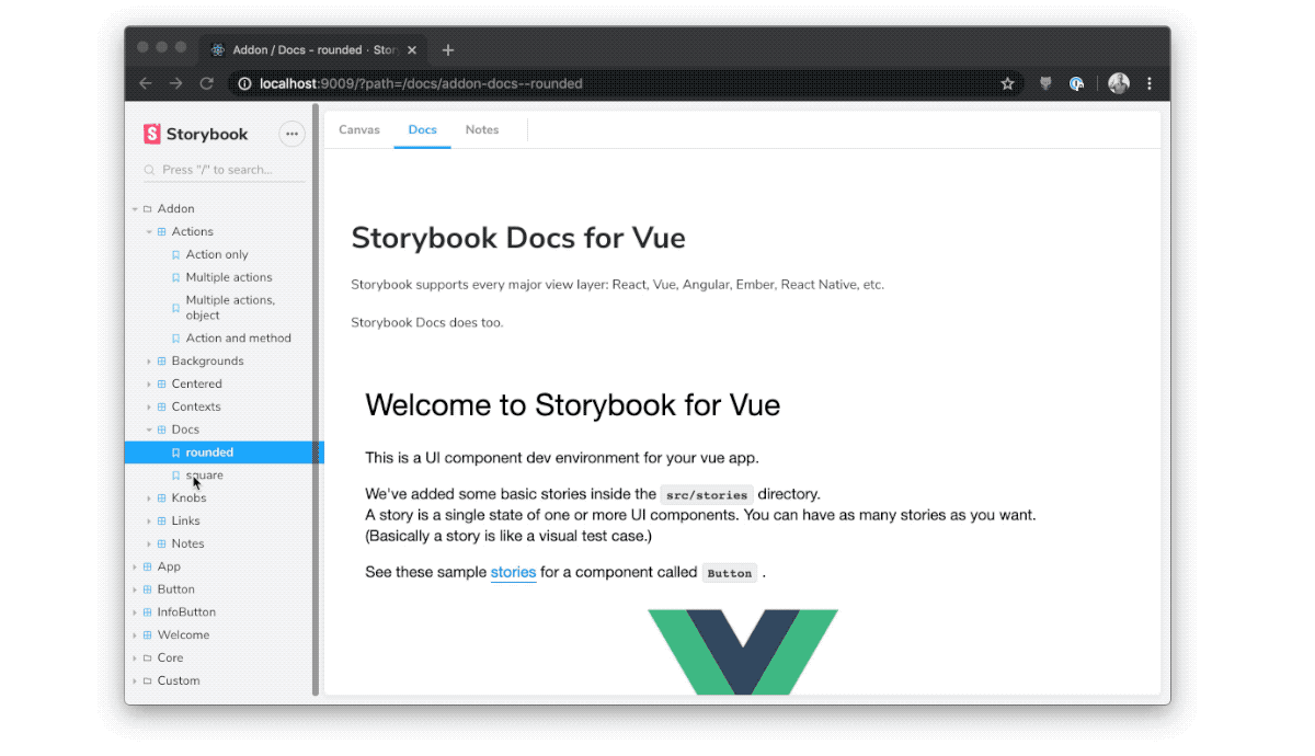
🌈 Auto-generated docs for more frameworks
Our vision with Storybook Docs is to help developers automatically generate best practice UI docs with zero configuration. Initially, we launched with React. Now, Docs has first-class support for Vue, Angular, Ember, and Web Components.
We designed Storybook Docs to be cross-framework from the ground up (like the rest of Storybook), but there are features like Props Table generation that are inherently framework-specific.
In Storybook 5.3, we’ve optimized Storybook Docs for Vue, Angular, Ember, and Web components. We’re committed to helping community members optimize SB Docs for their favorite framework with an implementation checklist.
Learn about the new frameworks Storybook Docs supports »
⚙️ Declarative configuration
Storybook configuration also gets a major upgrade in Storybook 5.3. You can now perform most common-case configurations in a single file, main.js.
It’s a huge win for developer ergonomics because you can declaratively configure your stories, configure addons, and even configure webpack (!) in a single file. The new config is backwards-compatible with the old format.
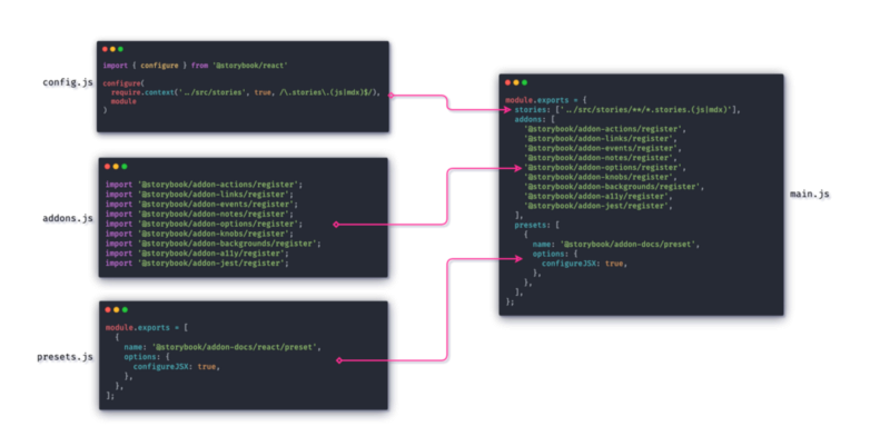
Viewed through the lens of the Storybook open source platform, declarative config sets the stage for a new wave of performance and integration opportunities that weren’t possible before.
Learn more about main.js declarative configuration »
🔌 Design tool integrations
In addition to improvements to the core Storybook product, there’s also a whole flurry of new ways to connect Storybook with your favorite design tools, thanks to our huge addon ecosystem.
Storybook has always been known for rich addons support. In 2019 the project hit a tipping point, with Storybook becoming the standard integration point for design tools.
First, InVision built Storybook support into Design System Manager. Now, there’s an addon for every major design tool, including Sketch, Figma, Abstract, and Adobe XD.
Read about all the ways to integrate design tools and Storybook »
🚾 Web components is officially supported
Storybook has a “more the merrier” approach to front-end technologies, with a cross-framework core architecture and shipping support for over a dozen different frameworks. Now, in Storybook 5.3, we’re happy to announce official Web Components support, thanks to Thomas Allmer and Lars den Bakker.
We’re now shipping @storybook/web-components, a new package to provide isolated component development and best-practices UI documentation for all web components projects. This is now Open-WC’s recommended way to develop Web components! To get started, please see the package README.
In addition to basic Storybook support, Lars and Thomas are also pioneering an alternative packaging of Storybook that contains a static build of Storybook’s “manager UI.” This makes it easier to embed Storybook into the development server of your choice, since Storybook’s default serving mode relies on Webpack.
For a deep dive on this effort, please read Thomas’ post:

And much more!
The amazing thing about a thriving community project with 850+ contributors is that the system is continuously improving at every level. Other highlights from 5.3 include:
✅ Deep linking by Patrick Lafrance, Atanas Stoyanov, and Michael Shilman (me!). Now it’s possible to deep-link to sections in Storybook Docs with a GitHub-style UI:
✅ Permalinking. Storybook 5.3 also contains Component Story Format upgrades so make it possible to specify component and story ID’s to create permalinks for components and stories. This way, even as you reorganize your Storybook, existing external links won’t break.
✅ DocsPage templates by Atanas Stoyanov. Storybook 5.2 shipped with DocsPage for auto-generating documentation from your stories. Now, thanks, DocsPage templates are now configurable. This way you can customize the template that gets applied to the stories. For example, it’s easy to add an extra section to each Docs page.
✅ Typescript Support. Gaëtan Maisse and Kai Roëder have been driving the long process of converting the Storybook codebase to Typescript, for maintainability’s sake and also to provide native package types to Storybook users. I’m excited to announce that in 5.3, the last user-facing packages have been converted! While 37% of the codebase is still Javascript, nearly all of the packages that users care about have been converted.
✅ Standalone CSF. Now it’s easy to implement Storybook’s Component Story Format (CSF) in other design and dev tools using the @storybook/csf library. The broader ecosystem has already started to adopt it:
With this release, we now use the new `storybook/csf` project:https://t.co/CQIwEU4CY1
— Web Components .dev (@webcomp_dev) December 19, 2019
Thanks @mshilman 👍
We look forward to contribute new things to it!
⬆️ Upgrade to Storybook 5.3 now
Storybook 5.3 is packed with new features, but doesn’t contain any breaking changes as far as we know. We’ve got a 5.0 upgrade guide if you’re coming from 3.x/4.x. If you’re already on 5.x, you can upgrade like this:
npx npm-check-updates '/storybook/' -u
npm install # or yarn
In addition, there are a bunch of migrations which are documented in the 5.3 migration notes. These are optional changes, but we recommend taking the time to upgrade in advance of the upcoming 6.0 release, at which time many of them will become required.
If you’re new to Storybook, now’s the best time to get started. Check out the Storybook Tutorial for a step-by-step of React/Angular/Vue. Or jump right in:
cd my-project
npx sb init
npm run storybook
Once you’re on 5.3, adding Docs to your project is a snap:
npm install @storybook/addon-docs --save-dev # or yarnThen add it to the addons field of your .storybook/main.js config:
module.exports = {
  addons: ['@storybook/addon-docs'],
};
For more information on configuring Docs, read the addon-docs installation instructions.
Get involved
Storybook’s backbone is its incredible community of developers and users. The project has accumulated nearly 45,000 GitHub stars, which puts us on a par with legendary projects like Rails and Bitcoin. Together, we’re building the future of component development.
We’d love to have you involved, regardless of your experience level. If Storybook makes your UI developer workflow easier, help Storybook get better. You can contribute a new feature, fix a bug, or improve the docs. Join us on Discord, support us on Open Collective, or just jump in on GitHub. Please 👏 applaud this post and share to help more people discover it.
Storybook 5.3 code contributors: @aaron-pool @adamyonk @adrian-potepa @aej11a @afebbraro @afholderman @alanhchoi @aokiken @apanizo @apust @aromanarguello @ashr81 @atanasster @b0c4j @beizhedenglong @bpeab @brandonchinn178 @carolstran @christiancooksponge @codebyalex @collingreen @crubier @dakmor @darmawanalbert @dbendaou @dhuang612 @discostarslayer @divslinger @domyen @donaldpipowitch @donysukardi @dsusskind @eubenesa @expe-lbenychou @ezhikov @frederickfogerty @gaetanmaisse @gaspardip @ghengeveld @gherciu @gongreg @halitogunc @hasparus @hcz @himynameisdave @hipstersmoothie @hobroker @hypnosphi @imgbotapp @indigolain @jack-barry @jamesdbruner @jasdeepgill @jeffgukang @jerriclynsjohn @johnalbin @jung-han @karlsander @kerbe @kerumen @kevin940726 @kevinsuttle @kroeder @kush @kylemh @lazaroonline @libetl @macrozone @mattfelten @meirish @michaeldeboey @mrmckeb @natalia504 @naturalclar @ndelangen @necolas @nminhnguyen @nutboltu @patricklafrance @peeja @pierroberto @pocka @quramy @ramkrish2079 @rbardini @sairus2k @schalkventer @shilman @spencerbyw @squidfunk @steel @stof @taimoormk @thollander @tmeasday @umar-ahmed @winterlamon @xmile1 @yosefalnajjarofficial