State of Storybook 2021
Huge year for performance, testing, and community ecosystem

Storybook is the industry-standard UI development workshop for components and pages. It's used by BBC, Netflix, Twitter, and thousands more teams.
Since the beginning, our goal was to make the tools and techniques used by the best frontend teams available to everyone.
Today, Storybook has established itself as the best practice for component development, testing, and documentation. It supports every major web framework, is made by 1400+ contributors, and benefits from hundreds of third-party addons.
This post recaps the platform's evolution in 2021 and previews the next generation of improvements.
Performance & stability
Our highest priorities are performance and stability.
In previous years, we built new workflows such as documenting and testing components, while also solving multi-framework compatibility. Thanks to these explorations, we understand what’s needed for a solid UI developer experience.
But as the project expands, it’s trickier to maintain. This is especially painful since frontend frameworks and build tools are rapidly evolving.
In 2021 we re-architected Storybook’s core for performance, in partnership with Webpack and Shopify UX engineering. Now that we have a better handle on performance, we’re setting our sights on improving stability.

Performance
When it comes to performance, smaller is faster. And the less the user has to build locally, the faster Storybook starts. I’m thrilled about the massive performance gains we’ve made.
- 6.4’s On-Demand Architecture: 3x smaller & 4x faster loads for static builds
- 6.3’s Vite builder with 10-100x faster startup times
- 6.2’s Webpack 5 support to leverage the latest optimizations
- 6.1’s App UI caching for faster build times

Stability
Stability is critical for an in-development tool. We rewrote Storybook’s core to be lighterweight and extensible. That simplifies integrations with next-generation frontend tooling like Webpack 5, Vite, and ESBuild.
We also streamlined the developer experience with automated migrations, feature flags, story linting, and versioned documentation (outlined in the 6.4 release post).

What’s next?
In 2022, we’ll prioritize refining Storybook’s existing features. We now have full coverage of the primary workflows of develop, test, and document. That means we can continue innovating under the hood. Here’s the roadmap:
- Speed: Webpack 5 build optimizations
- Weight: Modern ESM browser target to slim and simplify distribution
- Dependency conflicts: Pre-bundle dependencies to reduce install size and conflicts
- Reliability: Define a tight boundary around Storybook’s core and test more rigorously
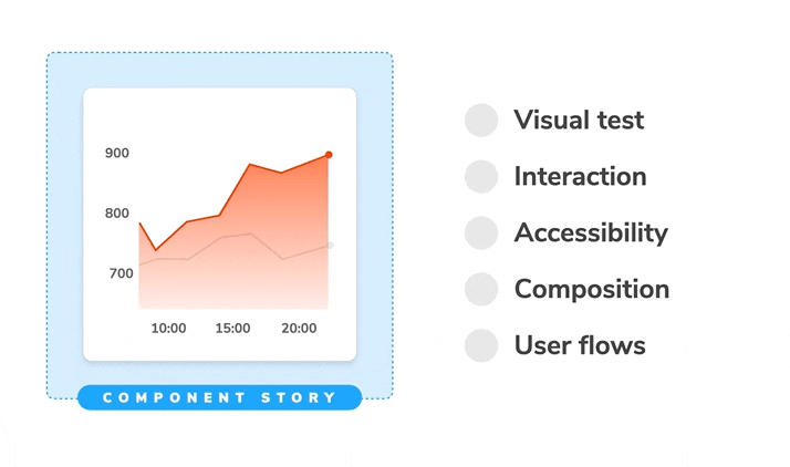
UI Testing
Storybook was made for testing from day one. Writing a story parallels the “setup” step in a typical testing workflow. But there’s a big difference between Storybook and other testing tools.
Whenever you write a story you also unlock an ecosystem of test integrations that validate UI appearance, accessibility, and performance. That’s why teams at Target, Adobe, and Shopify use Storybook. We're giving this use case a lot more attention in 2022.
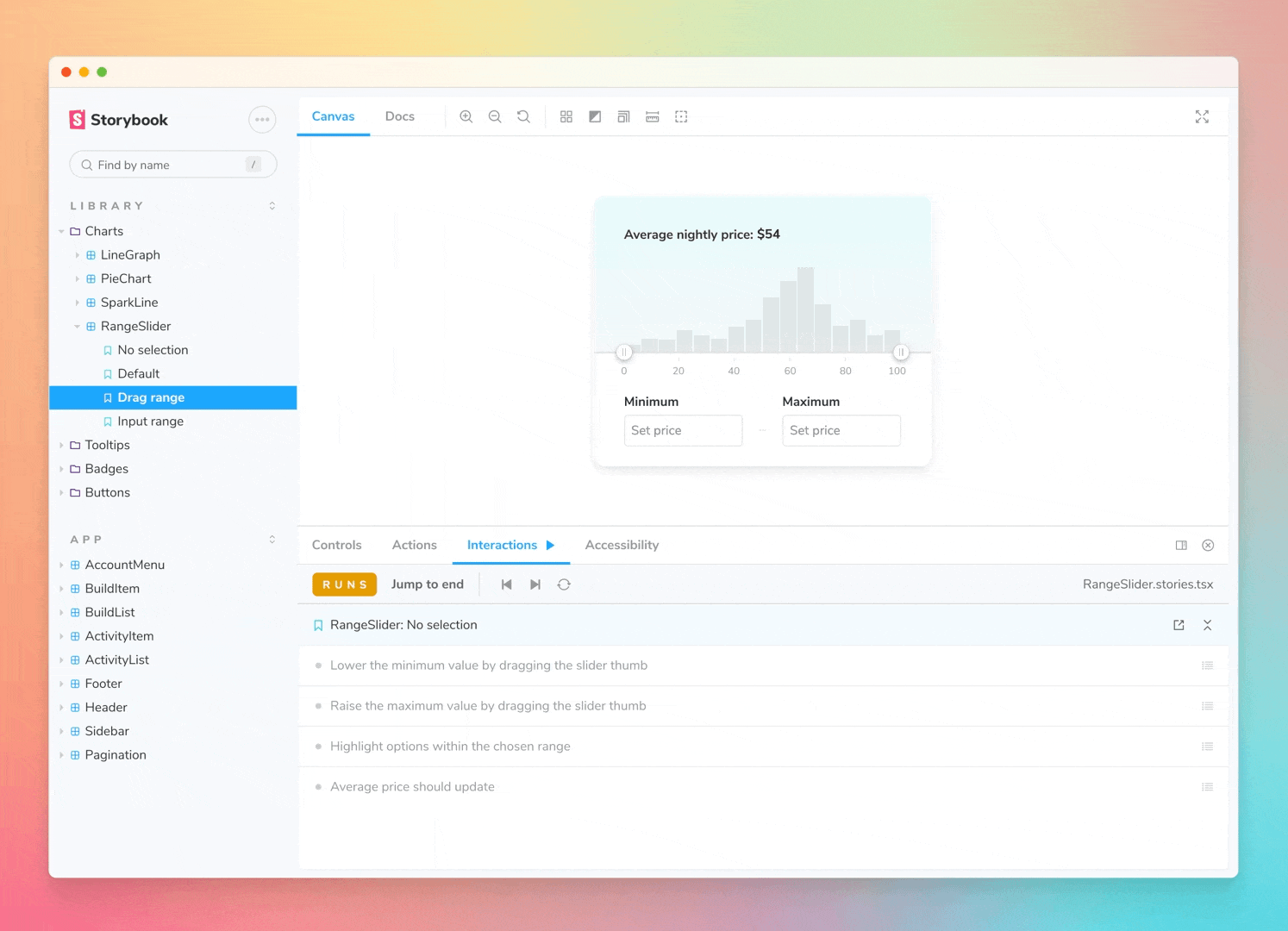
Interaction tests with Testing Library
Storybook interaction testing allows you to script interactions and check expectations in the story itself. That allows you to run functional tests across UIs in the same environment you develop them: the browser.
In August, we previewed Interaction testing which helps you to simulate user behavior in your stories. Since then, we launched Interactive stories, a new way to author, showcase, test, and debug user interactions against isolated components. There’s much more to come.
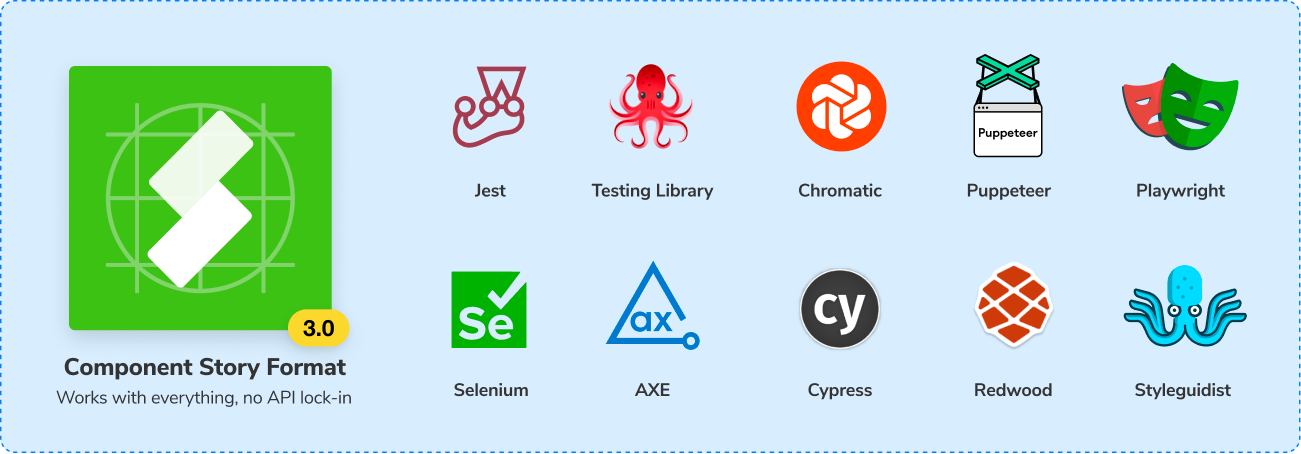
Component Story Format 3.0
Component Story Format 3.0 is the next major iteration of CSF. Our vision with CSF is to create a expressive, platform-agnostic format that's compatible with all JavaScript libraries – no API lockin.
This year saw widespread CSF adoption across the frontend ecosystem by tools like RedwoodJS, React Styleguidist, UXPin, Bit, and Backlight.
We now want to make it easier to reuse your stories in your favorite testing tools by shipping helper libraries Testing-react, Testing-vue, and Testing-angular.
UI Testing Handbook – 9 chapter guide
What’s the secret to testing UIs in 2021? We researched ten teams at Twilio, Peloton, O’Reilly Media, and more, to distill their testing tactics into a guide.
UI Testing Handbook is a 9 chapter tutorial that walks you through testing techniques used by top engineering teams. You’ll learn how to implement a pragmatic testing strategy that balances coverage, setup, and maintenance.

What’s next?
We’re continuing to make UI Testing a seamless part of your development workflow.
- 6.5 (coming soon) includes a Playwright-based test runner that can execute your stories in parallel and provide links to test failures for interactive debugging in the browser.
- Revamped addons for accessibility and performance
- Improve story reuse across all frameworks and tools
Addon ecosystem
In early 2021, we released the Storybook addon catalog to help users find the best addons to match their needs, and also help addon authors better reach the Storybook community. It categorizes addons for code, data & state, testing, style, design, storybook appearance, and story organization.
We also launched Storybook’s Addon Kit, a GitHub template contains everything to get started on a new addon.
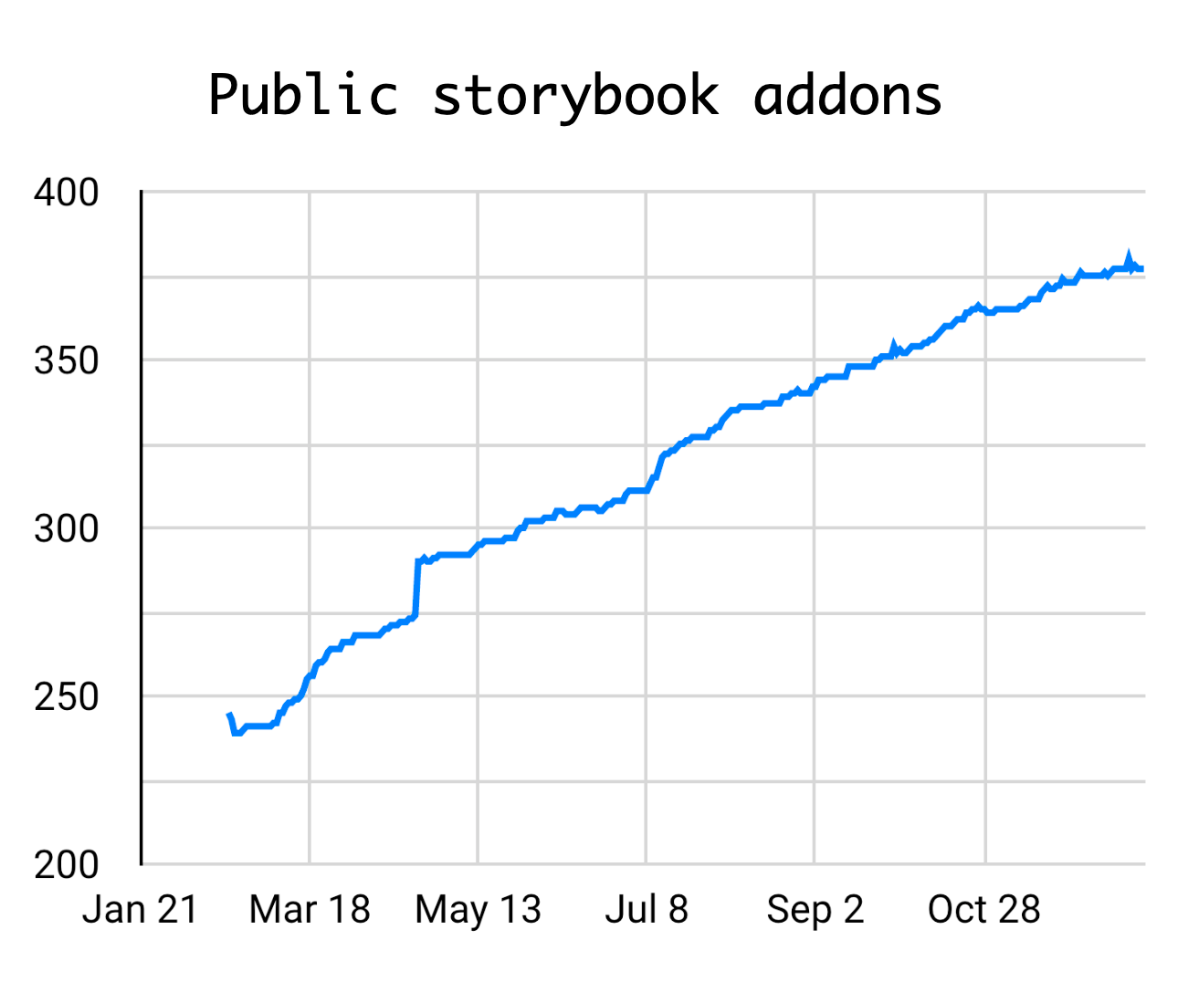
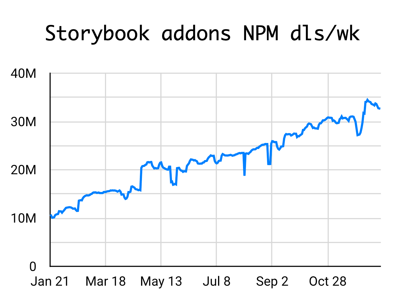
The addons work has been a resounding success. In less than a year, we’ve seen the number of public addons grow from 250 to nearly 400. We’ve also seen the weekly NPM downloads across all addons grow from 10M to almost 35M!
New essential addons
The Essential addons is a bundle of popular addons that’s included with each new Storybook installation to provide a great out-of-box experience with zero configuration. In 2021, we expanded Essentials with Measure and Outline for layout debugging.
What’s next?
Storybook’s API has remained stable since the hookification in 5.2 over two years ago. That provided a solid foundation for this year’s addon catalog and kit. We’ll continue to improve our documentation, expand the addon kit, and simplify integration.
Story embeds
More and more tools are embedding Storybook stories into their workflows. That’s fantastic news for users because you can reuse existing stories instead of rebuilding them.
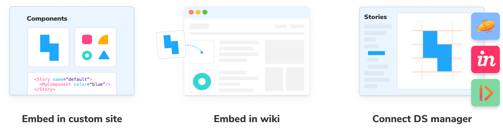
Documentation tools Zeroheight, InVision DSM, and Frontify were the first to embed stories into their products. These integrations use Storybook to showcase production components inside design system documentation.
2021 brought innovative embeds from popular design and development tools.
- UXPin embeds stories for interactive design/prototyping with production components
- Zeplin embeds stories to provide next-generation design-development handoff
- Prismic’s Slicemachine embeds Storybook for building pages on a headless CMS
- Chromatic launched embed support for Notion, Medium, Wordpress, and other services that support the oEmbed standard.

What’s next?
So far, the existing embeds were done without a formal embed API; we plan to add one in 2022. Our goal is to increase the utility and capabilities of your existing stories.
Community growth
Storybook’s greatest strength is our user community. You push the limits of component-driven development, help each other, and harden the tool with more use cases.
Storybook’s following has grown dramatically in 2021 thanks to tremendous work by our developer experience team. The Twitter account and Discord community have grown from a few thousand to over 13k followers and 11k members, respectively. That means there are more ways to engage with Storybook folks on platforms you already use.

Usage has also grown, with a 5-20% “market share” (as a percentage of weekly NPM downloads) across all major Web frameworks.
| Framework | Weekly DLs | Market share | 2021 Growth |
|---|---|---|---|
| React | 2.6M | 21% | 1.6x |
| Vue | 223K | 8% | 1.8x |
| Angular | 187K | 6% | 2.1x |
| React Native | 101k | 16% | 1.8x |
| Web components | 19k | N/A | 4.5x |
| Svelte | 14k | 6% | 2.2x |
React is our most mature and widely-used framework. It grew by ~60%, adopted by tens of thousands of teams this year. We’re seeing increased NextJS usage and plan to invest more there in 2022. We’re also thrilled about first-class integration in RedwoodJS, which is rapidly approaching its 1.0 release.
Vue and Angular both roughly doubled this year. We launched Vue3 support at the start of the year and Angular 12 with Ivy support in June. Both frameworks have benefitted from integrations with tools like Nx and Nuxt.
React Native (RN) is still on version 5.3. Nevertheless it has a ~16% market share. RN got two big shots in the arm including a long-awaited 6.0-alpha release and React Native Web support, so we expect to see a resurgence in 2022.
Web components (WC) grew most of any SB framework. @storybook/web-components is relatively new, so it has lots of room to grow, not to mention that WC is generally growing more popular.
Svelte support is early but we invested a lot into it this year with a native story format and improved docs support. As SvelteKit standardizes on Vite, we hope that Storybook’s Vite Builder leads to best-class support.
What’s next?
Your support keeps our team going. We plan to add more learning resources, integrate with your favorite libraries, and create community programs to help you take advantage of everything Storybook has to offer.
The upcoming Component Encyclopedia gathers the web’s best components in one place for you to use a resource in building your own UIs. Our community scoured the internet for battle-tested UI components from the likes of Adobe, Mozilla, GitHub, Wordpress, and more. We need your help to discover new projects. Submit the URL of your favorite published Storybooks here.

See you in 2022
Storybook’s popularity in the fast-moving JavaScript ecosystem is a testament to our thriving community. More teams than ever are building component-driven UIs with Storybook. Over 1400 contributors and tens of thousands of users help shape Storybook’s future.
In 2021 we shipped huge updates to performance, testing, and integrations. Rapid community & ecosystem growth!
— Storybook (@storybookjs) December 29, 2021
🏆 #52 most starred repo all time
👩💻 1400+ contributors
👋 10s of thousands users & even more fans
🧩 350+ addons
Read the 2021 State of SB 👇https://t.co/tQiYfVVugp pic.twitter.com/FB0347JR2J
These maintainers made outstanding contributions in specific product areas (alphabetical):
| Area | Maintainers |
|---|---|
| Angular | Thibaud Avenier, Mark Berry, Kai Röder |
| Controls | Tom Coleman, Gert Hengeveld, Michael Shilman |
| Core | Tom Coleman, Norbert de Langen, Michael Shilman, Juho Vepsäläinen |
| Documentation | Joao Cardoso, Kyle Gach, Dominic Nguyen, Varun Vacchar |
| React | Brody McKee |
| React Native | Danny Williams |
| Server | Jon Palmer |
| Svelte | Jérémie Brébec |
| Testing | Yann Braga, Gert Hengeveld, Varun Vacchar |
| Tooling | Clement Dungler, Gaëtan Maisse |
| UX | Michael Arestad, Gert Hengeveld, Dominic Nguyen |
| Vite | Sasan Farrokh, Eirik Sletteberg, Ian VanSchooten, Josh Wooding |
| Vue | Blaine Bublitz, Sasan Farrokh, Shota Fuji |
| Web components | Westbrook Johnson, Gaëtan Maisse |
And a huge thank you to everyone who contributed in 2021!
@102 @7rulnik @88ta @acdzh @adagar @adrianpdm @agriffis @allanchain @andarist @andrefarzat @andrewlevada @andrewvasilchuk @apalumbo @apapadopoulou @appsparkler @artmsilva @avaly @avendiart @avergos29 @awesome31 @banonotit @barbaralaw @bart-krakowski @bartjanvanassen @bebraw @benbender @bennypowers @bodograumann @brianblakely @chee @chrisbutler @cjmcintyre @commenthol @coreyjv @crixx @daleseo @dallasgale @damianosipiuk @darleendenno @develra @dexster @diedu89 @dominictwlee @domyen @doublejosh @drakang4 @dschungelabenteuer @eins78 @eirslett @emclaug2 @eric-burel @eungyeole @evancharlton @evhaus @extempl @facugaich @fede-moreno @fedodd @fenixk @forivall @frassinier @fredx87 @frozenpandaz @gabiseabra @gaetanmaisse @geisterfurz007 @gentoo90 @ghengeveld @glocore @graup @gregogun @gregorynative @guilhermewaess @happycollision @hatlen @huyenltnguyen @hydrosquall @hypnosphi @iamandrewluca @ianvs @igorszyporyn @ilya2306 @imgbotapp @inokawa @ittaibaratz @j3rem1e @jabbypanda @jadojodo @jakob-em @jakubriedl @jamesgeorge007 @janjakes @jason-lough-cap-rx @jayita10 @jeshwan @jgbright @jh3y @johannesfischer @jonniebigodes @jonspalmer @josh-biddick @joshuakgoldberg @juan-cortes @juristr @jwlms @ka2jun8 @kaelig @kherock @kmathytech @koba04 @kroeder @krofdrakula @kwhsiung @kylegach @lauracarballo @lifeiscontent @lihbr @literalpie @livthomas @lkuechler @lordvelisch @maael @maerten @mandarini @mann-david @marklb @marksy @maruta-bis5 @mashabow @maslade @matheo @mattdarveniza @maxime-aknin @maxmezzomo @maya @mayank99 @mdamian322 @medvedovic @meetpatel5396 @mehrdad-e @melindali255 @merceyz @mercs600 @methuselah96 @mfranzke @mgcrea @micahgodbolt @michaelarestad @michalmo @mikaoelitiana @morphatic @murtukov @nazeeh21 @ndelangen @neilbryson @nevnet99 @ngoov @niklasmh @nishargshah @nummi @oanaom @oscard0m @osdiab @patricklafrance @paulrosania @penguinofwar @penx @peschee @peterpeterparker @phaistonian @phated @phnessu4 @phunkren @pidelport @pocka @pokuwagata @profanis @przmv @pvinis @pzuraq @qoalu @quickgiant @radosvetpetrov @randak @raon0211 @renovate-bot @rev3rsor @revik @richorrichard @rickcardoso @rmschindler @robhil @samkirkland @saranrapjs @sasanfarrokh @saschwarz @scooooooooby @sebastiengllmt @seuros @sharebear @shilman @shisama @silversonicaxel @snakesvx @solimant @srmagura @stefan-schweiger @stefanoslig @stevensacks @stof @tanya-mahajan @tanyabrassie @tdorsey @tewson @thanarie @thawkin3 @thebestmoshe @theinterned @thepassle @thibaudav @thomasvaeth @titouanmathis @tmeasday @tomastomaslol @tooppaaa @tskarhed @tyankatsu0105 @valerybugakov @vdh @virtuoushub @vishmimoney @visualfanatic @vixalien @vmalay @westbrook @winkervsbecks @wivsw @wkich @xavierchevalier @xonev @yaim @yaireo @yannbf @yceballost @yngvebn @yozhezhi @yutasugimura @zacnomore @zarahzachz @zol