How to build connected components in Storybook
Learn how to mock context, app state and API requests using decorators

Presentational components like Avatar, Button, and Tooltip receive inputs exclusively via props and have no internal state. This makes it straightforward to isolate and write stories for them. However, components higher up in the application tree are trickier to build in isolation with Storybook.
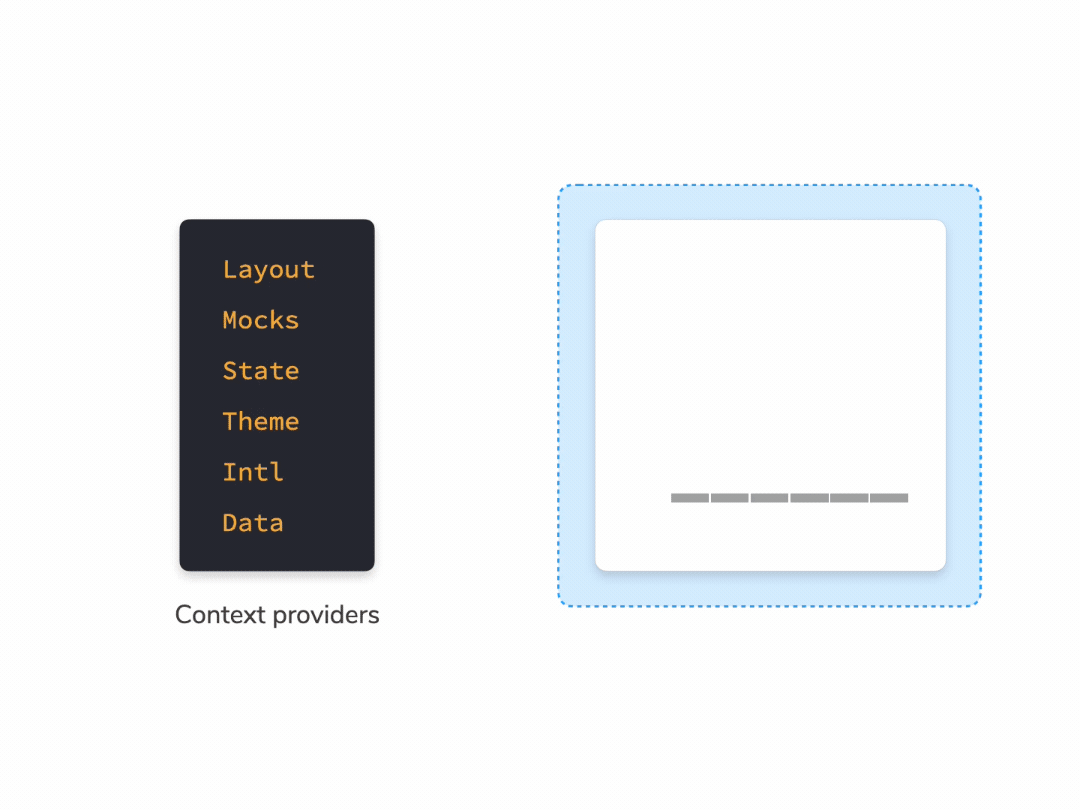
Connected components like Forms, List, and Cards track application state then pass behaviours down the tree. They often require a "harness/wrapper" to render in a useful way.
- Styling:
ThemeProviderand global styles - Layout: DOM structure that mimics layouts
- Data fetching: GraphQL providers or hooks to make API calls.
- State management: store provider for Redux, MobX, Recoil, etc.
This article shows how to use decorators to isolate connected components. You'll learn to build decorators, control their behaviour using parameters, and use them to mock component dependencies.
Why build connected components in isolation?
Every component has countless variations based on app state, theming, responsive behavior, device features, internationalization, etc. Developers write stories to cover all these use cases. This enables them to view any variant instantly then verify its look and feel.
While Storybook is widely used for design systems, it's also common for front-end teams to write stories for application components. These components are "connected" to app state, context, and hooks which yields more complex variations. Devs choose to build connected components in Storybook because it's easier to develop hard-to-reach use cases such as loading, error and empty states.
Codeacademy, Gitlab, IBM, DC/OS Labs and Monday.com are just a few such examples.

Use decorators to isolate connected components
UI components need data and action handlers to render. These are often passed in as props, but connected components also access them directly via context, API requests and hooks.
To isolate a connected component, you must mock its dependencies. In Storybook, you can use decorators to provide mock context and write stories for different component variations.
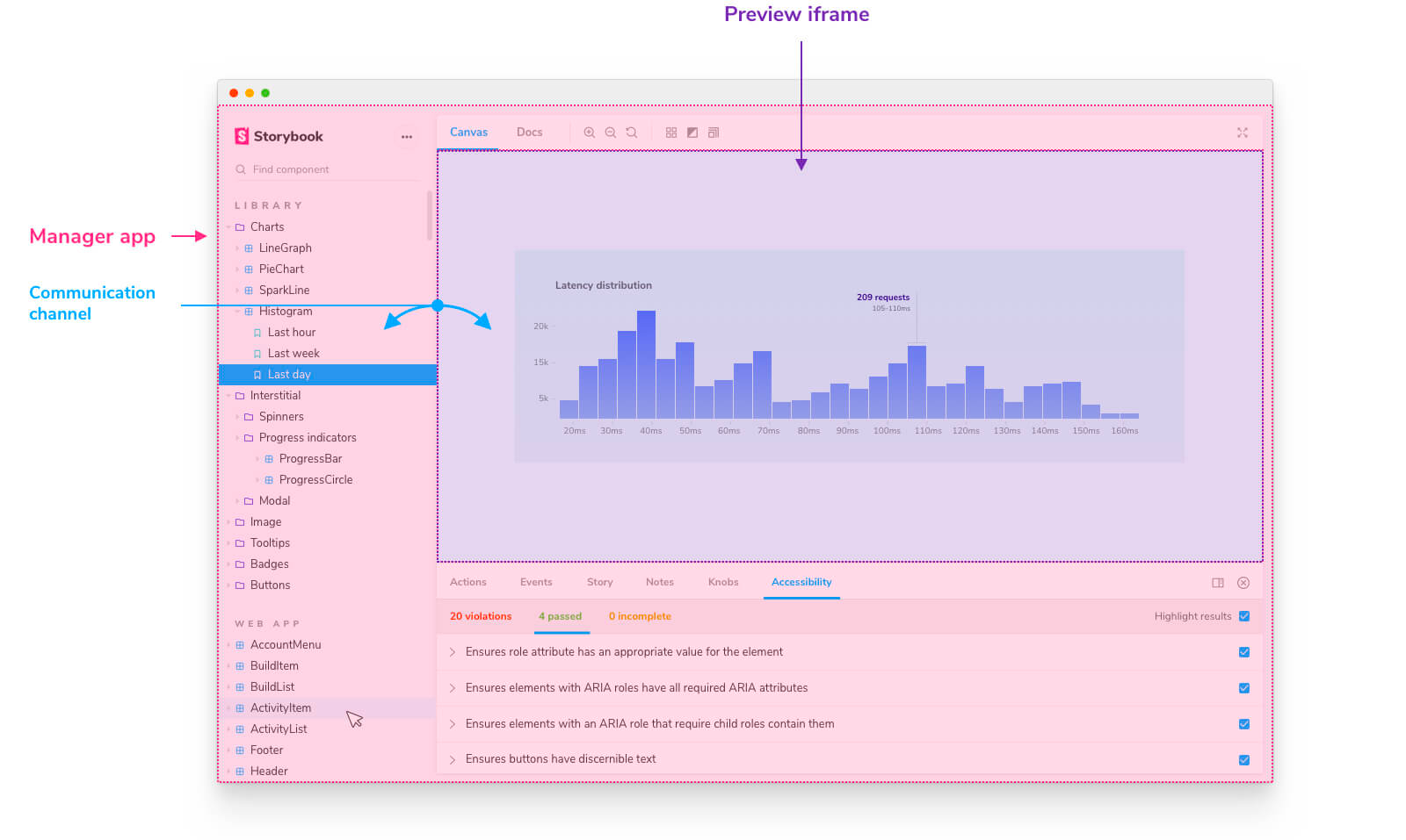
Storybook is split into two parts: manager, which renders the Storybook UI (search, navigation, toolbars, and addons) and preview, where your stories are rendered.
A decorator is wrapper code that runs inside the preview iframe. They enable you to control the story layout, how it’s rendered, and provide mock context. Let's explore all those possibilities with a few examples.
Control the layout of your stories
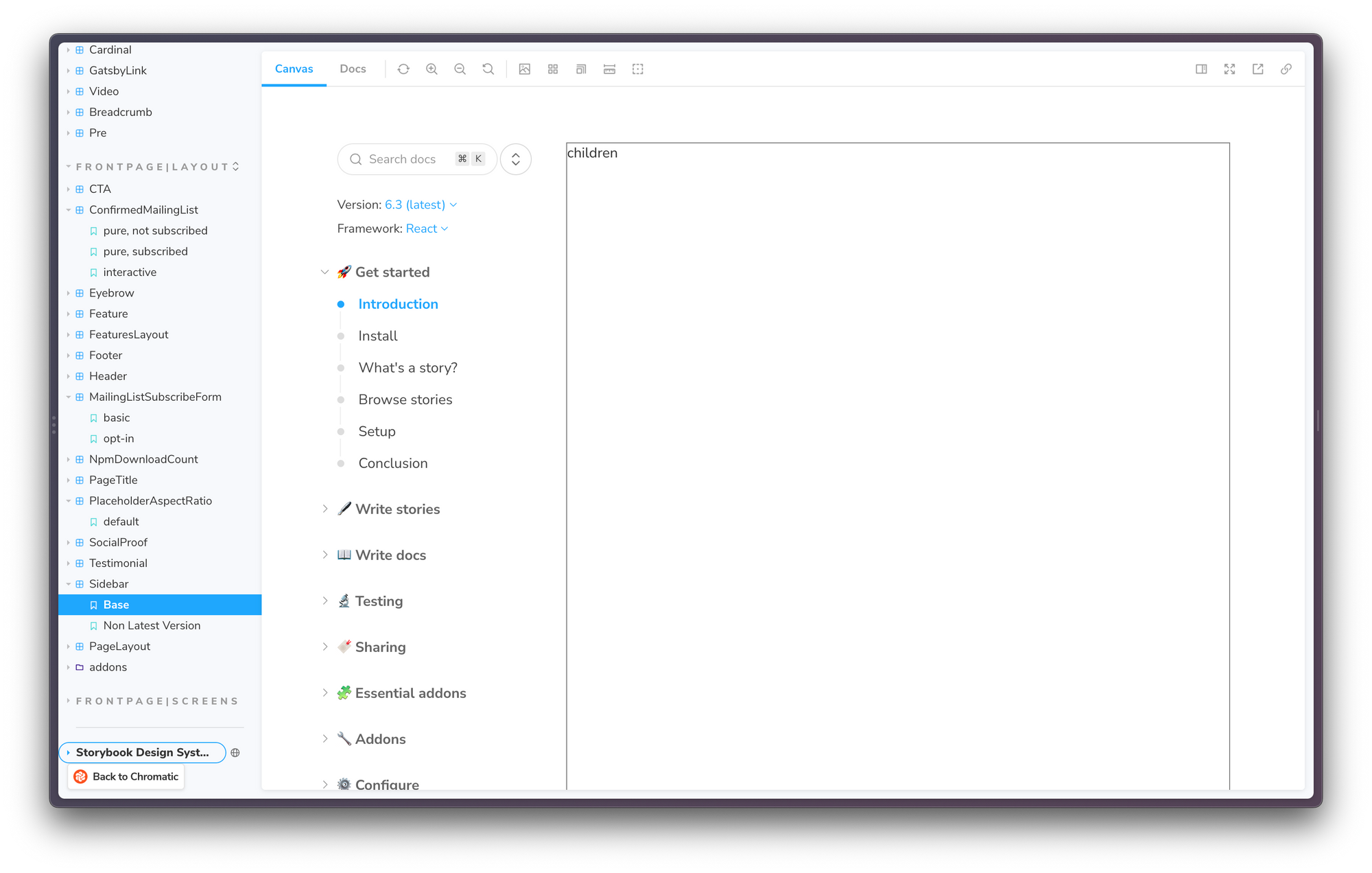
The most basic use case for decorators is to provide layout constraints for a component. Say you're building a Sidebar component. By default, it expands to fill its parent container. However, it's meant to be used in a page layout where it only takes up a small fraction of the viewport width. We can mimic that page structure using a decorator, like so:
// Sidebar.stories.js

import { Sidebar } from './Sidebar';

const withLayout = (Story) => (
  <div style={{ display: 'flex' }}>
    <div style={{ flex: '0 0 240px', marginRight: 16 }}>{Story()}</div>
    <div style={{ display: 'flex', flex: '1 1 auto' }}>children</div>
  </div>
);

export default {
  title: 'Sidebar',
  component: Sidebar,
  decorators: [withLayout],
};

export const Base = () => { /* ... */ };
export const NonLatestVersion = () => { /* ... */ };
Load global providers
Many libraries rely on global providers for configuration. For example, Styled Components and Chakra UI use a provider to customize themes. Whereas React Intl uses a provider to pass in locale-specific translations.

We can add a single global decorator to .storybook/preview.js to load up these providers. Here’s an example of how to set up React Intl with Storybook.
// .storybook/preview.js

import React from 'react';
import { IntlProvider } from 'react-intl';
import messages from './compiled-lang/fr.json';

const withIntl = (StoryFn) => (
  <IntlProvider locale="en" timeZone="Asia/Tokyo" messages={messages}>
    {Story()}
  </IntlProvider>
);

export const decorators = [withIntl];
Control decorators via parameters
Along with the story function, decorators also receive the story context object, which contains the story's args, parameters, globals, etc. This means you can configure addons using parameters.
For example, this withTheme decorator provides a theme to all your component and loads up global styles. Moreover, you can control which theme is active via story parameters. For a complete overview of this technique, check out: How to add a theme switcher to Storybook.
// .storybook/preview.tsx

import { ThemeProvider } from 'styled-components'
import { GlobalStyle } from '../src/styles/GlobalStyle'
import { darkTheme, lightTheme } from '../src/styles/theme'

const withTheme = (Story, context) => {
  // Get the active theme value from the story parameter
  const { theme } = context.parameters
  const storyTheme = theme === 'dark' ? darkTheme : lightTheme
  return (
    <ThemeProvider theme={storyTheme}>
      <GlobalStyle />
      <Story />
    </ThemeProvider>)
}

export const decorators = [withTheme]
Mock context for state management libraries
The provider pattern is also widely used by state management libraries such as Redux, MobX and Recoil to give components access to the state store. In this scenario, we can provide a mocker store using story decorators to render different component variants.

Consider this TaskList component wired up to a Redux store. The application state within that store determines which variant of the TaskList is rendered.
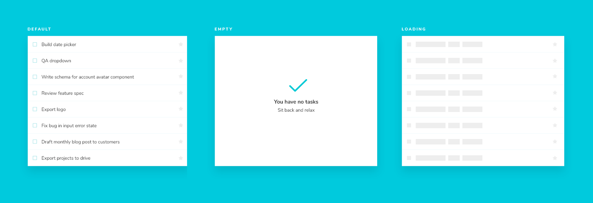
To control that application state, we’ll create a mock store using utilities from the @reduxjs/toolkit. Then apply different state objects to the mock store using story decorators. This enables us to replicate hard-to-reach component states as stories.
// TaskList.stories.js

import React from 'react';
import { Provider } from 'react-redux';
import { configureStore, createSlice } from '@reduxjs/toolkit';
import TaskList from './TaskList';

export default {
  component: TaskList,
  title: 'TaskList',
};

// Mock state that'll be passed to the mock redux store
const MockState = {
  tasks: [/*...code omitted for brevity */],
  status: 'idle',
  error: null,
};

// Mocked redux store
const Mockstore = ({ taskboxState, children }) => (
  <Provider
    store={configureStore({
      reducer: {
        taskbox: createSlice({
          name: 'taskbox',
          initialState: taskboxState,
        }).reducer,
      },
    })}
  >
    {children}
  </Provider>
);

const Template = () => <TaskList />;

export const Default = Template.bind({});
Default.decorators = [
  (story) => <Mockstore taskboxState={MockedState}>{story()}</Mockstore>,
];

export const Loading = Template.bind({});
Loading.decorators = [
  (story) => (
    <Mockstore
      taskboxState={{
        ...MockedState,
        status: 'loading',
      }}
    >
      {story()}
    </Mockstore>
  ),
];

export const Empty = Template.bind({});
Empty.decorators = [
  (story) => (
    <Mockstore
      taskboxState={{
        ...MockedState,
        tasks: [],
      }}
    >
      {story()}
    </Mockstore>
  ),
];
Within the React ecosystem, it's increasingly common to use a combination of hooks and context instead of a state management library. In that scenario, you can use the React Context addon to provide and manipulate context for your components.
Mock REST and GraphQL API requests
As you continue going up the component tree, you start wiring up the UI to back-end APIs and services. We can mock those requests right inside Storybook.
The JavaScript ecosystem offers many excellent tools for mocking API requests. What's more, most of these tools are available as Storybook addons. So instead of building a custom decorator, let's use an addon to get started quickly.
Mock Service Worker (MSW) is a versatile addon that uses service workers to intercept requests at the network level and return mocked data. It works with both REST and GraphQL back-ends.

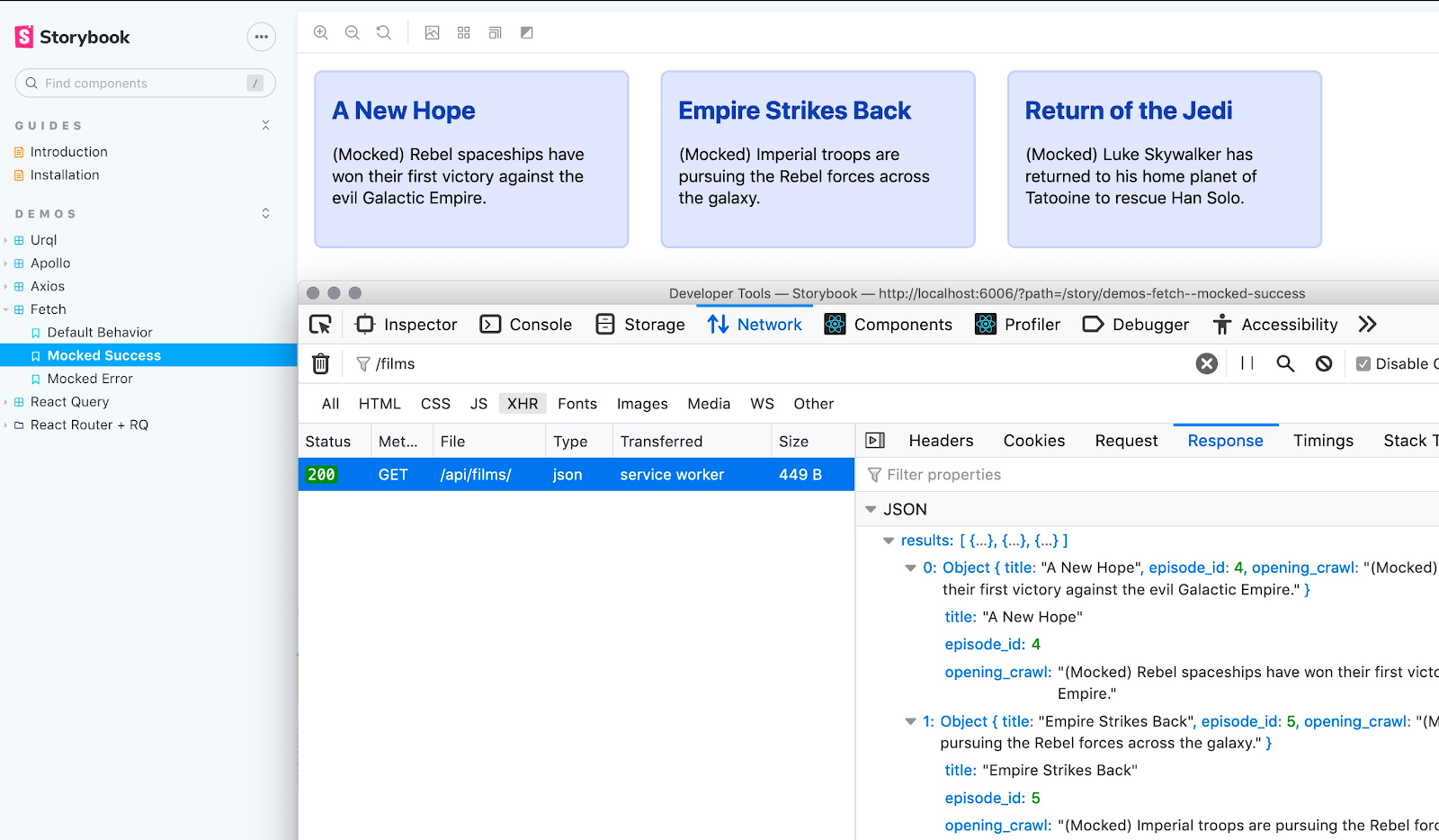
Under the hood, the MSW addon is powered by decorators. It automatically wraps your stories in an MSW decorator and allows you to supply the request handlers at the story-level via parameters.
// CategoryDetailPage.stories.js

import { rest } from 'msw';
import { CategoryDetailPage } from './CategoryDetailPage';
import { restaurants } from '../../mocks/restaurants';

export default {
  title: 'CategoryDetailPage',
  component: CategoryDetailPage,
};

const Template = () => <CategoryDetailPage />;

export const Default = Template.bind({});
Default.parameters = {
  msw: {
    handlers: [
      rest.get('/restaurants', (req, res, ctx) => res(ctx.json([restaurants[0]]))),
    ],
  },
};

export const Loading = Template.bind({});
Loading.parameters = {
  msw: {
    handlers: [
      rest.get('/restaurants', (req, res, ctx) => res(ctx.delay('infinite'))),
    ],
  },
};

export const Missing = Template.bind({});
Missing.parameters = {
  deeplink: { route: '/categories/wrong', path: '/categories/:id' },
  msw: {
    handlers: [rest.get('/restaurants', (req, res, ctx) => res(ctx.json([])))],
  },
};
While MSW is a highly utilitarian option, you can also find library specific addons for Apollo, URQL, GraphQL Kit and Axios.

Use decorators to extend Storybook functionality
Beyond mocking a component's dependencies, decorators also enable you to add extra bits of functionality to your Storybook. For example, the Measure, Outline and Backgrounds addons use decorators to inject code into the preview iframe, making CSS debugging easier. For more on this technique, check out the Create an Addon tutorial.
Conclusion
UIs account for endless permutations of language, device, user preferences, and app state. With Storybook, you can capture these variations as stories and revisit them during development and testing.
You can provide mock data via props to reproduce different states of a presentational component. But it's more challenging to isolate connected components because they're wired up to app state, interactions, and API requests.
Storybook decorators enable you to mock those dependencies. You can build custom decorators to wrap your components with providers or use off-the-shelf addons to mock API requests.
Storybook decorators help you build and test connected components in isolation.
— Storybook (@storybookjs) July 7, 2022
🏗️ Control story layout
💽 Load global providers
🎛️ Mock context for state management libraries
📡 Mock REST & GraphQL API requests
Get started with our new tutorial: https://t.co/PgSyCiDw6V pic.twitter.com/eTnMkpUMsh