Two new Storybook versions and faster release cycle
July 2023 Storybook update

July was a busy month in Storybook land!
The highlight was shipping Storybook 7.1 (our first release since Storybook 7). It contains a ton of features that smooth Storybook’s learning curve and setup difficulty, while also keeping Storybook up-to-date with changing trends (no, we don’t mean the Barbie movie).
Plus, Storybook 7.2 is also here — a much smaller but faster release as we experiment with a new, more frequent release cycle.
Explore all of last month’s changes below.
🏄 7.1: User onboarding, zero-config styling, and TypeScript docs
🧰 7.2: Angular, TypeScript, Vue2 fixes
🚅 New: faster release cycle
Storybook 7.1
Storybook 7.1 lets you achieve more with Storybook 7. Among hundreds of smaller fixes and optimizations, several of the standout features include:
In-app onboarding
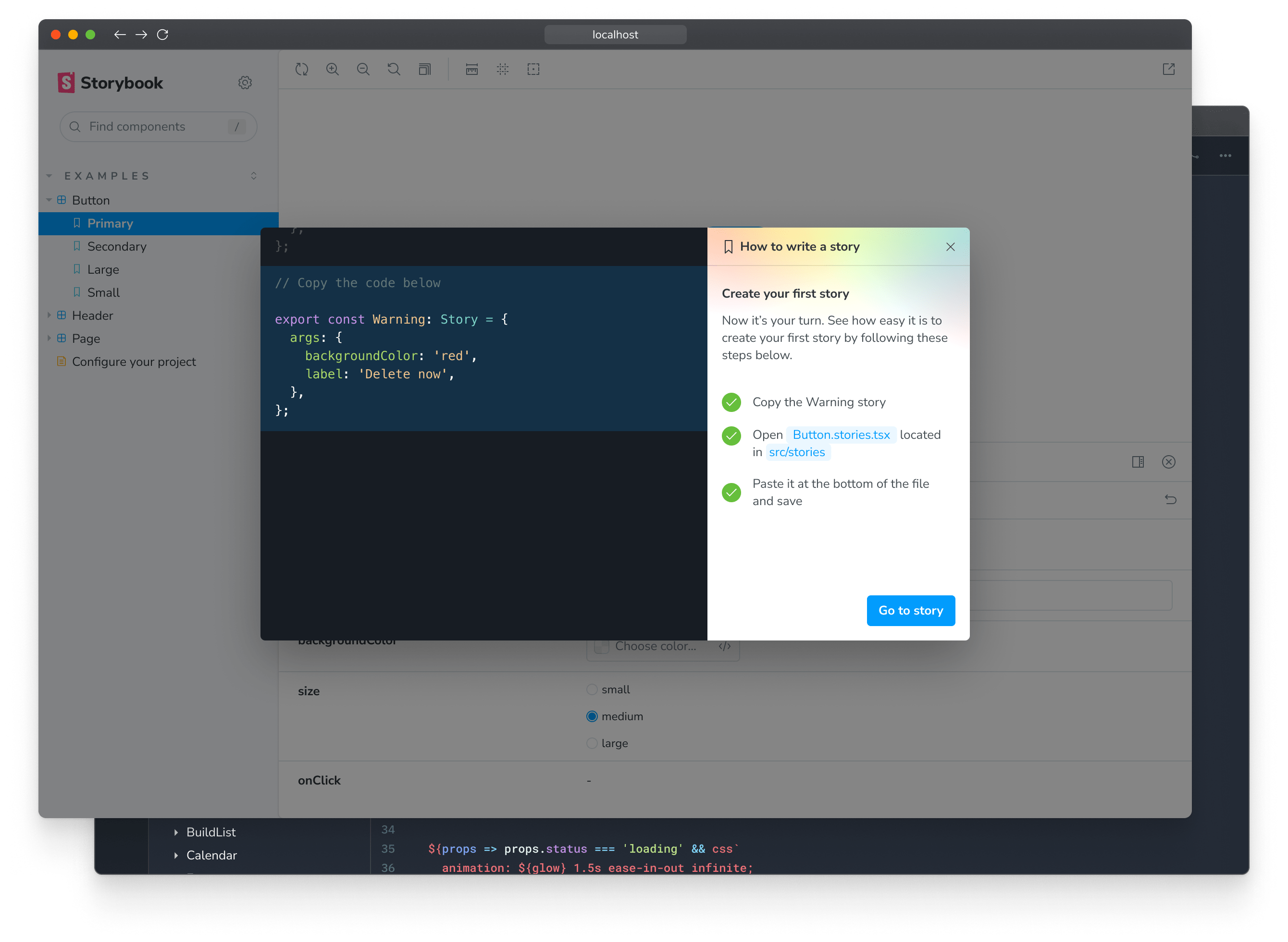
Learn Storybook in Storybook through our new user onboarding and get guidance on how to write your first story.
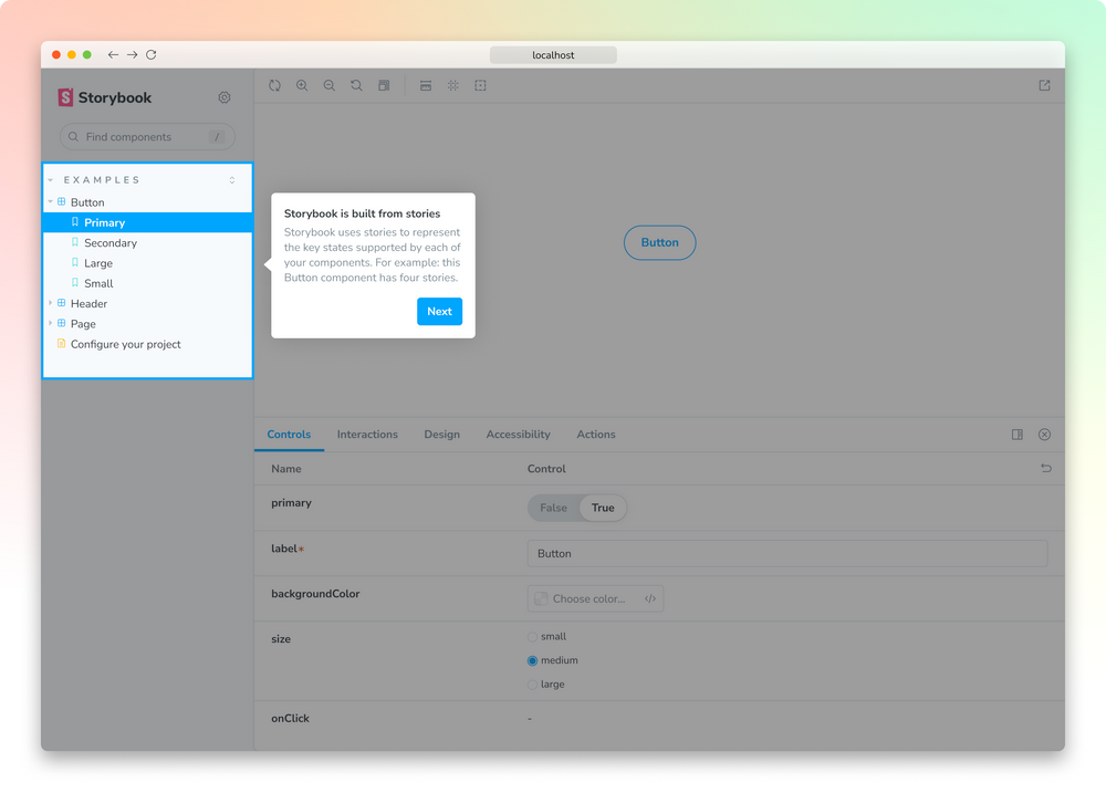
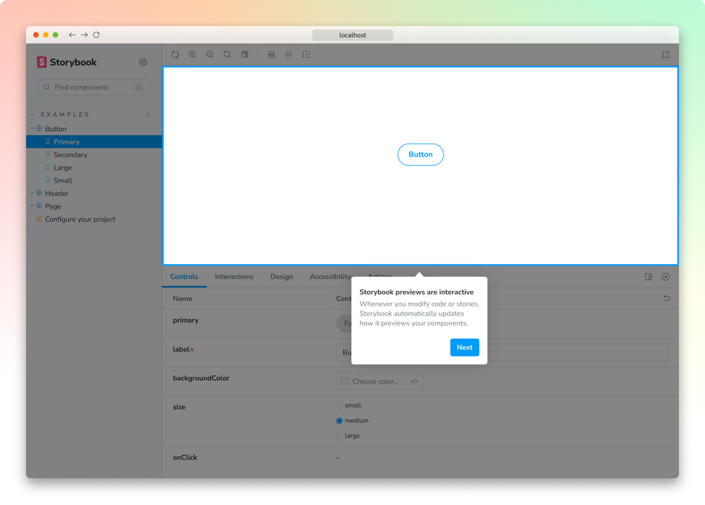
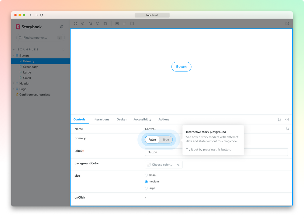
Currently available in all new React projects, with further framework support coming soon. Read more.
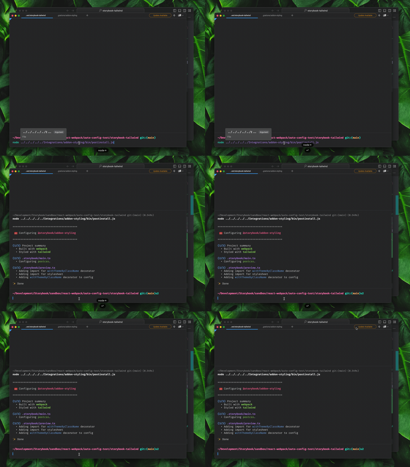
Zero-config styling
Our updated Styling Addon can now automatically configure Storybook for your project’s styling tools. Currently, it supports Tailwind, Material UI, Emotion, and styled-components, with more libraries joining the list in the future. Read more.
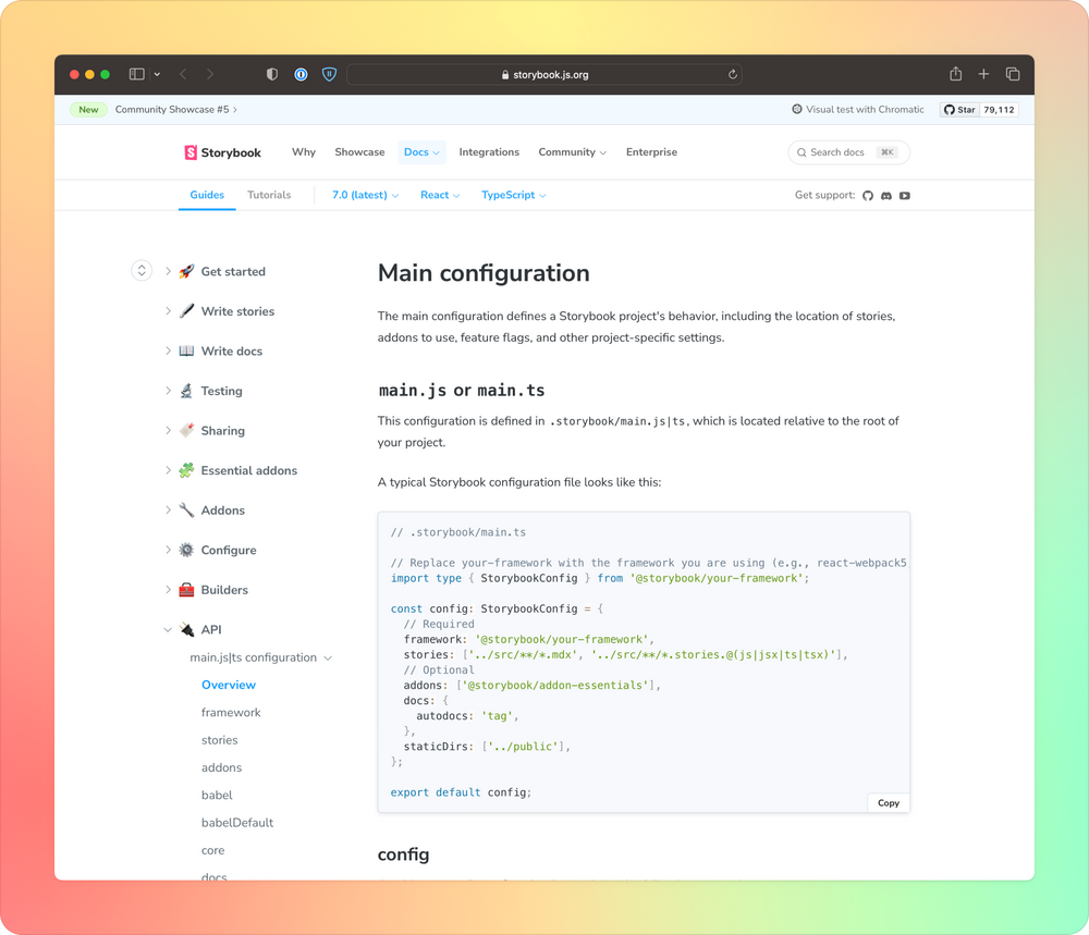
TypeScript-default docs
TypeScript is now the default language of Storybook's documentation. This follows changes in the world of FE dev, with TypeScript currently featuring in 80% of all Storybooks. Read more.
Additional features:
- New API reference material
- Improved Vue3 source snippets and reactivity
- Table of Contents for Storybook Docs
- Design Addon official support
Storybook 7.2
This month, we're experimenting with our launch cycle by releasing new versions of Storybook that are smaller but more frequent. Our goal is to bring you new features more quickly and smooth the upgrade process.
7.2 is the first of these faster releases. It contains several quality of life fixes and upgrades, including:
- Angular: added optional
prodmode when building Storybook - TypeScript: fixed issue where keywords
satisfiesandaswere incorrectly parsed by stories - Vue2: fixed reactivity bug
Upgrade to 7.2 now via npx storybook@latest upgrade!
Visual component testing for Storybook
Chromatic is a service by Storybook maintainers to help frontend teams automate visual & interaction testing and streamline stakeholder sign-off with CI/CD. Learn more »
Jobs board
Explore Storybook-using roles in leading frontend teams. Visit our community jobs board »

Thanks for reading! Keep in-sync with everything happening in Storybook by joining our dev community on Twitter, LinkedIn, or Discord.