
Storybook 5.0
Welcome to the future of component development!

We’re kicking off 2019 with Storybook 5.0 (SB5), our biggest release to date. Here’s what’s in it:
- 🎨 Complete overhaul of Storybook’s developer experience
- 💅 Theme-ready component library
- 🛠 Evolved front-end architecture for addons
- 🖼 Brand new Storybook website
Read on for a project update, tour of improvements, and upgrade instructions.
Storybook’s progress and what’s next
Storybook is the world’s favorite UI component workshop. It enables structured UI development, testing, and documentation for every major view layer including React, Vue, Angular, React Native, and Ember.
📈 Record adoption: Storybook is the tool of choice at UI powerhouses like Airbnb, Slack, Squarespace, Lyft, Dropbox. Adoption continues to grow across industry and open source projects, recently crossing 4.5 million monthly npm downloads.
👩💻 Thriving community: The Storybook community recently surpassed 600 contributors and 34k stars on Github, vaulting us into the top 40 Javascript projects by star count. The community is stronger than ever. To guide the project into the future we established a steering committee of top maintainers.
🛠 Professional-grade tool: In 2018 we focused on building the Storybook platform: expanded view layer support, addon cross-compatibility, and evolving alongside JavaScript tooling. Now in 2019 we’re improving the developer experience by:
- Prioritizing user feedback
- Making Storybook configurable in all the ways you want
- Stabilizing the platform with smaller, more frequent releases
Say hello to the new Storybook
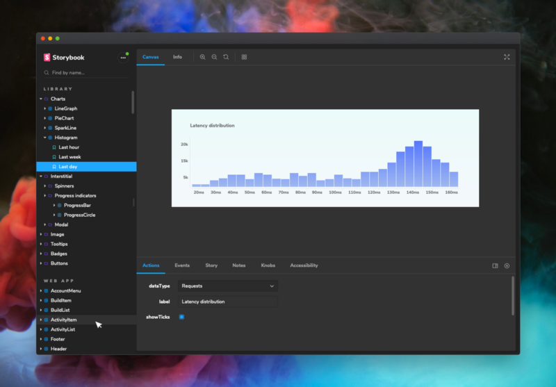
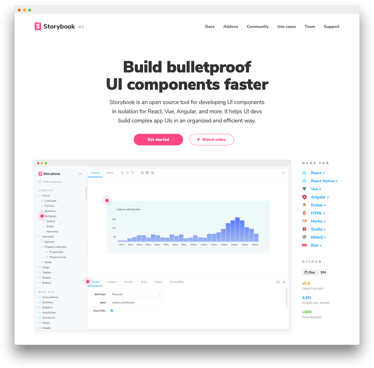
SB5’s centerpiece is a beautiful new user interface. Ironically, for such a widely used UI development tool, Storybook itself left a lot to be desired in the design department. Storybook’s new design is the first major overhaul since the project began.
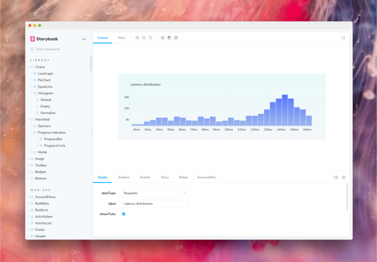
The new UI addresses accumulated user feedback dating all the way back to 2016. It boasts:
- 🌓 New design with light and dark themes
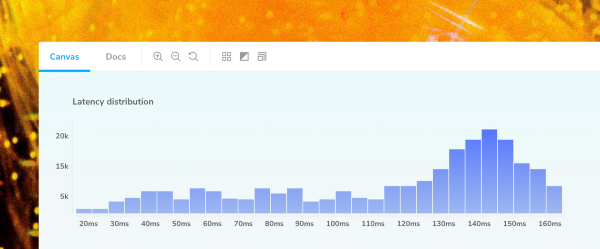
- 🛠 Canvas toolbar for easy access to addons
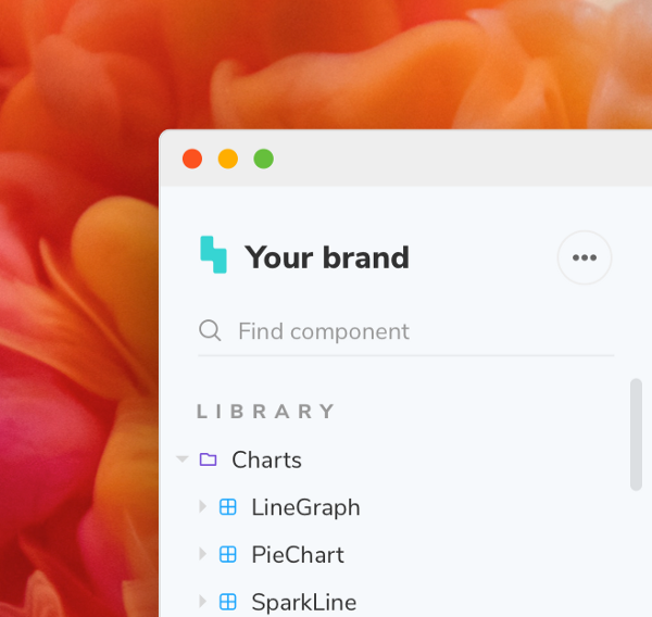
- 🗺 Overhauled navigation sidebar with an intuitive menu
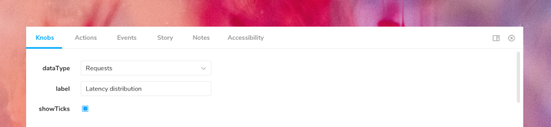
- 🗜 Redesigned addons panel with handy buttons to toggle visibility and orientation
- ⌨️ Improved keyboard shortcuts that are user configurable
- 🌍 New URL structure that eliminates long strings of query parameters
These upgrades improve the entire Storybook ecosystem of view layers, addons, and integrations. Read more about this project in Meet Storybook’s new design.
The UI was designed by Dominic Nguyen. Implemented by Norbert de Langen, Dominic Nguyen, Tom Coleman, Jessica Koch, Alexandre Bodin, and many more contributors.
Reuse Storybook’s components
Storybook is built with Storybook. We’re releasing the @storybook/components library to accelerate development, promote best practices, and dogfood our own UI workflows. This means addon developers can build addons that are consistent with Storybook’s UI much faster.
Storybook Components is implemented in React and Emotion. The library contains all of the building blocks for the Storybook interface, crafted for both desktop and mobile, and customizable through Emotion’s flexible theming API.
Releasing the library achieves a few different goals:
- ⚡️Accelerate development: We document common use cases, automate visual testing, and promote code reuse
- ✨ Promote best practices: Our long-term goal is that the library will be a shining example of how to build a well-documented design system in Storybook. We’ve got a long way to go here, but SB5 is a first step.
- 🏗 Improve the workflow: We eat our own dogfood. Many of SB5’s improvements came as a result of building our component library in Storybook.
Check out the library in Storybook’s Official Storybook, and stay tuned for more documentation as we continue to build out this resource for the Storybook community.
Customize Storybook to your needs
Storybook also boasts a new front-end architecture for improved customization. Storybook has always offered hackable addon and build configuration APIs; now SB5 begins to open up the user interface for configuration:
Theme API
Theming in Storybook is easier, more consistent, and better looking than ever. This is possible via new theme API, which improves upon the previous API that shipped in 4.0.
Storybook includes hand-crafted “light” and “dark” themes out of the box. These themes stand alone and serve as starting points for customization. Here’s a simple example to get you started:
SB5’s theme system is abstracted into a core set of variables. This simplifies theming for developers while making it easier to preserve backwards compatibility as Storybook’s UI evolves. For more information about theming in SB5, please see the updated Theming documentation.
For adventurous theme authors there is also an escape hatch that allows you to hack the underlying Emotion theming API.
Addons API
SB5 includes an expanded addons API with two new ways for addons to hook into the UI: Toolbar and Tab.
- Toolbar: Addons can now add UI into the … wait for it… toolbar!! This makes controlling addons discoverable and immediate for users. The Viewport, Backgrounds, and A11y addons all show off this new feature.
- Tab: Addons can also add new tabs to the main stories panel to embed alternative views onto your stories. The Notes addon shows off this feature, and we’ll be building out more creative integrations soon.
These new hooks are just the start of how we’ll be opening up SB5 to addons while maintaining a simple, streamlined API.
Toolbar or the revamped Addons panelFor addon users, installation and configuration has not changed in SB5. For addon authors interested in the new APIs, refer to the the Storybook addons documentation.
The brand new website
The cherry on top of the SB5 release is Storybook’s new website. The stunning site articulates the most common benefits of Storybook — inspired by meetups, discussions, presentations, and blog posts from the community at large.
Designed by Dominic Nguyen with review/QA from Igor Davydkin, Sacha Greif, orta, and Aparajita Fishman. The site is implemented in Gatsby by Dominic, Tom, Dale Blackburn, Lucas Carl, and Chak Shun Yu. It’s a great reference point for how to systematically build websites in Storybook.
“But why do I need Storybook?”
Users often ask why Storybook? There are many use cases for Storybook: a component explorer, styleguide, UI docs, playground, sandbox, workshop, and library. So many that it’s a mouthful to describe — even for maintainers.
I’m thrilled to announce a new intro video that answers this perennial question once and for all. In less than two minutes you’ll see why isolated component development is crucial for modern apps and how Storybook helps you do it.
The breathtaking intro video was animated by Daniel Egerev and directed by Dominic Nguyen.
Upgrade to Storybook 5.0
If you’re running Storybook 4.x, upgrading to 5.0 is straightforward. I’ve put together a 5.0 upgrade guide to walk you through it. And if you’re on 3.x, the 4.0 upgrade guide will also help.
If you’re new to Storybook, check out the Storybook Tutorial for a step-by-step walkthrough of React/Angular/Vue.
Or if you prefer to just jump in, it takes 30 seconds to add SB5 to an existing project:
cd my-project
npx -p @storybook/cli sb init
yarn storybook
Thanks to the community
Storybook is the product of over 600 community committers, organized by a steering committee of top maintainers. Thanks to gracious donations on Open Collective we’re at an annual budget of $20k for infrastructure, swag for contributors, documentation, and promotion.
Storybook 5.0 contains code contributions from the following people:@backbone87 @bertho-zero @dandean @domyen @donaldpipowitch @ebrearley @gabrielcsapo @gaetanmaisse @gbakernet @gongreg @greysteil @hypnosphi @igor-borisov @igor-dv @jessica-koch @jessidhia @jhummel @johot @jure @keraito @koenpunt @kroeder @kwm14 @kylemh @lauriejones @loklaan @maacky @manbeartm @marcobiedermann @martinmckenna @matteo-hertel @misund @mrmckeb @myoxocephalus @ndelangen @nitaking @pascalduez @petersendidit @pgoforth @pickra @piperchester @pksunkara @psyked @rwoverdijk @sayegh7 @sharils @shilman @tmeasday @tomraithel @web-padawan @wuweiweiwu
SB5 is the first time we’ve done a coordinated RC process. Thanks to everybody who tested and reported issues with a special shout out to MVP’s Alex Wilson and Leo Y. Li for putting SB5 through its paces.
If Storybook brings delight and efficiency to your UI development process, please consider helping make Storybook better. Whether you’re contributing a new feature like the ones described in this post, fixing a bug, or helping improve the documentation, there is a mountain of work that goes into every release. Join us on Discord, support us on Open Collective, or just jump in on Github.
Have questions or kudos? Say hi on Twitter, Discord, Github, or in the comments below. Please 👏 applaud this post and share to help more people discover it.