Storybook DocsPage
Beautiful documentation, instantly

I’m excited to announce DocsPage, available today in Storybook 5.2.
Storybook is the de facto standard UI component workshop. It powers frontend dev workflows at Airbnb, Lyft, Squarespace, Slack, & Dropbox, in addition to more than 25,000 public Github projects.
DocsPage is a zero-configuration way to turn your Storybook into a rich, readable document. It’s the first step towards transforming your Storybook into a world-class design system.
💡 What’s the big deal?
High quality component documentation is immensely valuable to any collaborative UI development process.
But writing documentation takes a lot of time. And even if you do manage to, maintaining your docs while building features is really hard. In reality, most docs are outdated the instant they’re published. 😭
Over the past few years, modern frontend teams embraced Component-Driven Development to build UIs from the bottom up starting with components and ending at screens. They use Storybook to encode key component states as stories.
Stories are easy to write and are always up to date because they use real production components. Many teams already generate hundreds of stories per project to capture their key use cases.
What if you could take the stories that you’re already creating during the development process and use them to auto-generate high-quality documentation?
You’d get the benefits of isolated component development and best-practices UI component documentation … for free!
💵 Show me the money!
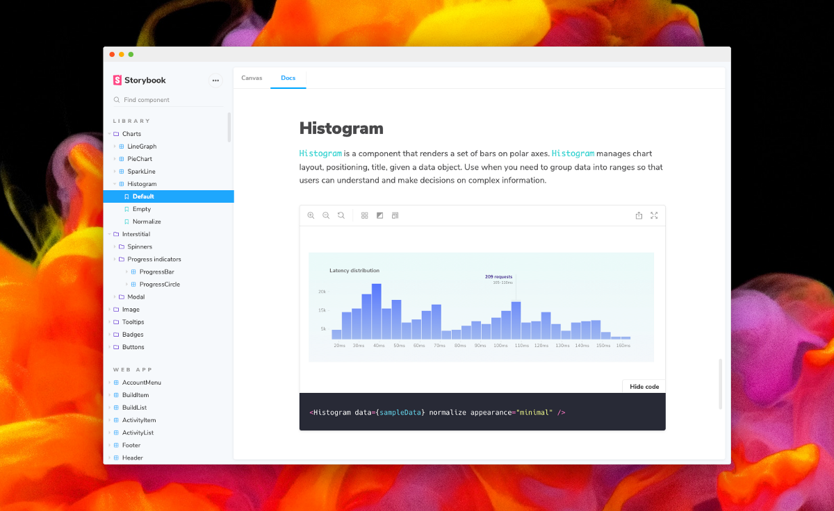
DocsPage is a simple template to turn your Storybook into great looking docs. Each component page consists of a description, a primary story (with copyable source), a props table, and a collection of stories:
You can browse this live as part of the Storybook Design System (intro post). Each component has its own DocsPage, auto-generated from an existing Storybook.
🏋️♀️ Building on the shoulders…
This isn’t a crazy idea. DocsPage replaces addon-info, an auto-documentation tool that’s one of the most popular addons in the Storybook ecosystem.
The Info addon boasts 1M+ npm downloads/mo, despite several known flaws. DocsPage fixes all of Info’s shortcomings and more:
- ✅ DocsPage isn’t tied to React. It handles components in any framework Storybook supports.
- ✅ It renders itself into its own window so it doesn’t pollute snapshot tests or other tools that interact with Storybook’s preview window.
- ✅ You can view documentation inside Storybook’s UI AND export a standalone documentation site.
- ✅ You get documentation per-component, rather than per-story.
- ✅ It’s dramatically easier to maintain thanks to a ground-up redesign.
Not only does DocsPage solve all of these problems, but we’ve even designed thoughtful migration paths if you already use addon-info or addon-notes.
📈 From good to great
But DocsPage is more than just better auto-documentation: it’s also the gateway drug towards an outstanding, richly documented design system.
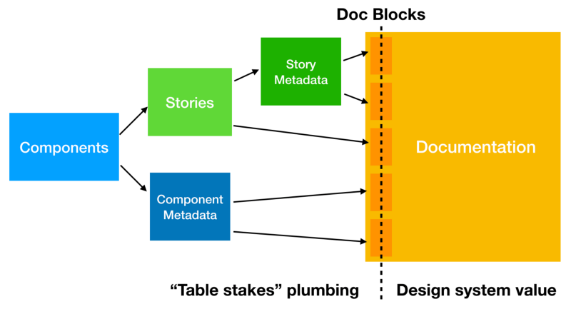
Every item in DocsPage is a Doc Block: a well-designed UI element that aggregates a single piece of information from your components, their stories, or associated metadata (source, prop definitions, types, docgen comments, git commits, test coverage, performance measurements, and on and on).
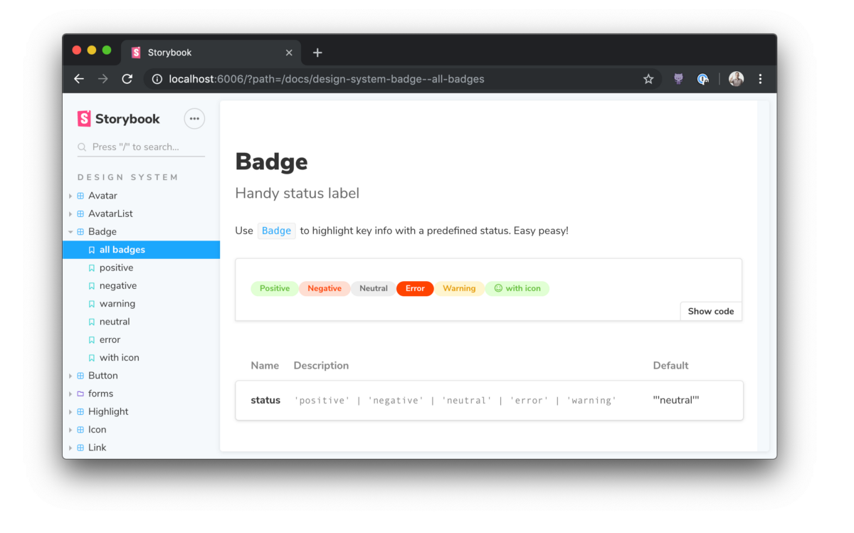
These same building blocks can also be easily reused inside longform markdown-based documentation using MDX:
import { Meta, Story, Props } from '@storybook/addon-docs/blocks';
import { Badge } from './Badge';

<Meta title="Demo/Badge" component={Badge} />

# Badge

With `MDX` we write longform markdown documentation for our `Badge` component and embed Doc Blocks inline.

<Props of={Badge} />

<Story name="positive">
  <Badge status="positive">Positive</Badge>
</Story>Storybook Docs makes it easy to replace a component’s DocsPage with MDX, or add supplementary MDX documentation to your storybook alongside the auto-generated DocsPage docs.
Thus the workflow becomes:
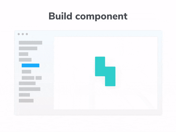
- Build your components in Storybook
- Get example-based documentation for every component automatically
- Enhance your documentation as needed with MDX
MDX support is available today in 5.2, with the official release available in Storybook 5.3 RC. For more information about MDX support, see the Storybook MDX release post.
⚡️ 1 minute installation
Want it? First upgrade your project to the latest Storybook:
npx npm-check-updates '/storybook/' -u
npm install # or yarn if you prefer
Then add docs to an existing project:
npm install @storybook/addon-docs --save-dev # or yarnFinally, add the following line to your .storybook/presets.js file:
module.exports = ['@storybook/addon-docs/preset'];Replace react with your framework of choice. For more information on configuring DocsPage, read the installation instructions.
🚀 Project collaboration
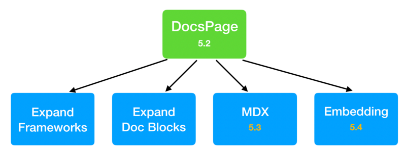
Storybook Docs is an ambitious project to streamline the technical side of building a design system.
In April we announced the project and in May we released the first technical preview. Since then, we’ve iterated through 70+ prereleases. DocPage is the first feature to launch.
We need your help to make Docs great.
The easiest thing you can do to help is install DocsPage in your project and ask questions and/or file bugs in our Github project. And if you see a bug you can fix, we welcome all contributions!
We also have bigger plans:
We’d love help bringing DocsPage to every framework Storybook supports. DocsPage comes “for free,” but some functionality — such as Props table support —still needs to be built on a framework-by-framework basis. If you’d like to improve DocsPage support for your framework of choice, please check out the current status for your framework in this umbrella issue.
In addition to DocsPage, we’ve also got a lot more coming in various stages of completion.
- We’re creating a rich library of Doc Blocks, for example avatars of Github collaborators for a component, component status badges, and so forth.
- We also support MDX authoring of documentation. A preliminary version of this is already available as part of the 5.2 release, and we want to improve it together with the community before official release in 5.3.
- Finally, we also want the ability to embed storybook docs in other documentation systems such as Gatsby.
If you’re interested in collaborating on any of this, or just want to stay on top of the latest, the project community mostly lives in the #docs-mode channel on our Discord.
Thanks to the community
Storybook Docs is being developed by Michael Shilman (me!), Tom Coleman, Norbert de Langen, Lionel Benychou, Atanas Stoyanov, and Igor Davydkin. Design and theming by Dominic Nguyen. Special thanks to bleeding-edge adopters Pål Nes, Jeroen Reumkens, Bart Ledoux, Aaron Pool, Alex Wilson, Joey Cozza, and Tom Speak. Huge 🙌 to Brad Frost for design systems project guidance.
If Storybook makes your UI developer workflow easier, help Storybook get better. You can contribute a new feature, fix a bug, or improve the docs. Join us on Discord, support us on Open Collective, or just jump in on Github.